Got a tip for us?
Let us know
Become a MacRumors Supporter for $50/year with no ads, ability to filter front page stories, and private forums.
iOS 26 Beta 6 ― Bug Fixes, Changes, and Improvements
- Thread starter Banglazed
- WikiPost WikiPost
- Start date
- Sort by reaction score
You are using an out of date browser. It may not display this or other websites correctly.
You should upgrade or use an alternative browser.
You should upgrade or use an alternative browser.
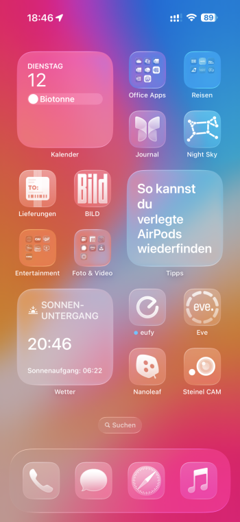
Yep wondered the same yesterday, took as a mistake a screenshot of my homescreen and it looked similar to yoursHas anyone noticed screenshots of the home screen look much darker than they are? It's odd. Here's the difference. The one on the left is correct. The wallpaper should look light and bright. But when I screenshot it, it turns dark like on the right.

Wil try it, one sec.Does ios26 fix hidden apps issue?
I mean whats the point of hidden app since you can get into the app through app store ?
Its still a thing in latest ios18
Edit: hide my game for example, and used Face ID to hide it and protect it.
Over AppStore it was listed as „open“ and I could open it with Face ID - is that what you meant ?
Ok I see what it does now. It adds .com without the long press. I also tried it on a .edu site and it automatically added the domain. Mail still has the long press.It’s still there on iOS 26, at least when you’re entering text into the Safari address bar.
yes...thank you, so its still not really hidden if you know this simple walkaroundWil try it, one sec.
Edit: hide my game for example, and used Face ID to hide it and protect it.
Over AppStore it was listed as „open“ and I could open it with Face ID - is that what you meant ?
Yes I would say so sadly, if you join iOS 26 beta you could report it thoughyes...thank you, so its still not really hidden if you know this simple walkaround
Yep wondered the same yesterday, took as a mistake a screenshot of my homescreen and it looked similar to yours
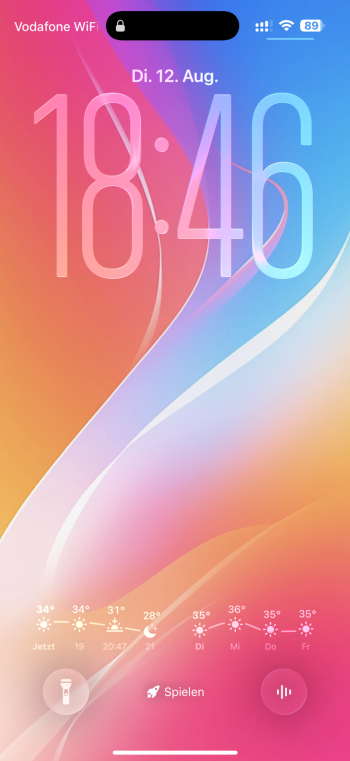
I get the same result on the lock screen. I reported it in the Feedback app. I'll stick to dark wallpapers for now.
Why on earth when capturing screenshots, is the “X” to close out of the editing on the upper LEFT corner, and the “✔️” to bring up the menu with save and other options, on the RIGHT?
Have employees lost all sense of basic design language? The “X” to close out of applications and windows goes to the RIGHT. It’s always been on the right. For decades and decades and decades. Everyone’s muscle memory thinks X/cancel/close is always to the top right.
Such a small thing, but holy hell does it irritate me in a big way. 😂 it’s just so simple…
Wasn’t it always on the right - I mean on iOS 18 I remember it was „Done“ not the Check Symbol…Why on earth when capturing screenshots, is the “X” to close out of the editing on the upper LEFT corner, and the “✔️” to bring up the menu with save and other options, on the RIGHT?
Have employees lost all sense of basic design language? The “X” to close out of applications and windows goes to the RIGHT. It’s always been on the right. For decades and decades and decades. Everyone’s muscle memory thinks X/cancel/close is always to the top right.
Such a small thing, but holy hell does it irritate me in a big way. 😂 it’s just so simple…
But I think it was always like this
can't remember ... but use Apple Music since launch and didn't think about it
Can’t say if an Apple Music subscription is required or not, but in order to be pinned, it must be in the library already. Not sure if you’ve tried that
It’s a bug. Tapping around on the screen fixed it, but then the top bar went dark. Lol

I'm still getting an annoying weird bug with the brightness adjustment. Basically the auto-brightness randomly makes the screen way too dim, and if I try to manually adjust it via the slider, the adjustment is not linear at all and a slight adjustment makes a big difference in brightness. Once I swipe away out of control center and go back, it's working normally again.
I can't figure out how to replicate it, but it happens periodically and I haven't seen anyone else mention it.
I can't figure out how to replicate it, but it happens periodically and I haven't seen anyone else mention it.
Wasn’t it always on the right - I mean on iOS 18 I remember it was „Done“ not the Check Symbol…
But I think it was always like this
No, previously the “done” button was on the left, where it makes sense.
Now they’ve moved it to the right (and replaced with a checkmark).
Absolutely wild to have the cancel / X as the left-cornered option. Goes against basic common design sense, and it bothers me. It’s something so simple it’s almost incredulous that they’ve done it this way.
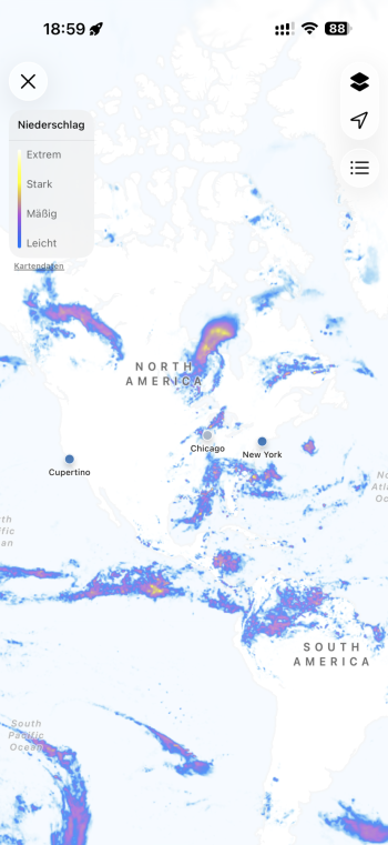
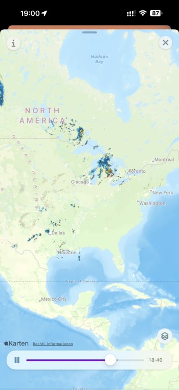
What I should have clarified is: do weather forecasts work if you ONLY have satellite connectivity (so if you're in the mountains, don't have any data, can you connect to a satellite and get a weather forecast this way)?Looks perfect with Apple Weather and Mercury Weather
View attachment 2536843 View attachment 2536842
Why? Hop on db6 already, it’s safe !Waiting for Public Beta…
oopsyWhat I should have clarified is: do weather forecasts work if you ONLY have satellite connectivity (so if you're in the mountains, don't have any data, can you connect to a satellite and get a weather forecast this way)?
still cant edit timezone info in calendar events. Calendar.app just hangs up. Reported to apple couple betas ago, nothing back from them yet
safe as @Stiille mentioned ... and I guess PB3 will be only tomorrow (taking again the 48h break)Waiting for Public Beta…
Just tried it and my screen shot matches my actual.Has anyone noticed screenshots of the home screen look much darker than they are? It's odd. Here's the difference. The one on the left is correct. The wallpaper should look light and bright. But when I screenshot it, it turns dark like on the right.

Why? Hop on db6 already, it’s safe !
From what I understand, you don't want to mix the paths. If you've got the PB, best to stay on the PB, if you're on DB, stay on DB.
you quote me 🙂) yes, in theory ... but if you jump I recommend not to jump again (even if it would be safe (same builds)), just for cosmetically reasons ...From what I understand, you don't want to mix the paths. If you've got the PB, best to stay on the PB, if you're on DB, stay on DB.
Register on MacRumors! This sidebar will go away, and you'll see fewer ads.


