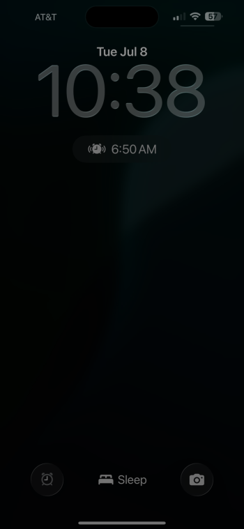
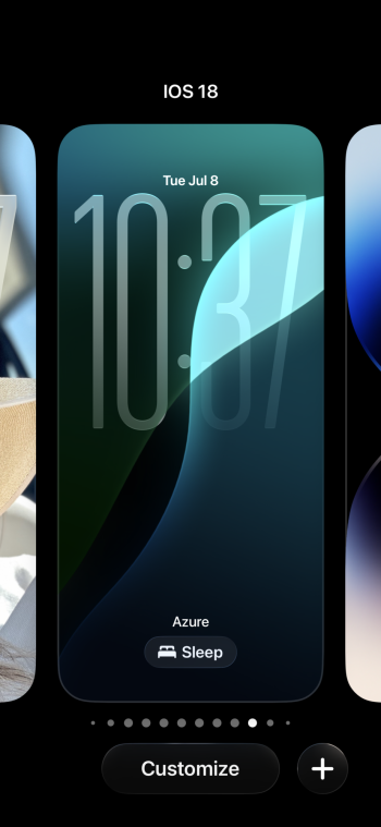
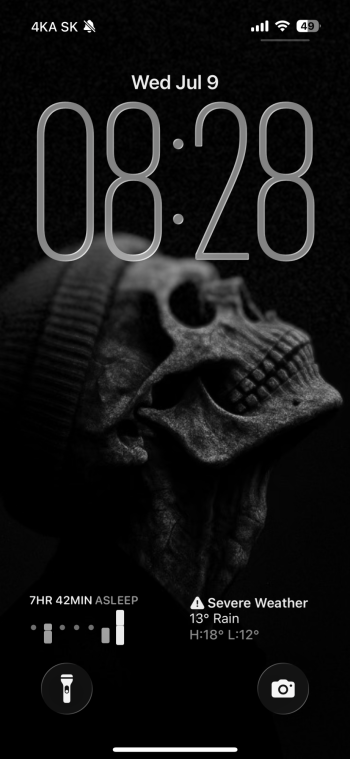
On my 13 pro max bets 3 has been far more stable, far less laggy, and oh my god I can see the UI. It’s like a friggin miracle. Thank god for the changes. 1 was basically unreadable. 2 made it better but was inconsistent and frequently unreadable. 3 has so far been much better and I can see the UI. I wish they’d give a slider like others suggested, darken the UI but leave a bit more transparency intact. I like the transparency but white on white on white is hard to see.
Got a tip for us?
Let us know
Become a MacRumors Supporter for $50/year with no ads, ability to filter front page stories, and private forums.
iOS 26 Liquid Glass Design Drama: Beta 2 vs. Beta 3 Changes in Every App
- Thread starter MacRumors
- Start date
- Sort by reaction score
You are using an out of date browser. It may not display this or other websites correctly.
You should upgrade or use an alternative browser.
You should upgrade or use an alternative browser.
In Settings, since it is impossible to please everyone, they should just add two options.
1) Glass, but difficult to read.
2) Opaque, but with the knowledge that we have been manipulated into forgetting that this update should’ve been an AI enhanced version of Siri.
1) Glass, but difficult to read.
2) Opaque, but with the knowledge that we have been manipulated into forgetting that this update should’ve been an AI enhanced version of Siri.
This is like comparing two samples of excrement.
In Settings, since it is impossible to please everyone, they should just add two options.
1) Glass, but difficult to read.
2) Opaque, but with the knowledge that we have been manipulated into forgetting that this update should’ve been an AI enhanced version of Siri.
How about also adding:
3) iOS 18 mode
Apple have a difficult task with this one, trying to balance the cool factor of the new glassy design (advertised as their major design shift for all platforms at WWDC) with actual contents readability & usability.
So whereas I liked that sleek glassy look in betas 1-2, I much more prefer the current (DB3) implementation, as it requires much less time and attention to actually be able to read stuff, which was especially hard in apps like Apple Music before.
So I am curious of how it all is going to evolve through the rest of the beta cycle.
It’s not liquid glass anymore. It is frosted glass. I much prefer the look in Beta’s 1 & 2 for sure. It now just looked like iOS 18.
Apple, please let us choose if we want liquid glass or frosted glass. Apple might have to edit their keynote presentation to take out the liquid glass design bit …
Apple, please let us choose if we want liquid glass or frosted glass. Apple might have to edit their keynote presentation to take out the liquid glass design bit …
Funny how this was never an issue in iOS 6 and earlier, which looked cool and was perfectly usable and legible, even without tons of Accessibility options.Apple have a difficult task with this one, trying to balance the cool factor of the new glassy design (advertised as their major design shift for all platforms at WWDC) with actual contents readability & usability.
Haven’t you posted this comment in this thread before . Are you click spammingIt’s not liquid glass anymore. It is frosted glass. I much prefer the look in Beta’s 1 & 2 for sure. It now just looked like iOS 18.
Apple, please let us choose if we want liquid glass or frosted glass. Apple might have to edit their keynote presentation to take out the liquid glass design bit …
I am on 15p,and in dark mode without RT in looks just ok, as seen just right now in music app, LG still there, but pushed back a bit with transparency, so it is just a fake plastic transparency shield behind object.I am to, and it doesn't.
In light mode the trasparency is more present, and it just looks off, a bit of ios18 with LG lipstick on.
Funny how this was never an issue in iOS 6 and earlier, which looked cool and was perfectly usable and legible, even without tons of Accessibility options.
I hope Apple will get the balance right. With Android going all flat and bright and clear with their “Material 3 Expressive”, Apple decided to go glassy and sleek instead. So I hope they know what they are doing, as Android lot already start criticising Apple’s new design:

Android 16's Material 3 Expressive shows just how bad iOS 26's redesign really is
Comparing Android 16's Material 3 Expressive with iOS 26's Liquid Glass UI, Google delivers clarity while Apple stumbles on flashy form.
www.androidauthority.com
Apple’s ideal scenario below, however, keeps me hopeful:

Meet Liquid Glass - WWDC25 - Videos - Apple Developer
Liquid Glass unifies Apple platform design language while providing a more dynamic and expressive user experience. Get to know the design...
Last edited:
Hard to believe that software engineers at Apple not see this liquid glass translucency interfering with the background UI elements. All this looks like some senior manager insisted on putting VisionOS translucency and software engineers followed through only to prove to the manager that it's not such a good idea.
Insert that meme of Donald Glover saying "Good.". Because most of the lefthand screenshots are trying very hard to score high on the illegibility scale. Like camouflage was the goal, rather than readability.
I'm a little concerned that the note about Maps says turn-by-turn directions are more translucent - because if I look at those at all, I want them to be instantly parseable with a single glance, not me trying to fathom out what they're trying to blend into the background.
I'm a little concerned that the note about Maps says turn-by-turn directions are more translucent - because if I look at those at all, I want them to be instantly parseable with a single glance, not me trying to fathom out what they're trying to blend into the background.
Last edited:
So I guess it is perfectly fine for Apple to ONLY polish App Store app and Apple Store app. Everything else can be a jumbled mess and people would still buy iPhone. That’s a very good direction to take.Of course, it would be fatal if the legibility issues would deter people from purchasing apps. Everything else is secondary.
The biggest selling point that Microsoft nailed it 16 years ago under windows 7, one of the prettiest OS ever released imo.What an absolute mess. I know we’re still in beta but c’mon.
It’s so inconsistent and all over the place. Hopefully it’s much better by final release.
Honestly I wish they’d just scrap it but unfortunately it’s their big selling point of iOS 26 lmao.
And yet, said senior managers banging on the conference room desk DEMANDING software engineers to shoehorn the entire mess into iOS 26 and everywhere else. Software engineer obliged but also tried their best to tread the fine line of angering said senior managers and making users happy.Hard to believe that software engineers at Apple not see this liquid glass translucency interfering with the background UI elements. All this looks like some senior manager insisted on putting VisionOS translucency and software engineers followed through only to prove to the manager that it's not such a good idea.
What I find jarring is the new lock screen animations. In IOS18 the lock screen pulls up or down like a window shade with subtle blurring. In iOS26 it is glass that reveals the wallpaper and then zoom animates the home screen in only when fully pulled up. And when you pull it down it glides down over the home screen to all of a sudden make the home screen disappear. Highly unsatisfactory to me.
Never let programmers do UX/UI…. They don’t have the design eyeHard to believe that software engineers at Apple not see this liquid glass translucency interfering with the background UI elements. All this looks like some senior manager insisted on putting VisionOS translucency and software engineers followed through only to prove to the manager that it's not such a good idea.
Yeah but windows so.... nopeThe biggest selling point that Microsoft nailed it 16 years ago under windows 7, one of the prettiest OS ever released imo.
Please just give us a slider for effect opacity. Disappointed with the reduction of the glass effect. Embarrassing on the revert, the saving grace is a slider.
Definitely it has something to do with device id.What's happening now is I stretch the time in customization and it doesn't "stick".
Epic fail
Attachments
Whose idea was it for this ugly illegible, difficult to read UI?
I’m perfectly ok with windows. I grew up WITH windows so yeah.Yeah but windows so.... nope
Regardless, windows 11 doesn’t have that beautiful aero glass so bruh.
Register on MacRumors! This sidebar will go away, and you'll see fewer ads.


