Got a tip for us?
Let us know
Become a MacRumors Supporter for $50/year with no ads, ability to filter front page stories, and private forums.
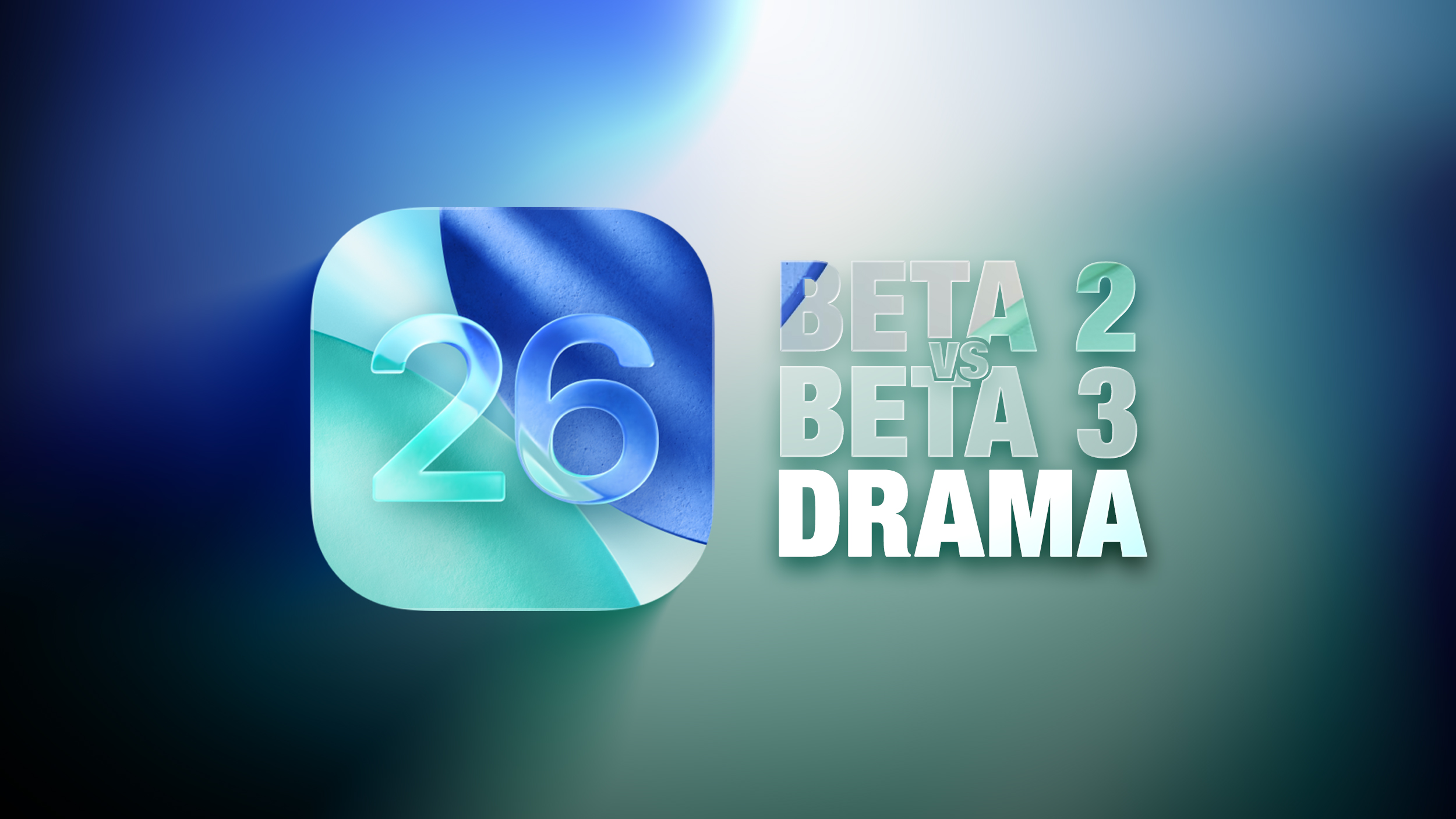
iOS 26 Liquid Glass Design Drama: Beta 2 vs. Beta 3 Changes in Every App
- Thread starter MacRumors
- Start date
- Sort by reaction score
You are using an out of date browser. It may not display this or other websites correctly.
You should upgrade or use an alternative browser.
You should upgrade or use an alternative browser.

I want to know if they fixed nightstand mode. In iOS 18, if my phone detected movement, it displayed the time. In iOS 26, that function is gone so I literally have to tap the screen to get the time. I no like.
They totally ruined the cool effect.
They could have just tweaked the icons's color to be more visible according to the background, instead they replaced glass with horrible opaque plastic.
👎👎👎
They could have just tweaked the icons's color to be more visible according to the background, instead they replaced glass with horrible opaque plastic.
👎👎👎
How completely embarrassing. Welcome to iOS 18.9. They make this big deal of the liquid glass as being the MAIN FEATURE of the new iOS and it's being walked back because it was so awful. What is going on?
Being truly transparent 'glass' only works if the background is VERY simple. A complex background such as many photos causes way too much 'noise' in the controls that hover above it forcing you to stare an extra second or more to be sure which control you need. There are multiple, subtle ways to fix that problem and I suspect they still haven't arrived at the final answer. I suspect part of the final answer will be a setting to let the user make the adjustment that suits them.They totally ruined the cool effect.
They could have just tweaked the icons's color to be more visible according to the background, instead they replaced glass with horrible opaque plastic.
👎👎👎
They took everything that made LG actually interesting and reverted all of it so now it looks like iOS 26 with a blur. I can't handle anymore of this...
Drama? Good grief. Please stay away from the clickbait nonsense, MR.
Hmmm, interesting.They took everything that made LG actually interesting and reverted all of it so now it looks like iOS 26 with a blur. I can't handle anymore of this...
I just discussed the images with a group of friends that happened to be in the same room. One out of 8 thinks beta 2 is better, and actually thinks beta 1 is better than beta 2. One is neutral. All others are very clear: beta 2 is unusable. But there are also concerns about usefulness with beta 3, based on these images. Not all beta 3 images look very good.
Do you really think millions of people watched the WWDC keynote? Millions of people certainly haven’t downloaded the developer beta. I’m guessing the vast majority of people know nothing about this and it’s mostly confined to people who are engagement farming on social media.For what it's worth I am in the design industry, and I am just flabbergasted at how the original state of Liquid Glass was passed and presented to millions of people, and ONLY NOW they see issues and make drastic changes. It doesn't take user feedback to realize it's legibility flaws.
It now leads me to believe that this entire iOS redesign was rushed and half-baked, and that animations were the priority. For a large company this is not the feeling I should have about their design process. They should want to be known for careful planning and innovation... scary times for Apple.
Whereas I find beta 3 a bit quicker to spot which control I want because they stand out better against a potentially noisy background.I just discussed the images with a group of friends that happened to be in the same room. One out of 8 thinks beta 2 is better, and actually thinks beta 1 is better than beta 2. One is neutral. All others are very clear: beta 2 is unusable. But there are also concerns about usefulness with beta 3, based on these images. Not all beta 3 images look very good.
Apple has been refining Liquid Glass during the developer beta testing process, and both beta two and beta three have introduced some major tweaks. There was little outcry over the updates that Apple made in the second beta, but the third beta's design updates have frustrated some users who feel that Apple is removing too much of the Liquid Glass aesthetic.
For context, Apple made navigation bars more opaque across many apps in iOS 26 beta 3, and we've got a series of side-by-side comparisons that demonstrate what's different. In all of the comparison images, beta 2 is on the left and beta 3 is on the right.
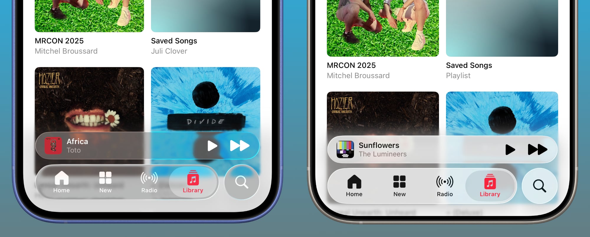
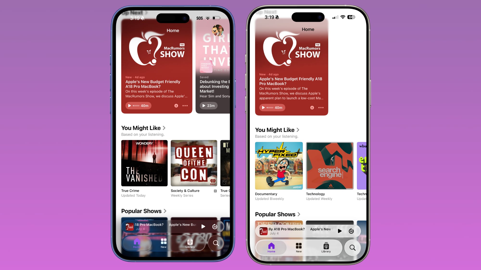
Apple Music
Apple Music's bottom navigation bar is more opaque, and it has the frosted glass look that Apple is now favoring. The change is most noticeable when scrolling over a background that has color. In beta 2, the navigation bar was almost translucent, allowing much of the background color to shine through. That effect is significantly reduced in beta 3.
Safari
The changes in Safari vary depending on what you're doing, the background color of the website, and which Tab View design you're using. In general, the URL bar is more opaque and less prone to notable shifts in color. Less of the background comes through.
The URL bar will still change from light to dark if the content you're scrolling over is predominantly dark, but there's a higher threshold for that to kick on.
It's easiest to see the difference with the Compact View, because it was the most translucent view to begin with.
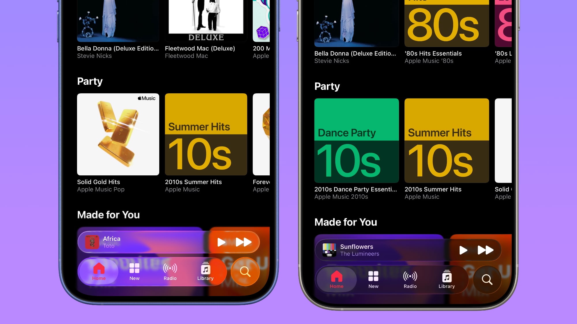
App Store
The App Store's navigation bar has one of the most noticeable changes, and it's almost entirely opaque now.
Light Mode
Dark Mode
Podcasts
As with Apple Music, translucency has been almost entirely eliminated in the Podcasts navigation bar. The change is easiest to see with backgrounds that have color.
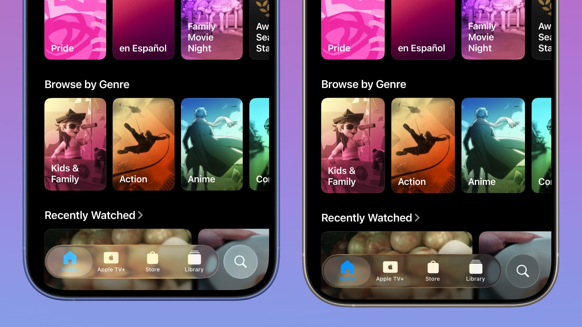
Apple TV
The Apple TV app has a darker background and the change is more subtle. The overlaying navigation bar is a darker glass color, but transparency appears to be similar.
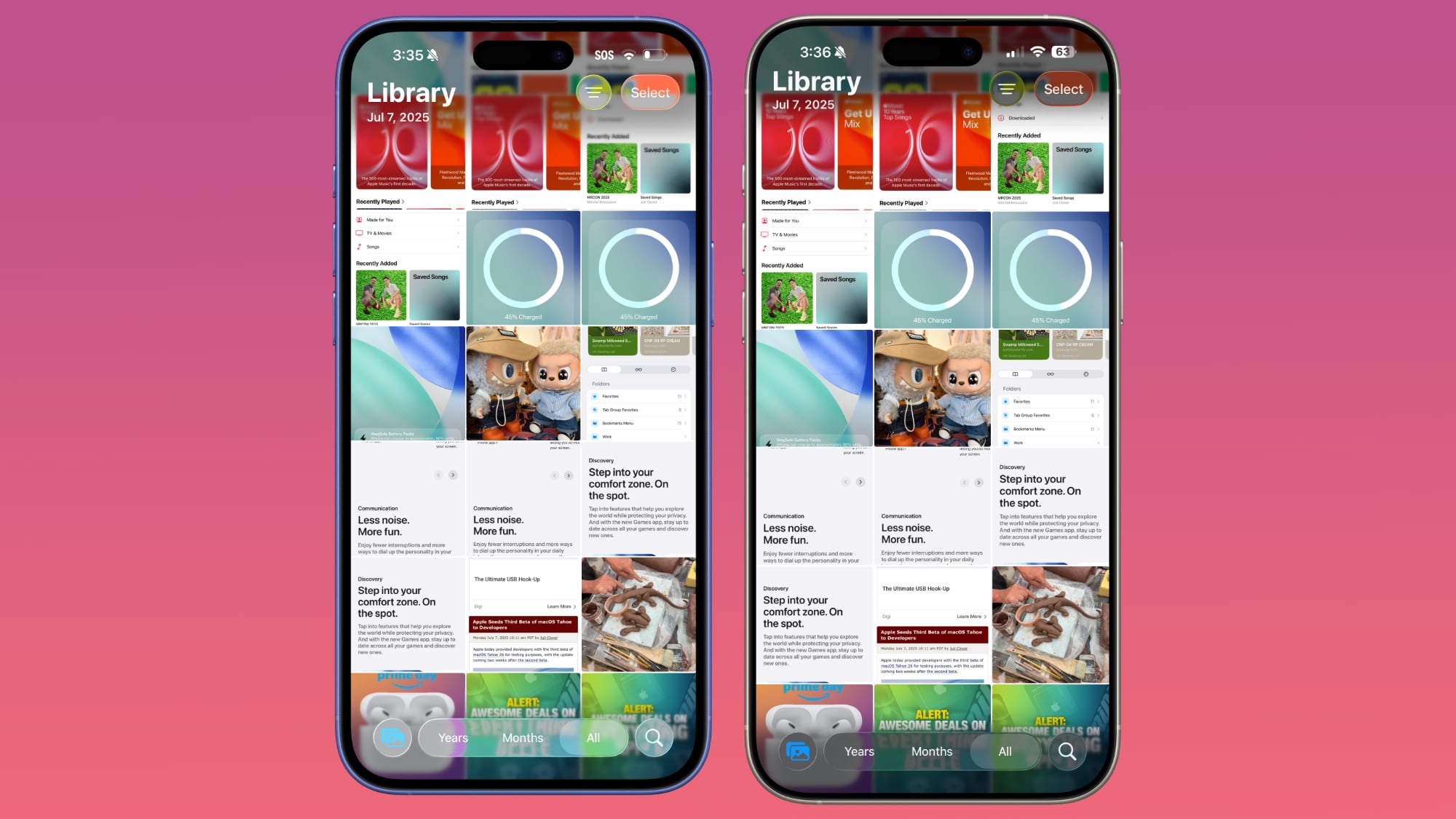
Photos
For the Photos app, Apple tweaked the design in a similar way to the Apple TV app. The navigation bar is darker, but there's been little change to transparency.
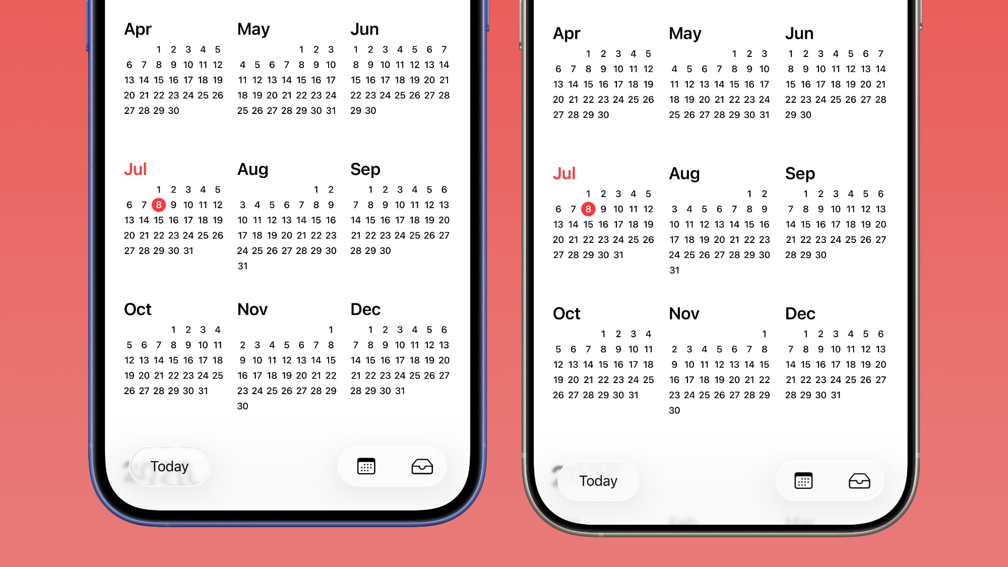
Calendar
Calendar's navigation buttons are more opaque, both in Light Mode and Dark Mode.
Keyboard
The Spotlight Search keyboard is both more and less translucent. The keyboard itself has slightly more background visible, but the search bar is darker.
Dark Mode
Dark Mode has retained more transparency than Light Mode for the most part, so you may see less of a difference if you have Dark Mode enabled permanently. Some menu bar elements are darker than before, but white text on a dark background is more readable so Apple had to increase the opaqueness less.
This isn't true for all apps, though, and there are areas with dark navigation bars that also have less translucency.
Color Dependency
The difference that you see between beta 2 and beta 3 can vary quite a bit depending on the color in the background. With some white backgrounds, it's hard to tell that the Liquid Glass has a more frosted appearance, and the updates are mostly noticeable with light colors.
Over content that is are darker, navigation bars will often transition to their Dark Mode view that appears more translucent, as can be seen in the Safari screenshot below. This is the same effect you'll see with Dark Mode enabled.
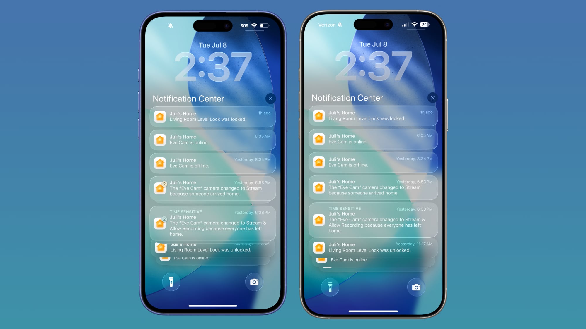
Notifications, Lock Screen, and Home Screen
On the Lock Screen, the time is ever so slightly more opaque than it was before. With some background colors, notifications also have a darker background than before, but this isn't always noticeable. Home Screen and Control Center haven't changed much if at all.
For App Library, the search bar doesn't have blurred edges when scrolling, which makes it easier to see. Apple hasn't changed translucency... Click here to read rest of article
Article Link: iOS 26 Liquid Glass Design Drama: Beta 2 vs. Beta 3 Changes in Every App

The whole “glass” thing didn’t work when Microsoft did it with the Aero design language in Windows Vista 19 years ago and it doesn’t work now, either.
Apple has managed to create a design system where controls annoy you when you don’t need them and yet disappear when you do.
All I’ll say is that I installed the beta on my iPad Mini, and now I don’t use my iPad Mini as much as I did
Yeah I noticed this too. It's all over the shop, but presumably this is deliberate to see what the trigger threshold is for people's feedbackIt's rather interesting how the main point of Liquid Glass was supposedly the uniformity between the OSes and everything else, but even pre-Beta 3, some of the apps are glassy looking, some are dark glassy, and some are frosted glassy. No uniformity there.
Hyperbole more . Not enoughThey totally ruined the cool effect.
They could have just tweaked the icons's color to be more visible according to the background, instead they replaced glass with horrible opaque plastic.
👎👎👎
You have reduce contrast enabled . Who are you trying to fool people ?So now the “glass” setting for the time on the lock screen has an outline and looks nothing like glass….
Epic fail on that
Last edited:
Ten thumbs up for this comment. 👍🏽👍🏽👍🏽👍🏽👍🏽👍🏽👍🏽👍🏽👍🏽👍🏽Please, Apple, just make sure that there is a switch in Accessibility that lets me turn off this useless eye candy. I want UI elements that are contrasty and easy to read, regardless of what is behind them. In the WWDC keynote, Federighi bragged about how this new design "blurs the lines between software and hardware." He should have stopped at "blurs the lines."
Problem with Apple these days…they see something minor and it doesn’t scale properly to a system…or even suite.
Like VisonOS UI on a screen.
Or a glass like UI over different background colors and completely forget contrast or accessibility or heck even basic grouping…
Like VisonOS UI on a screen.
Or a glass like UI over different background colors and completely forget contrast or accessibility or heck even basic grouping…
For goodness sake, just give the users a slider that can be configured in settings, from zero to 99%. Then everyone will be happy.
Apple has been refining Liquid Glass during the developer beta testing process, and both beta two and beta three have introduced some major tweaks. There was little outcry over the updates that Apple made in the second beta, but the third beta's design updates have frustrated some users who feel that Apple is removing too much of the Liquid Glass aesthetic.
For context, Apple made navigation bars more opaque across many apps in iOS 26 beta 3, and we've got a series of side-by-side comparisons that demonstrate what's different. In all of the comparison images, beta 2 is on the left and beta 3 is on the right.
Apple Music
Apple Music's bottom navigation bar is more opaque, and it has the frosted glass look that Apple is now favoring. The change is most noticeable when scrolling over a background that has color. In beta 2, the navigation bar was almost translucent, allowing much of the background color to shine through. That effect is significantly reduced in beta 3.
Safari
The changes in Safari vary depending on what you're doing, the background color of the website, and which Tab View design you're using. In general, the URL bar is more opaque and less prone to notable shifts in color. Less of the background comes through.
The URL bar will still change from light to dark if the content you're scrolling over is predominantly dark, but there's a higher threshold for that to kick on.
It's easiest to see the difference with the Compact View, because it was the most translucent view to begin with.
App Store
The App Store's navigation bar has one of the most noticeable changes, and it's almost entirely opaque now.
Light Mode
Dark Mode
Podcasts
As with Apple Music, translucency has been almost entirely eliminated in the Podcasts navigation bar. The change is easiest to see with backgrounds that have color.
Apple TV
The Apple TV app has a darker background and the change is more subtle. The overlaying navigation bar is a darker glass color, but transparency appears to be similar.
Photos
For the Photos app, Apple tweaked the design in a similar way to the Apple TV app. The navigation bar is darker, but there's been little change to transparency.
Calendar
Calendar's navigation buttons are more opaque, both in Light Mode and Dark Mode.
Keyboard
The Spotlight Search keyboard is both more and less translucent. The keyboard itself has slightly more background visible, but the search bar is darker.
Dark Mode
Dark Mode has retained more transparency than Light Mode for the most part, so you may see less of a difference if you have Dark Mode enabled permanently. Some menu bar elements are darker than before, but white text on a dark background is more readable so Apple had to increase the opaqueness less.
This isn't true for all apps, though, and there are areas with dark navigation bars that also have less translucency.
Color Dependency
The difference that you see between beta 2 and beta 3 can vary quite a bit depending on the color in the background. With some white backgrounds, it's hard to tell that the Liquid Glass has a more frosted appearance, and the updates are mostly noticeable with light colors.
Over content that is are darker, navigation bars will often transition to their Dark Mode view that appears more translucent, as can be seen in the Safari screenshot below. This is the same effect you'll see with Dark Mode enabled.
Notifications, Lock Screen, and Home Screen
On the Lock Screen, the time is ever so slightly more opaque than it was before. With some background colors, notifications also have a darker background than before, but this isn't always noticeable. Home Screen and Control Center haven't changed much if at all.
For App Library, the search bar doesn't have blurred edges when scrolling, which makes it easier to see. Apple hasn't changed translucency... Click here to read rest of article
Article Link: iOS 26 Liquid Glass Design Drama: Beta 2 vs. Beta 3 Changes in Every App
Apple Never gives much of a slider for such thingsFor goodness sake, just give the users a slider that can be configured in settings, from zero to 99%. Then everyone will be happy.
Remember homePod bass?
It only has Reduce bass toggle.
This. Just add a System Settings slider to dial it up and down as you please. I like the more invisible aesthetic, but I also see how those with visual disabilities may have trouble with it.We need a toggle slider for intensity of transparent glass. Please. I love the glass design.
Apple is adrift at sea, flailing about with great uncertainty. Change for the sake of change isn’t looking good.
Surely amongst the plethora of brilliant minds within this company, someone can get them back on track.
Suddenly the look and feel of Android as implemented on Google Pixels is looking quite compelling.
Surely amongst the plethora of brilliant minds within this company, someone can get them back on track.
Suddenly the look and feel of Android as implemented on Google Pixels is looking quite compelling.
Register on MacRumors! This sidebar will go away, and you'll see fewer ads.