Then it's a lot of "certain" users because the reports and examples abound.These issues seem to be isolated to certain users. I'm having absolutely none of these issues that you described above on my 16PM.
Got a tip for us?
Let us know
Become a MacRumors Supporter for $50/year with no ads, ability to filter front page stories, and private forums.
iOS 26 Liquid Glass Design Makes App Icons Look Crooked, Report Users
- Thread starter MacRumors
- Start date
- Sort by reaction score
You are using an out of date browser. It may not display this or other websites correctly.
You should upgrade or use an alternative browser.
You should upgrade or use an alternative browser.

Light theme is absolutely pastely and smudged, even with high contrast, so it's impossible to differentiate between icons. Dark feels like being captured in constant vertigo for some reason. It feels as the old parallax effect, except it moves itself or smth. This update is really really really bad for visually impaired and it's just driving me crazy.
Just here to concur. Liquid Glass is a set of supremely ugly and ill-conceived design updates on both MacOS and iOS
Liquid Glass comes from the Vision Pro right? Do people not have any issues with it there? Or does the 3d-ness help or make it less of a problem?
I did not like the way my icons and app windows look, so this morning I turned on the "Reduce Transparency" and "Increase Contrast" settings. That is a great improvement for me on my phone. I can do the same under MacOS Tahoe, but have not decided on it yet. In general, I think "Liquid Glass" is mostly marketing hype and very little functionality for the user. To me it is just a gimmick.
Simply stating my experience with iOS 26 on my 16PM. Like I said, I’m not experiencing any of these issues.Then it's a lot of "certain" users because the reports and examples abound.
I’ve been here a long time and I enjoy it.It's amazing how many people "LOVE IOS26!" that are totally new accounts.
Younger demographic I guess.
I see it most with dark icons in folders where the background is blurred out. Voice Memos is a good example. As I turn my phone the icon looks like it’s dancing.Simply stating my experience with iOS 26 on my 16PM. Like I said, I’m not experiencing any of these issues.
How do you turn this off???
iOS 26's new Liquid Glass interface has been criticized for making some content illegible in certain circumstances, and now the UI design is reportedly causing another unusual visual problem for some users.
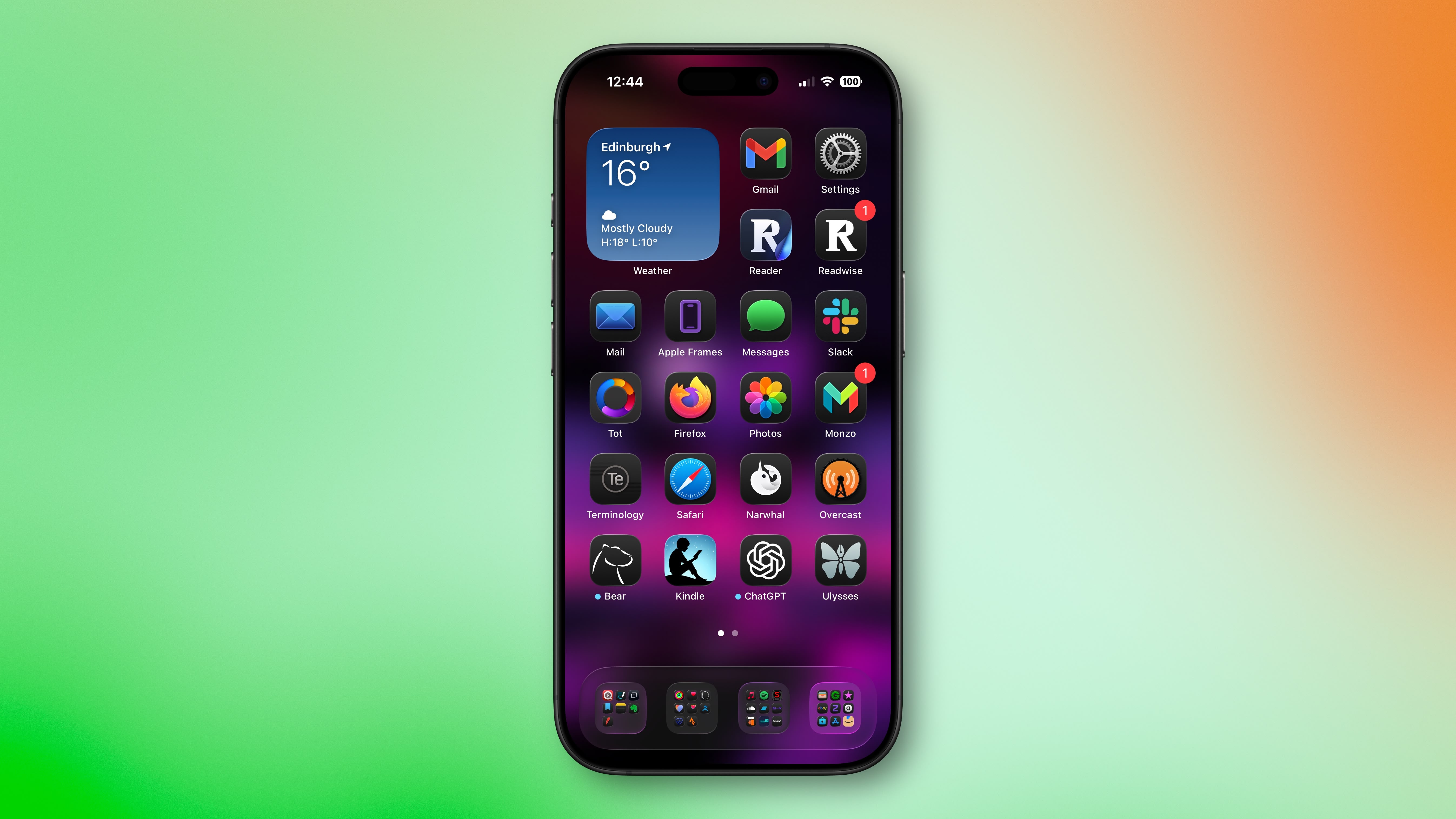
Liquid Glass adds subtle glowing effects to the corners of app icons, creating a dynamic glass-like appearance with depth and parallax effects. However, as noted by Gizmodo, this design choice can produce an optical illusion that makes icons appear tilted. Users impacted by the phenomenon report feeling disoriented, with some experiencing dizziness from the perceived slanting effect.
The issue has gained attention on Reddit, with one post receiving over 3,000 upvotes. "The frame glow effect makes apps look tilted, and it's really distracting," complained one user, while another said the update made them "feel drunk."
"All of iOS 26 is an optical nightmare," added another user. "It's horrible."
The tilting effect is most pronounced when icons are set to "Dark," "Clear," or "Tinted" modes against dark or black backgrounds, while colorful wallpapers seem to help mask the illusion by drawing attention away from the refractive corners.
Apple's transparency reducing options and the "Reduce Motion" setting (Settings ➝ Accessibility ➝ Motion ➝ Reduce Motion) don't seem to help minimise the illusion, with reports indicating most users fail to see a difference. Hopefully, Apple adds a dedicated control in a future update to adjust the icon effect that's causing the issue.
Are you suffering from the Liquid Glass optical illusion? Let us know in the comments.
Article Link: iOS 26 Liquid Glass Design Makes App Icons Look Crooked, Report Users

Apple's transparency reducing options and the "Reduce Motion" setting (Settings ➝ Accessibility ➝ Motion ➝ Reduce Motion) don't seem to help minimise the illusion, with reports indicating most users fail to see a difference.
This is a detail I've noticed for more than just this effect. The "Reduce Motion" option seems to do very little at all anymore in 26. Notifications have a sort of dance and wiggle motion to them with 26, at least if they pop up while you have the screen unlocked, which this toggle does not remove. The floating search/input bar thing now at the bottom of apps has a brighten & magnify/enlarge effect whenever touched, whether it's an input box or it's option buttons like at the bottom of the App Store app--in fact when it's a bar of several options, the options individually brighten and magnify depending on which is touched. Reduce Motion does nothing to alleviate any of that either. That in particular is driving me nuts because the floating bar is now overtop the app switch bar, so every time I just want to flick up from the bottom to switch apps, that stupid floating bar brightens up and enlarges because it thinks I'm selecting it instead. They really thought that one through.
Even on watchOS 26, the notifications have additional motion to them that Reduce Motion does not disable. In particular when you tap a notification to view it in detail, the text slides up and into view.. and then the thin white frame around the notification slides up a half-second later instead of together WITH the text, complete with its own little bounce effect to it too. Reduce Motion does not stop any of this.
It's just a mass of extraneous additional movement all over the place, and I find it horribly distracting, particularly with existing visual acuity issues. I get that others might like it and that's fine, but I explicitly have REDUCE MOTION TURNED ON, and apparently Apple's UX devs just couldn't be bothered to actually honor this accessibility toggle for all the new wiggles and jiggles they've slapped in.
This is a parallax effect, it's a feature not crooked icons. Apple explains it in the keynote. Each element in every icon is independent of each other. They are floating at various depths. so when you move your phone, the perspective shifts subtlety as it would irl. The same thing happens on Apple TV icons except it's when you scroll through them and on the Apple Cash card in Wallet except with colors."Are you suffering from the Liquid Glass optical illusion? Let us know in the comments."
No I'm not experiencing it or "suffering" from it.
Edit: the linked Gizmodo article has at least one inaccuracy: "To create the effect of glass and all of its reflective and shimmering properties, iOS 26 forces every icon on your iPhone home screen to have a slight glow to them in the top left and lower right corners."
That slight glow is around the icons and shifts as you tilt your phone -- it's not just the top left and lower right corners. If I tilt my phone, the glow will travel around the icons (easier to see on folders), shifting from the top/bottom/corners/sides to another location. It's a subtle effect that I think is a cool little detail.
2nd edit: I'm not saying other people are not experiencing the effect, just that I'm not, which is what the author of the Macrumors article asked us to do. Also, while it can be thought of as an optical illusion, it's not quite a typical one. Optical illusions typically affect most to all people who are not seeing impaired. That this is only affecting a subset of people suggests it's more of a particular effect that elicits an abnormal sensory experience for certain individuals. Again, that can be classified as an optical illusion but it's much more limited in scope. And don't think that me calling this an "abnormal sensory experience" is in any way a suggestion that it's invalid. Most to all human behavior is understood to be on a normal (Gaussian) distribution. There will always be people who have and experience things that are "abnormal" (in one of the distribution tails). That's not inherently bad. In many instances it's thought to be positive (e.g, 'superior' IQ).
While there are people experiencing this particular effect, what complicates the potential issue is the effect of suggestion through social pressure. What this means is that some people don't really notice the effect but when it's brought to their attention they start to and might even state, "Now I can't unsee it!" That's because what we perceive is affected by what we pay attention to (we can perceive things we are not aware of) and how we interpret what we perceive.
In effect, some people experience the effect but others do not notice the effect until it's brought to their attention. Some other people also convince themselves or are convinced by others that it's there when they do not really experience it. That's not lying (although it's possible some people are lying about it), it's just the nature of how our brains work. Brains are kind of weird in that way. They are amazing, but weird.
What's likely happening is a small subset of people notice the effect. Some others do not until someone points it out. It's likely that most people will adjust to the changes and their brains will normalize the experience and people will stop perceiving the effect. It's also possible some people will continue to experience it. Our brains are excellent at adapting and normalizing (adjusting to) new experiences most of the time.
If you are experiencing this effect, give it time and it should go away. Just be glad that part of your brain is working well enough to notice something new. If it doesn't go away and it is too distracting, hopefully various accessibility settings will rectify it.
3rd edit: "The issue has gained attention on Reddit, with one post receiving over 3,000 upvotes". Can we stop using things like this as a metric of anything meaningful? There's the issue of selection bias, bots, and more. It's data but unscientific and potentially useless and even misleading data.
As a designer this feels exactly like when the client is asking me to fix this and that instead of trusting my expertise. No, the icons are not blurry, and the icons are not crooked.
Poeple complaining that this new design identity is unfinished never been through the retina transition, and never been through the tall apps transition from iPhone 4S to 5, and never been through the iOS 6 to iOS 7 design update which was way more drastic than what we have now. Stop complaining and let them do their job.
Poeple complaining that this new design identity is unfinished never been through the retina transition, and never been through the tall apps transition from iPhone 4S to 5, and never been through the iOS 6 to iOS 7 design update which was way more drastic than what we have now. Stop complaining and let them do their job.
It’s crooked icons, or the appearance of crooked icons, caused by a feature.This is a parallax effect, it's a feature not crooked icons. Apple explains it in the keynote. Each element in every icon is independent of each other. They are floating at various depths. so when you move your phone, the perspective shifts subtlety as it would irl. The same thing happens on Apple TV icons except it's when you scroll through them and on the Apple Cash card in Wallet except with colors.
This is my phone sitting flat on my desk. Voice Memos clearly looks crooked.
Attachments

Turning off the transparency on my older iPhone 13 Pro Max helped a lot. I haven't had to do any other adjustments. It is visually jarring at first. I almost regretted updating it. I will see what it looks like when I move to the 17 pro max this weekend.
I've been using all betas and hadn't noticed it, but I have no apps installed with a flat black icon.
It's not crooked.It’s crooked icons, or the appearance of crooked icons, caused by a feature.
This is my phone sitting flat on my desk. Voice Memos clearly looks crooked.
Optical illusions typically affect most to all people who are not seeing impaired. That this is only affecting a subset of people suggests it's more of a particular effect that elicits an abnormal sensory experience for certain individuals.
Reasonable distinction. (But is this really not an optical illusion in the general sense; isn't differing the weights and colours of lines around corners and edges to suggest distortion classically an optical illusion?)
That slight glow is around the icons and shifts as you tilt your phone -- it's not just the top left and lower right corners.
Apparently this is not necessarily true, as at least one other user pointed out. I'm using a Mac mini, an iPhone 12 mini, a 2018 iPad Pro, and a current iPad mini (A17 Pro), and I'm only observing the shifting effect on the iPad mini. And even there, the shifting effect occurs on the Home Screen with app icons, folders, and widgets, but not with icons in the Dock!
What's more, activating the "Reduce Motion" accessibility setting guarantees the fixed skewed lighting effect rather than removing it or evening it out anywhere.
It seems clear that the fixed skewed effect – the effect this article existed to note that lots of people seemed to identify as a problem – is what Apple considered an accessible fallback for any and all users.
To the extent that a simple choice of angle in a user interface design can be wild, that seems pretty wild. If we insist on a lighting effect for every user, why not a centered one…?
Register on MacRumors! This sidebar will go away, and you'll see fewer ads.