wow. it looks glitched or something. Tawhy is really that bad ?If you compare some elements of Tahoe with an older MacOS's such as Mojave, things seem to have moved in a slightly ugly direction on the desptop as well.
The wallpaper preference panel for example used to be clearly layed out and consistent with Apple's general style guidelines, but now UI elements tunnel under the vertical slider on the right and under the selection panel on the left.
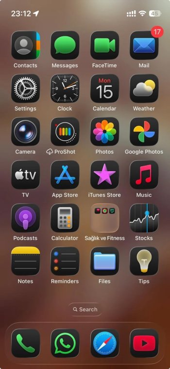
View attachment 2550514
View attachment 2550515
Got a tip for us?
Let us know
Become a MacRumors Supporter for $50/year with no ads, ability to filter front page stories, and private forums.
iOS 26 Liquid Glass Design Makes App Icons Look Crooked, Report Users
- Thread starter MacRumors
- Start date
- Sort by reaction score
You are using an out of date browser. It may not display this or other websites correctly.
You should upgrade or use an alternative browser.
You should upgrade or use an alternative browser.

If you're denigrating people who disagree, you're doing this wrong.
If you like these changes, comment on that ... but don't comment about the other forum users you disagree with.
If you like these changes, comment on that ... but don't comment about the other forum users you disagree with.
no there isn’t but it works comparing it to the very first beta release a few months ago with reverting back ios 18 in a matter of minutes i quite like ios26 in its current state then again only time i look at icons is when want to open an app i don’t sit there like an hawk looking at it 24/7 . as above my OCD days are overThere's nothing glass like about it is there really? It looks like they just added a Photoshop Emboss filter to everything.
MacOS Plasma?I really wish we had full-blown theming ability.
Having the entire OS, and other updates, beholden to Apple’s awful design choices really sucks.
Personally I like Cinnamon. The user interface is supposed to stay out of your way so you can get work done.
The wallpaper preference panel for example used to be clearly layed out and consistent with Apple's general style guidelines, but now UI elements tunnel under the vertical slider on the right and under the selection panel on the left.
This still drives me nuts. It was one of the first indications that Apple had stopped giving a crap about the user experience. Copy/pasting an element from one (vertical) product category to another (horizontal) without any adjustment is illogical. No one should have approved this.
The post-Jobs Apple is lacking anyone with any sense of responsibility to the users. No one seems to care about the products they’re putting out. It’s the investors who matter most. Feels like we’re living in the “if Scully succeeded” timeline.
Apple is no longer investigating and solving problems with the user interface experience. Perhaps all the problems have been solved. So they’re just rehashing hits from the past to make something comfortable feel fresher. They can’t even come up with original ideas or challenge themselves to think outside the box.
MacOS Plasma?
Personally I like Cinnamon. The user interface is supposed to stay out of your way so you can get work done.
MacOS "however I, the user and owner of the device, would prefer"
Classic internet mass hysteria. If you're feeling dizziness from an askew icon on your phone, you've got much bigger problems.Users impacted by the phenomenon report feeling disoriented, with some experiencing dizziness from the perceived slanting effect.
Don't get me wrong, Liquid Glass is a huge UI misfire IMO, but this above feels overblown.
Last edited:
If you enable "Increase Contrast" that will help with this "issue". IMO it makes it look even more cartoony, but it does clean things up a bit.
There are some parts of liquid glass that I like, and some parts I don't. Overall it feels a like a bit of a cheap Android ROM attempt to me, but with some cool glassy effects.
I will say I love that they sped up animations - that was long needed and will help the remaining 60hz devices feel faster as well.
Don't do it (go back to Windows), I run both as some of my games only run on Windows and well I have the hardware and the performance is better native. You'll quickly get sick of MS changing your preferences/settings every couple of weeks when they push a "patch" for Edge or Office. So tired of my browser settings going away and having to reset everything.Both the macos and the iphone OS updates offer some of the worst en********ation I've seen in the last 5-10 years - and that's quite saying something given how trendy software en********ation has been in the last decade!
Apple: take this malarkey a couple of steps further and I might be inclined to crawl back to already ghoulish world of windows operating systems.....
As for the new UI, not a fan. I'll probably get used to it eventually, but it would be nice to have a way to at a minimum turn off the glowy corners. And agreed it is much worse on my MacBook and iPad than on my phone or watch.
Totally true - worst design decision ever and also total waste of UI power - it’s like a toy UI and the horrible rounded corners is even worse - oh and the gaps - bring back the old UI the new window system is a clunker
🤣 Holy crap. Took me a while to actually look at the linked reddit page. That is nuts. I mean, it's obvious why it looks this way but it's also very obviously looking like the folders are skewed. I'm sure changing the wallpaper would solve this particular illusion.
Attachments
🤣 Holy crap. Took me a while to actually look at the linked reddit page. That is nuts. I mean, it's obvious why it looks this way but it's also very obviously looking like the folders are skewed. I'm sure changing the wallpaper would solve this particular illusion.
That would drive me absolutely insane to look at all the time.
This is sort of stuff we would have expected Apple to never do.
If you think your iOS26 app icons look crooked, you may be entitled to compensation.
Call today, 1-800-BAD-ICON
Call today, 1-800-BAD-ICON
Maybe it's just me, but I think iOS26 has been the best iOS update in years. I flippin' LOVE it. I love the aesthetic, the refraction, being able to see through stuff for that sense of position and reference but still view the content. I think keeping that point of reference is an overlooked huge benefit that may not be conscientiously noticed. It makes it less claustrophobic. Love it.
If you think your iOS26 app icons look crooked, you may be entitled to compensation.
Call today, 1-800-BAD-ICON
Or the usual hotline for all the problems of modern Apple.
1-900-TIM-COOK
It's a 900 # because he of course wants a cut of the phone call too.
It only shifts with tilting on newer iPhone models. On older models it’s static. Not sure where the cutoff is.That slight glow is around the icons and shifts as you tilt your phone -- it's not just the top left and lower right corners. If I tilt my phone, the glow will travel around the icons (easier to see on folders), shifting from the top/bottom/corners/sides to another location. It's a subtle effect that I think is a cool little detail.
How perceptible the effect is and how much it looks “crooked” also depends on the wallpaper. However in certain configuration it definitely looks like the icons aren’t straight.
This is a general problem with UI effects that aren’t very tolerant to theming/lighting variations.
the thing I noticed is a lot of app icons look blurred, though not in dark/night mode. messenger (Facebook) is a classic example, at the bottom of the icon.
I've felt dizzy using it although get motion sickness quite badly anyway. It looks like a design nightmare as well, like the images haven't been cropped properly. There really needs to be an option to completely turn it off as the "Reduce Transparency does nothing". I am not faced with whether to roll back or not, although that is a short term fix as at some point we will be forced to. It's a shame, as the rest of the update is quite good. Interesting the galdd effect works much better on a Mac.
I’m a crazy, but they look like they are stretched🤣 Holy crap. Took me a while to actually look at the linked reddit page. That is nuts. I mean, it's obvious why it looks this way but it's also very obviously looking like the folders are skewed. I'm sure changing the wallpaper would solve this particular illusion.
Just remove the ‘drawSillyLine’ method from the border, icon and window classes - just comment it out. Also change the value of ‘windowRadius’ to half the value
I've never had such a negative 'gut' response to an iOS release..it looks childish and a downgrade from 18... maturity has its own value even if it's 'boring'/'stale'.
Last edited:
I think it's fine.I had a feeling Liquid Glass would create accessibility issues... it feels like such an unnecessary way to alienate users.
The whole UI experience is a complete disaster! It's an embarrassment that a trillion dollar company can't hire competent software engineers.
Agreed, but some will never be happy.Maybe it's just me, but I think iOS26 has been the best iOS update in years. I flippin' LOVE it. I love the aesthetic, the refraction, being able to see through stuff for that sense of position and reference but still view the content. I think keeping that point of reference is an overlooked huge benefit that may not be conscientiously noticed. It makes it less claustrophobic. Love it.
Register on MacRumors! This sidebar will go away, and you'll see fewer ads.