Come on MacRumors you’re better than Gizmodo clickbait garbage.
Got a tip for us?
Let us know
Become a MacRumors Supporter for $50/year with no ads, ability to filter front page stories, and private forums.
iOS 26 Liquid Glass Design Makes App Icons Look Crooked, Report Users
- Thread starter MacRumors
- Start date
- Sort by reaction score
You are using an out of date browser. It may not display this or other websites correctly.
You should upgrade or use an alternative browser.
You should upgrade or use an alternative browser.
Come on MacRumors you’re better than Gizmodo clickbait garbage.
This is not "clickbait garbage"
Read the thread and you'll see PLENTY of people really dislike this.
Same thing on Tahoe if you choose the "clear" option 

I love it too! I hope that if Apple does address these petty "issues" people have, they don't take that away completely...like make it a Settings option to keep it or not use it.The “white” highlight line around the icons is cool. It actually moves around the icon as you move/rotate/tilt the screen. I like it, but that only me.
I'm in the same boat as well. I'm liking the new look as it's certainly given my 16 Pro Max a new life!I edited my comment to say much the same thing. I really like that detail.
Everyone is different and may see it differently. To each his/her own, I guess!
Petty issues? I've posted and reported issues with the UI where optional characters when long pressing a key doesn't show the characters at all! Petty? Check out this video I made and posted on another thread. In order to see the additional keys, I have to turn OFF the Transparency, which totally negates the Liquid UI. These are not "petty issues." This is a failed UI effort.I love it too! I hope that if Apple does address these petty "issues" people have, they don't take that away completely...like make it a Settings option to keep it or not use it.
Last edited:
It's just another annual, incremental, update that gradually increases the hardware requirements for effective IOS usage. Unfortunately it's ugly.
WOW! iOS 26 is absolutely fantastic. This new Liquid Glass user interface is SOOOOOO amazing and delightful that it’s a monumental treat to interact with it. Particularly impressive are the much larger and definitive navigation icons. Having written software in the remote past I can’t even begin to imagine how Apple software engineers achieved the dynamic glass effect that is just so mindbogglingly beautiful, particularly if one has many app-containing folders like I do. It’s like my iPhone 15 Pro has suddenly become alive after two years. After enjoying the new UI for a day, I turned it Off this morning for grins [Settings -> Accessibility -> Transparency] and was appalled at how ‘lifeless’ my iPhone had suddenly become. So I quickly turned it back On and it’ll remain On for the duration. This user experiences absolutely NONE of the distortion effects apparently seen by some.
Congratulations Apple. You have achieved something with this new UI that is so outstanding that it makes every other device in the world seem old, cranky and even dead … like my iPad Pro that just missed the cutoff for 26. Now I’m suddenly in the market for a new iPad Pro, Apple Watch, and MacBook Pro just to have Liquid Glass on all of my devices.
For those unfortunate folks who have commented elsewhere negatively about iOS 26 I would recommend that they use the path specified above to turn Off Liquid Glass transparency and go back to a simpler and less dynamic existence. [Perhaps they would even be happier by trading in their Appleware for Android devices.] As for those of us who truly understand the incredible technical achievement that OS’s 26 represent [like the billions of calculations per second that are required to simulate curved glass pieces moving over complicated backgounds], we’ll continue to bask in its luxurious feel and proudly flaunt it among our non-Apple-owing friends and family: “You don’t have Liquid Glass? … how unfortunate!”
Last edited:
Exactly. Thinking a decorative UI change based on glass and light could work in dark mode is disastrous thinking. It sucks. Make dark mode just that. No effects. It's dark. Not about sparkles or light! Users need dark because of light sensitivity health issues like migraine disease (one in six humans have it) or just a preference.
iOS 26's new Liquid Glass interface has been criticized for making some content illegible in certain circumstances, and now the UI design is reportedly causing another unusual visual problem for some users.
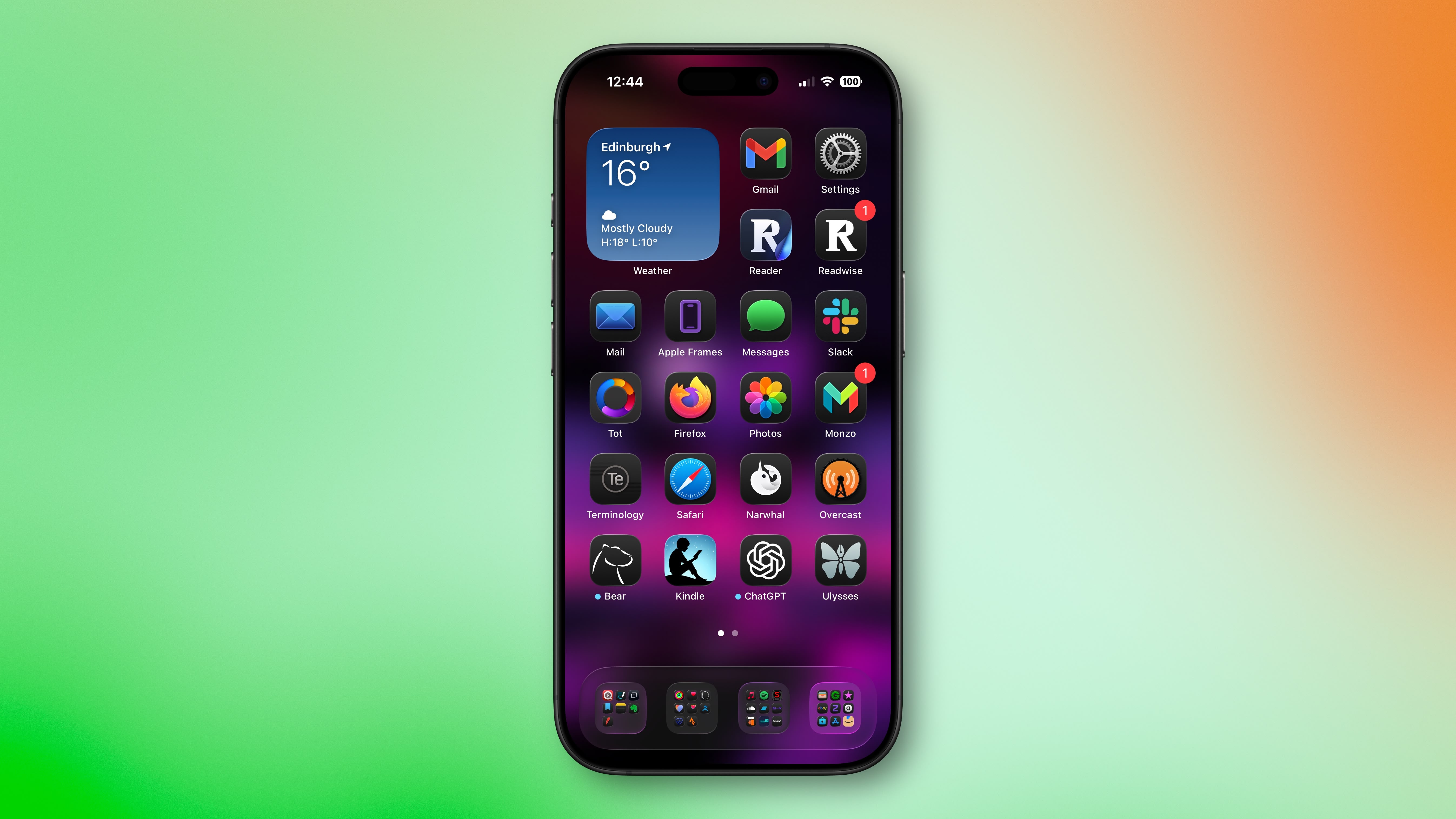
Liquid Glass adds subtle glowing effects to the corners of app icons, creating a dynamic glass-like appearance with depth and parallax effects. However, as noted by Gizmodo, this design choice can produce an optical illusion that makes icons appear tilted. Users impacted by the phenomenon report feeling disoriented, with some experiencing dizziness from the perceived slanting effect.
The issue has gained attention on Reddit, with one post receiving over 3,000 upvotes. "The frame glow effect makes apps look tilted, and it's really distracting," complained one user, while another said the update made them "feel drunk."
"All of iOS 26 is an optical nightmare," added another user. "It's horrible."
The tilting effect is most pronounced when icons are set to "Dark," "Clear," or "Tinted" modes against dark or black backgrounds, while colorful wallpapers seem to help mask the illusion by drawing attention away from the refractive corners.
Apple's transparency reducing options and the "Reduce Motion" setting (Settings ➝ Accessibility ➝ Motion ➝ Reduce Motion) don't seem to help minimise the illusion, with reports indicating most users fail to see a difference. Hopefully, Apple adds a dedicated control in a future update to adjust the icon effect that's causing the issue.
Are you suffering from the Liquid Glass optical illusion? Let us know in the comments.
Article Link: iOS 26 Liquid Glass Design Makes App Icons Look Crooked, Report Users

For a big design focused and health focused company like Apple to not have the design chops to understand this fundamental principle of design, contrast and bright versus dark, in its UI is shocking.
Apple is regressing back to the skeuomorphism days with this "Neuomorphism" UI/UX update.
I prefer the "flat" approach Ive introduced in 2013 that ran until this week.
The pendulum swings this way it swings that way, Heglelian dialectic
I prefer the "flat" approach Ive introduced in 2013 that ran until this week.
The pendulum swings this way it swings that way, Heglelian dialectic
But are they actually learning?Apple didn’t have enough features for iOS 26, so it changed the design to make us feel like there were significant changes. But this new design is huge step back for minimalism. Apple is learning the hard way not to fix what isn’t broken.
Been using the iOS, iPadOS and macOS since of betas released and had no issues apart from the highlights being mid-shapen on the initial beta. Maybe turn off the transparency effects if you have wonky eyes.
It's amazing how many people "LOVE IOS26!" that are totally new accounts.
Younger demographic I guess.
Younger demographic I guess.
Yes, new iOS feels nauseating. Not that it doesn’t look “fresh”, but these effects just fail to work with my eyes and brains.
People in the comments suggesting an eye test are totally tone deaf, maybe go and do IQ test instead? You don’t seem like you are writing smart responses. It is like if you saw a person with disability and started mocking that person for that said disability. Eye sensitivity is not something you can fix just by taking meds.
Motion sickness has been a thing ever since the early human. Ever heard of epilepsy and photosensitivity? Those are actual issues.
And r/PWM-sensitive has more than 16k subs, thread here on MR was started back in 2017. And those are totally related! I had been susceptible to eye strain from PWM, from HDR/P3 content ever since Apple had introduced those without giving off switch.
I am not happy about “only” choice to get iPhone 17 Pro. I cannot downgrade it anyway, what’s the point? It will be on same old iOS 26 with nauseating animations, effects and high contrast environment + poorly designed apps like photos (the app I planned to use 90% of time to manage my large photo library).
It wouldn’t surprise me if people start selling their old iPhones with notion “still on iOS 18” and try to earn more money this way
These issues seem to be isolated to certain users. I'm having absolutely none of these issues that you described above on my 16PM.Petty issues? I've posted and reported issues with the UI where optional characters when long pressing a key doesn't show the characters at all! Petty? Check out this video I made and posted on another thread. In order to see the additional keys, I have to turn OFF the Transparency, which totally negates the Liquid UI. These are not "petty issues." This is a failed UI effort.
View attachment 2550635
And here's a screen shot another user posted on that other thread.
100% this. I would bet money there's an analysis of every OS to figure out what processing impact it has and what devices will start to struggle with the overhead. Devices don't just magically "get slow" -- they get bogged down by ever more taxing animations and features.It's just another annual, incremental, update that gradually increases the hardware requirements for effective IOS usage.
I wish I were able to see a user interface in such a way.Maybe it's just me, but I think iOS26 has been the best iOS update in years. I flippin' LOVE it. I love the aesthetic, the refraction, being able to see through stuff for that sense of position and reference but still view the content. I think keeping that point of reference is an overlooked huge benefit that may not be conscientiously noticed. It makes it less claustrophobic. Love it.
"being able to see through stuff for that sense of position and reference but still view the content" makes no sense to me using a phone. This makes sense when driving a car, and maybe even with Vision Pro, but on a phone, I can not conceive of an instance where this would be helpful or even pleasurable. This sentence itself on paper as an idea seems distracting and confusing for someone using a 6-7" mobile device.
In what single instance is it beneficial to see through content on your phone to observe the content behind it so that you get a sense of position? Please share a screenshot. I am genuinely curious and a little desperate to understand.
I really don't understand the clear icons. The contrast is so low on them. I also think the dark mode icons don't look very nice, so I'm on dark mode + normal app icons. Haven't noticed any tilting effect.
The more I look at it and see it, promoting it as thin is joke. The Plateu is so ridiculous high that it completely looks silly. Before the iMac M series, apple did the same thing with the previous iMac saying it so thin marketing the look of being so thin with images of the sides of the iMac. The bulge on the back was huge. It wasn't thin at all. The new iMac M series. Now they can call that thin and no marketing mumbo jumbo pictures to fake the thin look.
This right here should have been enough for Apple to put a halt on development to consider if this may have been a bad idea.

To my eye, it makes app icons look like badly printed stickers. It looks like the ink didn’t go all the way to the corner.
I also hate the shimmer effect around icons. I don't see the optical illusion others do. I just don't like it. The first thing I did after upgrading was look through accessibility settings for an option to disable it. I want an option that will remove the liquid glass effects and restore the prior UI. Reduce transparency goes too far and makes the UI look worse than iOS 18. Reduce contrast is half baked and makes icons and folders inconsistent. That icon/folder inconsistency is a problem in general with this release, though.
Edit: I forgot to mention I use dark mode with dark icons.
Edit: I forgot to mention I use dark mode with dark icons.
Last edited:
Register on MacRumors! This sidebar will go away, and you'll see fewer ads.