Reduce White Point takes the edge off the white tones. Turn your brightness up and as you toggle it on/off you can see the change. It just takes the overly bright tint off the white sections.
Does it simply knock the overall brightness down a bit or does it affect just the white portions?
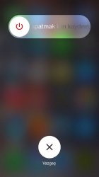
New power-off UI
Great. For years we had a nice button with an arrow that slid in a tray and made sense. Apple got rid of that to introduce the "futuristic design of a rectangular box" and we wet our collective pants one way or another over skeuomorphism. Now we have a round power button that slides (which historically is not a sliding control, those are normally a rectangular shape) and is confusing enough where again we have to read to be sure we know what to do. I can't wait to see my mom tap the button with that puzzled "why did I have you" look. We're being played.
You do if you're running beta 3.
I do and I don't. The GP leads me to believe there is a motion setting control when in Wallpapers & Brightness. iPhone 5s here.


