The dots consume too much horizontal real estate in a place where such space is already sparse; it makes for a cumbersome status bar.
Good thing we're entirely ignoring the fact that they take up the exact same amount of space

The dots consume too much horizontal real estate in a place where such space is already sparse; it makes for a cumbersome status bar.
+1!
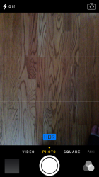
With all the translucency in iOS 7, I'd expect the camera button to be translucent so I can see that part of the picture. But no, it's solid red! Jony Ive confuses me
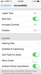
Anyone thinking that iOS 7 sucks obviously doesn't know what they're talking about. I've been using it since beta 1 came out and i gotta say it looks better and better the longer you use it. And with beta 2 fixing some of the bugs, i can see where apple is going with this. One issue i noticed in beta 2 is if you have icons on the top row the badge hits the status bar and actually goes under it. See attached to see what im talking about. Also i recommend to turn on the Larger type (if you need it), Bold text, Increase Contrast and for those people who dont like the Parallax Effect there is a switch for it (not sure if it was there for beta 1)
It consumes too much horizontal space for me. Look at the screenshots. The wifi bars are right next to the time, which looks awkward and causes other items to now be transfered to the right side of the status bar (such as the spinning loading circle). To me, having the loading spinning circle constantly next to battery seems out of place and unnecessary; it's not worth the "shine" of the dots. Granted, "AT&T M-Cell" is a long carrier title, but it's not much longer than "Verizon" or "T-Mobile".
Code:AT&T M-Cell Verizon T-Mobile
The dots consume too much horizontal real estate in a place where such space is already sparse; it makes for a cumbersome status bar.
It still fades away for me.
is anyone else not getting the voice changes in siri im on iphone 5
Don't remember the second page in the compass in beta 1
Don't remember the second page in the compass in beta 1
Sad that we need to turn ON Accessibility items to make the text on the home screen readable.
Anyone thinking that iOS 7 sucks obviously doesn't know what they're talking about....
i recommend to turn on the Larger type (if you need it), Bold text, Increase Contrast and for those people who don't like the Parallax Effect there is a switch for it (not sure if it was there for beta 1)
It's great, just tweak Accessibility settings for those with bad eyesight and you should be fine.
Oh, the irony.
Anyone thinking that iOS 7 sucks obviously doesn't know what they're talking about. I've been using it since beta 1 came out and i gotta say it looks better and better the longer you use it. And with beta 2 fixing some of the bugs, i can see where apple is going with this. One issue i noticed in beta 2 is if you have icons on the top row the badge hits the status bar and actually goes under it. See attached to see what im talking about. Also i recommend to turn on the Larger type (if you need it), Bold text, Increase Contrast and for those people who dont like the Parallax Effect there is a switch for it (not sure if it was there for beta 1)
lolll im just hoping for the best bro... i think apple should pull those out of the accessibility menu and make a new name for them lol like 'Customize' or something
The Music app shows pictures of the artist rather tan the album artwork [when availible]. Also the Now Playing button top right always shows an ellipses and no longer shows the whole phrase.PHP:
One jailbreak tweak I loved is an app called Transparency or such. It allowed you to adjust the camera buttons/sides transparency, allowing for a full view of the image. Wish iOS 7 implemented such a concept. It seems awkward now with the black bars, no gradient and white/yellow text.
The more I use and discuss iOS 7, the more I dislike it. The Keynote was exciting, it seemed a good step in the right direction, but the concept falls apart during everyday use.