Got a tip for us?
Let us know
Become a MacRumors Supporter for $50/year with no ads, ability to filter front page stories, and private forums.
iOS 7 Beta 3 Bug Fixes and Changes
- Thread starter tymaster50
- Start date
- Sort by reaction score
You are using an out of date browser. It may not display this or other websites correctly.
You should upgrade or use an alternative browser.
You should upgrade or use an alternative browser.
I guess not big changes here.
Small, subtle changes are all we are expected to get. The UI might be slightly tweaked for the GM build, but don't expect anything huge now - we've already seen it!
I guess not big changes here.
It's supposed to be a stability build not a make-over iphone edition. Those changes come in the later betas
Didn't work for me and others in beta 2
Tweetbot worked perfectly for me on beta 1 and 2 and again works perfectly so far on beta 3
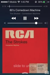
wow Apple removed the transparent NC and control center in the Iphone 4S -__- looks ugly.
Like on iPhone 4?
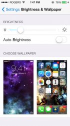
Setting a wallpaper makes the status bar black and the Settings app crashes a lot when changing the wallpaper.
my messages app badge icon still shows 40 even though all messages and threads are deleted
Tried resetting all settings?
This thread IS for beta 3..
Yes I get that but I mean does the OP want to edit his initial post like normally done so people don't have to scroll through pages and pages of comments.
Podcast app fixed. (Mine was broken in Beta 2).
Odd, as its an app you download rather than a stock app.
I'm going to:
- Download the entire Beta 3 IPSW
- Wipe my phone and install it as new
- going to watch all the new "bugs" vanish. That's how I roll.
- Download the entire Beta 3 IPSW
- Wipe my phone and install it as new
- going to watch all the new "bugs" vanish. That's how I roll.
It appears they're now using Helvetica Neue Light instead of Helvetica Neue UltraLight.
Ahhhhhh! This kind of cluelessness is maddening.
Apple already didnt use the ultra light variant almost anywhere. Clock in the lock screen, calendar icon, thats it, more or less. All other fonts were already not as light as ultra light. Ultra light is mostly eye candy and decoration, not meant to be used at small sizes and not meant to be used excessively. And Apple already didnt.
In iOS7 Apple uses different font weights depending on font size and semantic meaning (headline, subtitle, body text, etc.). On a given screen there might be many different font weights of Helvetica Neue present, from thin over light, regular and medium all the way to bold. Those different weights were made to optically fit each other. (By the way, this is actually super-awesome and Im unaware of any other UI doing it. Heck, today even many places where you might expect proper typography dont do it, for example pretty much all websites.)
Now, I would say that Apple picked to flimsy weights overall but Helvetica Ultra Light was never the problem.
Setting a wallpaper makes the status bar black and the Settings app crashes a lot when changing the wallpaper.
I thought the same thing, in fact what it's doing is that it's defaulting the top of the wallpaper to below the statusbar, you just have to drag it up the 20 pixels before you set it and it works just like before.
Calendar works fine for me.
It works fine yes but the disign is awful. Prefer iOS 6
Someone with a 4S post a screenshot with it locked + music playing?
There you go
Attachments
Register on MacRumors! This sidebar will go away, and you'll see fewer ads.


