Got a tip for us?
Let us know
Become a MacRumors Supporter for $50/year with no ads, ability to filter front page stories, and private forums.
iOS 7 Beta 3 Tidbits: New App Download Animation, Thicker Fonts, Safari Improvements
- Thread starter MacRumors
- Start date
- Sort by reaction score
You are using an out of date browser. It may not display this or other websites correctly.
You should upgrade or use an alternative browser.
You should upgrade or use an alternative browser.
Settings>General>Software Update> Checking for update.......
sometimes get a time out error, "unable to check for update, An error occurred while checking for a software update" Cancel or Try Again.
sometimes get a time out error, "unable to check for update, An error occurred while checking for a software update" Cancel or Try Again.
I knew they would have to up the weight on the font. At small sizes, even on a Retina screen they must look poor on certain backgrounds. They've had to go up in weight across the board to keep everything in sync.
Shame as it makes quite a difference to the style but rule number one in typography is extremely light type should only be used for display headings.
Shame as it makes quite a difference to the style but rule number one in typography is extremely light type should only be used for display headings.
...The blue circle simply means the app has been updated but not been opened yet.
Thanks for clarifying. Not intuitive and totally pointless design idea.
But it is conceptually consistent with the blue dot that currently denotes:
- Newly downloaded and unread emails (iOX and OSX)
- Newly downloaded and unwatched movies in iTunes (Mac iTunes and ATV)
 are listening to, and acting upon feedback about the UI where usability is compromised, but ignoring the feedback about the UI which is subjective.
Glad to see they are blind peoples visiting this site.
Glad to see there are illiterate people visiting this site.
This shows how much better the thicker font looks for smaller text
Oh nice, thanks!Calendar - In the monthly view, the Calendar app has been updated to display small gray dots on days where events are scheduled

im sorry but 7 is miles behind 6. are they planing to make the os after mavericks similar to ios 7 (i hope not), else ios7 is going to look dramatically different than osx! and they are in the same software ecosystem! ios6 was already elegant it needed some changes yes but the new thing is nothing even close to elegant or stripped; if ios6 is a maple tree then ios7 is a christmas tree!
as for these changes. well im surprised they even thought to use that nueve ultra light bullcrap in the first place, and to think it was even on a billboard, now this is a designing fiasco!
im still waiting for new icons! and a massively toned down version of the current windows aero...
as for these changes. well im surprised they even thought to use that nueve ultra light bullcrap in the first place, and to think it was even on a billboard, now this is a designing fiasco!
im still waiting for new icons! and a massively toned down version of the current windows aero...
Last edited:
I had to uninstall iOS 7 beta 2 since I couldn't really use my phone any more. The battery life seemed poor and things were always crashing. I sure hope they decide to fix those things before release.
... Yes, they will. That is the major reason they do this whole beta testing phase. Fixing the issues with iOS 7 and allowing developers to make sure their apps will work when iOS 7 launches.
If you are a) not a developer and/or b) installing a beta OS on your main device, you clearly don't understand how this thing works.
I appreciate the consideration of the typography. The design of every element on iOS has much more importance than ever now and that is the soul of Apple.
Looking forward to the GM release
Looking forward to the GM release

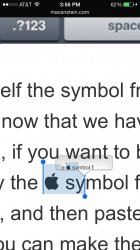
Is it just me or is this .com thing in safari a major issue? I really think they should add a band above the keyboard with various options for quick touch. For example http://www.123macmini.com/news/images/newsstory1287_1.jpg In this image you can see how organic the top keyboard bar will feel.
----------
to be honest,thats a very long carrier name. what solution do you suggest?
----------
it is time they fix this embarrassing triangle overlay over the wifi icon... This is a UI bug for an alpha release, not a third beta...
to be honest,thats a very long carrier name. what solution do you suggest?
it is time they fix this embarrassing triangle overlay over the wifi icon... This is a UI bug for an alpha release, not a third beta...
That triangle is there to denote that on the lockscreen you can pull down the notification center from the lockscreen. Otherwise most ppl would not realize that.
Beta
You gotta give credit to Ive and team unveiling a roughly designed version of iOS7 knowing backlash was coming but embracing that criticism immediately and keeping on track for fall release.
You gotta give credit to Ive and team unveiling a roughly designed version of iOS7 knowing backlash was coming but embracing that criticism immediately and keeping on track for fall release.
Anyone else prefer the thinner font in the previous beta's?
Yeah! I thought I was the only one that preferred the helvetica neue ultra light font.
Why do people resist change for the sake of what they are used to instead of what is better?
Folder "background"
My folder "backgrounds" are now a light green in b3.
I changed wallpaper a couple weeks ago to one with lighter colors than my previous and really liked the way it looked. When my phone started back up after the OTA update, I immediately noticed the light green, which doesn't blend with the wallpaper like it used to. And, to be honest, I now cannot recall what it looked like 30 minutes ago.
Attachments
I was hoping Beta 3 would bring some Twitter/Facebook post options like you have in iOS 6 Notification Center but still nothing.
Me too. The dialogs are there though and updated for the new UI.
Open Siri. Say Tweet or "Post to Facebook"
Register on MacRumors! This sidebar will go away, and you'll see fewer ads.