Become a MacRumors Supporter for $50/year with no ads, ability to filter front page stories, and private forums.
So, have you reported it as a bug at bugreport.apple.com? ;)

After filing over 15 ui related bugs, I learned that apple doesn't listen when it comes to that. Functional errors-yes. UI? It feels like "don't think you can teach us anything in that department" :)
 
I am hoping they change Spotlight back to the usual swipe right to activate.

Having to "top" swipe down for the Notification Center, and "middle" swipe down for Spotlight is getting highly annoying, because I never get what I'm swiping for.

Perhaps I use it more than most, mainly to launch apps that are in folders on pages 2 and beyond.

Why change it?

Perhaps you were in the minority here. I hated the right swipe and accidentally activating Spotlight. I hardly ever use it on my iPhone but perhaps that is because my folders are very well organised (opposed to my Mac desktop and my desk I am typing this on), but I digress.
 
Changes in Beta 3

Compass
- Compass app no longer shows the city you are in, only the coordinates
- Level in Compass app no longer gives you green when your phone is at 90 degrees in any way, only when at 0 degrees on a flat surface, when tilting it too much, it shows a red

Safari
-Safari URL bar is now a blueish gradient
-Safari has broken lines button by the URL bar
-Safari seems snappier ;)

Music
-Genres icon in Music is changed to 3 string instruments
-Now Playing button in Music now shows up as “Now Playing” not as “N........”
-Songs icon is redesigned into a single musical note
-Artists view now shows pictures of the artists that are fetched from the web (presumably)
-Other icons changed
-When in now playing, tapping the song name brings up Song Rating
-Tapping the cover art in Now Playing for a song without lyrics also brings up ratings, but if it has lyrics, only brings up lyrics

Miscellaneous
-Activation lock in Find My iPhone in settings, seems to ask if you want to turn it off even when trying to turn it back on

-Coverflow actually displays all my cover art (had a problem in beta 2 where it would show some of my albums as black squares)

-Spotlight search is smoother

- iPhone seems to have gotten hot again, battery doesn’t seem to be charging while plugged in

Feel free to add more.
 
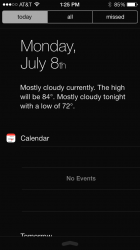
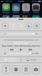
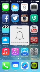
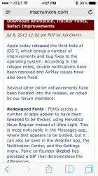
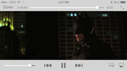
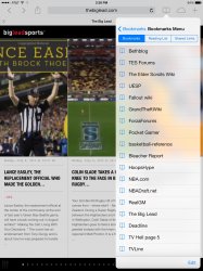
Biggest change I've noticed is that they've ditched transparency. The Control Center, Notification Center, the volume adjuster, Safari address bar and bottom icons, video controls, and much more are not transparent at all anymore on my iPhone 5. Haven't seen mention of it anywhere else. Elements are still transparent on my freshly-updated iPad. Attached a few photos of the phone. Cheers!

EDIT: As mentioned below, the "Increase Contrast" setting will make transparency go away now. I actually prefer this a little better!
 

Attachments

  • photo 1.PNG
    photo 1.PNG
    59.5 KB · Views: 273
  • photo 2.PNG
    photo 2.PNG
    191.1 KB · Views: 282
  • photo 3.PNG
    photo 3.PNG
    755.7 KB · Views: 289
  • photo 4.PNG
    photo 4.PNG
    138.5 KB · Views: 231
  • photo 5.PNG
    photo 5.PNG
    425.7 KB · Views: 244
Last edited:
Why were you installing beta software on your main phone? ;)

While I can't speak for OP, but I cannot afford a second iPhone myself, so my development work and my everyday phone are one and the same. While I do sometimes regret putting iOS 7 on my everyday (and only) phone, I think it is cool when people ask me wtf is on my screen!
 
Two things:
First I still don't have weather in my notification center.
Second, please tell me how to delete the phantom messages (2.5gb) that show on my usage.
 
Hallelujah for the opaque overlays!! They actually listen over there??

Maybe I'll try ios 7 again now :)
 
Anyone seeing black notification center, Siri and search keyboard on iPhone 5 - it's annoying me :(

I saw this right after I downloaded and was upset because I couldn't find anyone else that was dealing with it. However, after poking around in the forums here, I found out that you have to disable "increase contrast" in the Accessibility section of Settings.
 
Biggest change I've noticed is that they've ditched transparency. The Control Center, Notification Center, the volume adjuster, Safari address bar and bottom icons, video controls, and much more are not transparent at all anymore on my iPhone 5. Haven't seen mention of it anywhere else. Attached a few photos.

that's just for your phone it seems
 
Biggest change I've noticed is that they've ditched transparency. The Control Center, Notification Center, the volume adjuster, Safari address bar and bottom icons, video controls, and much more are not transparent at all anymore on my iPhone 5. Haven't seen mention of it anywhere else. Attached a few photos.

I think there is a contrast setting that adjusts this. Maybe yours is set to turn transparency off?
 
Biggest change I've noticed is that they've ditched transparency. The Control Center, Notification Center, the volume adjuster, Safari address bar and bottom icons, video controls, and much more are not transparent at all anymore on my iPhone 5. Haven't seen mention of it anywhere else. Elements are still transparent on my freshly-updated iPad. Attached a few photos of the phone. Cheers!

Something is wrong on your end. Here everything is transparent. Don't expect any changes in that.
 
Biggest change I've noticed is that they've ditched transparency. The Control Center, Notification Center, the volume adjuster, Safari address bar and bottom icons, video controls, and much more are not transparent at all anymore on my iPhone 5. Haven't seen mention of it anywhere else. Elements are still transparent on my freshly-updated iPad. Attached a few photos of the phone. Cheers!

someone came down to his senses. now put borders around the notification center and fix the icons and folders!

edit: oh well hope you can turn it off atleast
 
No it has been on the right in all iOS 7 betas. In iOS 6, however, the bolt is inside the battery icon.

That's what I meant, in iOS 6. Why would they want it to take more space? If the green isn't full, it's charging, the lightning bolt doesn't really help at all. They could even filly the not green part with some other color to indicate it's charging. (Or put the bolt back!)

Gary
 
Why do people resist change for the sake of what they are used to instead of what is better? :(

Sounds quite snobbish to be honest. Better at what? Even on many screenshots the font was not legible at all, especially with the wrong background. Not to mention that legibility has already suffered since the shadings have been removed in favour of the 'flat' design. Helvetice Neue Ultra Light was never meant to be used either for smaller text, body text or interfaces, but as a heading font for bigger text sizes. Keeping it would have been an affront to good UI design.
 
iCloud Keychain had big changes in beta 3 to the point of not being backward compatible with beta 1-2. That must explain it.

One day this week I'll try it out, but, keeping it off for now.

Settings>Brightness & Wallpaper now correctly shows dynamic wallpapers.:) But, Settings seems to like to crash after changing it.
 
Something is wrong on your end. Here everything is transparent. Don't expect any changes in that.

It was the "Increase Contrast" setting. Now it seems it turns off transparency. A welcome change, in my opinion. The more customization options, the better.
 
Safari

Im just glad they removed the stupid ".com" button. It was always getting in the way.
 
Register on MacRumors! This sidebar will go away, and you'll see fewer ads.