Got a tip for us?
Let us know
Become a MacRumors Supporter for $50/year with no ads, ability to filter front page stories, and private forums.
iOS 7 Beta 5 Tidbits: Icon Settings Redesign, New Control Center Options
- Thread starter MacRumors
- Start date
- Sort by reaction score
You are using an out of date browser. It may not display this or other websites correctly.
You should upgrade or use an alternative browser.
You should upgrade or use an alternative browser.
When you get rich enough that you can hire Apple to make an UI just for you, then maybe you'll be a happy person. But Apple doesn't make the UI just for you.I don't need a visual distinction of the apps being in the dock versus them being not int the dock. I know they're there, I placed them there. With all the talk about minimalism, getting the UI out of the way, and layers being great visually that looks AWFUL. I can't stand it because I don't like a fifth of my screen being blurry, and its bad design. I really wish they'd remove it.
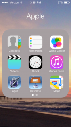
Also, 9 apps shown in a folder at a time STILL? It used to be 12 and that was it. Sure, pages inside a folder is nice but now instead of two taps and I'm in the app I want, it's two taps and a swipe. Again, bad design. Why do this? It makes no sense. They've taken one small step forward, and one pretty large step back. I really like iOS 7, but man there's a couple things that are driving me up the wall. At least performance is pretty good on an iPhone 4. I just wish they'd drop that stupid huge blurry dock background and put 12 apps per page back in folders. The rest is great. Though I would like to change the control center shortcuts, but that's no biggie compared to the other issues I feel are in iOS 7.
There has been no design change. iOS7 is the same ugly piece of crap it has been in every developer preview. People are generally fine with big changes as long as they are for the better. People don't like changes is just a silly explanation by Microsoft officials defending a new Windows usability nightmare. We've heard it with Vista, and Eight. And now it has come to the shores of Apple land.I agree, most people are not ready for big changes and come to macrumors crying out. J. Ive will come back to the original design in the next versions.
The slight differences between Windows 8 and Windows 8.1 do not effect the main problems with the underlying usability design concepts or rather misconcepts. In the same way iOS7 can only be tweaked, but never be fixed. You have to throw out the main idea of everything flat and clean. And only apply them, where flatter means better and cleaner means better. And you have to bring back realism and skeuomorphism, where they are needed to better the product. But that would require a completely new UI overhaul from which we are years maybe decades away.
We now (again) life in times of ugly phones and can only hope for our children.
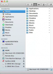
That color variety is very helpful for quick navigation. The reverse of the mistake they made when taking color out of the OS X standard folder icons, making my Finder sidebar (by default) too uniform to help me navigate!
You know you can fix that, right?
Attachments
What a nightmare!
Who the hell knows how iOS 7 will look like now! The design is going in all directions! Isn't there at Apple a single Art Director with the balls to be taking charge in there?? Meanwhile we are left here to suffer the hits and miss of these, sometimes godawful, design ideas. I've had it!
They have someone in charge. They are swapping different things in and out like paint swatches based on ideas from inside and outside the company until they get exactly what they want. If you can't handle that (normal) process for software design, maybe you shouldn't use the beta...
There has been no design change. iOS7 is the same ugly piece of crap it has been in every developer preview. People are generally fine with big changes as long as they are for the better. People don't like changes is just a silly explanation by Microsoft officials defending a new Windows usability nightmare. We've heard it with Vista, and Eight. And now it has come to the shores of Apple land.
The slight differences between Windows 8 and Windows 8.1 do not effect the main problems with the underlying usability design concepts or rather misconcepts. In the same way iOS7 can only be tweaked, but never be fixed. You have to throw out the main idea of everything flat and clean. And only apply them, where flatter means better and cleaner means better. And you have to bring back realism and skeuomorphism, where they are needed to better the product. But that would require a completely new UI overhaul from which we are years maybe decades away.
We now (again) life in times of ugly phones and can only hope for our children.
What skeumorphic elements do you want back?
And iOS 7 is not flat
You know you can fix that, right?
My Finder sidebar icons are all grey. How do I make them coloured?? I'm on Mountain Lion.
When you get rich enough that you can hire Apple to make an UI just for you, then maybe you'll be a happy person. But Apple doesn't make the UI just for you.
There is a simpler way to customize your UI. Just use more customizable OS like Android)
Anyway to make my screen clearer? Just updated, hard to see the fonts/time/date on the screen now
Try this:

Still translucent with mine. I see this happen sometimes even with previous betas. Try rebooting.
My Finder sidebar icons are all grey. How do I make them coloured?? I'm on Mountain Lion.
I'm also on Mountain Lion - it's called SideEffects. Not affiliated with their site or their software, but that was driving me crazy too, until I managed to find this little gem =)
If you can't handle that (normal) process for software design, maybe you shouldn't use the beta...
Why do so many get so rude and snarky online? I don't understand why the anonymity of the internet brings out the worst in people. Would you speak to a stranger in person like this? I'm so tired of how nasty people treat other, and before you excuse it as misreading your tone, how else should that be read?
Why do so many get so rude and snarky online? I don't understand why the anonymity of the internet brings out the worst in people. Would you speak to a stranger in person like this? I'm so tired of how nasty people treat other, and before you excuse it as misreading your tone, how else should that be read?
This. I can't believe the amount of hostility on this thread. I know I should be used to it on MacRumors by now, but my word people.
Its been 5 beta's and still no female Siri for the U.K? Are we not getting it? can someone please tell me? and the arrow (>) for slide to unlock shouldn't it be situated on the right? like this ( Slide to unlock >) instead of in front.
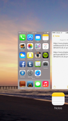
I also thought that the multi-tasking screen would show each application live, as when you go through the multi-tasking apps and browse through you see apps like the camera that show a blank screen. It would be nice to see just a bit of shadows under the text on the homescreen as I can barely read them and especially with the dynamic backgrounds. Another note I would love to see just like a tiny (X) or something to close all apps instead of doing them all.
I also thought that the multi-tasking screen would show each application live, as when you go through the multi-tasking apps and browse through you see apps like the camera that show a blank screen. It would be nice to see just a bit of shadows under the text on the homescreen as I can barely read them and especially with the dynamic backgrounds. Another note I would love to see just like a tiny (X) or something to close all apps instead of doing them all.
Last edited:
When you get rich enough that you can hire Apple to make an UI just for you, then maybe you'll be a happy person. But Apple doesn't make the UI just for you.
I'm sorry, it must be my fault as the customer for voicing my opinion about design flaws. I didn't realize that I was supposed to be perfectly happy with whatever Apple makes and see no design flaws. Actually read what I wrote instead of taking personal offense that I've seen some design changes that aren't good, thoughtful design that needs to be changed as an improvement rather than a change for changes sake. I'm a customer of Apple's so my opinion is valid and by no means does it require that I become a majority shareholder of theirs to voice that opinion. See the step back they've taken with their new folder UI changes and how it affects both UI design and user experience. Both the folder function and dock blurriness is a step back to me as a customer and maybe you need to quit thinking you and Apple are the only ones that matter when it comes to design. If you like that design, great. Apple is not and never will be perfect or immune from making bad decisions.
Last edited by a moderator:
There has been no design change. iOS7 is the same ugly piece of crap it has been in every developer preview. People are generally fine with big changes as long as they are for the better. People don't like changes is just a silly explanation by Microsoft officials defending a new Windows usability nightmare. We've heard it with Vista, and Eight. And now it has come to the shores of Apple land.
The slight differences between Windows 8 and Windows 8.1 do not effect the main problems with the underlying usability design concepts or rather misconcepts. In the same way iOS7 can only be tweaked, but never be fixed. You have to throw out the main idea of everything flat and clean. And only apply them, where flatter means better and cleaner means better. And you have to bring back realism and skeuomorphism, where they are needed to better the product. But that would require a completely new UI overhaul from which we are years maybe decades away.
We now (again) life in times of ugly phones and can only hope for our children.
Most people like iOS 7. Don't talk like you represent a majority
Really just shows you how far they were from being anywhere close to done when they debuted this OS....
Yeah, it's almost like it was a beta for a product still 3-4 months away or something!
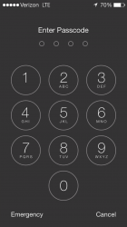
I don't understand what happened to the transparency that used to be there. I have a color rich background, why are all my menus gray?
View attachment 427017
View attachment 427018
View attachment 427019
View attachment 427020
Looks like you have 'Increase Contrast' under Settings > General > Accessibility turned on.
I'm sorry, it must be my fault as the customer for voicing my opinion about design flaws. I didn't realize that I was supposed to be perfectly happy with whatever Apple makes and see no design flaws. Actually read what I wrote instead of taking personal offense that I've seen some design changes that aren't good, thoughtful design. I'm a customer of Apple's so my opinion is valid. See the step back they've taken with their new folder UI changes and how it affects both UI design and user experience.
I like Apple's new design and find it adds to a better overall user experience.
I too am an Apple customer who's opinion is valid.
What are we going to do now?
Last edited by a moderator:
There is a simpler way to customize your UI. Just use more customizable OS like Android)
It's funny android users. They are so happy with their laggy phones, that they spend all day in apple forums??!!
I'm glad they are slowing adding color back into iOS 7. it has too much white
Color is one of three ways the human brain differentiates visual information, aside from movement and shape. No matter what anyone "feels" about it, it's simply much more efficient to have color differentiating differnt buttons/functions/categories.
What a nightmare!
Who the hell knows how iOS 7 will look like now! The design is going in all directions! Isn't there at Apple a single Art Director with the balls to be taking charge in there?? Meanwhile we are left here to suffer the hits and miss of these, sometimes godawful, design ideas. I've had it!
Put yourself together. A war is a nightmare. A slight change in an icon is not. Don't be an overreacting crying person. But don't worry, most people in this forum have the same behaviour.
Register on MacRumors! This sidebar will go away, and you'll see fewer ads.


