redbeard331
Suspended
Starting to remind me of this. By the time Apple removes the notch, at this rate, it will be 2036.

Yeah made me think of these 'boxier' Android notches also, think arguably it looked better (better being a relative term here?) before, more streamlined.Starting to remind me of this. By the time Apple removes the notch, at this rate, it will be 2036.
View attachment 1831281
They'll milk the curent design at least another year, book it.Expecting no notch next year.
I don't hate the notch that much. Well, at least not on paper. But when I saw that the notch hides the numbers from the battery percentage icon in the upper right corner (Status Bar) of the screen I opted out.It is an abomination that they’ve kept this aesthetic disgrace for as many years as they have. Another year I am forced to stick to the SE device.
I simply won’t purchase any iPhone with a notch. It is bad design that shouldn’t have ever gone rewarded.
It is an abomination that they’ve kept this aesthetic disgrace for as many years as they have. Another year I am forced to stick to the SE device.
I simply won’t purchase any iPhone with a notch. It is bad design that shouldn’t have ever gone rewarded.
Yes, doing the same design for just two years would be very atypical for Apple. I mean, even the 11 Pros were really just iterations of the Xs and X designs.They'll milk the curent design at least another year, book it.
We're all doing a lot of assuming here just based on a supposed leak.If they're just going to remove the notch next year, why bother with shrinking it barely this year? Seems like unnecessary R&D...?
The battery icon doesn't give you adequate info? A quick swipe down brings up the control center that displays the percentage numerically.im so angry at apple, why cant we have batt % back there is space, I dont want a bug widget just for that, apple are doing my head in, and why make the notch taller thats a downgrade
I can't grasp why I can't tap a switch in Settings and just get the numbers instead of the icon. And this won't even be a feature in the iPhones 13 despite the smaller notch.Would be nice if they actually used the extra space for something, like showing the actual battery %.
Notch is ok.,It is an abomination that they’ve kept this aesthetic disgrace for as many years as they have. Another year I am forced to stick to the SE device.
I simply won’t purchase any iPhone with a notch. It is bad design that shouldn’t have ever gone rewarded.
True dat. A notch is a notch. It’s like saying you’re second daughter is 20% less ugly than your first daughter…If they're just going to remove the notch next year, why bother with shrinking it barely this year? Seems like unnecessary R&D...?
They have become sooo greedy and I don’t blame them. No competition….. when was the last time an Apple event excited you ? …….
Speaker grill isn’t at the top like rumoured and the notch is barely smaller. Would’ve been better if it was shallower than thinner but hey ho, gives me a good reason not to upgrade this year.
Apple's new iPhone 13 models that were released today feature an updated TrueDepth camera and a new design for the notch, which has been slimmed down.
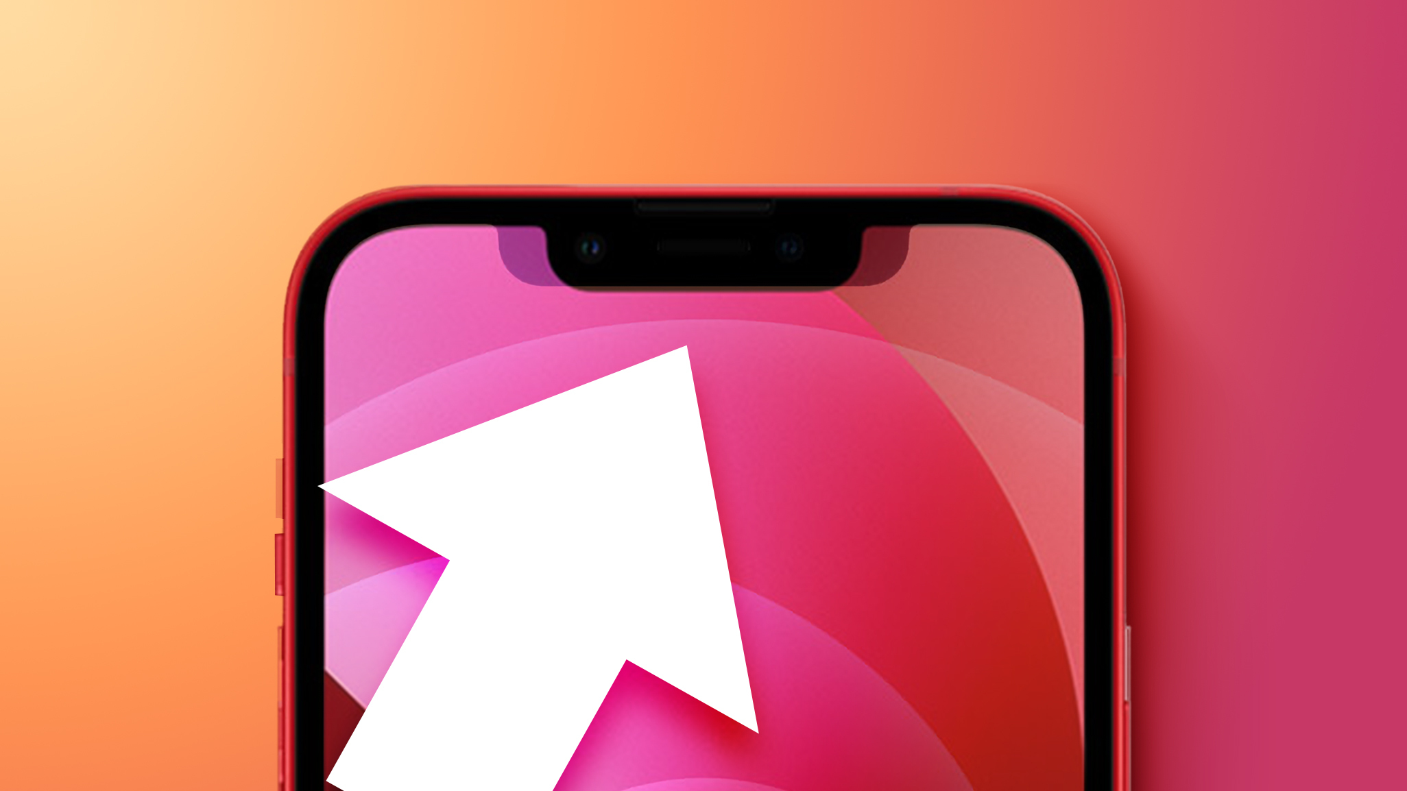
Apple said on stage that the notch is now 20 percent less wide than the notch used in prior models, but comparisons between the iPhone 12 and iPhone 13 confirm that the new notch design is just a tad bit taller.
In the overlay above, you can see the size difference in action. The notch is indeed a good bit smaller, and the tiny increase in height is barely noticeable.
The new notch design is in line with rumors that we heard during the beta testing period, which pointed to a design that was more compact and just a tiny bit taller.
Next year, Apple may do away with the notch entirely. Rumors suggest that at least some models will have no notch with a design that instead incorporates a hole-punch cutout for the front-facing camera, with Apple to adopt under-display Face ID.
Article Link: iPhone 13 Models Feature 20% Smaller Notch That's Just a Tiny Bit Taller
Groundbreaking technology!!!Expecting no notch next year.
The increased height is like what, the width of a hair? Maybe two hairs?It's narrower but nothing has changed in the indicators area? And now you have less vertical height for content because of the increased height of the safe area. 🤣

