Giving to Mrs haha, yeah I can claim back GST too.Depends what you plan on doing with the 12PM. If you claim usage on tax and sell it for 60% of original price, it's definitely worth the upgrade. I upgrade each year.
Got a tip for us?
Let us know
Become a MacRumors Supporter for $50/year with no ads, ability to filter front page stories, and private forums.
iPhone 13 Pro Max iPhone 13 Pro Max is here! First impressions and photos thread
- Thread starter Boardiesboi
- Start date
- Sort by reaction score
You are using an out of date browser. It may not display this or other websites correctly.
You should upgrade or use an alternative browser.
You should upgrade or use an alternative browser.

Wow seriously. The frosted backs on the pro model phones can give you so many color variations its crazy.The comparison pic I posted above is Sierra Blue vs Pacific Blue.
I'll post comparison of new vs old graphite soon
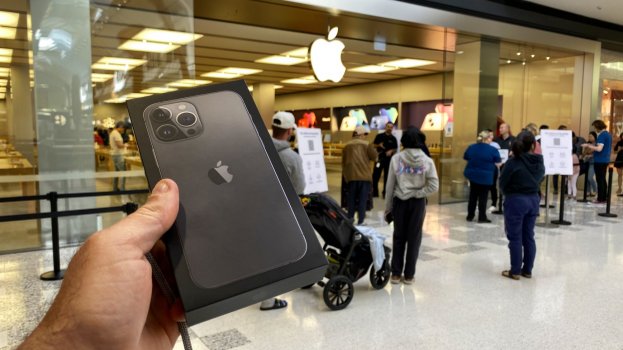
13 pro max screen looks kinda pink? Thanks for sharing.I just picked up my iPhone 13 Pro Max 128GB Sierra Blue from the Apple Store in Sydney Australia.
First impressions:
Happy to take questions! I've taken the day off work so I should be able to answer your questions within a reasonable time.
- The new phone feels does not feel any heavier in the hands than the 12 Pro Max
- The smaller notch is not that noticeable. But the font size in the status bar on either side of the notch seems to have increased, and they've moved it down from the top of the display. Why not keep the same font and position and add an extra icon or two?
- Sierra blue is absolutely stunning in person. It looks more steel / ice / glacial blue and not so much baby / powder blue. The colour on that stainless steel band is beautiful. Like the Pacific Blue last year, you get different colours in different lighting conditions
- Promotion display - Just WOW. Never had a Samsung 120Hz screen before so I didn’t even realise how smooth scrolling, swiping between pages on the Home Screen and watching videos can be. It’s worth every penny and is very noticeable even to untrained eyes like mine.
- Display is cooler than the 12 Pro Max display and no yellow tint when put side by side against each other.
- It pairs perfectly with the Apple dark cherry and sequoia green leather case,
- MagSafe magnet attachment does not seem any stronger than last year
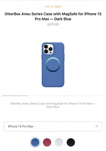
Some photos attached. Includes direct comparison with 12 Pro Max Pacific Blue, and when paired with Apple black silicone, dark cherry, sequoia green leather cases and Otterbox Aneu series in light blue.
I also have my partner’s graphite 13 Pro Max so I’ll update this post with some pics of that too.
View attachment 1842684View attachment 1842685
metzy25
macrumors 65816
Awesome thank youThe comparison pic I posted above is Sierra Blue vs Pacific Blue.
I'll post comparison of new vs old graphite soon
More comparison pics of 13 PM vs 12 PM
Pacific blue (left) vs Sierra blue (right)


13 Pro Max Graphite (left) vs 12 Pro Max Graphite (right) - The 13PM graphite is slightly darker


Pacific blue (left) vs Sierra blue (right)
13 Pro Max Graphite (left) vs 12 Pro Max Graphite (right) - The 13PM graphite is slightly darker
iRun26.2
macrumors 68020
Neither one of the blue pictured phones looks blue at all to me.More comparison pics of 13 PM vs 12 PM
Pacific blue (left) vs Sierra blue (right)
View attachment 1842919View attachment 1842920
13 Pro Max Graphite (left) vs 12 Pro Max Graphite (right) - The 13PM graphite is slightly darker
View attachment 1842921View attachment 1842922
imaginex20
macrumors 68000
Sierra blue definitely looks grayish. Looks neat but I went with silver/white again. Thanks for sharing.
akidokraja
macrumors 6502
Fred Zed
macrumors 603
Nice one. You beat @LFC2020 to it. 🤣I just picked up my iPhone 13 Pro Max 128GB Sierra Blue from the Apple Store in Sydney Australia.
First impressions:
Happy to take questions! I've taken the day off work so I should be able to answer your questions within a reasonable time.
- The new phone feels does not feel any heavier in the hands than the 12 Pro Max
- The smaller notch is not that noticeable. But the font size in the status bar on either side of the notch seems to have increased, and they've moved it down from the top of the display. Why not keep the same font and position and add an extra icon or two?
- Sierra blue is absolutely stunning in person. It looks more steel / ice / glacial blue and not so much baby / powder blue. The colour on that stainless steel band is beautiful. Like the Pacific Blue last year, you get different colours in different lighting conditions
- Promotion display - Just WOW. Never had a Samsung 120Hz screen before so I didn’t even realise how smooth scrolling, swiping between pages on the Home Screen and watching videos can be. It’s worth every penny and is very noticeable even to untrained eyes like mine.
- Display is cooler than the 12 Pro Max display and no yellow tint when put side by side against each other.
- It pairs perfectly with the Apple dark cherry and sequoia green leather case,
- MagSafe magnet attachment does not seem any stronger than last year
Some photos attached. Includes direct comparison with 12 Pro Max Pacific Blue, and when paired with Apple black silicone, dark cherry, sequoia green leather cases and Otterbox Aneu series in light blue.
I also have my partner’s graphite 13 Pro Max so I’ll update this post with some pics of that too.
View attachment 1842684View attachment 1842685
In a dark closet when in dark mode. How do the greys look ? Any hint of green? Cheers
wow that graphite is darker can hardly see the apple logMore comparison pics of 13 PM vs 12 PM
Pacific blue (left) vs Sierra blue (right)
View attachment 1842919View attachment 1842920
13 Pro Max Graphite (left) vs 12 Pro Max Graphite (right) - The 13PM graphite is slightly darker
View attachment 1842921View attachment 1842922
No. The camera cut out is bigger on the 13PM and the buttons have moved.Does the 12PM case for the 13PM?
More pics of Sierra blue in sequoia green/dark cherry leather cases paired with saddle brown and Baltic blue leather wallets, and in Otterbox Aenu light blue case


TheYayAreaLiving 🎗️
Suspended
happy orchard
macrumors 65816
Checking in about he screen: any flicker when filmed with slow-mo at brightness settings under 100%. The more less flicker usually means less PWM issues. If you could tell me it’s better, you’d be my favorite person today. 🙂
Mr. Jenkins
macrumors regular
I'm conflicted all over again. The two colors I'm leaning toward. Every time I think I've made up my mind, I see awesome pictures that makes me second guess.

MisterSavage
macrumors 603
Thanks for posting. I actually really like that case that has the colorful magsafe circle.
Getting my sierra blue tomorrow!
Getting my sierra blue tomorrow!
Do you think the light blue matches the sierra blue?Thanks for posting. I actually really like that case that has the colorful magsafe circle.
Getting my sierra blue tomorrow!
Was thinking of exchanging that for the dark blue.
Attachments
kp98077
macrumors 601
Legendts
macrumors regular
I’m starting to get jealous and my iPhone 6 is starting to look (and is) sloooww 🥴.
Maybe I need to upgrade, very soon 😁.
Maybe I need to upgrade, very soon 😁.
The sierra blue looks more blue here compared to the other pictures.More pics of Sierra blue in sequoia green/dark cherry leather cases paired with saddle brown and Baltic blue leather wallets, and in Otterbox Aenu light blue case
View attachment 1843090View attachment 1843091View attachment 1843092View attachment 1843093View attachment 1843094View attachment 1843095