Become a MacRumors Supporter for $50/year with no ads, ability to filter front page stories, and private forums.
You keep going on about a change in usability.


You're easily younger than I am. Please do not attempt to talk down to me.


As long as you don't go insane with thematic elements, no, it does not. Design your icons (and dock background) to look how you wish and change those.

A complete interface change would require developers to update their app icons to match, and I can't see people changing 50,000 apps just because Apple wants them to look different.

I think the home screen could use a little bit of organization, but the OS as a WHOLE "looks" old. I think the pixels could be changed without the need for moving the UI around or confusing people.

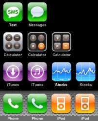
By the way... I've always hated how the Clock, Weather and Photos icons look. So far, the Calculator, iTunes Store, Stocks, SMS, Phone, and iPod icons have changed... why not others?
 
but the OS as a WHOLE "looks" old.

to you. Because you've had it for awhile. You're in the vast minority unfortunately. It's not like they're using 70s colors or styles. The iPhone is only a couple of years "old". Even the WWW is just catching up to apple's "style" with mirrored icons, the glass look, etc. Visually - the design is still VERY current. You're bored. And that's ok - but that does NOT mean the UI looks or is old. It's not.
 
Here are the icon changes I've noticed through the years. Anyone know if there's been any other icon changes? I tried as hard as I could to remember what has changed.

attachment.php


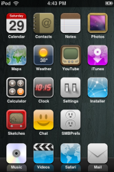
Edit: Remember back in the day?:

attachment.php
 

Attachments

  • Icon Evolution.jpg
    Icon Evolution.jpg
    119.8 KB · Views: 664
  • foo_4.png
    foo_4.png
    166.4 KB · Views: 675
I think 4.0 will have an entirely brand new UI. The standard iPhone UI is getting rather dated. I can't wait to see what iPhone OS 4 is going to look like.

I think we need a better springboard. The current one is okay for one page, but if you get too many pages going, it looks cluttered. We need folders and different customizable views. When Apple originally designed the iPhone OS, I don't think they were thinking about thousands of third party apps... so they didn't design it with the App Store in mind.

What do you think? New UI in iPhone OS 4?

You aren't asking for a brand new UI your asking for the existing one to be tweaked so you can feel like it's newer. Apple may oblige, but they also understand the importance of a consistent platform.

I will grant you that the popularity of apps and the now 11 springboard screens should be addressed, other than via spotlight. I now refuse to add a new app if it takes me over 6 screens.
 
I actually dig the way the UI looks. Simple and easy.

Anyone ever notice how the clock app is smaller than all the other apps?
 
Then why ever change a UI. The core functionality that was included in the original UI will never, ever go away. That isn't the point of a UI change. Why doesn't Vista look just like XP? Why doesn't Windows 7 look just like Vista? Why doesn't Leopard look identical to Tiger? After all the previous revisions were functional, so why the change?

There are two reasons. The first is that underlying the UI are the functions the UI controls. As those functions change and (typically) grow, so the UI changes - at least to some degree. The second is to help differentiate one UI version from another, so change occurs as a means of demarkation.

As one example of the former, with the iPhone, the core functionality was easily represented in the UI we initially saw, where one screen was not even fully populated with icons. Now we have thousands of apps and millions of variations of apps any specific device might contain, so the simple tap-icon-to-run metaphor is less ideal. At present it's accommodated by use of multiple screens, but there may be better ways to provide access to apps.

Another example might be the original SMS icon that has now been replaced by one with a blank bubble (because except for us in the US, it's now MMS as well as SMS). It's a cosmetic change reflecting a functional change.

A further example would be the growing tree of settings, reflecting a growing depth of functions the user can control, such as Push or location services which were not initially present when the 2G was released.

An example of the latter would be the purely (as far as I know) cosmetic changes in icons such as iTunes and calculator, which seem more to do with ensuring users see some difference after an update than with anything otherwise 'useful'.
 
An example of the latter would be the purely (as far as I know) cosmetic changes in icons such as iTunes and calculator, which seem more to do with ensuring users see some difference after an update than with anything otherwise 'useful'.

They should update all the icons. Apple typically updates the icons in OS X with new versions of the OS. Even if they're only slightly enhanced. We've seen so many iTunes, iChat, Address Book, Calculator, DVD Player, QuickTime and System Preferences icon changes.

They could "enhance" the OS without really radically changing it. For example... they could remove all the gloss and make everything matte. They could change the light blue color to a more graphite color. They could allow us to use a background image on the springboard. There are plenty of things Apple could change that wouldn't affect the way we use our iPhone, but it would look nicer and more up-to-date.
 
I dunno... I kind of like the new Phone, Messages and iPod icons.

The old old calculator icon is ok too, but seems too "aluminum back" for the new phone casings.
 
2) Multi-tasking support - not just being able to run multiple apps simultaneously, but having the GUI in place to easily switch apps and be able to tell which apps are open. Honestly, I hope Apple just steals Web OS's card system.

They can do better than the card system. How about double click the home button to invoke something like expose? :D

I'd like to see multitasking too. Other than that... maybe folders/stacks.

Come to think of it, since that's all I want, maybe I should just jb. :)
 
They should update all the icons. Apple typically updates the icons in OS X with new versions of the OS. Even if they're only slightly enhanced. We've seen so many iTunes, iChat, Address Book, Calculator, DVD Player, QuickTime and System Preferences icon changes.

They could "enhance" the OS without really radically changing it. For example... they could remove all the gloss and make everything matte. They could change the light blue color to a more graphite color. They could allow us to use a background image on the springboard. There are plenty of things Apple could change that wouldn't affect the way we use our iPhone, but it would look nicer and more up-to-date.

Yeah - I see what you're saying. I just don't agree at all. The changes you want are arbitrary. Glossy to Matte? Why? Because you want to see something different?

If Apple allows for customization - themes, it solves your button and springboard issue. Simple as that. People can buy whatever scheme they want for their Apple icons and the app store can make some money. win-win.

Personally - I think Matte would look more "dated" than the gloss anyway. Look around you (the real world) and you'll see much more graphic design for hi-tech products that are glossy vs matte. The PRE UI you're currently drooling over is glossy. So I'm confused why you think it looks more current. Wait. I'm not confused. It's as I've said - it's just because you've used it for over a year. ANY change would seem "welcome"

But also knowing you (as little as I do) - it wouldn't take long for you to point out how the newer buttons were a pixel smaller than the old ones. They don't stand out as much. They look dull. Or whatever you decide at the moment is your issue"
 
How about double click the home button to invoke something like expose?

Oh, heavens no! Exposé sucks, and it would be difficult to tell what the apps are with the small screen (and low resolution). The home button is already overloaded with functions as it is.

I really hope they don't start cluttering the home screen like they did with spotlight either. For example, swiping down shows running apps and swiping up shows notifications.
 
You aren't asking for a brand new UI your asking for the existing one to be tweaked so you can feel like it's newer. Apple may oblige, but they also understand the importance of a consistent platform.

I will grant you that the popularity of apps and the now 11 springboard screens should be addressed, other than via spotlight. I now refuse to add a new app if it takes me over 6 screens.

I agree. The UI won't be totally redone. NO WAY! It is still awesome.

In 2.0 Apple heavily addressed the corporate world which it really needed to take care of.

Then you see with the business world happy, they returned to the consumer with 3.0 and added tons of requested features.

Now, with 4.0 they essentially have the all the heavy lifting done and it will be time to refine refine and play. Springboard is an issue and was designed before the App Store. I predict you will see new implementations with Springboard and organization, such as Stacks, File structure, multi-tasking perhaps, a new subtle implementation of alerts and pop-ups, and some cool fun stuff like iChat and eye candy made possible from Snow Leopard technology making its way into the iPhone OS. (Apple is improving the resolution, efficiency, and requirements of iChat with Snow Leopard...very interesting eh?!). ;)

I am confident in my prediction and I also think some of those things are already underway and will debut on the Tablet first (such as the mention I made of iChat being tweaked), then follow on the iPhone! :D

What do you guys think?

I always liked the first Calculator app icon, but how have the Store, Stocks, iPod, and Phone apps been changed?

I think the current calculator icon actually is by far the best. Kinda funny how it went through 3 revisions though. That must have been bugging Steve lol! :p
 
There are two things I'd like to see out of the next iPhone OS update. The cosmetic appearance of the UI isn't a major factor to me, but I do think that the search function could be used to improve the navigation of the phone.

The search screen is far too spartan in its default state. When selected, I would like to see a basic scrollable folder heirarchy that appears beneath the search field which sorts applications or data depending on metadata. Default folders could include Music, Games, Documents, Photos, Videos, etc. You could tap on one to see all the games on your phone for instance instead of having to search through them on your home screens.

And second, I would like to see the Mail.app enhanced with spam filtering and rules. It doesn't have to be as elaborate as a desktop application but any ability to help sorting through mail would be welcome.
 
Man, I really gotta give it to Spaz - his threads have legs, every time.

They're all 5+ pages without exception. Someone could make a "Steve Jobs has died" thread and it'd only go to 2, maybe 3 pages; but Spaz just needs to start a "iPhone is a product from Apple" thread and it'll go to 11+ pages in an afternoon.

It's kind of amazing.

It's not that hard when you reply to every single post with one of your own :D
 
Oh, heavens no! Exposé sucks, and it would be difficult to tell what the apps are with the small screen (and low resolution). The home button is already overloaded with functions as it is.

I really hope they don't start cluttering the home screen like they did with spotlight either. For example, swiping down shows running apps and swiping up shows notifications.

Well, we'll have to agree to disagree. I LOVE expose on the mac (lack of it is the #1 reason I find using windows so hard) and think it could be adapted beautifully to the iphone. Maybe they could create some kind of gesture that would invoke it if the home button has too many uses.

Even if expose isn't the answer, I think the weaknesses of the card system will become apparent once phones get powerful enough to be running a half dozen or more apps without slowdown. The number of "touches" required will start to exceed what it takes to change apps on the current iphone OS (and yes, I do recognize there's more to multitouch than number of touches, such as backgrounding and state preservation).

How about 2 finger pinching gestures on the home screen?
 
Register on MacRumors! This sidebar will go away, and you'll see fewer ads.