I much prefer the current iOS 6 home screen look and feel. It just makes my iPhone feels like a premium device, I really like it. I can definitely appreciate the new multitasking, upgrade on Safari, and also the control switchers. But the design seems like a major downgrade... Anyone else feels the same way?
Got a tip for us?
Let us know
Become a MacRumors Supporter for $50/year with no ads, ability to filter front page stories, and private forums.
Is it just me or the new iOS 7 making the iPhone feels like a cheap toy?
- Thread starter WWDC2013
- Start date
- Sort by reaction score
You are using an out of date browser. It may not display this or other websites correctly.
You should upgrade or use an alternative browser.
You should upgrade or use an alternative browser.

I don't see how you can say that if that noisy wallpaper of yours makes it look like a cheap toy compared to stock iOS 6.
I second this. I kinda hate the Google Youtube App and Google Maps app interface. They seem to follow same kinda of flat design. Maybe I am just getting used to the old interface or I myself is too old. But I definitely feel the new interface looks cheap.I much prefer the current iOS 6 home screen look and feel. It just makes my iPhone feels like a premium device, I really like it. I can definitely appreciate the new multitasking, upgrade on Safari, and also the control switchers. But the design seems like a major downgrade... Anyone else feels the same way?
It's you, from your screenshot, I'd say it looks as horrible as Windows and Myspace. Too much going on. I prefer the new cleaner, fresh and modern look of iOS 7 over iOS 6. Looking back at iOS 6 just looks extremely outdated now.
I completely agree. The color scheme is just too bright. It would be alright if it were customizable at all, but it's not. I'm hoping there are some changes to it before the final release. I don't think I can take this color palette all the time. And the notes app just looks so plain now. I don't understand the appeal of this new design. I liked the skeuomorphic design much better. I never realized it was so hated before. The current design, iOS 6 and earlier, is one of the reasons I never cared for Android much. Stock Android always looked cheap compared to the rich iOS gloss. Now Apple feels like Android, but with less options. I don't like the new direction one bit.
It's you, from your screenshot, I'd say it looks as horrible as Windows and Myspace. Too much going on. I prefer the new cleaner, fresh and modern look of iOS 7 over iOS 6. Looking back at iOS 6 just looks extremely outdated now.
While I agree that iOS 6 is dated..
iOS 7 is absolutely not a cleaner, fresh and modern look.
Flat UI can be done beautifully to look modern, this just looks plain and boring. I am shocked and disappointed.
OP, i see where you're coming from and i agree that the new UI makes the iPhone lose it's individuality.
Thank god for jailbreaking!
If you're judging solely on screenshots, then you're way off. Seeing it in person gives it a feel that is unlike anything we've seen before.
I've commented in other threads about this, but it seems to make the whole screen feel more alive and vibrant than I can ever remember before. There is an added emotional element to it with the way the wallpaper subtly shifts as you hold the device.
Test it in person before you judge.
I've commented in other threads about this, but it seems to make the whole screen feel more alive and vibrant than I can ever remember before. There is an added emotional element to it with the way the wallpaper subtly shifts as you hold the device.
Test it in person before you judge.
Flat UI can be done beautifully to look modern, this just looks plain and boring. I am shocked and disappointed.
i imagined a better UI than this and I'm a lover of extreme minimalism. it's bland and empty.
I completely agree. The color scheme is just too bright. It would be alright if it were customizable at all, but it's not. I'm hoping there are some changes to it before the final release. I don't think I can take this color palette all the time. And the notes app just looks so plain now. I don't understand the appeal of this new design. I liked the skeuomorphic design much better. I never realized it was so hated before. The current design, iOS 6 and earlier, is one of the reasons I never cared for Android much. Stock Android always looked cheap compared to the rich iOS gloss. Now Apple feels like Android, but with less options. I don't like the new direction one bit.
Regarding the "theme" item, changing your background image significantly alters the overall theme of the OS. Because there is a level of translucence to most items, the color palette of the wallpaper can completely change the feel and emotion of the design. It is quite spectacular, actually.
I have yet to make up my mind on iOS 7, but I do like the classic, 'quality' feel of iOS 6. While I agree that it wasn't the most fresh, modern UI, I thought it had a sense of classic and robust design, like something that doesn't really age, just because it is good, they got the basics right.
In my opinion, iOS 7 will look dated in a few years while iOS 6 would stand the test of time no matter what.
In my opinion, iOS 7 will look dated in a few years while iOS 6 would stand the test of time no matter what.
If you're judging solely on screenshots, then you're way off. Seeing it in person gives it a feel that is unlike anything we've seen before.
I've commented in other threads about this, but it seems to make the whole screen feel more alive and vibrant than I can ever remember before. There is an added emotional element to it with the way the wallpaper subtly shifts as you hold the device.
Test it in person before you judge.
i would like to read your opinion again after a few days of use.
not necessarily saying you will change your mind, but i have a feeling that, for many, the honeymoon period will be quite short with these flat and uninspiring icons (not that the iOS 6 icons were any better, mind you).
Indeed. This was a really elegant way of bringing customizability to a higher degree in Apple's closed way.Regarding the "theme" item, changing your background image significantly alters the overall theme of the OS. Because there is a level of translucence to most items, the color palette of the wallpaper can completely change the feel and emotion of the design. It is quite spectacular, actually.
I can't wait to get iOS7 on my iPhone 5 and iPad 2!
Indeed. This was a really elegant way of bringing customizability to a higher degree in Apple's closed way.
I can't wait to get iOS7 on my iPhone 5 and iPad 2!
I have a feeling I'm missing a lot by having it on my iPhone 4 test device. It's not stable enough to put on my 5 yet though. Maybe I'll change my tune once I can see the full graphical layers. It's stripped down a lot on the 4.
I much prefer the current iOS 6 home screen look and feel. It just makes my iPhone feels like a premium device, I really like it. I can definitely appreciate the new multitasking, upgrade on Safari, and also the control switchers. But the design seems like a major downgrade... Anyone else feels the same way?
Cheap toy?? Not even close. The old iOS certainly did though.
iOS 7 looks clean, classy, elegant, and modern.
Some of the icons aren't the best, but the keyboard, menus, control panel, notifications, app switcher, Safari tabs, new Calendar, basically all of the stock apps... They all look and feel great. iOS 6 now officially feels like an outdated turd.
I'm amazed at people on here who constantly complain about everything Apple does.
Tell you what, why don't you build your own device and OS to suit your requirements? It looks like Apple is not delivering to your expectations.
more than 10 million people do just that. they jailbreak so they can get the features and looks they want.
ironically apple has adopted in iOS 7 the most popular jailbreak features and gotten rid of the gloss which are the major reasons why people jailbreak - and have been asking for years.
but you cant blame them for being disappointed for doing a poor job when they finally get round to do it.
S
syd430
Guest
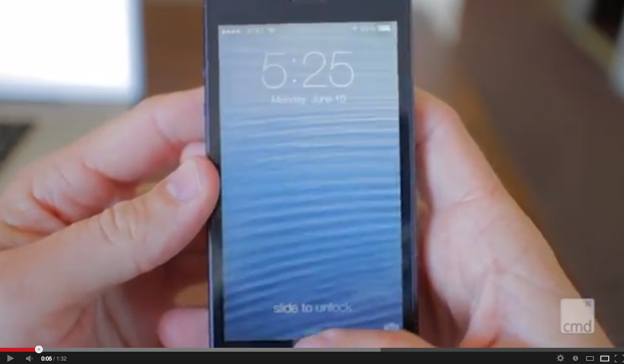
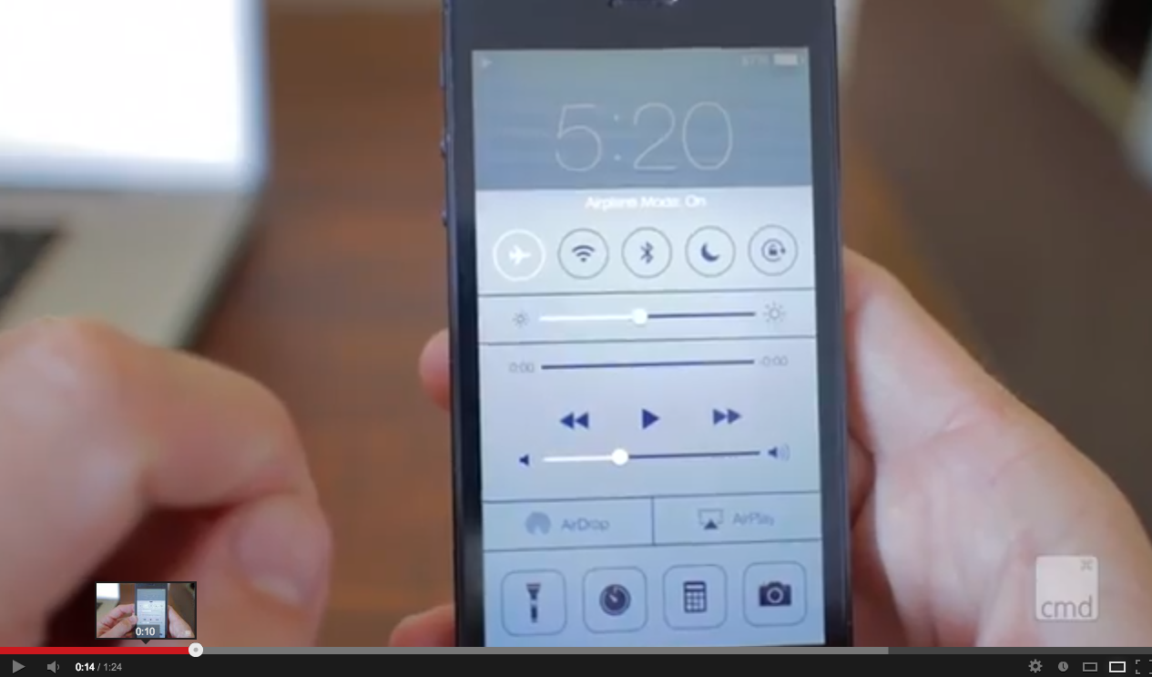
I really think it just comes down to the gaudy animated wallpaper that they used for the demo. For instance check out this video that I came across that uses a standard iOS 6 wallpaper:
http://www.youtube.com/watch?v=iM1M68HQQjQ
Looks really good here imo.
Edit: Screenshots
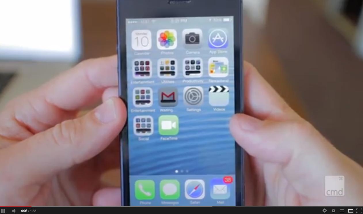
http://www.youtube.com/watch?v=iM1M68HQQjQ
Looks really good here imo.
Edit: Screenshots
Last edited by a moderator:
I much prefer the current iOS 6 home screen look and feel. It just makes my iPhone feels like a premium device, I really like it. I can definitely appreciate the new multitasking, upgrade on Safari, and also the control switchers. But the design seems like a major downgrade... Anyone else feels the same way?
I know this is really offtopic, but is there any chance you want to share the wallpaper in your screenshot?
Thanks in advance
")
Pre-WWDC:
"Apple better update the iOS UI. It's old".
Post-WWDC:
"iOS 7 is horrible, I hate it, my life isn't worth living, I now have a toy".
"Apple better update the iOS UI. It's old".
Post-WWDC:
"iOS 7 is horrible, I hate it, my life isn't worth living, I now have a toy".
I'm with you.
I also think a few people here should have this installed on their phone before making any comments, or being crazy fanboys surfing the hype wave.
I also think a few people here should have this installed on their phone before making any comments, or being crazy fanboys surfing the hype wave.
I actually thought it looked halfway decent during the keynote. But I just put the beta on my 4S, and it's pretty hideous and just straight up awkward in real life usage. It seems even more Fisher-Pricey than ever, but more than anything, everything just felt really bloated and cramped on my tiny screen. Maybe it'll grow on me once it's out of beta and I upgrade to 5S.
I also miss having the weather widget in the notification center, and not sure what the hell happened to the Voice notes app that I use to record lectures.
I also miss having the weather widget in the notification center, and not sure what the hell happened to the Voice notes app that I use to record lectures.
Is it just me or the new iOS 7 making the iPhone feels like a cheap toy?
Wait, Voice Memos are gone? What the heck? I need that app! 3rd party apps don't have the Private API access to be able to make a usable voice notes clone!
I'm shocked that they showed off with Compass (who uses this?) but got rid of Voice Memos
Wait, Voice Memos are gone? What the heck? I need that app! 3rd party apps don't have the Private API access to be able to make a usable voice notes clone!
I'm shocked that they showed off with Compass (who uses this?) but got rid of Voice Memos
I'm with you.
I also think a few people here should have this installed on their phone before making any comments, or being crazy fanboys surfing the hype wave.
I second this. The design is awkward and the animations overzealous when you're actually using it.
S
syd430
Guest
I also think a few people here should have this installed on their phone before making any comments, or being crazy fanboys surfing the hype wave.
I've got to admit that the people that were changing their avatars to the iOS 7 logo before they've even seen the demo was a a bit cringe worthy.
Register on MacRumors! This sidebar will go away, and you'll see fewer ads.