Become a MacRumors Supporter for $50/year with no ads, ability to filter front page stories, and private forums.
I much prefer the current iOS 6 home screen look and feel. It just makes my iPhone feels like a premium device, I really like it. I can definitely appreciate the new multitasking, upgrade on Safari, and also the control switchers. But the design seems like a major downgrade... Anyone else feels the same way?

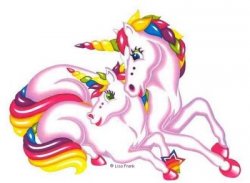
iOS 7 makes me think of this
 

Attachments

  • rainbow_unicorns_copyright_lisa_frank.jpg
    rainbow_unicorns_copyright_lisa_frank.jpg
    21.3 KB · Views: 267
So then how did this get a standing ovation at WWDC? Is everyone in the audience kool aid drinkers? :confused:
 
So then how did this get a standing ovation at WWDC? Is everyone in the audience kool aid drinkers? :confused:


they always perform a standing ovation at these ceremonies.


then they go back to their office and bash the hell out of it. :D


well to be honest most of them don't have the guts to do just that. they will wait a week or two, read the negative reviews and only THEN echo that sentiment; or at the very least acknowledge that a portion of people aren't happy, expected more, etc.
 
I much prefer the current iOS 6 home screen look and feel. It just makes my iPhone feels like a premium device, I really like it. I can definitely appreciate the new multitasking, upgrade on Safari, and also the control switchers. But the design seems like a major downgrade... Anyone else feels the same way?

Yes it's a downgrade..

One word..time to switch mobile phones I'm afraid.

It's not a design much of us will put up with, it's not a minor change it's a whole overhaul.

Blackberry now looks more professional. :)
 
Nope you're right!

All the strong colors and simply drawn icons make it look like a kids drawing.

Or even worse, like a cheap copy of Touchwiz or one of those awful UIs you find on Chinese feature phones.

(I switched from Android a while ago, and ios7 actually reminds me a but of an Android overlay: MIUI. That's maybe the worst part. It looks like they grabbed and borrowed from everywhere...)

If anything, its user hostile. Buttons barely look like buttons. Etc.

I'm so disappointed, and will probably not upgrade. Apple is about to be introduced to serious fragmentation is my guess.
 
I'm not alone! The gradience and wallpaper instantly reminded me of that Robot Unicorn Attack game. ;)

Robot_Unicorn_Attack_by_blackseagull.jpg

Lol, yea, certainly not the design direction people were hoping for..

It's like the guys at Apple let the makers of that Unicorn cartoon/game design iOS 7.

It looks amateurish and childish, you just know there has to be many many people inside Apple cringing over this design.
 
I applaud Apple for finally changing things up but they really botched it. This thing is straight up ugly. The best comment I've read on it is "it looks like a unicorn ran all over it spitting sprinkles." Did a brony design this? Its a mismatch of designs that comes off messy. The bright colors scattered throughout it is annoying. The translucency makes it look gaudy and something akin to windows vista. They didn't even make the stock apps cohesive design wise. The icons look like they are from 2010. I have had an iPhone since the 3GS but this seriously makes me not want to use iOS devices anymore. The worst part is it won't be very customizable. Theres no way I'd want to have to look at that design every day. This will be it for years. Apple doesn't tend to shake things up very often. They didn't event open up iOS like Tim Cook said they would. There is still no communication between apps. You still can't make defaults. There is some weird half attempt at live tiles. Sir still sucks.

It is clear to me that Googles new design language is far superior to whatever Apple calls this junk. I will be going back to using my N4 and using Google services.
 
Regarding the "theme" item, changing your background image significantly alters the overall theme of the OS. Because there is a level of translucence to most items, the color palette of the wallpaper can completely change the feel and emotion of the design. It is quite spectacular, actually.

Would you care to post a screenshot of the new home screen but with a dark background? Pretty please? Maybe upload another one with control center fired up for comparison? I haven't tested it in person, but I believe I might completely agree with you.

I appreciate it, since I can't find this anywhere.

IMO, the problem is just the stock background, which is a little bland. If they change it for the final release, people are gonna be wow'd. And a couple of stock icons need polish. For example, messages icon is still green but the app has a blue theme. Some icons look 'dimpled' while others look 'bumped'.
 
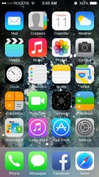
So compare that to this... Just downloaded the iOS7 beta.
 

Attachments

  • image.jpg
    image.jpg
    278.8 KB · Views: 175
It seems like more than half of us do not like the new icons.

That is because Apple did not do a good job finding universally acceptable ones.

IOS7 looks like Hello Kitty used my iPhone as a litter box.

They are poorly designed with a day-glow color scheme.

Most everything else looks great.
 
Many people here say they throw all of Apple's stock icons in a folder because they never use them. So why are people so obsessed over the look of app icons they never use? :confused:
 
Register on MacRumors! This sidebar will go away, and you'll see fewer ads.