Become a MacRumors Supporter for $50/year with no ads, ability to filter front page stories, and private forums.
Apple makes a lot of money with iTunes on windows machines, and the Cocoa framework does not exist on Windows machines. From Apples point of view, a pure Cocoa GUI for iTunes would be a disaster, until Microsoft provides some compatibility layer, which i cannot see in the current Windows 7 versions.

The main Carbon frameworks are integrated in the CoreServices framework, which is a 64-Bit framework. All sub-frameworks are 64-Bit, so Carbon and 64-Bit do not exclude each other. Just the "Carbon.framework", which has nothing to do with the CoreServices sub-frameworks is a 32-Bit framework.

Apple appear to be gradually making an application layer for windows again (or maintaining the old one at least), check out your C:\Program Files\Common Files\Apple\Application Support directory...
 
Ok. So how do I get rid of the album art view ?
It's totally throwing off the overall feel of everything to me.

I much prefer either not having it at all or it piping up in the side bar like it used to.

Is that an option in 10???
 
Ping is interesting but clunky. I've gotten trapped on screens and had to hit the back button to get to navigation links.

I've noticed some half implemented changes too. I looked at my reviews. It says "3 out of 3 people thought this was helpful" or something like that. But when you go to the site for the album, it doesn't say that. It says 3 people "like" it. And the yes/no option is gone and replaced by a like link similar to facebook. There are like links for reviews and albums.

I noticed this too. If you go to an album that you have purchased some songs from, the like option is not there. Click the option to see the entire album and the like option appears. The default view is to "complete my album". You can go back to that. Strange though that only one view has the like option.


I was looking forward to seeing the concert dates. But many artists I'm interested in are not on board. The ones I added do not produce any dates that I can see. I thought that would appear in your own profile (dates for all artists you follow). But perhaps I'm wrong about that.
 
It would, but a lot of people seem to think that moving from 32bit to 64bit is automatically doing to double performance or something? I don't think people really understand the difference or the implication.

Actually the move to Cocoa and 64bit would mean using the new QuickTime Kit IIRC is only available in 64bit as far as I am aware (based on what I read here: http://arstechnica.com/apple/reviews/2009/08/mac-os-x-10-6.ars/5 ) which will be optimised encoder/decoding, greater stability since most of the focus these days are on the Cocoa Frameworks, many of the features of Cocoa already have GCD hooks into it so when you move over to Cocoa you inherit a whole heap of cool features.

I think people are forgetting how much of a big change Cocoa actually brings; it is more than just a 'feeling' but a reality that one can see already with a more snappy finder, the ability to spawn threads and spread the load on multicore machines.
 
It's cluttering the sidebar uselessly if I'm not going to use it. What harm is there in having an option to hide the icon ? There's an option to hide all the Genius stuff if people don't want it (I use Genius a lot so I don't hide it).

I can't believe people are complaining about people wanting to remove clutter from their sidebars instead of offering insight into how to do it.

This is the first version of 10. This issue is cosmetic. Let it rest for now.

Performance issues should come first in the initial updates. Then cosmetic options.

Since its all gray, it shouldn't stand out so when you are browsing your library.
 
Well, couple things messed up:

The album art window in hybrid view, is a bit small. I've been listening and watching the Arcade Fire's new album, which you can download from their website for 8 bucks, with Apple Lossless, and M4A files that have handwritten lyrics pop up in the artwork window, with a little link on the bottom of the window to take you to a website they find interesting (different for each song)

Lyrics were tough to read unless you got the album artwork in the modular window, but now with the interface enhancements, they've moved any links to the MIDDLE OF THE ARTWORK, set to never hide!! So, good luck reading those lyrics.

TV Shows... I don't see anything for rent for 99cents from Fox/ABC Studios in Canada. Still $3.50 to buy an episode.

The rest of it is fine by me.
 
Actually the move to Cocoa and 64bit would mean using the new QuickTime Kit IIRC is only available in 64bit as far as I am aware (based on what I read here: http://arstechnica.com/apple/reviews/2009/08/mac-os-x-10-6.ars/5 ) which will be optimised encoder/decoding, greater stability since most of the focus these days are on the Cocoa Frameworks, many of the features of Cocoa already have GCD hooks into it so when you move over to Cocoa you inherit a whole heap of cool features.

I think people are forgetting how much of a big change Cocoa actually brings; it is more than just a 'feeling' but a reality that one can see already with a more snappy finder, the ability to spawn threads and spread the load on multicore machines.

Cocoa is also a lot quicker to code with than Carbon.
 
Cocoa is also a lot quicker to code with than Carbon.

True, hopefully that coupled with LLVM and the awesome debugger that is now included with XCoder 4 that we'll see bugs squashed a lot faster and easier. For many people here I don't think they appreciate just how difficult it is to actually fix bugs whilst ensuring that the whole thing doesn't come crashing down - hopefully with better development tools it will not only help third parties but also Apple to quickly fix bugs and located the problems quickly.
 
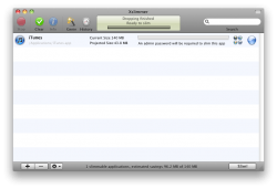
iTunes + Xslimmer = win-win!

Just shedded about 100mb of useless files off from iTunes 10 with xslimmer app. Now, I have about 40mb total on iTunes so that's pretty cool. Here's the snapshot tho.
 

Attachments

  • Screen shot 2010-09-02 at 9.54.58 AM.png
    Screen shot 2010-09-02 at 9.54.58 AM.png
    76.8 KB · Views: 123
Sorry, I had to register just to say this, because after almost 500 posts, it hasn't been mentioned yet:

What's with the griping about the monochrome iTunes? :confused: No one here has an iPad? They've simply ported the iPad's iPod interface into iTunes 10. I haven't seen anyone stab their eyes out with a fork over the iPod interface there, so why are people jumping off buildings en masse now? :confused:
 
So... i can't have the normal list view with the album art anymore? I have quite a lot of EPs (and singles) with 4 songs and can't show their album art anymore in list view. Wasting space is good to make things less cluttered and ugly.

I also don't like the grey icons, takes away some usability, now I have to read the damn things again. I actually wouldn't use iTunes at all if there was another working way to sync my iPhone.
 
COLORS!

I hate the lack of colors in iTunes 10, so I did a little ThemePark rsrc hacking and put the colored icons from 9.2 back into 10. It's not perfect, but I didn't want to waste too much time on it, and it looks alright on my computer for the icons that I use regularly.

Download (zip, 11.1mb)

Instructions included.

Enjoy, and feel free to let me know if you see an icon that should be fixed—I didn't check that they all look normal. :p

- Small size only.
- Some may be broken.
- No guarantees.

itunes10screenshot.png

thank you
 
Can't believe some people are complaining because they can't get rid of the little ping icon in the side bar. Honestly, its not doing anything. If you don't want to use ping, don't use it. The icons doing no harm by just sitting there is it? No.

But the icon is watching me!

tinfoil-hat.jpg


:p

And as for iTunes 10 being a step down from iTunes 9, its the same to me, just with a slightly different look and a few more non-intrusive features. The dock icon isn't nice but that can easily be changed!

I really like the alternative icons from Jonas Rask, though I wish he had a version of the speaker icon without the bright, glassy music notes. Just the speaker alone (sans flames) would be cool with me.

http://www.jonasraskdesign.com/downloads/downloads.html

EDIT: scratch that, he actually has a version of the speaker icon sans shiny notes or flames in the download pack. Sweet.

But I'm struggling to use these to replace the existing icon. The old tricks I used to use don't seem to work, and heck if I'm going to pay Panic $29 for Candybar. (Really Panic, $29 for an icon swapper app???) Any tips out there?

EDIT: never mind, tip posted in an earlier comment by END3R. Thanks!

For those that don't know how to replace it. Right click on the iTunes app in the Finder, not the dock, select "Show Package Contents," navigate to "Contents > Resources" and replace the iTunes.icns file with the one in this zip file.
 
20-1-1.png


Well actually it's been that way since iTunes 2 (on Mac OS X 10.2 Jaguar) just in mini view. If you ever pressed the green button you would know that.
Yes I know, I would argue that it has always been incorrect but this exception could be overlooked for the added convenience of having a minimal controller view. It is not the same as having it on a main window.

Personally I think Apple should obey their own HIG:
http://developer.apple.com/mac/libr...ppleHIGuidelines/XHIGWindows/XHIGWindows.html

On its own this is a tiny thing that I don't really care about, but it seems symptomatic of how Apple seems to be missing their attention to detail with OSX these days.


Thanks for that!

iTunes has always been an experimental UI playground for Apple and a sign of what may come in future releases of Mac OS X. iTunes is a standalone application and it can follow it's own rules within reason, it could end up with a wooden interface similar to Garageband, if Apple wanted to, not everything has to look like Finder.

I'm aware of Apple's Human Interface Guidelines, and I'm sure Apple is too, but they are definitely experimenting with them. Remember tabs on top for Safari that everyone complained about, and then complained again when they got to like them and Apple pulled them at the last minute. I think Apple has some big plans for the UI of Mac OS X, we're just looking at the crumbs and wondering whats cooking!
 
One Account, One Ping

Perhaps this was mentioned before, but the big Oops with Ping (outside the fact that you can't get rid of it from the sidebar), would seem to be that it's one account, one ping. Unless I'm missing something obvious?

A family of four--mom, dad and the two teens--use one credit card under one account for downloading iTunes. If all four want to set up "pings" for their with their particular circle of friends, focusing on their particular music...they would seem to be outta luck.

From what I can see, one account gets you one Ping under one name. :p
 
Turned off Ping. It asks what your music favourites are,yet it doesn't show the albums of that style of music in my favourites. I have no interest in Lady Gag Gag or Jack Johnson for that matter. So it's bye bye to Ping.
 
iTunes has always been an experimental UI playground for Apple and a sign of what may come in future releases of Mac OS X. iTunes is a standalone application and it can follow it's own rules within reason, it could end up with a wooden interface similar to Garageband, if Apple wanted to, not everything has to look like Finder.

I'm aware of Apple's Human Interface Guidelines, and I'm sure Apple is too, but they are definitely experimenting with them. Remember tabs on top for Safari that everyone complained about, and then complained again when they got to like them and Apple pulled them at the last minute. I think Apple has some big plans for the UI of Mac OS X, we're just looking at the crumbs and wondering whats cooking!


I know what you're saying but I disagree, I think all the apps should look like Finder as per the HIG. There should be one set of normal widgets, perhaps a set in a dark colour for photo editing etc (where it would be distracting to have bright ones) and that's it. All apps should then use only what is provided as standard by the OS.

No weird & massive toggle buttons like in the Time Machine control panel, no buttons using a different theme (like in the About this Mac window) and certainly no rotated window controls.

If Apple want to experiment, how about they do internal testing and sod off changing things on a stable OS!
 
Register on MacRumors! This sidebar will go away, and you'll see fewer ads.