I'm kind of irritated that I can now only choose from "small," "medium," or "large" to display my cover art in Album List view. Laaame!
Got a tip for us?
Let us know
Become a MacRumors Supporter for $50/year with no ads, ability to filter front page stories, and private forums.
iTunes 10 Now Available to Download
- Thread starter bob616
- Start date
- Sort by reaction score
You are using an out of date browser. It may not display this or other websites correctly.
You should upgrade or use an alternative browser.
You should upgrade or use an alternative browser.
I guess OS X graphite theme users will appreciate the more depressing look of the new icons, but they're not for me. Still better than the new option to hide the icons altogether though!
They did finally sort it out so the icons don't all indent when you connect an iDevice though!! And the 'Devices' section gets a 'hide' button, but the new feature we ALL want to hide, Ping, doesn't seem to want to disappear. At least Genius could be turned off, albeit still not in an obvious fashion. And party shuffle could be hidden, etc.
I'm sure there will be a way; every new version of iTunes is followed quickly by defaults write commands to change things back . It doesn't seem to have reversed my hidden settings either, which is nice.
Finally having the option to remove the tick boxes is nice - never have used those. Sunken buttons on the status bar are a little odd. Volume control is a lot odd.
STILL doesn't fix the iTunes dashboard widget, 6 years on.
They did finally sort it out so the icons don't all indent when you connect an iDevice though!! And the 'Devices' section gets a 'hide' button, but the new feature we ALL want to hide, Ping, doesn't seem to want to disappear. At least Genius could be turned off, albeit still not in an obvious fashion. And party shuffle could be hidden, etc.
I'm sure there will be a way; every new version of iTunes is followed quickly by defaults write commands to change things back
Finally having the option to remove the tick boxes is nice - never have used those. Sunken buttons on the status bar are a little odd. Volume control is a lot odd.
STILL doesn't fix the iTunes dashboard widget, 6 years on.
hybrid view
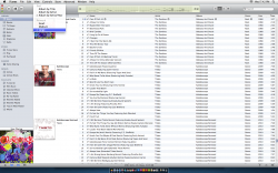
a bit buggy. (see picture) i have a jumbled-in-hybrid soundtrack where some tracks appear as "unknown album" even though the title is correct. I tried changing from compilation-yes to compilation-no, too. made the "album artist" and "artist" the same. nothing worked.
weird. it's the only one. I also had some artists fail to appear in the list of artist names in hybrid mode.
I wonder why they didn't make it so that albums with just a couple of songs don't stretch to show the full cover thumbnail? It makes the formatting seem sloppy.
Attachments
really, my library is just over 60gb (all correctly tsgged music) and updated fine. hope you had a backup.
Hopefully I'm an isolated case. Strange though since I only have a 16GB library and repaired permissions and quit iTunes before installing.
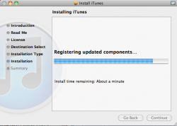
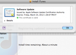
Anyone else notice this little icon in the top right? I've never seen this with apple software before.
i noticed that for the first time tonight, too. Interesting and handy.
Why did they remove all color?!
So the album artwork can pop out even more, as it should.
I always thought the colors looked cluttered!
Beautiful UI and incredible speed........thumbs up from me..........
I'm kind of irritated that I can now only choose from "small," "medium," or "large" to display my cover art in Album List view. Laaame!
unless I'm misunderstanding what you mean, I still have a slider to change the sizes. It was a little choppy at first, but it still has the full slider range of resizing.
So who wants to place bets on when we'll see a cocoa rewrite?
Apple makes a lot of money with iTunes on windows machines, and the Cocoa framework does not exist on Windows machines. From Apples point of view, a pure Cocoa GUI for iTunes would be a disaster, until Microsoft provides some compatibility layer, which i cannot see in the current Windows 7 versions.
The main Carbon frameworks are integrated in the CoreServices framework, which is a 64-Bit framework. All sub-frameworks are 64-Bit, so Carbon and 64-Bit do not exclude each other. Just the "Carbon.framework", which has nothing to do with the CoreServices sub-frameworks is a 32-Bit framework.
You don't ? I actually want it gone. I can't find an option to remove it. BTW, it'll appear the first time you click on the store.
I must be getting old... (wait a minute, I am old)... I see the ping icon now...
Everything looks VERY metallic. Mac OS X generally looks like the Mac hardware, so maybe this is a foresight to liquidmetal Macs in the future?
New UI better not be all grey... That is so Windows 95...
unless I'm misunderstanding what you mean, I still have a slider to change the sizes. It was a little choppy at first, but it still has the full slider range of resizing.
This is what I'm seeing ...
Attachments
Worth it just for the new shiny icon in the Dock. 
Otherwise all I noticed was b&w mini-icons in the side bar. Perhaps new playlist icon.
Don't care about Ping. BE great if I was 20 in today's tech world. But I'm not.
I have to wonder whether users though will go for a 2nd "social network" even if it is specialized. I suppose it's easy enough to invite folks and everyone already has iTunes log-in. Because of that I'd say it will catch on.
Not sure what Jobs is talking about when he mentioned album art being used instead listing the album 5-10 times or more. First, Apple has this mode before in iTunes if I remember right.
Second so far this mode sucks. Guess I list mostly by artist, but that throws off compilation collections and so that album name gets stuck in between album art. Looks weird. Maybe I'll get used to it.
updated look to little tiny checkboxes I never use and updated font for column headers. That's all I've seen on the surface.
IMO there are a few things they could do make it better for all.
TV shows - personally I like the album art view. But they could make it better by grouping seasons of tv shows together in some form which shows they are indeed different seasons of the *same* tv show. A faint box around the tv show in which you have more than one season? Or just list Mad Men once inside a box containing icons for seasons 1-4.
Or hell one big icon for each show and mouse over to see the seasons inside? Something.
Also podcasts need 30 skip more than skip to next podcast or fast forward through podcast. back arrow should be skip back 10 seconds. (could be user programmable in options.)
Anyone that listens to podcasts skips some content often enough or goes back to hear a part they missed or want to hear again. I have to bet I am far from the only one. These controls are much better for that then current iTunes/iPod controls. (straight from Tivo.)
Last iTunes has to make a move to the browser. Maybe it's me. Must be somewhat because iTunes sells so much music etc. But feels like a chore to go to iTunes to get to the store when I'm often in my browser when I think of buying a song.
Ping is La-La tech from what I can see. Still waiting for La-La tech web-based iTunes store.
Also just feels weird because I go to Apple store on, guess what?, the web to buy every other product apple sells.
Okay so everytime I click on "apps" in itunes under my iphone 4 tab (the place you can drag and organize), itunes takes a **** and closes on me? Not to mention I dont really like how everything is just grey? color looked so much better
Anyone else notice this little icon in the top right? I've never seen this with apple software before.
Apple plans to distribute only signed software updates (via http pages) in the future. Most security updates already have security signatures. That is the reason, why you see, what you see.
I've been trying to change my name on Ping without it changing the billing address' name changing...
Anyone else have this problem?! I don't have a credit card, therefore I'm stuck using my mothers' CC. So because of this, my display name is her name and I cannot make it my own.
Some social network..
Anyone else have this problem?! I don't have a credit card, therefore I'm stuck using my mothers' CC. So because of this, my display name is her name and I cannot make it my own.
Some social network..
Register on MacRumors! This sidebar will go away, and you'll see fewer ads.


