Become a MacRumors Supporter for $50/year with no ads, ability to filter front page stories, and private forums.
i haven't tested the iOS7 yet but as far as i've seen videos and comments, the main concern is with the icons, they look too simple or incomplete, haven't read any issues other than that, most of the reviewers are congratulating apple that they have changed things without any major issues,
now that a new team is the head of hardware i hope they also change the design language of the iphone. that would be great.:)
 
I guess I'm in the minority but I actually like the new icons.

I don't mind having "flattened" icons with a simpler look. My complaints about iOS 7 really boil down to four things:

- Feels like we've lost a few visual cues as things have flattened. They are using new types of cues (colored text that kinda look like hyperlinks as back buttons for example), but it feels a touch too far in places.

- The icon design in the homescreen and other places feels utterly unpolished. The Safari icon is a great example of an ugly icon. I don't mind that they simplified it, but the details are all in the wrong areas of that icon. The new "downloads" and "share" icons are weird too. Using boxy line art is out of place where a lot of rounded shapes are being used.

- Inconsistent button/icon/tab bar designs. Some tab bars use just icons, some have text too, some have text only. Icon styles vary as well in many places.

- The default font is a bit too thin. It looks awesome in some places, bad in others. Which is a bit of a problem.

The thing is, there is nothing about these complaints that says "Gimme back the iOS 6 look". It's more "Fix the ugly parts of your new design, please".
 
can he also redesign Sea Lion??

I would not mind to have possibility to change the look of "Sea Lion"
It is kind of boring to have it same.
 
Though I'm happy with what I've seen of the new designs so far, I'm glad to hear that they're remaining flexible with it and it is considered a "work in progress". My guess is that they released what they had with the intention of gauging customer reaction and making slight alterations with those sentiments in mind before launching the final product.
 
There are always fewer people than opinions, you'll never please everyone, it's impossible, and some would have you think that the loudest and most offensive comments and opinions are the most important and relevant. There is no correlation whatsoever between the two.
 
It was not in a WIP, otherwise they would put all those marketing stuff in the CUSTOMER apple website and keep everything on the developer website.

They are just trying to react to the backslash from designers.

I know one that were fired for less than that because he didn't want to apologize...
 

Attachments

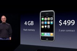
  • initially-the-phone-cost-499-at-its-cheapest-today-you-can-get-an-iphone-for-as-little-as-49-wit.jpg
    initially-the-phone-cost-499-at-its-cheapest-today-you-can-get-an-iphone-for-as-little-as-49-wit.jpg
    20.3 KB · Views: 321
In pop culture there is a color trend towards neon or highlighter type colors that have a very blatent/obnoxious youthfulness/freshness. American Apparel women's fashion is a good example of this.

If no one here likes this color pallet, than what?

How about baby blue, salmon, maroon, canary yellow, blueish green, in a more pastel vein? I just described American apparel's men's fashion.
 
Steve always kep these trigger happy idiots in line. Wtf ... Schiller adds "my ass" to his dictionary during keynote. Federighi jumbles around like he's on crack.

and now we are talking about possibility that they will be reworking these crappy icons during beta period? WTF seriously. Not the Apple i know.

Sorry to repeat this, but Steve really wouldn't have approved this. He would say "i asked for this and you've brought me a small *****".

The point IS actually that this is a different Apple. Steve Jobs said himself not to think about what he would do so.....

Anyway, there's rough edges, but honestly... I'm more positive about the future now than I was a week ago. This is the foundation of the future. I mean, even while they were on stage I immediately felt they were a lot happier, more excited, and way more confident since Job's passing than ever.
 
You seem to have forgotten that iOS shown in the keynote in 2007 was different than the iPhone. Examples: Safari icon (even then) and split view in Mail.

Two icons vs most icons. Also if only icons were the issue in iOS 7.
 
So before iOS 7 is released, a big stink is made about Johnny Ive and how he's taking control of the OS.

After the backlash of iOS 7s homescreen, now he "let the marketing team design the icons."

Uh-huh...:rolleyes:

Oh, Jobs; how we miss you.
 
Also, it's not the true. The original iPhone shipped with slightly different icons than shown in the keynote.

And, as they said, it's the biggest change to iOS since iOS. So in retrospect, we can fully expect the icons to change.

Well ok then I fully expect changes to come and what ships will be much more polished.
 
So many clueless people here. It was genius to give the icon design to the marketing team. Even if people hated it (which is evidently the case), Apple wins. Here we are with news article after news article in the tech world, twitter, social networks, etc, talking about Apple's new iOS and icon designs and how controversial they are. It doesn't matter what they look like, the advertising (or dare I say, Marketing?) is now running rampant and best of all its free. I have a feeling the truth is a mix of this story. I think Jony did have some influence into these icon designs, while also agreeing to let them create a little controversy to show that Apple is willing to mix things up, all the while knowing they have plenty of time to make adjustments.

This is marketing at its finest.
 
iClarified has this comparison between iOS6 and iOS7.

icons.jpg


I think overall the new icons are cleaner and generally look better. But as others have said the sharp gradients, weird radius on the outline edges, and few other tidbits need to be refined a bit as some icons really look out of place.

I'm thinking they have this great new compass icon, while the safari icon looks very out of place (infact the two simple triangles barely resemble a compass at all now). No reason they cant combine some of the elements of the new compass into the safari icon to keep things consistent. Just a thought.
 
I don't get the outrage over the new icons and interface. I think the new streamlined interface for iOS 7 is a lot nicer than the current interface which is nearly 10 years old, fragmented and stale. The skeuomorphic look of some apps is just awful, Apple went overboard with the 3D, beveled, glossy look in the past few years. The new interface is fresh, clean, consistent and modern.

Many people just hate change no matter what. "I'd prefer to keep using this old crappy interface rather than having to get used to something new." Get over it.
 
The point IS actually that this is a different Apple. Steve Jobs said himself not to think about what he would do so.....

Anyway, there's rough edges, but honestly... I'm more positive about the future now than I was a week ago. This is the foundation of the future. I mean, even while they were on stage I immediately felt they were a lot happier, more excited, and way more confident since Job's passing than ever.

I don't think he meant kicking Forstall and hiring Sinofsky, because by the looks of things this is what happened.
 
MarCom should have been concentrating on putting out... you know... effective marketing and communications. Not this. Sort of reminds me of the color palette from Old Navy's spring collection.:eek:

The wife loves it. Me, not so much. To each his own.

Seems as if Ive put MarCom's head (figuratively) right under the bus wheel. At least we know things could change in the near future.
 
You seem to have forgotten that iOS shown in the keynote in 2007 was different than the iPhone. Examples: Safari icon (even then) and split view in Mail.

The icon on the keynote was just blue and white, but if you looked at the phone they used to demo, the icon was the same as today's icon.

I agree the general direction of a livelier, friendlier interface is the right direction, but the icons need some polishing. I'm really surprised a marketing team was in charge of the interface. This is something I would expect from other companies, not a company known renowned for its design.
 
Steve always kep these trigger happy idiots in line. Wtf ... Schiller adds "my ass" to his dictionary during keynote. Federighi jumbles around like he's on crack.

and now we are talking about possibility that they will be reworking these crappy icons during beta period? WTF seriously. Not the Apple i know.

Sorry to repeat this, but Steve really wouldn't have approved this. He would say "i asked for this and you've brought me a small *****".

It's too bad that Steve didn't set out some kind of roadmap before he passed, so he knew the company would progress in a certain direction for at least a small part of the foreseeable future.

Oh, wait. By most accounts, he did have just such a roadmap in place, which we can assume Tim Cook and the other Apple execs are following (at least in some fashion).

I doubt there is anyone that has loved every single thing Apple has done or every single product they've released in the last twenty-four years, much less the last 24 hours. But don't assume that just because you dislike it that Steve is rolling in his grave or some similar nonsense. Instead, try to understand that it just might not be your specific cup of tea.
 
I hope this rumor is true.....has anyone seen/heard anything more to confirm this (icons were designed by marketing and will likely be redone)?
 
Maybe it was a idea of the marketing team to get everyone talk about the bad icons and in the end, apple changes them into sth beautiful and everyone is like ohh apple is hearing us and makes our wishes come true and do what the users want for the system :p

Haha.

But overall I like the design after few times looking at it. While watching the keynote I was like, yeah but some things... those arent apple like. There is way to much white in some apps. The buttons arent buttons anymore, okay, but they are not clear to be clickable.

For the icons: some of them I really like, some not.

Good ones:
Messages
weather (kinda like that,would be cool if it would change to bad weather)
clock (yeah why not? not much to go wrong here)
maps (flat but yeah? not that bad)
videos (kinda boring but can live with that. Never used my videos icon in ios6 anyway)
stocks (looks pretty cool)
newsstand (yeah like that)
passbook
compass (hm why not, looks not bad)
phone (like that the messaging/communication icons still look similar)

Bad:
Calendar (yeah pretty lame)
photos (not that bad, kinda misplaced)
camera (lulz some ps icon on some grey background?!?)
notes(nah boring and I have never seen notes with some yellow on top..)
game center (playful bubbles to be playful? Yeah its cool but why make everything flat and then some 3d shaped bubbles?)
itunes/appstore (yeah.. some weird sizes those circles and placement.. looks like there is more space between the top than the bottom)
settings (oh my god what happened with the cool looking gears? bah)
mail (boring)
safari (looks fugly)


Okay
reminders (yeah why not..)
music (exepct background)
 
Register on MacRumors! This sidebar will go away, and you'll see fewer ads.