pedantry
I agree with what you say, but an isosceles triangle doesn't point right any more than it points up-left, and down-left.
Does instant recognition of what it signifies make an icon better? I don't believe it does. Most good icons I've seen are way less descriptive than that. In any case, it's clearly an audio wave which is just fine as a signifier compared to a radio microphone (and really, a better descriptor since audio waves are actually involved, while a microphone is not). Most people are perfectly capable of recognizing audio waves at this point, I'd think.
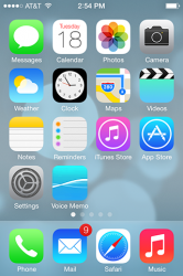
But I swear, Apple changes it's iOS icons and suddenly everyone becomes an icon critic. Look at the icons in your iPhone or you Mac and tell me how many of them are actual visual illustrations of what the app does. I'd be willing to bet it's not nearly as many as you'd think, and that you have no problem clicking on the correct icon to get to a certain app even if it's not illustrative. There's absolutely no need for the icon to be directly connected to what it does. Think about the universally accepted icons for "Pause" and "Play." What do two vertical lines and an isosceles triangle pointing right have to do with pause and play? And yet we know what they mean because they're culturally accepted as such, and because we've used them many times. The criticisms of the icons based on visual appeal are one thing, but all this talk of the icons not "meaning" anything is getting ridiculous, the product of people suddenly overthinking icons since now we're all being critical.
I assume this also means the design of the actual app has been changed too, which, thank god. It's got to be one of the ugliest apps out there.
I agree with what you say, but an isosceles triangle doesn't point right any more than it points up-left, and down-left.
Last edited:


