No one knows what the future will bring. I do not know anyone who predicted this train wreck, right? No worries. Everything changes.Thanks for sharing this sadly depressing news.
Though I hope it means the structure of Liquid glass and the execution will still change.

Got a tip for us?
Let us know
Become a MacRumors Supporter for $50/year with no ads, ability to filter front page stories, and private forums.
Mac OS 26 Is Utter Garbage and Apple Has truly lost its way....
- Thread starter jsnuff1
- Start date
- Sort by reaction score
You are using an out of date browser. It may not display this or other websites correctly.
You should upgrade or use an alternative browser.
You should upgrade or use an alternative browser.

p a t r i c k
macrumors newbie
So far I'm finding Mac OS Tahoe to be really good in most respects. I've only had one problem with it which has been resolved.
I first installed it within a day or two of its release on my M1 MacBook Air with 8 GB of RAM. It looked great to me but there was a problem with Apple Pages crashing, which was bad. Fortunately that was resolved with an update.
My Intel Mac mini doesn't have it of course.
My very new MacBook Pro 16-inch M5 Pro has it of course. This MacBook Pro is going to replace both the Mac mini and the MacBook Air so I will become a one Mac guy again for the first time in many years.
The first Mac I had was an LCII with System 7 which I bought in the early 90s. That is up in my attic right now although it doesn't work anymore. I haven't kept any other Mac actually, I do sell them when I change to a new one which I don't do very often, usually when they reach about six or seven years of age.
I do see quite a lot of complaints about Mac OS Tahoe however pretty much every release of Mac OS brings a lot of complaints. The more different they are from the previous one the more complaints.
I don't wish to invalidate the complainers though because, yes, with new Mac OS releases there are always problems and if you are experiencing one of these problems then it is very annoying.
I see some saying that Steve Jobs would not like Mac OS Tahoe. I think it is the first OS update in a long time that Jobs would have liked. It is the first one that reminds me of Aqua to which it is in a way a bit of a homage/development.
Jobs loved watery, curvy, translucent things.
Personally I think the overall look of Tahoe is very good indeed. For some time OSes had been rather conservative updates of what had gone before.
So from my perspective Mac OS Tahoe is getting a 👍 however that hand is also touching wood because I don't want any of the problems. 🫰
I first installed it within a day or two of its release on my M1 MacBook Air with 8 GB of RAM. It looked great to me but there was a problem with Apple Pages crashing, which was bad. Fortunately that was resolved with an update.
My Intel Mac mini doesn't have it of course.
My very new MacBook Pro 16-inch M5 Pro has it of course. This MacBook Pro is going to replace both the Mac mini and the MacBook Air so I will become a one Mac guy again for the first time in many years.
The first Mac I had was an LCII with System 7 which I bought in the early 90s. That is up in my attic right now although it doesn't work anymore. I haven't kept any other Mac actually, I do sell them when I change to a new one which I don't do very often, usually when they reach about six or seven years of age.
I do see quite a lot of complaints about Mac OS Tahoe however pretty much every release of Mac OS brings a lot of complaints. The more different they are from the previous one the more complaints.
I don't wish to invalidate the complainers though because, yes, with new Mac OS releases there are always problems and if you are experiencing one of these problems then it is very annoying.
I see some saying that Steve Jobs would not like Mac OS Tahoe. I think it is the first OS update in a long time that Jobs would have liked. It is the first one that reminds me of Aqua to which it is in a way a bit of a homage/development.
Jobs loved watery, curvy, translucent things.
Personally I think the overall look of Tahoe is very good indeed. For some time OSes had been rather conservative updates of what had gone before.
So from my perspective Mac OS Tahoe is getting a 👍 however that hand is also touching wood because I don't want any of the problems. 🫰
Last edited:
So far I'm finding Mac OS Tahoe to be really good in most respects. I've only had one problem with it which has been resolved.
I first installed it within a day or two of its release on my M1 MacBook Air with 8 GB of RAM. It looked great to me but there was a problem with Apple Pages crashing, which was bad. Fortunately that was resolved with an update.
My Intel Mac mini doesn't have it of course.
My very new MacBook Pro 16-inch M5 Pro has it of course. This MacBook Pro is going to replace both the Mac mini and the MacBook Air so I will become a one Mac guy again for the first time in many years.
The first Mac I had was an LCII with System 7 which I bought in the early 90s. That is up in my attic right now although it doesn't work anymore. I haven't kept any other Mac actually, I do sell them when I change to a new one which I don't do very often, usually when they reach about six or seven years of age.
I do see quite a lot of complaints about Mac OS Tahoe however pretty much every release of Mac OS brings a lot of complaints. The more different they are from the previous one the more complaints.
I don't wish to invalidate the complainers though because, yes, with new Mac OS releases there are always problems and if you are experiencing one of these problems then it is very annoying.
I see some saying that Steve Jobs would not like Mac OS Tahoe. I think it is the first OS update in a long time that Jobs would have liked. It is the first one that reminds me of Aqua to which it is in a way a bit of a homage/development.
Jobs loved watery, curvy, translucent things.
Personally I think the overall look of Tahoe is very good indeed. For some time OSes had been rather conservative updates of what had gone before.
So from my perspective Mac OS Tahoe is getting a 👍 however that hand is also touching wood because I don't want any of the problems. 🫰
Don’t speak for dead people, that’s very rude and culty. “Argument from authority” is usually also a very weak and misguided argument.
There are lots of UI issues and glitches in Tahoe and the design chief responsible has fled.
p a t r i c k
macrumors newbie
Don’t speak for dead people, that’s very rude and culty. “Argument from authority” is usually also a very weak and misguided argument.
There are lots of UI issues and glitches in Tahoe and the design chief responsible has fled.
With regard to Steve Jobs I'm responding to some that say that he would not have liked Tahoe. I think he would have. I make the rather obvious comparison with Aqua. So are the people claiming Tahoe is some kind of blashemy against Jobs "speaking for dead people" etc?
I'm sure there are some UI issues and glitches with Tahoe. I don't remember an OS update where that wasn't the case.
I read that Alan Dye, who I guess is who you are referring to, has left Apple to join Meta. Maybe Meta are just paying him more than Apple are paying him?
I have no problem with disagreeing with people. I am finding Tahoe to be pretty good overall.
None of your comments change my opinion.
p a t r i c k
macrumors newbie
I think Steve Jobs would have loved Liquid Glass.
Those aren't my words but rather they are from this substack article by John William Sherrod.
I do agree with John Sherrod.
At the end of 1998 upon its release in the UK I bought the first Bondi blue iMac (I had been using an LCII since the early 90s). I was living in London at the time and working in the creative sector my friends were all Mac enthusiasts.
Many of them were outraged by this new iMac. They thought it a silly design and how it was going to finish off Apple. Nobody was going to take this seriously.
In 2001 Apple released Mac OS X Cheetah. It wouldn't run on that iMac so it was a few years before I had a more powerful Mac that would run OS X.
People forget how OS X Cheetah caused outrage with its Aqua interface. I think Steve Jobs most famous comment about it was:
We made the buttons on the screen look so good you'll want to lick them
So, outrages at new Apple products or interfaces is definitely not new and possibly a sign they've done something right.
Those aren't my words but rather they are from this substack article by John William Sherrod.
I do agree with John Sherrod.
At the end of 1998 upon its release in the UK I bought the first Bondi blue iMac (I had been using an LCII since the early 90s). I was living in London at the time and working in the creative sector my friends were all Mac enthusiasts.
Many of them were outraged by this new iMac. They thought it a silly design and how it was going to finish off Apple. Nobody was going to take this seriously.
In 2001 Apple released Mac OS X Cheetah. It wouldn't run on that iMac so it was a few years before I had a more powerful Mac that would run OS X.
People forget how OS X Cheetah caused outrage with its Aqua interface. I think Steve Jobs most famous comment about it was:
We made the buttons on the screen look so good you'll want to lick them
So, outrages at new Apple products or interfaces is definitely not new and possibly a sign they've done something right.
Last edited:

nebojsak
macrumors 6502
Don’t speak for dead people, that’s very rude and culty. “Argument from authority” is usually also a very weak and misguided argument.
Does this include "Steve would never have allowed this" and "Steve would not do that", along with his permanent rolling in his grave from 2011 onwards? Because there are like 30 such statements on MR per day.
There are lots of UI issues and glitches in Tahoe and the design chief responsible has fled.
Needs some hard evidence.

capamac
macrumors 6502a
I'm not surprised that the person who designed Tahoe dresses like this:
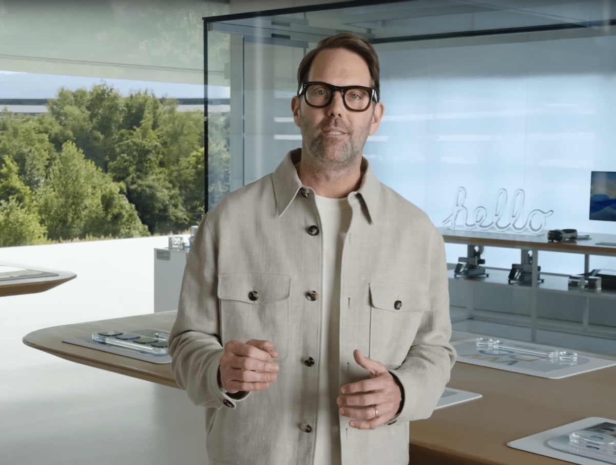
It just makes so much sense.
It just makes so much sense.
With regard to Steve Jobs I'm responding to some that say that he would not have liked Tahoe. I think he would have.
Exactly. ‘YOU THINK…’
Not what he thinks. He is dead. The only thing we can assume is he would not have allowed Tahoe to ship in that broken state because no macOS has shipped in such a bad state since Cheetah and we know he really got angry about Cheetah’s bugs and missed deadlines.
Does this include "Steve would never have allowed this" and "Steve would not do that", along with his permanent rolling in his grave from 2011 onwards? Because there are like 30 such statements on MR per day.
Of course. People who speak for the dead are only speaking for themselves. Nobody knows what a deceased person would have done. Some people lose standards and discipline with age. Look what happened to Elvis and many others.

Onlyuseapple
Suspended
I for one happen to really like macOS Tahoe. I have not had any of the issues others have had, it works perfect for what I do with it, and for that I am thankful. I am going to be interested in seeing what macOS 27 has for us if it will be made available for the m1 series, which at this point I see no reason it wouldn't be, the m1 is still stupid fast even with only 8gb of ram in MY use case and so far extremely happy with the m1 MacBook Air I got Monday afternoon, and with Tahoe that I installed on it Monday night after getting home with it.
That's not to say that others have not had problems with it, and I am wondering if the majority of people who are having issues with Tahoe are using it on an intel system as I tried to run it on a virtual machine on my i7 iMac and it would not run in a virtual machine, although it is the first time I ever tried to use a virtual machine so it could have been user error as well.
In MY opinion, I like Tahoe better than sequoia and even Sonoma although they were also very good versions of macOS, so it may come down to personal opinion which is fine.
That's not to say that others have not had problems with it, and I am wondering if the majority of people who are having issues with Tahoe are using it on an intel system as I tried to run it on a virtual machine on my i7 iMac and it would not run in a virtual machine, although it is the first time I ever tried to use a virtual machine so it could have been user error as well.
In MY opinion, I like Tahoe better than sequoia and even Sonoma although they were also very good versions of macOS, so it may come down to personal opinion which is fine.
I for one
for what I do with it
That's not to say that others have not had problems with it
In MY opinion
so it may come down to personal opinion which is fine.
I for one.
Give your post a gold medal.
In my opinion.
For what I do with it.
It’s a shame operating systems are developed for millions of people and not just one guy with a used cheap M1.
Onlyuseapple
Suspended
Out of respect, I will not reply the way I was going to. If you do not like the fact that I got an awesome deal on my m1 MacBook Air and have no problems at all with Tahoe, you can send me $2500 and I will go buy a high end MacBook Pro and still use Tahoe and enjoy it.I for one.
Give your post a gold medal.
In my opinion.
For what I do with it.
It’s a shame operating systems are developed for millions of people and not just one guy with a used cheap M1.
Out of respect, I will not reply the way I was going to.
Get a sense of humor.
The issue was you couched your post in a half a dozen caveats so hard that it discredited the whole post.
It also gave the impression you created an account to gaslight people who complain about bugs and performance. You attempted to pass the blame to Intel Mac owners, but that’s a real weak argument because usually the older the Mac is the better the upgrades are for it because many initial bugs get fixed with each OS update.
Not just that - this UI experience actually looks like someone dressed like this 🙂I'm not surprised that the person who designed Tahoe dresses like this:
View attachment 2617414
It just makes so much sense.

throAU
macrumors G4
It's clear that the next generation of useless engineers are completely taking over those that built the iPhone and OS X, and it's a sad day.
I have never thought I would say I would be installing garbage from Apple, but here it is. OS 26 Tahoa is truly garbage and an affront to what Jobs and Ives built.
You can see the carelessness and horrible work throughout. Non cohesive designs, BUGS EVERYWHERE, loss of caring of whats going on behind the hood, and chasing visual eye candy over function.
Its sad.
I cant even get my tabs to work correctly in safari and have to access the sidebar to access them correct (icons bugging out etc).
Apple really needs to sit down and fire half its team and spend a whole major version update just clearing the junk that has been built up and going back to building functional systems first, we have reached windows Vista level of garbage...
Don’t dispute the bugs.
I still find Tahoe (and iPadOS 26 for that matter) better to get work done in than previous versions.
Call screening, muc more reliable continuity/linked keyboard and trackpad/mouse between the two device etc.
Does the ui irritate me mildly? Sure.
But I’ll take the functionality gains thanks.
Speaking of vista. It had better functioning system search than any later windows version.
Vista was fine if you didn’t expect to run it on a potato.

droplink
macrumors 6502

droplink
macrumors 6502

droplink
macrumors 6502


fisherking
macrumors G5
what? everything isn't (at least on your terms) perfect? as it always was before tahoe... 😳🤣Evidence nr. gazillion and 2.
From Mail this time. Amateur hour.
EDIT: just thinking about this. i use music all the time; i use it to listen to music. i use mail constantly (you know; for email). i don't worry about minute GUI details when i'm using my mac; the things you pointed out don't interfere with using those apps. (and yes, apple could make some of these things better).
some things are obviously in need of fixing; others are subjective, and not issues, at all....
Last edited:
droplink
macrumors 6502
So I understand that this is complicated, but follow me here: The idea of on upgrade is to improve things.what? everything isn't (at least on your terms) perfect? as it always was before tahoe... 😳🤣
If you add more bugs or design flaws you are in fact in fact not improving, but making a downgrade, or in other words, a deterioration.
You are also welcome to make comments on the actual point that I was making, instead of going ad hominem.
fisherking
macrumors G5
yes, and upgrades never end; we don't get to that finite point where everything is perfect. all software is a work-in-progress, especially OSes. see? not complicated at all....So I understand that this is complicated, but follow me here: The idea of on upgrade is to improve things.
If you add more bugs or design flaws you are in fact in fact not improving, but making a downgrade, or in other words, a deterioration.
fisherking
macrumors G5
hmmm. as you yourself said: "So I understand that this is complicated"....So I understand that this is complicated, but follow me here: The idea of on upgrade is to improve things.
If you add more bugs or design flaws you are in fact in fact not improving, but making a downgrade, or in other words, a deterioration.
You are also welcome to make comments on the actual point that I was making, instead of going ad hominem.

Apple Knowledge Navigator
macrumors 601
Many of them were outraged by this new iMac. They thought it a silly design and how it was going to finish off Apple. Nobody was going to take this seriously.
…
People forget how OS X Cheetah caused outrage with its Aqua interface.
You’re comparing apples to oranges, and like yourself I was there at the time.
The iMac was indeed received with mixed response initially, but what we should be analysing is the user reaction, not the onlookers. In this regard, the iMac design was a success because it enabled a friendly, jovial appearance that allowed the core technologies to be visible, thus highlighting that computers didn’t need to be scary to newcomers.
OS X was a genuine shock to the computer user because it was radically different to preconceived notions of what an OS could look like. But, importantly, the concept was sound - and that is the key differentiator to Liquid Glass: the quality of the concept.
People comparing Aqua to Liquid Glass are missing an important point, which is that Aqua existed to enable depth between UI by contrasting elements with clear and obvious purpose.
An application window frame would use flat brushed metal to conceive notions of integrity and to reflect the material of the hardware, whereas many buttons use variations of liquid ‘aqua’ as a floating and contrasting area of depth. Simply, the use of flatness and 3D graphics were warranted and used well for a striking visual contrast.
Liquid Glass, on the other hand, is a single ‘material’ that is intended to transform to a range of elements, but in the process masters none of them because the properties of the material are not conducive to the broad range of on-screen actions. Apple has a taken a one-size-fits-all approach, not considering the implications on accessibility and usability.
fisherking
macrumors G5
because we've all lived with computers for years? grew up with them? or will be born into a world where a GUI like LG might be someone's first GUI? who doesn't know their way around their mac in 2026, raise your hand... (hmm, am not seeing any raised hands) 😉Liquid Glass, on the other hand, is a single ‘material’ that is intended to transform to a range of elements, but in the process masters none of them because the properties of the material are not conducive to the broad range of on-screen actions. Apple has a taken a one-size-fits-all approach, not considering the implications on accessibility and usability.
i get that you feel this way, but not everyone does. still, we go round-&-round. am happy, at least, that i am thoroughly enjoying using my mac, instead of stressing things that won't change (or won't change much)
Apple Knowledge Navigator
macrumors 601
because we've all lived with computers for years? grew up with them? or will be born into a world where a GUI like LG might be someone's first GUI? who doesn't know their way around their mac in 2026, raise your hand... (hmm, am not seeing any raised hands) 😉
i get that you feel this way, but not everyone does. still, we go round-&-round. am happy, at least, that i am thoroughly enjoying using my mac, instead of stressing things that won't change (or won't change much)
You’re altering the intent of my comments.
I did not suggest that any Mac users on this forum do not know their way around their computer in this year; my comments clearly pointed to newcomers and, specifically, the OS X era.
My comments comparing Aqua and Liquid Glass were to highlight the differences in nature, regardless of whether Liquid Glass is someone’s first UI or not.
I also did not suggest that everyone feels “this way”, as you put it.
Further, “we go round and round” because you choose to reply to my comments.