Shirasaki
macrumors P6
I’d hazard to guess there must be some sort of KPI in the UI/UX department where they must come up with X number of new design to receive a bonus.Just go back to SysPrefs from Monterey
Don't overspend resources on this
I’d hazard to guess there must be some sort of KPI in the UI/UX department where they must come up with X number of new design to receive a bonus.Just go back to SysPrefs from Monterey
Don't overspend resources on this
The AppleInsider report cited here states „Apple's decision to rearrange key system settings in macOS 15 (and likely iOS 18) was obviously created with the end user in mind. By lumping together related options, the company seeks to make it easier for its users to find specific settings.“
With the macOS 15 update that is set to debut at WWDC in June, Apple plans to rearrange "menus and app UIs," according to a report from AppleInsider. The System Settings app, which was last updated with macOS Ventura, will get one of the biggest updates.
With macOS Ventura, Apple renamed the System Preferences app to System Settings, introducing a design similar to the Settings app on the iPhone and iPad. System Settings in macOS 15 is said to feature a new organizational system based on "priority and overall importance."
The Notifications and Sound categories in System Settings will be moved lower in the list, with General settings moved up right under Network settings. Apple plans to move the existing Wallpaper and Displays sections into the same section with General settings, and Privacy and Security will be paired with Touch ID and Password and other relevant settings. Siri and Spotlight will be paired with Internet Accounts and Game Center.
Apple also reportedly plans to redesign the Siri menu bar icon, making a flat black and white icon to replace the current colorful icon, and there are said to be design changes coming to Calculator (a more iOS-like design) and Safari (a unified menu for page controls). Other rumored macOS 15 changes include a Printable Account Recovery Summary option, a new iCloud preference pane, and a "modern" user interface for AirDrop.
Apple's annual Worldwide Developers Conference keynote is set to take place on Monday, June 10, and it will see Apple unveil macOS 15, iOS 18, tvOS 18, visionOS 2, and watchOS 11.
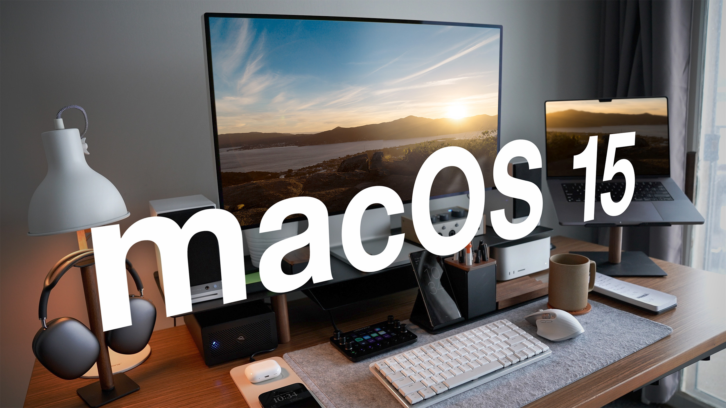
Article Link: macOS 15 System Settings to Get Design Overhaul
Yes, i had gotten so used to that … so used, that i never questioned why Quicktime appeared under “Internet & Network“ item. What i liked best was being able to see so many System „Preferences“ at once … it made and still make sense because Mac screen sizes begin basically where iOS screens end. Here is another example for my preferred layout as used in HighSierra:Make it look like this: (credit to iSMH at 512)View attachment 2381705
My first experience with macOS was the much beloved Snow Leopard <3I legit miss 10.4 era Aqua
Every single day for me. Changing wallpaper, adjusting when the Mac goes to sleep if I’m downloading a torrent, etc.How often do people actually change / use the settings app that any of this even matters? What settings are you guys constantly changing? I set things up the way I want, and they’ve been set up Ike that for decades, untouched. The only things that actually change on the regular are accessible in control center and/or the menu bar.
Try Balance Lock on App Store, it is free, and has fixed this problem Apple still has.Priority and importance according to whom? Certainly not the user. I constantly access Sound settings since macOS stopped keeping user prefs for L-R balance for my AirPods Pro. Every time I connect, the balance resets to default and I have to reset to accommodate my one-sided hearing loss. This was not a problem before macOS 14 and has become my most-used setting. My priority for my system and my needs has been demoted according to Apple's definition of priority, a very un-Apple approach to the user experience.

 apps.apple.com
I feel just the opposite, i wish all devs were forced to put their settings in the settings app so everything was in one place, with the same UI, and i didn’t have to try to figure out how the settings are laid out in Meta’s apps vs Spotify, etc. They’re all terrible, and every company puts the settings menu somewhere different and does their best to bury the ones they don’t want you to changeTHANK YOU. I've always hated that Apple's first party apps put their settings within the Settings app whereas every third party app has their settings within the app itself and only uses the Settings app to control certain permissions. Put app settings with the apps and leave the Settings app for system settings.
Did you ever look at iOS settings, it’s the worst aspect by far of iOS and iPadOS.System settings (and the similar print dialog box) is easily the biggest pain point of macOS since Ventura. They could do almost ANYTHING to change it and it couldn't possibly get worse. I'm thrilled to hear Apple are even thinking about it.
Cracks me up.Settings are one of the worst part of iOS. There are now way too many. Settings used to be a lot simpler back in the iOS 9 days. Now It’s dizzying. Whatever they do its sure to confuse us all over again. Not looking forward to mucking around in an alien settings interface once again.
It’s weird — they can’t even get settings to be nice.

