OptimusGrime
macrumors 6502
Looks like Beta 5 has added support for the Steam Controller. I haven’t tried it though.

Last edited:



Possibility for Switch 2 controller 🤞Looks like Beta 5 has added support for the Steam Controller. I haven’t tried it though.
View attachment 2651777


I see that that putting apps such as Mail and Safari into full screen mode means the very top of your content gets cut off. See 2 pics below. Bring things back to windowed mode fixes things.

Several friends of mine from Taipei use a green Taiwan flag on their walls.View attachment 2651636
Weird it works for me...


Haven’t seen any evidence unfortunately. To my knowledge the Switch 2 controller uses a different bt protocol (maybe btle?). Happy to be corrected.Possibility for Switch 2 controller 🤞
or just steam for now
You are correct. Apple has completely and totally lost its way regarding design. The whole thing with tahoe and GG is just pathetic. And 100% unnecessary.Apple has mixed two completely different design languages, and this might be the worst design decision they have ever made.
On the left, you can see the progressive blur from the Liquid Glass era. On the right, you can see the same blur with an old macOS toolbar outline placed on top of it. It looks like ****.
In light mode, the strip is barely visible, but it still creates more visual noise. In dark mode, the toolbar background is clearly visible, while the progressive blur remains visible on the panel next to it.
Apple had to put a background behind its supposedly brilliant Liquid Glass buttons just so people could actually see them. LMAO. This is ****ing ridiculous.
Apple’s designers have no idea how an interface should be rendered. Apple has no idea what it is doing.
What really pisses me off is that this toolbar strip appears ONLY WHEN YOU HOVER OVER THE TITLE BAR. THIS IS COMPLETELY WRONG.
Every button already jumps around with those annoying Liquid Glass animations, and now the entire toolbar background appears on hover too. This is a nightmare for a desktop operating system. It is incredibly distracting when you are just trying to work in peace.
What the **** is Apple doing? Why is Apple ruining the look of the entire operating system?
Dark mode now looks just as bad as light mode. This is a massive downgrade, possibly even worse than Tahoe.View attachment 2651901
I’ve hated some niche inconsistencies that bug me more than everyone else, but this looks good to me, personally.Apple has mixed two completely different design languages, and this might be the worst design decision they have ever made.
On the left, you can see the progressive blur from the Liquid Glass era. On the right, you can see the same blur with an old macOS toolbar outline placed on top of it. It looks like ****.
In light mode, the strip is barely visible, but it still creates more visual noise. In dark mode, the toolbar background is clearly visible, while the progressive blur remains visible on the panel next to it.
Apple had to put a background behind its supposedly brilliant Liquid Glass buttons just so people could actually see them. LMAO. This is ****ing ridiculous.
Apple’s designers have no idea how an interface should be rendered. Apple has no idea what it is doing.
What really pisses me off is that this toolbar strip appears ONLY WHEN YOU HOVER OVER THE TITLE BAR. THIS IS COMPLETELY WRONG.
Every button already jumps around with those annoying Liquid Glass animations, and now the entire toolbar background appears on hover too. This is a nightmare for a desktop operating system. It is incredibly distracting when you are just trying to work in peace.
What the **** is Apple doing? Why is Apple ruining the look of the entire operating system?
Dark mode now looks just as bad as light mode. This is a massive downgrade, possibly even worse than Tahoe.View attachment 2651901

I take back what I said. Experiencing same issue I had last year with 26 betas. Safari doesn't work for internet. Cisco VPN or any other app that uses the "in-browser/Safari" gateway to login (Teams, Outlook, etc) also does not work.Beta 5 broke my use of Safari. Claude tells me a sandbox profile issue - not a huge deal, I use many other browsers.
Otherwise, this beta has been running very smooth on my M1 Max Studio.



 forums.macrumors.com
Yes. I agree with you. It's so bad it's stunning this made it into production. Thank god responsible parties were fired and we can only hope that Ternus will usher a new era soon.Apple has mixed two completely different design languages, and this might be the worst design decision they have ever made.
On the left, you can see the progressive blur from the Liquid Glass era. On the right, you can see the same blur with an old macOS toolbar outline placed on top of it. It looks like ****.
In light mode, the strip is barely visible, but it still creates more visual noise. In dark mode, the toolbar background is clearly visible, while the progressive blur remains visible on the panel next to it.
Apple had to put a background behind its supposedly brilliant Liquid Glass buttons just so people could actually see them. LMAO. This is ****ing ridiculous.
Apple’s designers have no idea how an interface should be rendered. Apple has no idea what it is doing.
What really pisses me off is that this toolbar strip appears ONLY WHEN YOU HOVER OVER THE TITLE BAR. THIS IS COMPLETELY WRONG.
Every button already jumps around with those annoying Liquid Glass animations, and now the entire toolbar background appears on hover too. This is a nightmare for a desktop operating system. It is incredibly distracting when you are just trying to work in peace.
What the **** is Apple doing? Why is Apple ruining the look of the entire operating system?
Dark mode now looks just as bad as light mode. This is a massive downgrade, possibly even worse than Tahoe.View attachment 2651901
forums.macrumors.com
Apple has mixed two completely different design languages, and this might be the worst design decision they have ever made.
On the left, you can see the progressive blur from the Liquid Glass era. On the right, you can see the same blur with an old macOS toolbar outline placed on top of it. It looks like ****.
In light mode, the strip is barely visible, but it still creates more visual noise. In dark mode, the toolbar background is clearly visible, while the progressive blur remains visible on the panel next to it.
Apple had to put a background behind its supposedly brilliant Liquid Glass buttons just so people could actually see them. LMAO. This is ****ing ridiculous.
Apple’s designers have no idea how an interface should be rendered. Apple has no idea what it is doing.
What really pisses me off is that this toolbar strip appears ONLY WHEN YOU HOVER OVER THE TITLE BAR. THIS IS COMPLETELY WRONG.
Every button already jumps around with those annoying Liquid Glass animations, and now the entire toolbar background appears on hover too. This is a nightmare for a desktop operating system. It is incredibly distracting when you are just trying to work in peace.
What the **** is Apple doing? Why is Apple ruining the look of the entire operating system?
Dark mode now looks just as bad as light mode. This is a massive downgrade, possibly even worse than Tahoe.View attachment 2651901

My made in China 2023 MacBook Pro shows the Taiwanese flag emoji when I search for it. Not sure what's going on here.Thanks for checking. It's not worked for me for a while - I was wondering why Apple was ignoring my feedbacks 😁
I'll have to do some digging ...
EDIT: Apple allows all laptops manufactured in China to be controlled by the Chinese government (in a very minor way, but even so). I had to edit the hardware manufactured-in country and now I can access the Taiwan flag.
sudo defaults write /Library/Preferences/.GlobalPreferences.plist Country TW
 forums.macrumors.com

They don't know what they're doing...If you've been missing Tahoe's transparent toolbars, here's how to bring back more transparency in macOS 27:
View attachment 2652054
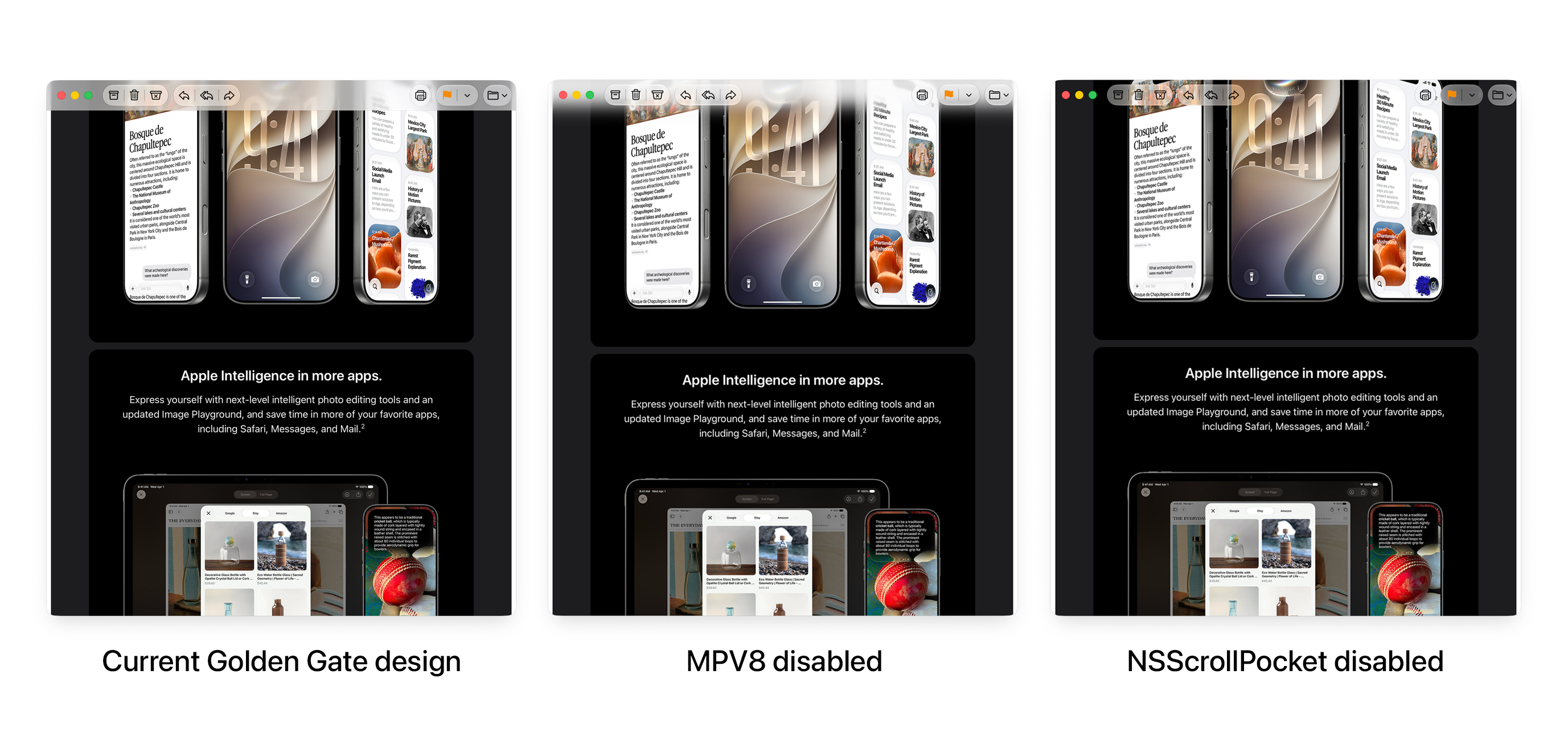
Here's how to bring back more transparency in macOS 27
If you were a fan of Liquid Glass in macOS 26, you may have missed the more transparent design of titlebars in macOS Tahoe. While the exact same design is no longer possible because macOS 27 removed the previous rendering pipeline, you can get pretty close. Softer scroll edge effect For a...
With the MPV8 default set to disabled, you can now have progressive blur everywhere:
View attachment 2652055
My made in China 2023 MacBook Pro shows the Taiwanese flag emoji when I search for it. Not sure what's going on here.


