Become a MacRumors Supporter for $50/year with no ads, ability to filter front page stories, and private forums.
actually this digression into what constitutes a valid criticism is enlightening , aesthetics will always be subjective I fear , but functionality depends on the design specification - a fully functional implementation of a design may fall short of the functionality envisioned (or desired) by the user leading to the question who is misleading who. I admit I tend to blame marketing but users are also capable of self delusion. you of course will decide for yourself on whatever basis you determine is appropriate. enjoy (no I haven't upgraded to Tahoe simply because I see no compelling reason to do so)
*** Full disclosure: My Apple tools do not use Tahoe or IOS 26. Neither have I used Tahoe or 26. And I have never personally seen them in action. My MacIntel MBP is on still on Big Sur 11.7.10 and my 13mini is still on IOS 18.6.2.

My comment on Tahoe is not informed by personal experience, and is without merit to those who have hands on experience.

Even so...

I am retired now but I spent many, many years writing advertising creative briefs, marketing-focused creative briefs, and product planning briefs.

But as I read your comments... you made me recall my creative brief writing days. And you made me wonder about the creative briefs that resulted in Tahoe and IOS26.

Every bad creative brief that I have seen - if it and the output that resulted from it were approved despite being substandard - they always resulted in a message / promotion / product that was objectively compromised in some form, and that failed to achieve in the market place what the business needed it to achieve. I only ever saw bad creative briefs get approved:
1 - when the ego of the approving executive was more important than the brand or the business or the customer or the market data.
2 - when the approving executive was not one single person but a committee of people with disparate objectives and agendas.

Unfortunately, this happens quite a lot. Of course, you can have a great creative brief that results in a great message / promotion / product, and it may still do poorly in the market place due to other exogenous factors. I am not going there.

Effective creative briefs must set a very clear vision/mission with measurable and concretely defined boundaries, meanings, mandates, guidelines and rules for what is to be created. If one assumes that the designers/creatives actually follow the directives within the brief, then one can expect a creative output that will closely resemble the vision set forward in the brief after one or two revisions.

However, a weak brief with unclear vision or with undefined boundaries, mandates, and such... the output should never be approved as it would not pass user acceptance testing / user experience testing / customer satisfaction testing. Bad briefs that result in bad products that are pushed to market anyway end up dividing the customer base and hurting the business. And the company spends lots of time, and warranty labor and OpEx afterwards, doing damage control, doing product recalls, or releasing .1/.2/.3/.4 corrective software releases. (Half of my career was spent in Technology marketing in San Fran and Seattle, and the other half in marketing and product planning in the auto industry.) The tech company I worked for only released software updates for security issues, post launch. Prior to the Gold Master label being placed on the final iteration of software, they did hundreds if not thousands of hours of "hackathons" with employees, customers and partners to break the code and ID any bugs pre-launch. They did not release new betas of the same, already-launched code to correct what should have been caught prior to launch... because they caught stuff prior to launch. Beta was a name applied to new software code, not a name applied to a bandaid for the latest attempt to correct already released code.

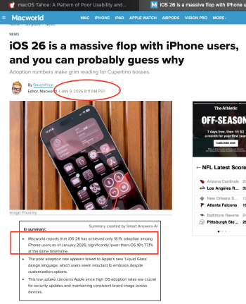
So, I truly wonder about the quality of the creative briefs behind Tahoe and IOS26 - and the quality of the executives that approved them. Especially when I think of the attached IOS26 article. I will assume that Tahoe download rates will be similar when that data is reported.
 

Attachments

  • Screen Shot 2026-01-22 at 2.46.12 PM.png
    Screen Shot 2026-01-22 at 2.46.12 PM.png
    855.2 KB · Views: 15
*** Full disclosure: My Apple tools do not use Tahoe or IOS 26. Neither have I used Tahoe or 26. And I have never personally seen them in action. My MacIntel MBP is on still on Big Sur 11.7.10 and my 13mini is still on IOS 18.6.2.

My comment on Tahoe is not informed by personal experience, and is without merit to those who have hands on experience.
not sure i understand this. i've not used (or really seen) Windows 11, so i would not want to comment on or critique it. i wouldn't even be on a Windows 11 forum (for that very reason).

criticism seems to be very popular, but criticism without experience seems (to me) pointless...
 
  • Love
Reactions: Kal Madda
Look at the Search field in your image, overlapped by scrolling items. If you move that list up another few notches Battery will fully underlay Search and make it illegible. Even worse if you scroll so the selected entry (General) is underneath.

View attachment 2597276

So bad.
Hmm… I see that problem in System Settings also when having ”Reduce transparency” enabled. That is pretty bad.
1769121525139.png
 
Are you saying that if people don't like Tahoe, they should just spend several hundred/thousand dollars on a new PC?
consider the possibilities. for example:

1. stay on current mac and don't update the OS to tahoe
2. move to tahoe and get on with life
3. sell current mac and put that money towards a PC
4. move to tahoe and complain endlessly on this forum

am guessing that, for most people, 1, 2 or 3 would be the most rewarding options
 
I think there's a strong difference between 'These UI elements are inconsistent/look bad and I don't like it' and 'there are many bugs in this OS that makes using my computer harder.' But writing off people's actual experiences, screenshots, videos, and so on as 'opinions' is exactly why we have so many of these threads.

Every time someone posts an issue they're having, there's a constant stream of condescending 'That's just your opinion, it's fine for me so it's a you problem why do we even talk about this?', then more people chime with similar issues and we get great conclusions of 'Ok fine yes, there are some bugs in your opinion but just live with it since Apple knows best.'

That thread gets pushed down after the fanboys shout down everyone else through endless 'polite' (read: condescending) posts. Someone else has the same issue, and they post a new thread instead of reviving an old one. Do we think Apple added a 'tint' switch to the display settings instead of accessibility just for fun?

I've been pretty open that I like the way LG aims to look (my homeassistant dashboard has been doing something similar with CSS for a few years now), but the bugs that I've experienced (not being able to use TimeMachine, buttons moving or vanishing, confusing visual hierarchy, and so on) are about the actual OS functions not working as well as they could.

It's one thing to upgrade from an OS to a new look and not like it, I think that happens to everyone at some point. It's another to upgrade and immediately have trouble reading the same menu text and tooltips as the old OS in the new OS or having your first time machine backup balloon to several hundred gigs (and never actually backup, even after a new drive/fresh OS install), or just completely refuse to work with your dock.
I simply just “ignore” those fanatics. They’re only few but they just make unnecessary crowds.
 
I'd recommend Ubuntu Linux over Windows. As bad as MacOS has gotten (because Apple only cares about iPhones), it's still better than the AI-written, major new bug update after update, that is Windows 11.
Unless you are technical and have compatible softwares you need in Linux, it’s hard for ordinary people to start using Linux intuitively.
 
I downgraded to Sequoia. Some people don't understand what is wrong with Tahoe, that's fine. For me it was just too much of a bad design and really what I feel is neglect. Frankly I don't know what is going on in the minds of the Designers and Execs.
I will wait and see what comes out at WWDC. If I feel there is still caring I will continue using Mac, otherwise I am out. Using Macs since 1999.
Oh man, I'm with you. True negligence on Apple's part. I've given Tahoe an honest 2 month try. Submitted around 40 issues via Feedback Assistant during that time before reverting to Sequoia. They've fixed around 10% of those so far. That's nice, but it's not enough.
 
Hmm… I see that problem in System Settings also when having ”Reduce transparency” enabled. That is pretty bad.
View attachment 2598259
That particular underlapping scroll bug seems to be fixed with the latest Tahoe 26.3 beta, so that now turning on 'Increase contrast' or 'Reduce transparency' fixes that particular instance. I don't know if this update has fixed this issue of underlapping scrolling items in other parts of Tahoe though, but it seems to me that it shouldn't happen anywhere in any operating system, including any variant of Liquid Glass, even without turning on increased contrast or reduced transparency.
 
Last edited:
Especially when I think of the attached IOS26 article. I will assume that Tahoe download rates will be similar when that data is reported.
iOS 26 adoption in this article is possibly being misreported.

Also, Apple has appeared to delay the "automatic rollout". (Anecdotal data just based on my wife's phone. I don't take action to update it, I just let it go automatically. iOS 17 and iOS 18 dropped on her phone in mid-November. iOS 26 didn't drop until right before Christmas. If that's the normal thing that's happening to "most people", it makes sense that numbers would be lower at the time of that article.)
 
  • Love
Reactions: Kal Madda
Just chiming here to say that after Tahoe's UI and bug issues (in addition to things like Gatekeeper which were introduced earlier) my next daily driver machine is going to run Linux.

Edit: I'm at the point that it's clear that someone saying they have no problem with Liquid Glass (especially on desktop) clearly isn't a designer. It's fine to have opinions about design and not be a designer, in the same way that it's OK to have an opinion about a movie without being a director. I'm just not going to trust you to make a movie.

Liquid Glass's legibility issues on their own, give me a headache let alone the clear text and UI placement bugs. I'm tired of the direction mac OS is going, making it harder to read text on my own computer and harder to install software on it. With Windows 11 an even bigger mess, I'm opting out, and if I had the budget right now I'd replace my MBP with something running KDE Neon (until KDE Linux comes out).
 
Last edited:
While I haven't really had any issues with Tahoe for the most part what does drive me nuts is window resizing with those damn rounded corners! So often I go to "pull" a window only to find I've missed the grab target as it was part of the floating space behind the round corner. This is my number one gripe with the new layout, and is a real, measurable regression. It is *not* intuitive to grab free space to resize a window vs the corner of the window.

My (distant) number two is icons in all the menus - it just looks terrible when half the menus don't have icons and even when they do they're often different icons for the same function between different apps. I'd love a setting to turn that off.

Other than that I don't really have much bad to say about Tahoe. Is it better than Sequoia (aesthetically)? Not really, but I don't hate it, not enough for me to downgrade anyway. I don't use dark mode however, so maybe I'd be more put out if I did by the sounds of it. Hopefully 26.3 onwards starts fixing some of the small paper cuts (well, I find them annoying, YMMV).
 
what is it you need fixed? just wondering. many ppl (even, sigh, outside of macrumors) are running tahoe just fine, and working (& playing). i can do all my work without issue.

what exactly are you concerned about?
It's just a small sample size of 1 and I have a friend who's been an Apple superfan since day one. He was the one with an iPhone before anyone else got one here (they weren't that common here in Germany in the beginning). He gave in and updated the other day and since then keeps going on about how he's going to switch to Linux. 😂 From what I saw it's not just the design. There are just so many bugs in many places. His audio interface not connecting how it used to. Sound not playing via his headphones even though everything is connected like before. Just to mention a few. Personally, I'm not a big fan of the super rounded corners of windows but that's something I probably would get used to. What really is an objectively bad design decision is the botched Music app. Having that now playing field super small overlapping the rest of the interface at the bottom and having a large empty space at the top where the now playing interface used to be just makes absolutely no sense...
 
Last edited:
Have you tried using linux lately? It's much easier to use now than it was even five years ago, especially Ubuntu.

Exactly. Linux has advanced a long way since the days of having to use the terminal just to get things working after installation. Especially since there are now immutable distributions that make it impossible to break the installation.
 
That particular underlapping scroll bug seems to be fixed with the latest Tahoe 26.3 beta, so that now turning on 'Increase contrast' or 'Reduce transparency' fixes that particular instance. I don't know if this update has fixed this issue of underlapping scrolling items in other parts of Tahoe though, but it seems to me that it shouldn't happen anywhere in any operating system even without turning on increased contrast or reduced transparency.
Good to know! Means they're working on it. 🙂

But of course this feels like something that should have been adjusted before 26.0 was released. But I think I'll give Apple some slack to iron things out. At least Tahoe has been stable for me overall if looking past the GUI adjustments that are needed.
 
Last edited:
Good to know! Means they're working on it. 🙂

But of course this feels like something that should have been adjusted before 26.0 was released. But I think I'll give Apple some slack to iron things out. At least Tahoe has been stable of me overall if looking past the GUI adjustments that are needed.
I give slight credit where slight credit is due. But really, all this Glass Nonsense should have been opt in.
 
  • Like
Reactions: whatnot
I give slight credit where slight credit is due. But really, all this Glass Nonsense should have been opt in.
The reality is that we now live within a microwave/techno world society were the people get restless. So they begin to complain to their favorite vendor of choice that their product looks stale and they are threatening to jump ship. Said company gives in to those demands and changes things even if those changes are not implemented correctly just to quell the stale excuse from their customers. We've been here too many times before, prior to iOS 7, then the UI switch with the new flat look in Yosemite. People seem to complain regardless.
 
The reality is that we now live within a microwave/techno world society were the people get restless. So they begin to complain to their favorite vendor of choice that their product looks stale and they are threatening to jump ship. Said company gives in to those demands and changes things even if those changes are not implemented correctly just to quell the stale excuse from their customers. We've been here too many times before, prior to iOS 7, then the UI switch with the new flat look in Yosemite. People seem to complain regardless.

We spend alot of money on Apple products.

Imagine you take your vehicle into the dealership, they do a firmware update to your vehicle as part of the service.

The vehicle performance isn't quite what it used to be, the controls on the infotainment center buttons have been moved around, less responsive.

Would you just suck it up and be silent?
 
We spend alot of money on Apple products.
I don't. I buy the cheapest most inexpensive Mac which is the base model Mini.
Imagine you take your vehicle into the dealership, they do a firmware update to your vehicle as part of the service.


The vehicle performance isn't quite what it used to be, the controls on the infotainment center buttons have been moved around, less responsive.

Would you just suck it up and be silent?
None of that matters. The computer powers on, it works and it functions basically the same. People cry for change and when they get it, they then complain they don't like the change. This is a pattern with just about every tech company. Google is no different, they changed the look of all their icons where they all blend in and it's hard to tell them apart. But you know what? You learn to adjust and move on.

People complain that Apple has lost its way and they just happened to produce the worse version of [insert latest OS]. A year later the newest OS is the worse and the previous OS which was hated on the forums is now considered to be their best effort.

This is a recycled first world problem that happens just about every year on this forum with iOS, iPadOS, macOS etc. I can't run macOS 26 and I would like to but my 2018 Mini doesn't support it.
 
The reality is that we now live within a microwave/techno world society were the people get restless. So they begin to complain to their favorite vendor of choice that their product looks stale and they are threatening to jump ship. Said company gives in to those demands and changes things even if those changes are not implemented correctly just to quell the stale excuse from their customers. We've been here too many times before, prior to iOS 7, then the UI switch with the new flat look in Yosemite. People seem to complain regardless.
The big difference here is that it BREAKS SO MANY rules of accessibility. Rules do not change just because customer wants a new OS design. They stay EXACTLY the same.
 
I say forget it, learn unix - single user boot into Darwin (it will be helpful to know how to code at this point) and get to work, those annoying ui problems (user interface or is short for urinary tract infection) will be history
 
Register on MacRumors! This sidebar will go away, and you'll see fewer ads.