Become a MacRumors Supporter for $50/year with no ads, ability to filter front page stories, and private forums.

MacRumors

macrumors bot
Original poster


Apple released macOS Tahoe last September, but despite two point updates since then, it is still struggling to resolve an embarrassing interface issue in Finder that appears to have been introduced with its Liquid Glass redesign.

macOS-Tahoe-Finder-Bug-Underscores-Apples-Slipping-UI-Polish-Feature.jpg

If you updated your Mac to macOS Tahoe and you prefer to work in Finder's column view, there's a good chance you've been frustrated by the glitch, which developer Jeff Johnson has been admirably tracking over on his blog.

macos-tahoe-finder-column-view-bug3.jpg
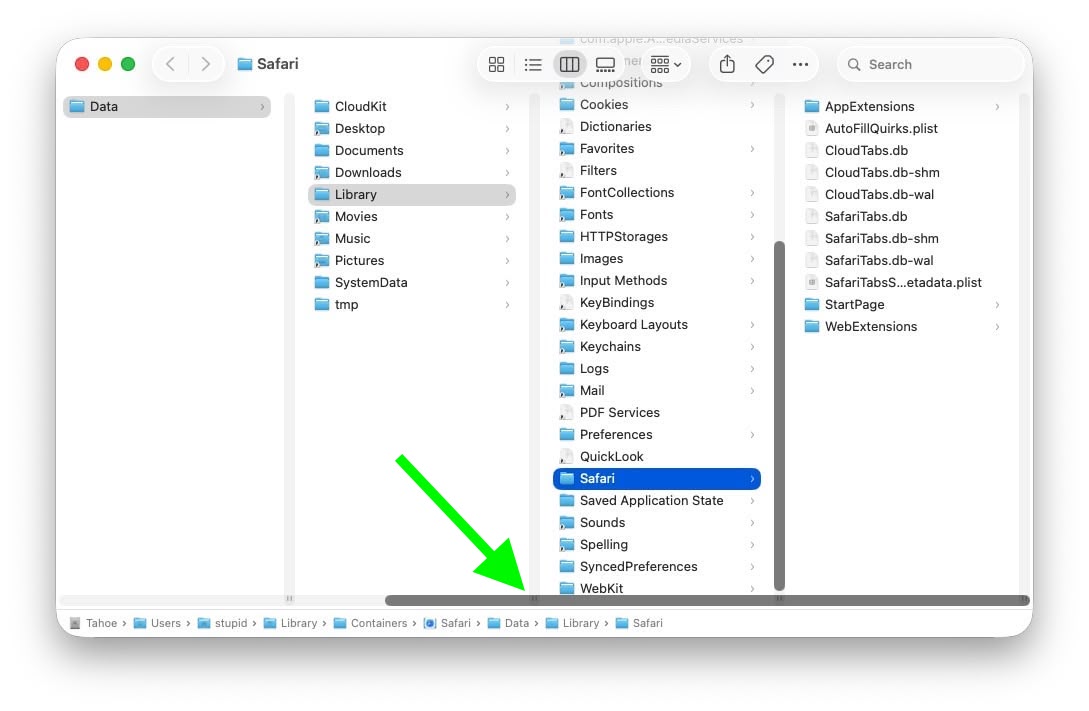
Scroll bar blocking column resize handles (Original image: Jeff Johnson)

At the bottom of each Finder column are handy little resize handles allowing you to expand or reduce each column as you see fit. But in macOS 26 and macOS 26.2, when scroll bars are set to "always show," the horizontal scroll bar at the bottom overlaps and covers those handles, so you can't click them to adjust column widths the way you could in earlier macOS versions like Sequoia.

macos-tahoe-finder-column-view-bug2.jpg
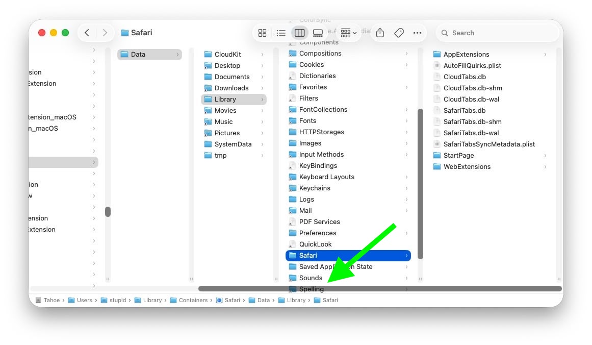
Scroll bar occluding column content (Original image: Jeff Johnson)

With the recent release of macOS 26.3, Apple attempted a fix. The vertical scrollers were shortened so the resizing widgets now sit above the horizontal bar and are technically clickable again. Unfortunately though, as Johnson points out, the horizontal scroll bar still overlaps file names in the view, causing it to regularly obscure content. Moreover, if you hide the path bar and status bar, the layout leaves a weird amount of empty space below the scrollers, making the whole thing look unfinished (see image below).

macos-tahoe-finder-column-view-bug1.jpg
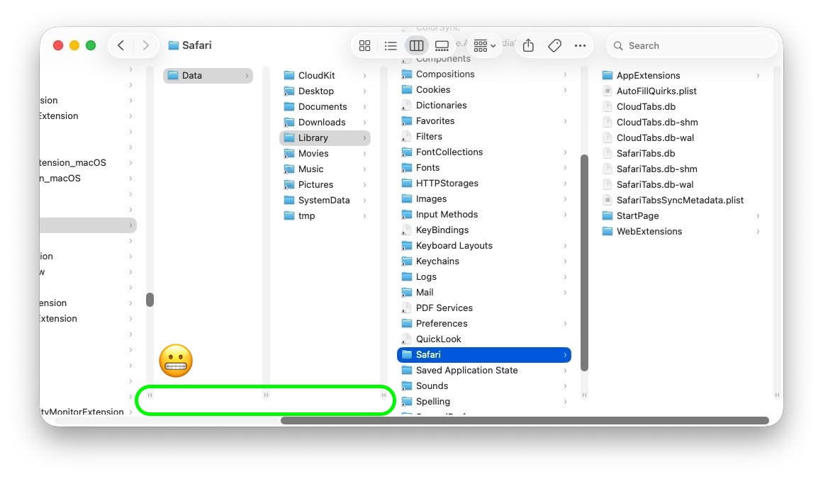
Column resize handles suspended in mid-air (Original image: Jeff Johnson)

Johnson's take is basically that while the most disruptive bug is less bad now, the overall column view layout still feels half-baked – especially for anyone who keeps scroll bars always visible.

As Daring Fireball's John Gruber points out, it's an embarrassing fudge for a company that used to pride itself on pixel-perfect settings across its Mac operating system.

At this point, it's unclear when Apple will manage to iron out the UI irregularities introduced by Liquid Glass. macOS Tahoe‌ 26.4 is likely to be released in March or April, and could introduce some new Siri features, though at least some of the capabilities that we were expecting may have been delayed, depending on who you believe. The update is also expected to introduce new emoji characters.

Article Link: macOS Tahoe Finder Bug Underscores Apple's Slipping UI Polish
 
Last edited:
"Pixel perfect"? Still waiting for that fix on the annoying Tahoe Dock Folder jump issue (when Dock Magnification is enabled, the Dock Folder abruptly jumps approx. 10-15pixels down as the user moves the cursor after a brief pause). FB20761846, opened in October, 2025.


It feels like macOS has become Apple’s lowest-priority product. Lately, many of the updates seem mostly cosmetic rather than meaningful improvements. In some cases, it even feels like stability has declined, with more bugs and small issues creeping in. Safari keeps crashing almost every day and some websites are not even working properly in Safari. Every Mac user needs Chrome installed as well as Sarfari is so useless following web-standards.

How about the bug where you save a file/screenshot on the desktop and the icon/file not appearing until you "Reboot" Finder och save another file to the desktop so it "refreshes" the view. Insane!

QuickTime is another example, it feels like a relic from decades ago. Why hasn’t Apple replaced it with a modern, unified “Video Player” app? What person born after year 2000 knows what "Quicktime" is? There are still many legacy elements throughout macOS that make the system feel dated, especially when compared to the polish and cohesion of iPadOS.
 
Not seeing this.as soon as I start scrolling, the grab handles move up so the scroll bar doesn’t cover them. Similar with path bar enabled/disabled. It looks like the view doesn’t automatically redraw when toggling some of these features, only when you begin to scroll.
 
  • Like
Reactions: G5isAlive
This is actually extremely common for devs (not just apple) to forget about the always show scroll bars settings. Because most trackpad users don't use this setting. Even if you use a mouse, chances are if you have a scroll wheel or anything like that, you don't use this setting. It is meant for old school mouses, or people who still prefer the workflow associated with an old school mouse. I've been at more than one company where this oversight has caused UI bugs.

Apple absolutely SHOULD fix this. But I'm not surprised this tripped them up too.
 
Am I doing something wrong? I use column mode all the time but I don't have or need those resize handle, I can just grab the column anywhere and resize it...
Same. I still use Ventura. It's been like that for years, I've never seen these resize handles before. Also, the side scroll bar shows up over the text, but I never have it set to 'always show' because that is unnecessary. A trackpad will just let you scroll sideways with a gesture, so there's no need to click and drag a scroll bar.

I get that MacOS has issues, but this is not really that different to previous versions. I think the file names disappearing under the menu bar at the top looks more like garbage.
 
Ok I'm going to say this about Tahoe - I'm a column view guy, and for every single iternation of macOS, I couldn't just have the column width adjust to the width of a file name - and now for some reason it works.

Now as for all the other issues on Tahoe.... some are gone, some remain. My M1 Max seems to be having some OS hanging and freezing that I have never seen before in my 20+ years as a mac user (maybe apart from when using Fusion drives!)
 
The focus and priority at Apple is on what:
  1. brings in the biggest revenue
  2. has the potential to be monetised down the line
  3. can be removed or repackaged in a way that will increase revenue
  4. will keep shareholders happy (i.e. always non-product related)
Everything else needs to be just good enough. So design decisions are neither here nor there.

This has been the case for over a decade and it's picking up pace.
 
At the bottom of each Finder column are handy little resize handles
There's a what now? I just have a clean vertical line I can grab anywhere? In principle I'm aligned with this article: Apple stuff has to "just work" and their raison d'être is to deliver near-bug-free, near-perfect, delightful user experiences, and it's valid to discuss and debate where they achieve this and where they fall short. I just don't "get" this specific issue myself. Eh well.

Screenshot 2026-02-13 at 21.00.23.png
 
I would like a Group by Folder option in Finder.

The current options for Group by are: Name, Kind, Application, Dates, Size, Tag.

File explorer on Windows has an option for grouping by folder.
 
Register on MacRumors! This sidebar will go away, and you'll see fewer ads.