Become a MacRumors Supporter for $50/year with no ads, ability to filter front page stories, and private forums.
The menu of sizes ranges from 1 to 7. In at least one context, the default is smaller than the mid-point.

An unintended consequence of the recent reduction? I wonder.
 
From a wiki (the the original was arn's, these quotes may be from other editors):

Restore the functionality and compactness of the forum page.

Is https://forums.macrumors.com that page? https://forums.macrumors.com/posts/21509595 suggests addition of the quick navigation menu.

Or, did the request relate to a variety of interfaces within the forum?

Add automatic post merging for consecutive posts.

Computed automation too often lacks the human touch that adds value to a post. Automation will produce dislikable mixtures; https://forums.macrumors.com/posts/21402595

Add button to 'Cancel' the post you are composing deleting any auto-saved text and multi-quote data

Please, no; Cancel must not lose multiple quotes.
 
I'd welcome a quick way to purge all quotes

So would I – I often used that feature with vBulletin – but that must not be confused with 'Cancel'.

Cancel is too ambiguous a word. For some users, there'd be unexpected loss. Wastes of time, losses, caused by ambiguous systems are never acceptable.
 
It seemed to work well in the old forum

Things were very different, cruder, with vBulletin. I suggest waiting at least another month before making any decision about reintroducing things that suited vBulletin and/or the old design. Allow plenty of time for people to appreciate the new features and design before allowing computer-generated, careless interference with styles of writing.

At least: any alteration of an author's content, by someone or something other than the author, should generate an alert – probably a red alert.
 
Last edited:
Things were very different, cruder, with vBulletin. I suggest waiting at least another month before making any decision about reintroducing things that suited vBulletin and/or the old design. Allow plenty of time for people to appreciate the new features and design before allowing computer-generated, careless interference with styles of writing.

At least: any alteration of an author's content, by someone or something other than the author, should generate an alert.

The old system would have merged the two consecutive replies you have just made into one post with a grey dotted line separating the merged posts if they had been posted within 5 minutes of each other. I don't see a problem with that.
 
The old system would have merged the two consecutive replies you have just made into one post with a grey dotted line separating the merged posts if they had been posted within 5 minutes of each other. I don't see a problem with that.
I agree, it was a nice feature. Of course, there are advantages to not merging posts as well.
 
  • Like
Reactions: grahamperrin
With vBulletin I often waited (a false wait, an interruption to trains of thought) to avoid the computed mergers.

Whenever I did allow a computed merger, I always proceeded with at least one edition, to correct what the computer had got wrong.

… "Cancel" which does delete the multi-quotes existing seperatly …

To clarify: if I use the multi-quote dialogue to remove some of the quotes before insertion, then does later cancellation of the post remove what was inserted in the draft? Or more than what was inserted?

I'm reminded of this part of the wiki:

Clarify how multi-quoting works.

Generally

I'd like to see what will happen, over time, as a result of untitled posts
 
Last edited:
Pagination

… 25 posts per page (I normally use 100) …

… 80+ posts per page...

… hate 25 posts per page and loved 100. …

plugin available -- looking into

– thanks to @arn and all concerned.

This topic, to date, non paginated and minimalist
(The green 'opening poster' badge customisation does not appear beyond the 25th post. I don't expect such things to work with AutoPagerize. In any case, the opening poster here should be easily recognisable.)
 
  • Like
Reactions: MagicBoy
Printing

2015-05-30:

Low priority: the style for print could be improved. The six-page volatile edition of this topic yields a twenty-one page PDF, with unnecessarily large avatars and so on (a wide left hand column).

How do I do a print? Previously I could do a print view and then do like 40 posts per page and print. seems to be missing?

I vaguely recall a reply, maybe from a member of staff, indicating that there was not (or not yet) a print-oriented style.


Generic avatars

… get stone rid of generic avatars … It might be a challenge, or you could use something different, like squiggly lines depicting a dialogue …

… I find these genetic avatars to be much nicer:

generic-avatars-png.564629

Printouts (PDF) here include some greyscale in lieu of colour.

The avatar above is lovely, and may be most commonly associated with @arn. Seen against someone else's name, that de-coloured version of arn's avatar could be misinterpreted as having special meaning (not generic meaning).


Without avatars (member-provided workaround)

I have stumbled across only one interface that is circle-oriented:

screenshot 2015-06-27 at 22.13.49.png


Postscript – correction

The original @ reference to arn was misinterpreted as the wrong arn. I'll explain in a separate post.
 
Last edited:
After the redesign, I'm receiving very few (almost none) notifications although every one of my "watched threads" request an e-mail notification. Any reason for this or what's the remedy?
 
Member areas of activity

https://forums.macrumors.com/members/audentio.928466/#postareas
https://forums.macrumors.com/members/doctor-q.12149/#postareas
https://forums.macrumors.com/members/redheeler.926659/#postareas … and so on. Thanks to @redheeler for the hint about this enhancement.

There's unnecessary emphasis (bold) on the link to each area.

(Also, not yet sufficient contrast between the dark background and dark text of the header, so I guess that the enhancement is very recent, with work in progress – thanks!)
I will suggest one improvement to this as well. It would be nice if the area posts counts could link to a search of the posts made in that area.

Regardless, it's nice to see a feature I've wanted for so long :)
 
  • Like
Reactions: grahamperrin
After the redesign, I'm receiving very few (almost none) notifications although every one of my "watched threads" request an e-mail notification. Any reason for this or what's the remedy?
Unscribe and then re-subscribe with email notification. That will fix your problem
 
  • Like
Reactions: grahamperrin
Saved searches, search again

With vBulletin, I never found a reliable way to save.

XenForo may be better suited to saving but in six weeks, I haven't found a way that's intuitive. A selection, based partly on my browser history:

https://forums.macrumors.com/search/26636/?q=stickiness&o=date&c[title_only]=1&c[node]=66
https://forums.macrumors.com/search/26665/?q=mark+read&o=date&c[node]=66&c[user][0]=109331
https://forums.macrumors.com/search/98133/?q=search+separator&t=post&o=date&c[thread]=1888113
https://forums.macrumors.com/search...t=post&o=date&c[node]=66+82&c[thread]=1888113
  • represents multiple criteria, including a thread, in the search again form
https://forums.macrumors.com/search/169035/
  • has nothing overtly criteria-related in the URL
  • represents a search criterion
  • search again represents multiple criteria.

https://forums.macrumors.com/search/169270/
  • performed a few seconds ago
  • represents none of the search criteria
  • search again does not work – there's simply a form, with none of the previously given criteria
– and if it helps, the criteria included the name of a member.
 
Last edited:
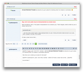
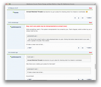
Bug: one's own posts may be misrepresented as unread (new)

Write something, post it. The system misrepresents it as unread by you. That's illogical; what's written by you is always read by you.

… the "Go to first unread" button is being displayed below my post. Clicking that button takes be back to your post, which I quoted in my post. This is weird.

I'll take a closer look at that …
 
Unread Watched Threads has become my go to place for checking what I've missed or overlooked.

Was there ever a better go to place for that task?


Some read posts may be misrepresented as unread before and after an inline reply

For @ardchoille50:

I'll take a closer look at that …

Before drafting a reply:

2015-06-28 16-29-35 screenshot.png

Drafting:

2015-06-28 16-33-19 screenshot.png

Done:

2015-06-28 16-33-42 screenshot.png

In that example, three of three things that were read are misrepresented as unread.

Hint

Users who are puzzled by the misrepresentations can use the More Options… button.

Observations

Marks of newness may may, as expected, disappear when a page is reloaded.

Inline replies do not reload the page.
 
Last edited:
I'm not sure why email notifications wouldn't be working. @AppleDApp and @mafaky

Are you getting any emails from the forums?
 
Far right, near the top. With some browsers, a click on the blue flag presents a menu. With others, simply pointing at the flag presents a menu.

Either way, the primary menu item is not vertically below the the heading of the menu (not vertically below the flag). And so, for the end user, there's unnecessary movement to the left.

Enhancement request

Please improve the ergonomics by using right for alignment of the Alerts menu item.
 
Register on MacRumors! This sidebar will go away, and you'll see fewer ads.