It jumps to the first unread post when you enter a thread (meaning, clicking just on the title of the thread). If you commented, and somebody (or many people) commented after you, next time you enter a thread, it brings you right to the page/comment you haven't read. If you'll enter a thread again (if nobody commented or if you read all comments), you'll be brought to the first post of the thread. Thus, there is no need to click on those buttons you've mentioned.I like the round avatars.
I'm concerned about the touch targets for the "jump to first unread post" links in the list of threads. Everything else looks like it was made with touch in mind, except for these super tiny barely visible blue dots. Are those adjustable somehow? They just seem incongruous with the rest of the design.
And, yes, the theme is designed for iPhones and iPads and other mobile devices and not so much traditional computers. Sorry, but that's the way the world is going.
Got a tip for us?
Let us know
Become a MacRumors Supporter for $50/year with no ads, ability to filter front page stories, and private forums.
MacRumors New Forums Design and Testing
- Thread starter arn
- Start date
- Sort by reaction score
You are using an out of date browser. It may not display this or other websites correctly.
You should upgrade or use an alternative browser.
You should upgrade or use an alternative browser.
- Status
- Not open for further replies.
tobefirst ⚽️
macrumors 601
It jumps to the first unread post when you enter a thread (meaning, clicking just on the title of the thread). If you commented, and somebody (or many people) commented after you, next time you enter a thread, it brings you right to the page/comment you haven't read. If you'll enter a thread again (if nobody commented or if you read all comments), you'll be brought to the first post of the thread. Thus, there is no need to click on those buttons you've mentioned.
Ah ha! I did not know that. Thank you! This is my first experience with Xenforo.
grahamperrin
macrumors 601
Topic listings: bold/strong titles and small circular dots
So it seems that the small circular dot is an indication that part of an unwatched topic, or part of a watched topic, is unread; the dot is complementary to the strong/bold typeface.
Appearance bug: where the title wraps, the dot does not appear at the beginning; it typically appears mid-sentence. A guess, this may be a vertical alignment issue.
Please make the dot appear at the beginning.
To jump to the start of a topic
Click the date.
… first unread post when you enter a thread (meaning, clicking just on the title of the thread) …
So it seems that the small circular dot is an indication that part of an unwatched topic, or part of a watched topic, is unread; the dot is complementary to the strong/bold typeface.
Appearance bug: where the title wraps, the dot does not appear at the beginning; it typically appears mid-sentence. A guess, this may be a vertical alignment issue.
Please make the dot appear at the beginning.
To jump to the start of a topic
Click the date.
grahamperrin
macrumors 601
Search results: a few thoughts
A mixture of posts and topics, but I dont know how many pages (of fewer topics per page) I must browse before I find a link to a topic.
No option to sort chronologically. Reversal is forced.
Theres more, but Im off to work now
Bye 🙂
A mixture of posts and topics, but I dont know how many pages (of fewer topics per page) I must browse before I find a link to a topic.
No option to sort chronologically. Reversal is forced.
Theres more, but Im off to work now
Bye 🙂
Attachments

zhenya
macrumors 604
Please check that http://xenforums.macrumors.com/thre...progress-in-the-decade-since-panther.1843899/ is open (if you have not already voted).
that page is one of the better looking examples of the new forum, especially the first post looks nice.
On IE11:

Im viewing in safari on macbook air 13"
If I could have the User CP in the new forum acting the same way it does here I could stomach the new place.
Is that too much to ask? 🙂
----------
and the zebra print is driving me crazy 😡
and there'd errors are an annoying pop up in the vein of microsoft paper clip. Cant wait till this sort of stupid this is what you are doing visual feedback comes to driving cars. #dumbest**** Ever
----------
two minutes on the other forum and I can't stand it so came back here to read New Posts.
Am officially old. Back in my day, I remember when forums were readable and didn't give you a jarring pain in the brain and visual cortex.
Ok grandad
and I'm not that old 🙁
In the established forum and in the test forum, seek the following words:
measurements presented GoSquared
In the established forum there are two matches, both within the timeframe of the snapshot. The second is an exact match for each word but there's no highlighting, maybe because the word matches are within the title of a reply.
In the test forum, no matches are found.
If content is properly indexed, then failure to find the matching words at http://xenforums.macrumors.com/threads/is-yosemite-really-that-bad.1860215/page-7#post-21210094 is a bug.
I'm going to sit down and go through the rest of the responses later today.
this one, I know the answer for. Titles weren't originally imported into Xenforo. The search index hasn't been rebuilt since we did import titles. That's why it isn't found.
in other words, this will work as expected in the final run.
arn
grahamperrin
macrumors 601
roundup
Thanks (to everyone involved).
Titles, subject lines, search engines and rankings
Absence of prompts for titles will take some getting used to (for people like me). I guess that not bothering with titles is a sign of the times, with so few people paying attention to subject lines/titles.
Whilst use of bold/strong and/or other markup for an opening paragraph can give the visual effect of a title, I wonder whether abandoning titles will eventually have an unexpectedly negative effect on search results (Google and so on); on the ability of search engines to quickly and easily lead to a relevant (well-titled) post within a topic.
Ambiguity within/around alerts
Re http://xenforums.macrumors.com/conversations/report-acknowledgement-rejection.807521/#message-807523 (part of a private conversation in a volatile area), please see the image below. I redacted a little but (as mentioned in that conversation) there's neither a link nor an identity.

Separators within breadcrumb trails, versus copying
From http://xenforums.macrumors.com/threads/test.1880069/page-2#post-21248624:
Links to topics
Compare with the second attachment to this post.
A suggestion: within each result that is a post, include a link to the topic (its start, not an unread point); feduce the need to click repeatedly.
I'm going to sit down and go through the rest of the responses later today. …
Thanks (to everyone involved).
Titles, subject lines, search engines and rankings
… no post titles …
Absence of prompts for titles will take some getting used to (for people like me). I guess that not bothering with titles is a sign of the times, with so few people paying attention to subject lines/titles.
Whilst use of bold/strong and/or other markup for an opening paragraph can give the visual effect of a title, I wonder whether abandoning titles will eventually have an unexpectedly negative effect on search results (Google and so on); on the ability of search engines to quickly and easily lead to a relevant (well-titled) post within a topic.
Ambiguity within/around alerts
Re http://xenforums.macrumors.com/conversations/report-acknowledgement-rejection.807521/#message-807523 (part of a private conversation in a volatile area), please see the image below. I redacted a little but (as mentioned in that conversation) there's neither a link nor an identity.
Separators within breadcrumb trails, versus copying
From http://xenforums.macrumors.com/threads/test.1880069/page-2#post-21248624:
HomeForumsiPhone, iPod, iPad, Apple WatchApple WatchHomeForumsiPhone, iPod, iPad, Apple WatchApple Watch
Links to topics
A mixture of posts and topics, but I don’t know how many pages (of fewer topics per page) I must browse before I find a link to a topic. …
Compare with the second attachment to this post.
A suggestion: within each result that is a post, include a link to the topic (its start, not an unread point); feduce the need to click repeatedly.
Attachments

Last edited:
grahamperrin
macrumors 601
Do you have an alternative suggestion?
Generally: I find the XenForo Community interface to search more intuitive.
Specifically: for accessibility (including magnified cursor) and for other reasons, I strongly suggest not having two different things in the same position. The arrow pointer and/or glove pointer may effectively prevent the viewer from realising the change to what's beneath the pointer. Animating the change (did I see a swipe from left to right?) is not an ideal workaround.
Thanks again for your consideration.
The Doctor11
macrumors 603
Add the following to your user stylesheet:
Code:.avatar img{ -webkit-border-radius: 0 !important; -moz-border-radius: 0 !important; -khtml-border-radius: 0 !important; border-radius: 0 !important; }
On mine I have the corners rounded slightly, just by replacing "0" with "3px".
What is a user stylesheet?
That's correct. When it's set up, we might invite you to test again. Won't that be fun?The forum censoring isn't working.
Post
What is a user stylesheet?
It's a file containing customisations to CSS styles. Copy the text above into a new file, save it somewhere with a .css extension, and set it up in Safari > Preferences > Advanced.
The Doctor11
macrumors 603
That's correct. When it's set up, we might invite you to test again. Won't that be fun?
Haha I'm up for that test 😀
It's a file containing customisations to CSS styles. Copy the text above into a new file, save it somewhere with a .css extension, and set it up in Safari > Preferences > Advanced.
Thank you.
S.B.G
Moderator emeritus
It's a file containing customisations to CSS styles. Copy the text above into a new file, save it somewhere with a .css extension, and set it up in Safari > Preferences > Advanced.
I did that and they're still round when I view the new forums.
I did that and they're still round when I view the new forums.
Try quitting and restarting Safari.
I7guy
macrumors Westmere
I've accessed the new forum software on mobile (iphone 5) and windows.
On windows, and maybe I missed it going through the options, I find the color scheme to be lighter than the current website. Too light for my liking.
Also the space occupied by each post on xenforum is more than on the current website and not as well delineated.
So, two requests:
1. ability to change the theme,
2. ability to somehow customize the post area to add/delete content or maybe that is tied in with the ability to create a theme.
grahamperrin
macrumors 601
Emphasising (and ideally jumping to) well-liked posts within a topic
From an earlier topic:
XenForo aside, for a moment.
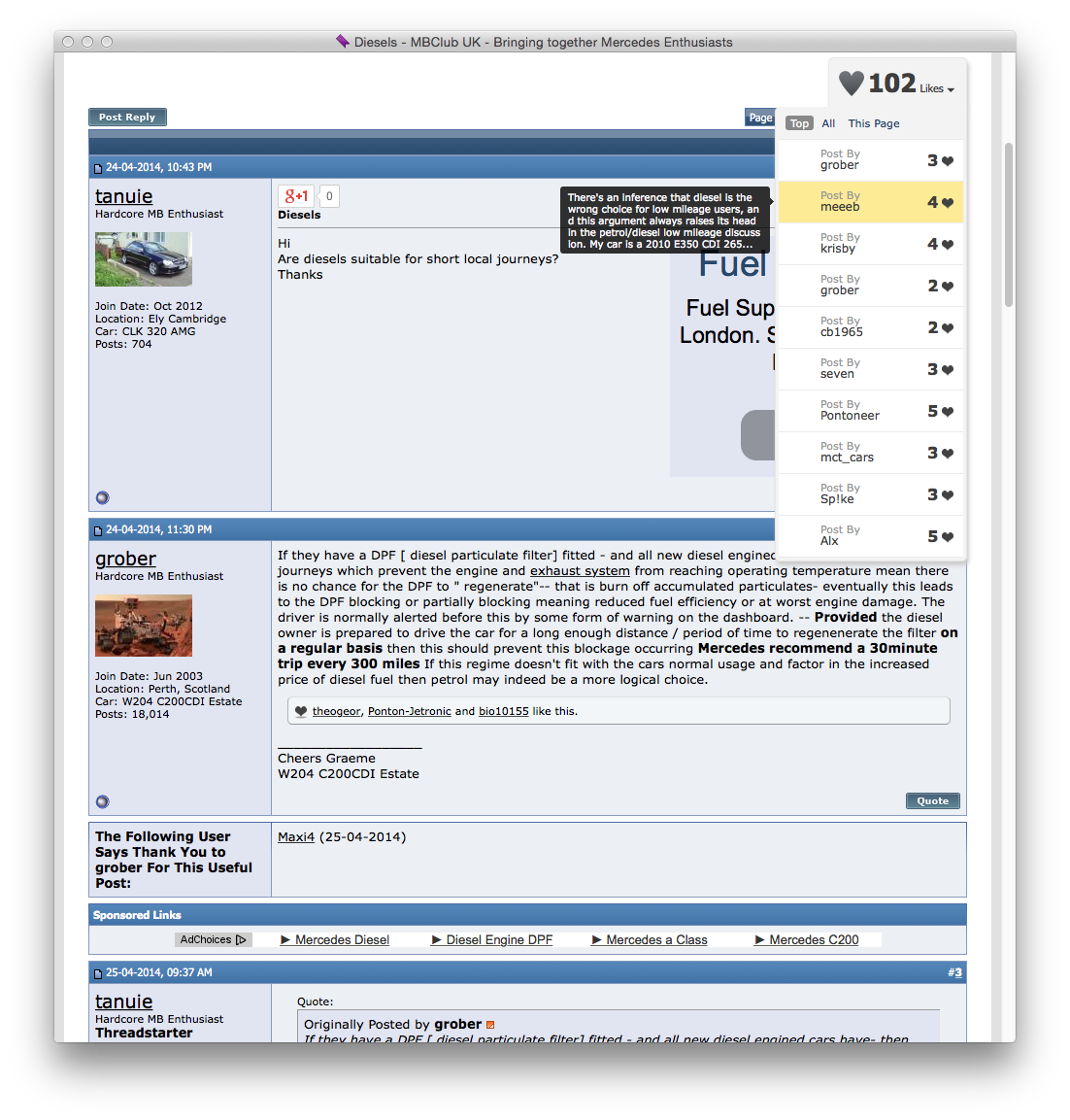
Consider this implementation, from a vehicle-related forum. Note what's at top right:
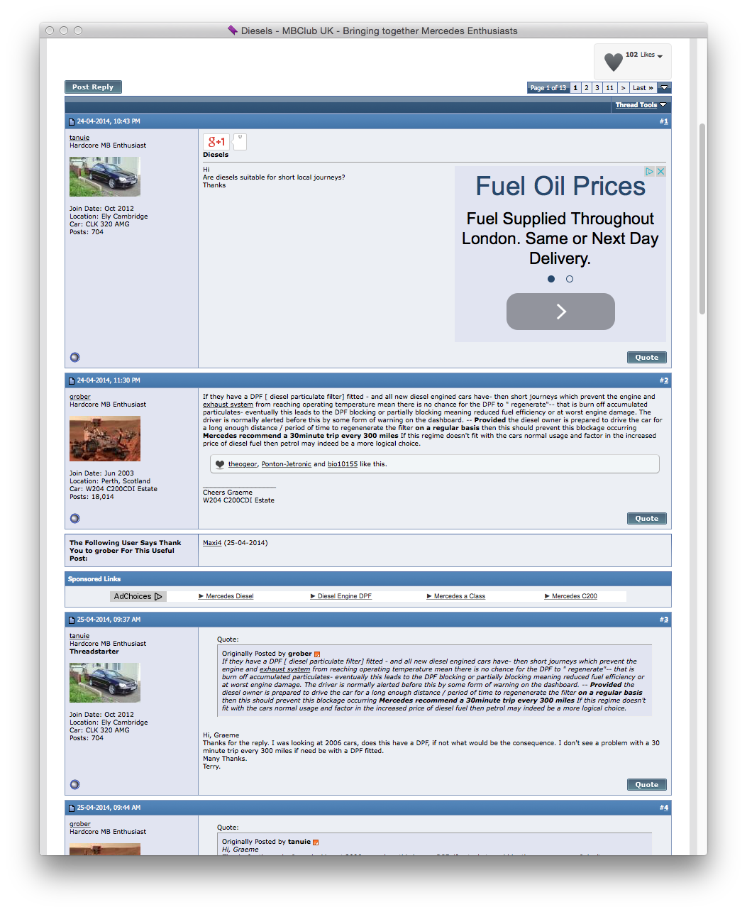
– that's a long topic (thirteen pages) with a reasonable amount of likeable content.
Click to reveal a shortlist of posts that are liked;
then point (without clicking) for a snippet from a post –
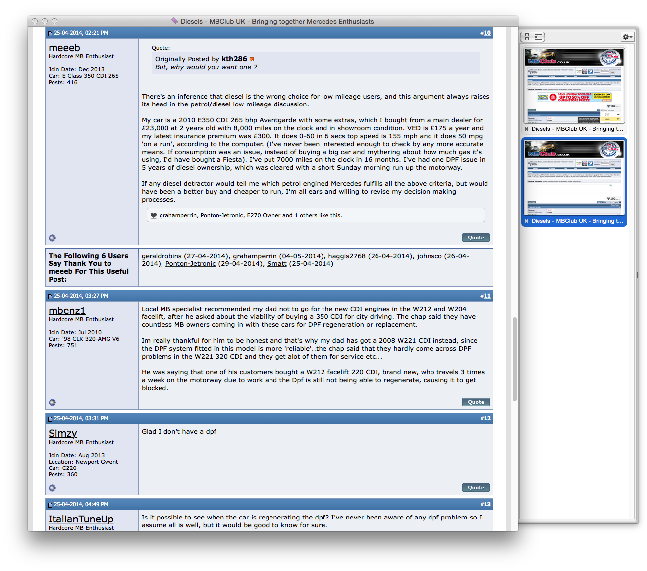
– then, if the snippet of text is appealing, click to jump to the post:
XenForo: identifying well-liked posts within a topic
I performed a few searches of XenForo Community (example) and sped through a few results but at a glance, nothing struck me as appropriate.
There was, for example, XenFans.com - Popular Content [v1.0.4 Beta 7] | xFTEAM Underground - XenForo Addons,Mods,Hacks, Skins and Support (2012) but that's quite different; it probably collated popular content from across a range of topics (not a focused list/summary within a topic).
If there is a suitable add-on, I wouldn't expect addition to coincide with migration. But it might be smart for the future.
----
Side note: the MBClub UK example originally appeared near the end of thanks-related https://forums.macrumors.com/posts/20506210/
From an earlier topic:
… Is there a way to view top rated comments in a thread created by anyone of us just like you can do from the posts on the front page?
XenForo aside, for a moment.
Consider this implementation, from a vehicle-related forum. Note what's at top right:
– that's a long topic (thirteen pages) with a reasonable amount of likeable content.
Click to reveal a shortlist of posts that are liked;
then point (without clicking) for a snippet from a post –
– then, if the snippet of text is appealing, click to jump to the post:
XenForo: identifying well-liked posts within a topic
I performed a few searches of XenForo Community (example) and sped through a few results but at a glance, nothing struck me as appropriate.
There was, for example, XenFans.com - Popular Content [v1.0.4 Beta 7] | xFTEAM Underground - XenForo Addons,Mods,Hacks, Skins and Support (2012) but that's quite different; it probably collated popular content from across a range of topics (not a focused list/summary within a topic).
If there is a suitable add-on, I wouldn't expect addition to coincide with migration. But it might be smart for the future.
----
Side note: the MBClub UK example originally appeared near the end of thanks-related https://forums.macrumors.com/posts/20506210/
Attachments


cambookpro
macrumors 604
I'm not really a heavy forums user - I only visit a few, so maybe I'm not best placed to give detailed feedback, but I thought I'd share a few thoughts about the new MR forums.
I think it looks really, really great - I was concerned that the navigation may be lost in a glossy new theme, however it looks like the same MR forum just designed for the 2010s. It's really easy to use, easy on the eye and quick across all devices.
I can't speak for every forum feature people use (I just turn up here, click on a few bits that look interesting then type some gibberish occasionally - I'm oblivious to everything else going on!), but generally browsing and viewing posts is a much better experience. It looks a lot more cohesive as a website - at the moment, the forums look like an add on to the site, almost an afterthought, but the new design ties everything together.
Contrary to some, I like the new circular avatars as it provides a much more uniform look, but each to their own.
I can only imagine the work it takes to migrate and test forums of this size, but keep it up and I look forward to using it permanently in the future!
grahamperrin
macrumors 601
Currently under Test:
Particularly annoying wherever a post is concise. See, for example, the attached screenshot; it exemplifies a poor balance between data and metadata.
I like cohesion.
I like the design and features at XenForo Community. I have no idea whether that area uses XenForo defaults; no idea whether third-party add-ons are used; I just like/love what I saw there a few months ago.
Now, with the first open test of the redesign for MacRumors Forums, I feel that a MacRumors-inspired theme has been added to a XenForo template (no surprise there) but critically, that addition has subtracted some of the goodness of XenForo.
Back to those wastes of space in content areas to the right of enlarged avatars. The annoyance may be reduced by adopting an approach that's more like XenForo Community.
Repetition (wastes of space)
For example:
-- is it essential to see texts such as those beneath every appearance of an avatar?
It is useful metadata, but the in-your-face repetition:
It should suffice to simply click on an avatar. Doing so presents metadata for the user, in a neat overlay.
Refrain from repeated in-your-face presentation of any of the metadata from that overlay.
The enlarged avatars are somewhat annoying.... At least we get a size bump to 96x96. Not the 100x100 that was promised, but still.
Particularly annoying wherever a post is concise. See, for example, the attached screenshot; it exemplifies a poor balance between data and metadata.
... It looks a lot more cohesive as a website - at the moment, the forums look like an add on to the site, almost an afterthought, but the new design ties everything together. ...
I like cohesion.
I like the design and features at XenForo Community. I have no idea whether that area uses XenForo defaults; no idea whether third-party add-ons are used; I just like/love what I saw there a few months ago.
Now, with the first open test of the redesign for MacRumors Forums, I feel that a MacRumors-inspired theme has been added to a XenForo template (no surprise there) but critically, that addition has subtracted some of the goodness of XenForo.
Back to those wastes of space in content areas to the right of enlarged avatars. The annoyance may be reduced by adopting an approach that's more like XenForo Community.
Repetition (wastes of space)
For example:
-- is it essential to see texts such as those beneath every appearance of an avatar?
It is useful metadata, but the in-your-face repetition:
- adds to the potential annoyance of the enlarged avatar
- leads to more wasted white space wherever a post is concise.
It should suffice to simply click on an avatar. Doing so presents metadata for the user, in a neat overlay.
Refrain from repeated in-your-face presentation of any of the metadata from that overlay.
Attachments

wrldwzrd89
macrumors G5
Just played with it for the first time. WAY better - I like this layout a lot. I'm looking forward to when this test becomes the regular forum!
OSXMavericks
macrumors member
XenForo customer here myself.
I think the permalink font/background could do with being a bit smaller. They are currently too big and I think it takes a lot of the emphasis away from the post message. First thing I see is the permalink number.
Overall really impressive tho. I always worry when a big forum says they are going to convert platforms because causally they do a half baked job. Not here tho.
Well done to the designer. With a few touches here and there this is easily my favourite XF style.
Thanks for all the feedback everyone.
When reading through the feedback, I mentally sorted things into:
1. Migration issues
2. Style bugs
3. Style issues
4. Xenforo (things behaving differently from vB)
Those are roughly graded in severity.
Things that will be fixed (before migration, I hope). #1 and #2. IE 11 bug. Any data migration losses. Clear style bugs. etc...
#4 is the lowest priority. Later, we can possibly add new features via custom built add-ons, but that's not going to happen immediately. We will wait to see what's the priority after the shift.
#3 - will be on a case by case basis as well. I agree, for example, that the Polls don't look great no the new theme. But it's not a such a critical feature that it will hold things up. But we'll look into it.
arn
- Status
- Not open for further replies.