Become a MacRumors Supporter for $50/year with no ads, ability to filter front page stories, and private forums.
Status
Not open for further replies.
From vBullletin private messages (PM) to XenForo conversations: loss of context

Conversation

… data migration losses. …

Probably already noted, but worth mentioning here: where private messages and replies thereto were migrated, there was no sense of conversation in the first open test. Specifically: everything that had a reply in vBulletin had a count of zero (0) replies in XenForo.

Without digging for a proper explanation, I suspect that the problem centres around the relatively clumsy vBulletin approach to private messaging.

Personally, I can bear the loss, because I avoided the clumsy interface and so, I found only three pages of single-message conversations in the first open test. YMMV; I expect some other users to shriek with horror at the notion of loss of context.

(It's not exactly loss of data, but some users might treat it as a showstopper.)

Generally

Thanks again. The prioritisation is sensible.
 
Conversation


Probably already noted, but worth mentioning here: where private messages and replies thereto were migrated, there was no sense of conversation in the first open test. Specifically: everything that had a reply in vBulletin had a count of zero (0) replies in XenForo.

Without digging for a proper explanation, I suspect that the problem centres around the relatively clumsy vBulletin approach to private messaging.

Personally, I can bear the loss, because I avoided the clumsy interface and so, I found only three pages of single-message conversations in the first open test. YMMV; I expect some other users to shriek with horror at the notion of loss of context.

(It's not exactly loss of data, but some users might treat it as a showstopper.)

Generally

Thanks again. The prioritisation is sensible.


Yep, unfortunately that's a sideeffect of the migration. But it actually mimics vB's setup. It mostly looks weird because Xenforo conversations are supposed to be threaded... and future conversations will be

arn
 
3. Style issues

Any chance we can get 100x100 square avatars? :)

Otherwise Xenforo is definitely a design improvement. I especially like the new way of handling signatures (smaller and allowing for more characters/formatting).

4. Xenforo (things behaving differently from vB)

Will fluid be making an appearance on Xenforo? Without it there's a whole lot of wasted space on a 27" screen.


Off-topic: Could you look into fixing this on VB?
 
Any chance we can get 100x100 square avatars? :)

I'll look into it.

Will fluid be making an appearance on Xenforo? Without it there's a whole lot of wasted space on a 27" screen.

Probably not on day 1, but soon after. It's a relatively easy change.

Off-topic: Could you look into fixing this on VB?

We're not going to be on vB much longer.

arn
 
New layout is excellent for the most part. Love the streamlined process for ignoring users!

My feedback
  • Report post button is too prominent with a read icon and right in your eyeballs as you scan posts
  • Never use italics for anything, use smaller and different colours to differentiate quoted text
  • Are post numbers important enough to warrant such visual weight?
  • Post date, but no post time?
  • The post delineator feels like it should be at the top of the post, the weak blue attachment makes the date feel detached to the post

Example attached. Allows for slightly more compact layout as well.
 

Attachments

  • compact2.png
    compact2.png
    53.9 KB · Views: 149
Last edited:
Just quickly went through some parts of the new design. Overall I like it, however I also have to voice concerns over wasted space and lack of visual separation between some elements. I see Arn already mentioned Fluid HD can be added easily, so that should help with the horizontal wasted space.

My main suggestion would be to darken up some of the lighter colours. It would really increase the visibility of post borders and such. Likewise, quotes look a bit out of place to me. The header bar for the quoted post is too large and the rest of the quoted post lacks much visual separation from the rest of the main post. I'd suggest using the colour around the avatars and such to make the quoted posts look different from the actual post.
 
Problems


Scaling

Not all browsers will scale things neatly.

Whilst Safari and OmniWeb appear to behave relatively well, Firefox may allow things to appear so wide that it's necessary to scroll horizontally.

(Currently testing: Firefox Developer Edition 40.0a2 (2015-05-26), I suspect that the same symptoms will be seen with released versions of Firefox.)

Examples:
  1. the long line of code at http://xenforums.macrumors.com/threads/test.1880069/page-2#post-21248621
  2. http://xenforums.macrumors.com/threads/test.1880069/#post-21248605 and some other approaches to presentation of large images.
Please aim to resolve or work around those inconsistencies before go live.


Separation of green permalink from the green line

http://xenforums.macrumors.com/threads/test.1880069/#post-21248605 is also exemplary of separation of, and probable misalignment of, the permalink – viewed in Firefox Developer Edition 40.0a2 (2015-05-26).

That is untidy, but not a functional showstopper.


Enhancement suggestions

Quote boxes could be wider (they appear artificially narrow).

… Never use italics …

I do sometimes italicise a word or phrase.

It's bad to force italicisation of text that was previously upright. (Maybe OK in print, but not OK on screen.) I strongly recommend ceasing that practice before go live. Making quoted texts more immediately legible should subtly but significantly improve how readers perceive, and interact with, site content. Quoting is widespread, commonplace; make the best of it from the outset.

(Preservation of upright text, from the outset, may lead to better feedback for later improvements.)

use smaller and different colours to differentiate quoted text …

Texts should be not too pale. Use reasonable amounts of contrast.

I like the subtle box that is drawn around a quote.

… darken up some of the lighter colours. It would really increase the visibility of post borders and such. Likewise, quotes look a bit out of place to me. The header bar for the quoted post is too large and the rest of the quoted post lacks much visual separation from the rest of the main post. …

The size of quoted text should be the same (normal) as non-quoted text.

The 'johndoe said:' text that precedes a quote, within the quote box, could be relatively small. Maybe a point, or two.
 
A somewhat counterintuitive routine for multi-quote

Two posts selected:

http://xenforums.macrumors.com/threads/test.1880069/page-2#post-21248631

http://xenforums.macrumors.com/threads/test.1880069/page-2#post-21248638

Then, a click on the reply button alongside the second of the reddened multi-quote icons.

Expected

Two quotes.

Actual result

In the inline reply area, only one quote is visible.

I'm more than fifty percent certain that I saw this bug before, whilst testing over the long weekend, but I can't recall which system I used at the time.

Screenshot attached, from Firefox 38.0 on PC-BSD.


Postscript

Now I realise, this is more a design/workflow issue than a bug.

After clicking two or more multi-quote buttons, it's appropriate to ignore any visible 'Reply' button. Specifically:
  1. do not click 'Reply'
  2. go to the end of the page
  3. page up, or scroll up, until the edit toolbar is visible above the empty field
  4. click 'Insert Quotes…'
  5. click 'Quote These Messages'
  6. draft your reply
  7. when your draft is complete, click 'Post Reply'.

(If you click 'Reply' and then simply insert quotes, there'll be duplication of one of the quotes. If you click 'Reply' and then insert quotes, it's appropriate to remove one from the list; remove the one to which you replied.)
 

Attachments

  • only one quote visible.png
    only one quote visible.png
    132.2 KB · Views: 160
Last edited:
We upgraded our theme.


A few notes

1. Please delete any "xenforums.macrumors.com" cookies from your browser. We had to change the cookie domain. So this might cause problems logging in and out if you don't delete it.

2. IE 11 issue should be fixed.

3. Unfortuantely, signatures are misplaced at the moment (below the button bar). Working on a fix there.

Let me know if we introduced any new issues.

arn
 
Excessive scrolling in response to 'Reply'; and links are obscured by previews

Excessive scrolling in response to 'Reply'

Actions

01) at http://xenforums.macrumors.com/threads/migrating-to-xenforo.1823418/#post-20414911

02) click 'Reply

Expected

03) the reply field, populated, with the edit toolbar visible (ideally, close to the top of the window)

Actual result

03) foot of the page

Workaround

04) page up, or scroll up, until the field and toolbar are visible.

Environment

Safari 7.x in Mavericks, OS X 10.9.5.

Links are obscured by previews

… any new issues. …

I suspect that the style problem below is new.

Actions

01) at http://xenforums.macrumors.com/forums/site-and-forum-feedback.66/

02) point at any title

03) wait

04) observe the preview

05) click

Expected

06) a topic view of the previewed text

Actual result

06) the preview disappears

07) the list of topic remains

Workaround

08) quickly, before the preview reappears

09) click again
 
Actions

01) at http://xenforums.macrumors.com/threads/migrating-to-xenforo.1823418/#post-20414911

02) click 'Reply

Expected

03) the reply field, populated, with the edit toolbar visible (ideally, close to the top of the window)

Actual result

03) foot of the page

Workaround

04) page up, or scroll up, until the field and toolbar are visible.

Environment

Safari 7.x in Mavericks, OS X 10.9.5.

Hmm... I'm not seeing this. Can you make sure your caches are cleared?

arn
 
Caches emptied then disabled. Problem reproduced. ...

Side note: I had previously cleared all macrumors.com cookies, when prompted to do so at the test site. (The Preferences pane in Safari found no xenforums.macrumors.com cookies.)

After observing the two problems in Safari, I quit (or forced a quit) then used WebKit.app with extensions off. Neither the excessive scrolling nor the misplaced previews were reproducible. Then a quit (or forced quit) of Safari and I vaguely recall not reproducing either problem, but I was falling asleep in the chair :) and the requirements to force quit were unusual, so I decided to take a break and get a good night's sleep.

----

Now, neither problem is reproducible in Firefox on PC-BSD.

I have restarted the Mac and will revisit Safari.app in due course. If I don't reply to this post then please assume that both problems were local and/or inexplicable, unrelated to the second design in the open test.
 
Side note: non-appearance of Apple logos produced by Option-Shift-k

... especially like the new way of handling signatures (smaller and allowing for more characters/formatting). ...

... signatures are misplaced at the moment (below the button bar). Working on a fix there. ...

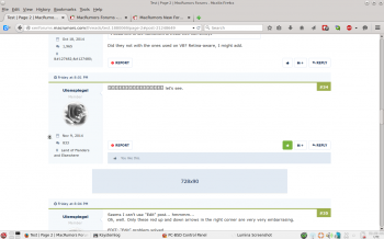
Rewind a little, in the test content at http://xenforums.macrumors.com/threads/test.1880069/page-2#post-21248638 Ulenspiegel wrote:

 let's see.
This is not a problem with XenForo, but if users are encouraged/inspired to review their signatures it may be timely to advise/remind people that:

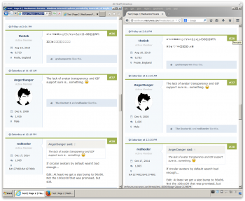
  • an Apple logo produced by Option-Shift-k on a Mac keyboard is likely to not appear as an Apple logo on systems without OS X
– the signature below, taken from vBulletin, is also exemplary.

...

----
 MacBook Pro 13" Mid-2012, iPad Air 2, iPhone 5C
## There are two types of countries: Those who have been to the moon, and those who have not.
## 'Merica

Screenshots attached.

Advice

In the Site and Forum Feedback area, one of the two 'Apple logo' topics is relevant. Old but relevant:
 

Attachments

  • Apple logo without OS X.png
    Apple logo without OS X.png
    112.6 KB · Views: 159
  • 2015-05-27 21-18-22 screenshot.png
    2015-05-27 21-18-22 screenshot.png
    240.5 KB · Views: 276
  • 2015-05-28 06-58-45 screenshot.png
    2015-05-28 06-58-45 screenshot.png
    239.6 KB · Views: 253
  • 2015-05-28 06-59-09 screenshot.png
    2015-05-28 06-59-09 screenshot.png
    295 KB · Views: 275
Last edited:
Rewind a little, in the test content at http://xenforums.macrumors.com/threads/test.1880069/page-2#post-21248638 Ulenspiegel wrote:

This is not a problem with XenForo, but if users are encouraged/inspired to review their signatures it may be timely to advise/remind people that:

  • an Apple logo produced by Option-Shift-k on a Mac keyboard is likely to not appear as an Apple logo on systems without OS X
– the signature below, taken from vBulletin, is also exemplary.


Screenshots attached.

Advice

In the Site and Forum Feedback area, one of the two 'Apple logo' topics is relevant. Old but relevant:

Just give users an :apple: image for :apple: like on VB and problem solved, most will just use that.
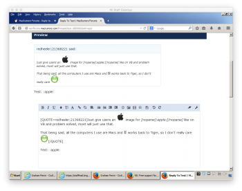
That being said, all the computers I use are Macs and  works back to Tiger, so I don't really care :D
 
http://xenforums.macrumors.com/threads/xenforo-notes.1880068/

if you take a look right now, you can see it with square avatars. See what you think

I was originally tossed up, but I think I prefer circles now.

arn

As I already mentioned on another thread, I quite like the square with subtle rounded corners. It means more usable space for avatars and it matches the rest of the forum a bit better.

This has nothing to do with my avatar specifically (I have decided to change it after the switch anyway) but just my general opinion on the square avatars vs. circular ones.
 
Last edited:
My preference is for the square ones. Probably because we've had square ones for years on VB and I'm comfortable with them.
 
Status
Not open for further replies.
Register on MacRumors! This sidebar will go away, and you'll see fewer ads.