Become a MacRumors Supporter for $50/year with no ads, ability to filter front page stories, and private forums.
Jeez! I like the current interface. I really like the 3D look. iTunes? I think it looks like Windows. The only part I would want changed are those three little 'droplets' in the upper left of every window (the traffic lights). They are not nearly big enough to suit me. I regularly click on the wrong one.
Other than that, I hope they leave it alone.
Rich :cool:

I agree with you on this one. I appreciate Apple's attention to detail, however I think there are bigger things to worry about than just colors and polish. Two things that I'd like to see are:

1. The ability to truly "Maximize" a window like we've been able to do in the windows world for 10+ years
2. Windows steals plenty of stuff from Apple...this time Apple should steal from Windows... I really like the ability to make a window fit half of the screen by dragging it to either side of the screen (like in Windows 7).

Cheers.
 
Where has the innovation gone and while were at it how about user selectable themes across all apps?:rolleyes:

Exactly. I tried modding programs such as Windows Shade, but it would make much more sense to implement a UI tweaking application.
 
:D How to fix that:

1. Set Magnification to "off".

2. Open Terminal and enter the following:

Code:
defaults write com.apple.dock no-glass -boolean NO; killall Dock

Enjoy. :D
Cool! It's "-boolean YES;", though. ;)

I already have that look since I use the vertical Dock layout. Widescreen 16:10 steals enough space vertically on its own, I don't need the Dock to deprive me of even more -- and I don't like auto-hide -- so I keep it on the side of the screen. But it's nice to get rid of the 3D dock... the mirror effect is like something Microsoft would come up with.
 
Themes is a definite must if they're going to tweak the UI yet-again. I mean, I have no major problems with the current UI really, as the grey has never put me off as it's a good, non-distracting colour; i.e - it's a good UI from a workflow perspective. Windows 7's interface is nice to look at, but not especially practical once you get past the shininess.

I would however like to have a darker UI personally, I've always liked shiny-black for example. A themes/skinning capability has been sorely lacking for a while now, I know there are 3rd party solutions but these are hacks, and often break with OS updates. Properly support themes would be awesome.
 
I also wish and hope Apple offers a button to lock the Dock items from accidentally being dragged off into a poof. I run a business on Macs and when someone uses the computer they tend to drag stuff off the Dock thinking they deleted something. This can be a disaster for big companies using Macs.

Most big companies would probably use Open Directory and MCX to push policy onto machines for this type of restricted preference.

I know as I have been working on doing this for a large company. Each department has a different default Dock, you can lock them of course and pretty much any other preference is enforceable that way. It is all built into Leopard and Tiger right now.
 
Choices

I don't mind if they tweak the UI but I really hope they leave us the option to keep the current theme. I don't know if I want to be forced to look/use a new UI. I like the current one but I'm also open to something new. I would like options i guess.
 
perspective please

".... dramatic changes ..." ...please... they are moving a few pixels around. Apple using batteries that held a charge after more than a year of use - now that would be dramatic.
 
I'm an application developer and have to think about this all the time. Fun stuff...

Are there any online resources about that?
I know about the Apple HUI guidelines, but they're a bit outdated and even Apple doesn't respect them, really.

That "between 5 and 9" items in the main menu makes total sense. Some applications add one menu item per installed plugin which can really clutter things up (even worse, in OSX the rightmost entries don't appear if your screen resolution is too small...). Better apps usually have a plugin entry where everything is listed.

If there's some universal guidelines on how to make GUIs better to use, I'd appreciate some links.
 
I just think that without any design changes, or UI changes, it's going to be hard for apple to sell SL. Yeah, we all know it's about speed, but for the avrg. user, they don't need it really. I'll still be buying it, but for the occasional computer user/average, SL won't appeal to them much.

I would of rather They brought out a new OS with more UI and GUI changes, and with the rewritten apps, and the speed, then us to wait longer for it, rather than having SL, then 'thenextcat'.

Anyone agree?

I just think Apple will be needing to try extra hard trying to sell it to an average user.

-Sam:apple::apple:
 
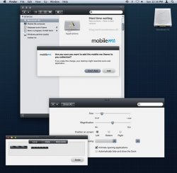
I came across these images when helping someone with iPhone tethering:

rzyf

vlfa


I pretty sure it is the new Snow Leopard "Marble" user interface.

It's also the same kind of UI used on me.com. And we'll probably see iTunes/iPhoto type scrollbars. I'm not sure really what else is Aqua about the UI anymore.
 
Marble =

Wikipedia® : 1) "Marble is a nonfoliated metamorphic rock resulting from the metamorphism of limestone. 2) Metamorphic code is a programming technique used to disguise code in computer viruses".

So the question is... What is the code that is being disguised in the Snow Leopard builds? Besides a new UI, I would say the the possibillity to interact with multitouch on future Mac screens and future iTablets.

It´s very clear to me. Therefore the final UI might be a huge change and a very welcome suprise...

Here is me hoping!!!:D
 
I don't think it's great when you have your fingers. You can only see one thing at a time, anything ahead or behind is obscured. And there is also no way to navigate through anything in segments like there are with a scrollable list.

Sure, cool, you can see a preview of a document or w/e it is. 1) you can get a preview of the document with out cover flow and 2) seeing a little thumbnail of a research paper isn't as telling as a title because the thumbnail is too tiny to make any of the text out.

It's simply not practical. Sure you're buying into oh it looks cool, but that has nothing to do with practicality.

I've never seen anyone use cover flow when they were legitimately looking for a specific thing. EVER.

When coverflow came out for iTunes, I didn't see it as more than eye-candy either. I'm 21 and most of the music I own was purchased in digital format. It's not really helpful for navigation because I don't have any idea what most album art looks like or which albums contain what songs.

I was excited and thought I used coverflow quite productively when it was introduced into finder for documents, however. I try to keep everything in digital format. The most efficient way I could think of for converting my stacks of paper into PDFs was through a repetitive naming scheme that didn't help me much (i.e. - scan0001.pdf). Coverflow made it pretty easy to see a full-size preview of a document without opening it. I could then easily rename it to something more detailed (i.e. - 20090316_receipt_jewel-osco.pdf). It was also an extremely helpful tool for entering data in spreadsheets to determine if it was worth filing a Schedule A or tracking gas mileage.

In response to your biggest complaints:
For renaming files and data-entry, I think it's helpful to only allow one thing to be clearly seen. I'm not on a Mac now, so I can't check, but I don't recall the preview functionality being as quick before Coverflow. You can expand the size of the preview in finder quite easily. I was reading the data from my receipts and documents with no troubles.

On topic:
I'm in agreement with most here. I'll be glad to see the OS with a unified look. On top of being more comfortable to use, it should be easier to support with novice users. Very subtle differences tend to add lots of confusion and shake the user's confidence with their support person, especially with phone support:

"Click the blue 'OK' button"
"There is no blue 'OK' button"
"What are you seeing?"
"There are two gray buttons: 'Cancel' and 'OK'"
---------------------------
"...you can navigate your movies folder by clicking-and-holding the scroll bar"
"What's a scroll bar?"
"It's the shiny blue oval on the right side of the window"
"There is nothing like that here"
"Is there a flat gray oval?..."
 
Instead of displaying the entire scroll column/row at all times, Apple could just overlay only the "blue thing/slider?" over the screen.

The biggest thing I'd like to see change is having the menu auto hide like the doc until I mouse over. I need all the vertical screen I can get on my 13" MacBook.
 
I know it's just a artist's rendition, but if Apple could find a way to pull this off for all of their apps, I would be very impressed.

quicktimexplayer090307-2.jpg


The original discussion can be found here

No no no and no! I'm fed up with all this frosted glass black thing going on in everything OS at the moment. Vista has it and now people want it in OS X, i say no! the marble style scroll bars i think i can live with i kind of want some colour in OS X but not to the extent that windows does, it just hurts your eyes with all the aero eye candy!
I'm wondering if by implementing a universal GUI whether it may have system benefit in reducing file sizes etc? i personally like the idea of scroll bars disappearing and only showing when you scroll or hover over them.
 
Speaking of iPhone. When youtiuch the Topif the browser, it snaps to top, anyone else peeved that there is no snap to bottom and sometime after pages reload, you sit there spending a minute getting back to the point you were at, say a forum, by scrolling down, down, down. Should be an easy fix. Anyone know what I mean?

Yes I get really annoyed by this.
 
Jeez! I like the current interface. I really like the 3D look. iTunes? I think it looks like Windows. The only part I would want changed are those three little 'droplets' in the upper left of every window (the traffic lights). They are not nearly big enough to suit me. I regularly click on the wrong one.
Other than that, I hope they leave it alone.
Rich :cool:

Itunes looks like Windows? LOL.
 
why apple would try and add such a big thing to the OS this late in the Dev cycle is beyond me. The UI is literally everything. If u try and throw it in within the last couple Betas, then u'll be in for big trouble.
 
I wouldn't be impressed. Thats horrid. It looks Windows Media Player 11 related.
Well, get used to the thought because QuickTime will look a lot like that, insofar as the controls go. It's been reported to have edge-to-edge video with controls that only appear on mouseover, just like WMP12 in Windows 7. As for the black title bar in the artist's rendition, I seriously doubt that part.
 
Two things that I'd like to see are:

1. The ability to truly "Maximize" a window like we've been able to do in the windows world for 10+ years...
Cheers.

I actually like the behavior of this button in OS X better than the maximize button in Windows. In Windows, a maximized window will always take up all of your screen, regardless of its contents; in OS X, the window is (supposed to be...) sized to best fit its contents. There's no point in, for example, the iChat contact list to take up all the screen horizontally when a smaller amount of space is needed. (Of course, I don't always agree with what the application thinks, but it's easy enough to resize on your own. :) I don't think I've ever made any app on my Mac take up all of my screen.)
 
Register on MacRumors! This sidebar will go away, and you'll see fewer ads.