Become a MacRumors Supporter for $50/year with no ads, ability to filter front page stories, and private forums.
Apple didn't get rid of bezels like Samsung.

This phone has reduced bezels.

Please Macrumors stop saying it's bezel-less

Wait... Samsung didn't get rid of the bezels either.

See those black things below? Those are bezels! Now how do you feel? :p

I agree... nobody should say the words "bezel-less" until there is a phone that matches that description.

But there will always be some bezels... or how else will you hold the thing?

galaxy-s8-bixby-4120.jpg
 
Last edited:
  • Like
Reactions: McTool
i actually love the look of this new iphone (except the fugly rear camera). i would like if they made the top of the screen/either side of the sensors unusable by apps and just black/white it out (depending on phone model colour) and show status icons like battery/wifi/signal etc.
 
Where I agree with you is I actually don't have an issue either way if the cut out exist or if it doesn't. I don't think the cut out is that off putting and if it debuts on the 'iPhone 8', then so be it. It won't stop the iPhone from selling any less. Ultimately the Notch seemingly will exist to maximize the display and house the sensors/camera.

Where I disagree with you is I don't necessarily think everyone is being negative about the cutout. It's just that Some don't have an understanding of how this is all going to mesh together, which translates into disapproval. It's just a different design with the previous iPhone layouts, and it's difficult for some to fathom these changes that might be made to this new iPhone without fully understanding why.

For people who don't care about specs, people very well may choose the 7S instead. It still has the updated process and would be a bonus that it's cheaper. The notch is off-putting, to say the least. Whether it will truly make an aesthetic impact on daily use is unknown, but it looks fugly, and people don't like that.
[doublepost=1502538211][/doublepost]

I believe it was mentioned that the virtual home area at the bottom is static and will not change based upon the application (aside from hiding in full screen video)

Aside from this, and the new split status, one might assume it would be possible they only include maybe the signal strength, battery and time in the top. bluetooth, hotspot, screen rotation, alarm etc. may require you to pull down to view.
 
Last edited:
If true, this is not only appalling but also a crazy departure from iOS/UI uniformity across devices.
I just can't imagine this will be real.

Just follow the developers on Twitter who are knee deep in the HomePod firmware, there is so much evidence in the code. All these wild guesses about "maybe there is a finger print scanner under the screen, maybe the power button will have touch ID, maybe the power button will be the home button, maybe there will be no virtual home button, etc", it's based on nothing but hope/fantasy and ignoring reports by professionals and developers.

Regarding the area next to the notch and the home button area, it might be hard for us the imagine right now, but just remember how it always goes with Apple. First everybody hates it, then people buy it and very soon everyone loves it. It would really not surprise me to see it like this:

DG-PZ5EU0AEhm_Z.jpg


By the way, there is also zero evidence that app elements can or will be available in the home button area. Everything seem to point to a static OS area.
Oops - I am not disputing the code evidence !
I just cannot imagine this to be true => the HomePod leak must be a hoax planted by Apple
(why would HomePod exclusive firmware contain so much iPh8 exclusive code...)
 
Last edited:
Hopefully we have to 3D Touch the home button to close an app or I'm going to accidentally hit that all day long.

Good point. Long press/3D touch would be a good way to force close an app. Android has used this for a long time with their back button and I've very much missed it. Going to the app switcher is very time consuming and an annoying process.
 
  • Like
Reactions: macduke
I know we’ve seeen some questionable designs over the years, such as when the iPhone 4 leaked and everyone thought the antenna band was the ugliest thing ever and then we all got used to it and loved it.
Could you not speak for everyone, please?
Caliber26 said:
However, I can’t begin to wrap my head around this design and how distracting it is - particularly in the white-faced dummy that was featured in yesterday’s video.
A dummy is not a leak. The leaked parts were black and looked great.

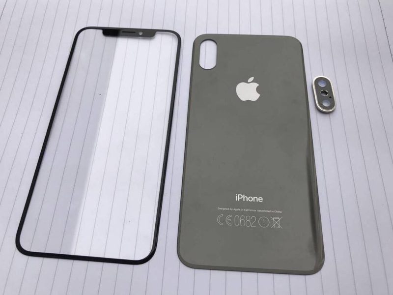
frontpanels1-800x600.jpg


These few pieces look so reminiscent of the iPhone 4, I love the damn thing to death already.
 
A dummy is not a leak. The leaked parts were black and looked great.

These few pieces look so reminiscent of the iPhone 4, I love the thing to death already.

The notch looks like the material normal bezel is made out of. While that's not terrible, because it is fairly dark and does not draw attention - but the fact that it will have screen on both sides will certainly be a bit distracting for me. I'm not looking forward to its presence, although I'm not going to make it overblown like lots are here.
 
I know! I’m trying to tell you that there has to be a second row to accommodate the clock and all the other information that doesn’t fit on the sides of the notch.
I see what you’re both saying. I am of the opinion that most of that stuff is useless on a day-to-day basis, and to remain minimalist, Apple should keep the time in the ULH corner, and the battery in the URH corner.

Just my $0.02.
 
I'm keen on getting a new Seat Ibiza. I must say nobody has seen the nrw model yet. But a friend who is rather good at drawing cars did a few sketches based on old models and that was enough to make me go out and buy it. He even drew booster rockets and a HUD display. Wow. How cool is that! Wait til my mates hear about all the new bits it has. On a slightly more negative note, I have another friend who thinks I am rather naive and quite irrational in basing my buying decision on an unconfirmed and purely hypothetical design. But what does he know eh, readers? He knows nothing about cars and just applies logic and common sense when he gets stuff. Pah!. How boring is that? Misguided loyalty and disporoportionately high levels of enthusiasm do it for me every time. So get the bank manager on the phone and get that crippling loan sorted early. I'm coming to a showroom near you soon! ("Yes, yes. We get the analogy''-Ed)
 
The notch looks like the material normal bezel is made out of. While that's not terrible, because it is fairly dark and does not draw attention - but the fact that it will have screen on both sides will certainly be a bit distracting for me. I'm not looking forward to its presence, although I'm not going to make it overblown like lots are here.
And if these corners are only/mainly used for white on black status bar icons, still distracting? I think you may find, that this way the content area is emphasized and free of unrelated status information. Your eyes will jump right into the app and you won't read the time every time first.
 
The position of the clock makes sense. There would no longer need to put the “back to app” button inside of the status bar replacing other icons.
 
Oops - I am not disputing the code evidence !
I just cannot imagine this to be true => the HomePod leak must be a hoax planted by Apple
(why would HomePod exclusive firmware contain so much iPh8 exclusive code...)

Well, the HomePod is an unreleased product that runs iOS. It will come to market after the iPhone 8, that's why all the iPhone 8 software features are in there. Also, Apple put the firmware online by accident and all iPhone 8 code is pretty well hidden (the phone is code named D22, FaceID is called Pearl ID, the notch information was found by calculation, etc). This is no hoax by Apple. Every year a lot leaks out, this year is no different.
 
And if these corners are only/mainly used for white on black status bar icons, still distracting? I think you may find, that this way the content area is emphasized and free of unrelated status information. Your eyes will jump right into the app and you won't read the time every time first.

I agree, as long as it's blacked out and used strictly for non animated content, it will mostly be a non issue.
 
I thought the point of the "notch" was to push up the status bar icons so that all of the screen below the notch could be freed up. If there is a "second row" of status bar below the notch, this defeats that entire purpose. I can't see them doing this.
 
  • Like
Reactions: Michael Scrip
I know you guys are just trying to come up with stuff, but in the HomePod firmware it has been confirmed that there will be an area for the home button. There is actual code that describes it! The facts (not believe, but facts) are that:

- It resizes
- Indicator can be hidden
- No API to change colour
- Tab bar can extend under it

So no, the power button will not have a double function as that would be terrible. Also 3D touching on a random part of the screen would never work as apps are using 3D Touch (where would you 3D Touch in Mail to get home? Impossible!) You guys are reaching for things while Apple already provided the evidence for you.


The same as above, the HomePod firmware confirms the sides next to the notch is for the status bar:

40187e5fbebd82e04d6acc02de479414.jpg


This is evidence from Apple itself, so not an opinion of how people on a forum want it. By the way, developers have generated a screen based on these values and guess what, it perfectly forms the those spaces next to the notch:

1df4b56a282ff0248572660331398f33.jpg


Also, the glyph in the firmware might tell something about their intentions:

56b5859fe6fb7032026615a7c63603d8.jpg


If Apple would always want to hide the notch through software and black bezels, why make it so obvious in this glyph? I first was of the idea of symmetry and blacking out parts of the display, but the real evidence is showing that Apple might embrace the notch and use the extended tab bar (so depending on the colour of the app) to show the home button area.
Firstly, I've seen the firmware describing the status bar, and the glyph. The 'split status bar' is completely irrelevant. I'm saying elements will of course go into those, and the entire bar will be 'status bar'. I'm saying the corners cannot fit status bar elements giving the useful purpose to the status bar. They're absolutely tiny spaces and they'd fit virtually nothing. If Apple only used those, the status bar would be completely pointless. You cannot fit the absolutely critical elements in those. Time, signal strength, battery, and battery percentage. Therefore, the top left and right portions are just that, a portion of the status bar. They're new areas where new elements will go.

As for the glyph, Apple is hiding the bar, at the very least in certain situations because it's impossible not to hide it during movie playback as an example. By impossible I mean anyone would agree that you do not play movies with a cutout in the screen like that. It's simply hilarious.
 
I have another friend who thinks I am rather naive and quite irrational in basing my buying decision on an unconfirmed and purely hypothetical design. But what does he know?
Nothing! Do a google image search for "erlking cars" and you will find that the auto industry operates on the exact same rumor cycle for unannounced car designs. Of course car enthusiasts base their purchase decision on little pieces of information about upcoming new cars as well.
 
Last edited:
Well, the HomePod is an unreleased product that runs iOS. It will come to market after the iPhone 8, that's why all the iPhone 8 software features are in there. Also, Apple put the firmware online by accident and all iPhone 8 code is pretty well hidden (the phone is code named D22, FaceID is called Pearl ID, the notch information was found by calculation, etc). This is no hoax by Apple. Every year a lot leaks out, this year is no different.
But why would a Homepod ipsw share iP8 code base ? Similarly does AppleTV ipsw share iPh7/6/5/iPod base code ?
 
Last edited:
I'm saying the corners cannot fit status bar elements giving the useful purpose to the status bar. They're absolutely tiny spaces and they'd fit virtually nothing. If Apple only used those, the status bar would be completely pointless. You cannot fit the absolutely critical elements in those.
The status bar is completely pointless as it is, because most third party apps hide it and claim the screen space for themselves. Especially the games I spend the most time in, won't show me my vanishing battery life. Corners are a solution to the current lack of critical status information.
 
Last edited:
Register on MacRumors! This sidebar will go away, and you'll see fewer ads.