Become a MacRumors Supporter for $50/year with no ads, ability to filter front page stories, and private forums.
Apple didn't get rid of bezels like Samsung.

This phone has reduced bezels.

Please Macrumors stop saying it's bezel-less

Concur: Clearly should be phrased in positive light of what Apple has acheived: Expanded Display Area (full stop).

Underpromise, overdeliver.
 
That notch gives me hives...please, Apple, hide it (use the area solely for white time/signal/wifi/text on black background). If they embrace it, it's going to take some seriously impressive other features to get me to consider that model over the 7S Plus.

Between that screen shape, and the stupid hump on the back of the iPhone battery case, Steve must be rolling over in his grave with some of these design decisions.
 
This may have been covered on other MR Articles, but I can't remember ... what's the consensus for what the display resolution will be ?
 
I hate the notch way more than I disliked the bezels. I know I must be so old to not care about those giant bezels but that cutout is hideous. This whole anniversary phone is turning into a half measure. Couldn't get TouchID or sensors under the screen, couldn't do real wireless charging, losing the iconic home button. I understand the tech isn't there yet for some of this, and thats fine, but why do we have to have a few extra centimeters of screen before the tech is ready? They say Steve was a d|ck but you would have thanked him when someone handed him this notched phone and he screamed at them and threw it across the room.
totally agree if these mockups are accurate, then this iphone is going to be ugly as f@*k
[doublepost=1502498432][/doublepost]
The left one. Please let it be the left one.
yes please be this one
 
These are my concepts
 

Attachments

  • app store concept.png
    app store concept.png
    1.7 MB · Views: 293
Who ever came up with these imaginary renders should just quit right now! The phone design looks sssooooooo unbalanced it's ridiculous! iPhones are never about having unbalanced designs.
uhhh yes they are.
off balanced position of camera's on the back ever after iPhone 5. Camera bump etc...
 
My guess is that the function area will slide up and down like Safari when scrolling.
No. Home Button has to be available instantly, always. It would be extremely annoying to have to scroll back like you have to in safari to get the home button back up.
[doublepost=1502502704][/doublepost]
What about the carrier, orientation lock, location services, and battery percent (and the lock indicator when the screen is locked). All of those are currently present on my iPhone and there is no way that would fit in the notches.
Exactly. They will be in a single line below the cutout and new elements will be in the cutouts. That's my assertion.
 
That notch gives me hives...please, Apple, hide it (use the area solely for white time/signal/wifi/text on black background). If they embrace it, it's going to take some seriously impressive other features to get me to consider that model over the 7S Plus.

Between that screen shape, and the stupid hump on the back of the iPhone battery case, Steve must be rolling over in his grave with some of these design decisions.
The screen shape makes sense to thinkers. You're a thinker seemingly, because your desire for them to hide it is the correct thought. You know Apple will hide it. Don't worry.
[doublepost=1502503189][/doublepost]
I must say: all terrible. Especially with the time under the notch. Fragmented. Laughable. – Apple might be in trouble. We'll see. And hope.
Laughable? You're equating concepts from non-Apple employees as Apple being in trouble? That's laughable..
[doublepost=1502503371][/doublepost]
This is ridiculous...
Can’t comprehand how stupid 100 posters are...
Make that 113
What the hell are you talking about? Haha
[doublepost=1502503437][/doublepost]
I hate the notch way more than I disliked the bezels. I know I must be so old to not care about those giant bezels but that cutout is hideous. This whole anniversary phone is turning into a half measure. Couldn't get TouchID or sensors under the screen, couldn't do real wireless charging, losing the iconic home button. I understand the tech isn't there yet for some of this, and thats fine, but why do we have to have a few extra centimeters of screen before the tech is ready? They say Steve was a d|ck but you would have thanked him when someone handed him this notched phone and he screamed at them and threw it across the room.
Hahaha. Instead of panicking why not think more?
 
The screen shape makes sense to thinkers. You're a thinker seemingly, because your desire for them to hide it is the correct thought. You know Apple will hide it. Don't worry.
[doublepost=1502503189][/doublepost]
Laughable? You're equating concepts from non-Apple employees as Apple being in trouble? That's laughable..
[doublepost=1502503371][/doublepost]
What the hell are you talking about? Haha
[doublepost=1502503437][/doublepost]
Hahaha. Instead of panicking why not think more?
That post of yours will make it to 115
 
  • Like
Reactions: 9594864
Apple didn't get rid of bezels like Samsung.

This phone has reduced bezels.

Please Macrumors stop saying it's bezel-less

Samsung didn't either.....there are still bezels at the top and bottom of the S8 and S8+......
[doublepost=1502505184][/doublepost]
The clock won't be present, hence the drag-down feature introduced in iOS 11.

Will lead to a more immersive experience, like fullscreen apps on the Mac.

This right here - look at iOS 11 for clues. Although I'm not a fan of the new pull down notification solution, it will likely make a lot more sense on whatever the next iPhone is.
[doublepost=1502505365][/doublepost]
These are my concepts

That first one doesn't make much sense.....why get rid of the bezels if you're just going to fill in the display to look like bezels.

The second two look nice - I think Apple will have a solution for the wasted space around the virtual home button. I hate Samsung's current "hidden" home button - hope iOS's is always visible. You can fit a dock of 4 apps around the home button that's always there ala iPad iOS 11 and macOS
 
  • Like
Reactions: luisfelipesv
Is there a reason why there needs to be a notch in the middle, couldn't they just raise it on the upper lip area and provide more screen real estate? The phone looks smaller already than the Plus size so it's not like it'll make the phone more cumbersome.
No they couldn't. Because physics
 
I think that the BlueTooth symbol should be grouped with the WiFi signal strength and the carrier bars. That way, it's all about the connections. The clock and battery can possibly be on the right top corner.
 
They make the iPhone 8 look like a POS.
Some of the comments in here are hilarious. I agree by the way
[doublepost=1502505833][/doublepost]
Samsung didn't either.....there are still bezels at the top and bottom of the S8 and S8+......
[doublepost=1502505184][/doublepost]

This right here - look at iOS 11 for clues. Although I'm not a fan of the new pull down notification solution, it will likely make a lot more sense on whatever the next iPhone is.
[doublepost=1502505365][/doublepost]

That first one doesn't make much sense.....why get rid of the bezels if you're just going to fill in the display to look like bezels.

The second two look nice - I think Apple will have a solution for the wasted space around the virtual home button. I hate Samsung's current "hidden" home button - hope iOS's is always visible. You can fit a dock of 4 apps around the home button that's always there ala iPad iOS 11 and macOS
Two things:

Firstly, the clock will of course be in the top center of the iPhone 8. Not relocated to the lock screen via a pull-down. Why? Well. Pretty simple. The time has been and always will be glanceable 99% of the time. It's not even of question, it's a guarantee.

Secondly, making the screen look like bezels is relative. Do they look like bezels? Yeah because they're lack bars. However, they have dynamic content in them, so I'm not sure how you equate that to the same as having bezels?
 
Some of the comments in here are hilarious. I agree by the way
[doublepost=1502505833][/doublepost]
Two things:

Firstly, the clock will of course be in the top center of the iPhone 8. Not relocated to the lock screen via a pull-down. Why? Well. Pretty simple. The time has been and always will be glanceable 99% of the time. It's not even of question, it's a guarantee.

Secondly, making the screen look like bezels is relative. Do they look like bezels? Yeah because they're lack bars. However, they have dynamic content in them, so I'm not sure how you equate that to the same as having bezels?

The picture shared by the poster I quoted had blank black space around the home button. I was referring to that specific mock up. If its black space and nothing else, then whats the point?

Obviously I assume the space will be used for lots of various things.

As to the clock - it would be a quick swipe down away. How is that not easily accessible? Putting it in the center as the mock ups have done makes no sense from a design perspective. I can't see Apple wasting all that space just for a strip that shows the time - especially when the clock is extremely easy to access.
Okay I fully agree with your interpretation of the mockups. They bother to do concepts without using any imagination as to what will go in the spaces.

The clock would be easily accessible, but not glanceable. I agree again the concept artists are people who don't think very hard about what makes sense apparently. I believe the clock will remain in the center as it is now, I believe the entire status bar will remain as it is now, in a single line directly under the cutout. I believe the top left and right corners will be utilized for new elements. New status elements, new dynamic elements and even touchable elements.

As an example: if the device is in landscape and you're playing a game, a button could go in each of the places beside the cutout


As the launch of Apple's "iPhone 8" approaches, we've seen multiple images and dummy models outlining what the device will look like, but non-functional dummy devices don't include software and don't offer a complete picture of what we can expect.

Designer Maksim Petriv has mocked up several iPhone 8 images that take into account current rumors to demonstrate what iOS 11 might look like on the new device.

Rumors and leaked firmware information suggest the iPhone 8 includes both a top notch that houses the front-facing camera and sensors for a facial recognition system and a function area with a virtual Home button, both of which are imagined in Petriv's images.

iphone8statusbarmockup1.jpg

Petriv's photos include status bar information located at the top of the device on either side of the notch, and a small Home button area at the bottom. We're not yet sure what Apple plans to do with that area of the iPhone 8, but we do know that it's resizable, can be hidden, and does not appear to include app UI elements, meaning it's simple.
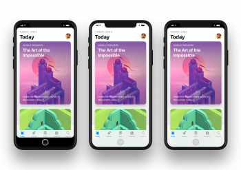
The renderings made by Petriv demonstrated the Lock screen and App Store, along with popular apps Netflix and Spotify.

Apple's HomePod firmware has suggested the status bar information like signal strength, carrier info, and battery life will be split and displayed in the area near the sensors/camera, with Petriv also imagining three ways Apple could display status bar information. Apple's own firmware image leak points towards the third option and suggests the company will fully embrace the notch rather than hiding it through software.

iphone8statusbarmockup2.jpg

It's not quite clear what design solution Apple will use, but these images do give us some idea of what apps will look like on an edge-to-edge display with almost no bezels and with a cutout for the front-facing camera and sensors.

Apple typically unveils new iPhones in early September, so we are just weeks away from getting our first glimpse at the iPhone 8 and its companion devices, the iPhone 7s and the iPhone 7s Plus. For a deeper look at what to expect from the upcoming iPhones, make sure to check out our iPhone 8 roundup.

Article Link: Mockups Imagine What Apps Might Look Like on iPhone 8
[doublepost=1502507460][/doublepost]I like the notch. I think I'm the only perso that does.
 
Maybe I’m biased but I really liked the white dummy phone it reminds me of the 4/4s. I think the white front looks better and the notch on top doesn’t bother me.
 
Okay I fully agree with your interpretation of the mockups. They bother to do concepts without using any imagination as to what will go in the spaces.

The clock would be easily accessible, but not glanceable. I agree again the concept artists are people who don't think very hard about what makes sense apparently. I believe the clock will remain in the center as it is now, I believe the entire status bar will remain as it is now, in a single line directly under the cutout. I believe the top left and right corners will be utilized for new elements. New status elements, new dynamic elements and even touchable elements.

As an example: if the device is in landscape and you're playing a game, a button could go in each of the places beside the cutout

Interesting thoughts - except in that landscape mode, the display loses symmetry from left to right. If you keep the status bar elements in the top split around the cut out, they could simply rotate in landscape leaving the display a symmetrical rectangle.

At any rate, I'm fairly certain Apple has thought about this quite a bit and their solution will be both elegant and useful.
 
I am 99.9% POSITIVE the time won't be on the status bar on this iPhone. You know how I know this?

They changed the notification pane to mimic the lockscreen, down to the huge time and date at the top. They obviously wouldn't have done that if they had a way to display the time otherwise.
 
  • Like
Reactions: Roessnakhan
Register on MacRumors! This sidebar will go away, and you'll see fewer ads.