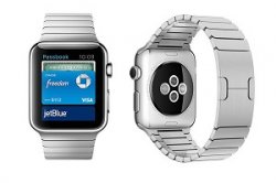
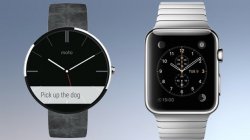
The Almost 360 just doesn't look refined to me. Looks way too big for smaller wrists. And I'll bet the first thing that changes is where the straps attach to the watch. Attaching at the bottom makes it look like a big tire sitting on your wrist.
Got a tip for us?
Let us know
Become a MacRumors Supporter for $50/year with no ads, ability to filter front page stories, and private forums.
Moto 360 decided my Apple Watch
- Thread starter deanfitz1
- Start date
- Sort by reaction score
You are using an out of date browser. It may not display this or other websites correctly.
You should upgrade or use an alternative browser.
You should upgrade or use an alternative browser.
Moto 360 decided my Apple Watch
Interesting, I didn't think it would be that big of a difference between the 2. Most people that I know and that I've seen, have the Plus.
Ugh. I was being nice at 75%.
http://fm.cnbc.com/applications/cnbc.com/resources/files/2014/11/20/Iphone6.png
Interesting, I didn't think it would be that big of a difference between the 2. Most people that I know and that I've seen, have the Plus.
Last edited:
Why are you wearing a Nest thermostat on your wrist?
Not original
That's the biggest difference between Apple and the rest. Somebody at Motorola actually signed off on mass producing a circular watch face (which isn't necessarily bad) that is massively out of proportion (bad) and has a display that isn't a complete circle (really bad!). And the worst part is that he probably still works there!
Bit dramatic.
I don't think it's "massively out of proportion". Obviously neither do all the people who've bought one. It's somewhat large, but not ridiculously so.
Nor is the incomplete circle "really bad". It barely affects its use. (The only time I've seen it affect anything was with a watchface that used the very outside edge to display a second timezone hour marker.)
Moreover, it's only missing a tiny part of a circle on one side that's rarely used. Heck, rectangular watches are missing huge parts of a circle on all their sides
:\
I love how minimalistic the Moto 360 is. I know it has some imperfections and it is big, but it's one of my favorite watches for the simple look.
I dunno where I stand about 42 vs 38mm. It's not much of a difference really, and I never wear watches so I have a feeling the 42 would be obnoxious.
I love how minimalistic the Moto 360 is. I know it has some imperfections and it is big, but it's one of my favorite watches for the simple look.
I dunno where I stand about 42 vs 38mm. It's not much of a difference really, and I never wear watches so I have a feeling the 42 would be obnoxious.
The Almost 360 just doesn't look refined to me. Looks way too big for smaller wrists. And I'll bet the first thing that changes is where the straps attach to the watch. Attaching at the bottom makes it look like a big tire sitting on your wrist.
This is very true. It helped me realize that the Apple Watch will look even thinner than the small difference in measurement between the two watches thanks to the position of the band lugs.
Apple Watch is the first "smart watch" to have a good design. Period. Everything else just looks like generic technology products strapped to a wrist. Even the bands available for Moto 360 look so trashy. That metal band and all the empty space near the connectors is just terrible, cheap junk.
It reminds me of the vast majority of the smart phone market before Apple came. A few interesting attempts but almost nothing worth buying unless you liked constant crashing and hideous low quality craftsmanship.
Tried on a Moto 360 to gauge a size for theWatch.
What is this small hole?

What is this small hole?
I Googled it for you
https://motorola-global-portal.custhelp.com/app/answers/detail/a_id/100984
There is your answer
I Googled it for you
https://motorola-global-portal.custhelp.com/app/answers/detail/a_id/100984
There is your answer
Ah.. many thanks. Love this piece of information though "WARNING: Do not attempt to insert anything into this hole."
It's just so tempting.
Why are you wearing a Nest thermostat on your wrist?
That's the biggest difference between Apple and the rest. Somebody at Motorola actually signed off on mass producing a circular watch face (which isn't necessarily bad) that is massively out of proportion (bad) and has a display that isn't a complete circle (really bad!). And the worst part is that he probably still works there!
LOL seriously. That photo really looks ridiculous!
What is this small hole?
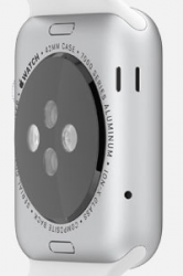
Obviously the Moto 360's microphone hole. Very similar to the microphone and speaker holes on the Apple Watch:

(Always looks like a robotic happy face to me.)
Of course, in all these months, you've probably never seen those Apple Watch holes.
That's because until recently, Apple has carefully avoided showing their Watch from that unflattering angle, usually making sure that the crown was seen instead.

Last edited:
I wouldn't worry. People said the 6+ was too big and after a few days it was perfect for me.
So perfect that you have to buy an AW because your 6+ is too hard to pull out of your pocket.....Apple's master plan is becoming clear to me.
Ha. Another stupid Apple bashing meme going on. There is a huge design difference. The placements of the holes are design as such for aesthetics and functional reasons, not be seen (if possible and still functional) when it is worn in the wrist.
Fugly 360 in person, in ads, everywhere and in all angles.
You get what you pay with other smartwatches out there - fugly plasticky looking or wannabe cheap knockoff Omegas etc.
Fugly 360 in person, in ads, everywhere and in all angles.
You get what you pay with other smartwatches out there - fugly plasticky looking or wannabe cheap knockoff Omegas etc.
Last edited:
Obviously the Moto 360's microphone hole. Very similar to the microphone and speaker holes on the Apple Watch:
Obviously it's not similar but I'm not surprised YOU never know the difference.
It's a microphone. And the Apple Watch has holes with similar functions. But unless you watched the 2014 Keynote, where Apple almost "hid" those holes (they were only shown several times, including the very first seconds of the very first video that presented the watch to the public, and quite another few times during that keynote)

and if you haven't looked at the Apple Watch website, I'm sure that you would maybe miss those holes too.
Edit: On Topic: Of course the popularity of the Moto 360 was good news for Apple, as it proved that people aren't shy about wearing massive watches on their wrists, and with the Apple Watch having a significantly smaller footprint on your wrist, they won't need to worry about anything being "too bulky" for many. I have thick wrists and the Moto 360 probably wouldn't look too bad at all, I was just slightly letdown by it's appearance in real after seeing the renders. Plus I'm not really too interested in any smart watches right now.
Last edited:
The usual suspects defending the Moto 360 design are really funny. The 360 was only ever "popular" because a) early renders/videos made it look a little nicer than it really is and b) because even earlier smartwatches (Pebble, Samsung Gear etc.) were super ugly and the 360 seemed a step up. One look at a real 360, though, is all you need to see that it just screams N-E-R-D. To even compare this thing (including the available straps), design-wise, to the Apple Watch (including the straps), just proves that you a) have an agenda or b) not a single clue about design (or fashion). Oh, and the Apple Watch will, as Apple products usually do, look (and feel) even better than the fotos/renders. Don't even get me started on the supposed sales "success" of the 360 (or even Pebble). Those numbers will start looking very small from April 24th on.
It's a microphone. And the Apple Watch has holes with similar functions. But unless you watched the 2014 Keynote, where Apple almost "hid" those holes (they were only shown several times, including the very first seconds of the very first video that presented the watch to the public, and quite another few times during that keynote)
Image
Doesn't your picture show speakers? I would guess that microphone would be in the same shape as the Moto?
Obviously it's not similar but I'm not surprised YOU never know the difference.
Everyday in their lives the usual delusional Apple bashers will be on something. They are ready for their e-memes. It took months for this one, lol. Once AW is released ... watch out for them touting the other platforms 'features' and what makes in their eyes AW not that special. It is so hilarious that they think the Fugly 360 is so popular even though a only miniscule few thousands got fooled buying them and when no one in the watch, fashion, tech, apps developers etc industries that matter and most importantly, the world, did not care or found them just worthless POS.
The usual suspects defending the Moto 360 design are really funny. The 360 was only ever "popular" because a) early renders/videos made it look a little nicer than it really is and b) because even earlier smartwatches (Pebble, Samsung Gear etc.) were super ugly and the 360 seemed a step up. One look at a real 360, though, is all you need to see that it just screams N-E-R-D. To even compare this thing (including the available straps), design-wise, to the Apple Watch (including the straps), just proves that you a) have an agenda or b) not a single clue about design (or fashion). Oh, and the Apple Watch will, as Apple products usually do, look (and feel) even better than the fotos/renders. Don't even get me started on the supposed sales "success" of the 360 (or even Pebble). Those numbers will start looking very small from April 24th on.
For all you say, this is "Fashion"
Apple fans are flipping to and from between fashion and tech in an attempt to try and win each argument.
If you don't like to look of the Apple watch then that's that, end of argument.
If you want a round watch then you won't want the apple watch.
It does not matter what it does, what it's made of.
If this is fashion, it's how it looks which is important.
Like for me, being able to have any watch face, NOT controlled and censored by Apple over rides everything else.
You can keep all the health stuff, the send a heatbeat gimmics that will be junked in later apple watches. and links to the your iphone.
if I can't have the screen looking how I want, I don't want it.
that, to me (fashion) takes total priority over everything else.
If I don't like the "look" of it, that's that.
Doesn't your picture show speakers? I would guess that microphone would be in the same shape as the Moto?
lol - true, I was trying to capture one of those many moments where they were """"hiding""" the mic hole, but then showed the speakers.
Anyway, try
http://www.youtube.com/watch?v=38IqQpwPe7s&t=58m46s
http://www.youtube.com/watch?v=38IqQpwPe7s&t=70m11s
just two that I found quickly...
The actual 42mm Apple Watch (as opposed to 0.1mm thick paper printouts or Photoshop'd size reductions) looks pretty darn big on smaller wrists too.The Almost 360 just doesn't look refined to me. Looks way too big for smaller wrists. And I'll bet the first thing that changes is where the straps attach to the watch. Attaching at the bottom makes it look like a big tire sitting on your wrist.
The Apple Watch is thicker.Tried on a Moto 360 to gauge a size for theWatch.
Decided to go for the 42mm as its 4mm smaller in height than this Moto 360 and about 1mm thinner.
Wrist size 160mm
Apple Watch body including sensor: 12.46 mm thick
Apple Watch body without sensor: 10.6 mm thick
Motorola 360: 11.5 mm thick
Apple carefully avoids the straight side shots that show the full thickness. Instead, Apple uses angled shots which minimize/de-emphasize the Watch's thickness.
By comparison, a Rolex is about 11mm thick (12mm for submariner models).
The same thing could just as easily be said about the Apple Watch.The usual suspects defending the Moto 360 design are really funny. The 360 was only ever "popular" because a) early renders/videos made it look a little nicer than it really is and b) because even earlier smartwatches (Pebble, Samsung Gear etc.) were super ugly and the 360 seemed a step up. One look at a real 360, though, is all you need to see that it just screams N-E-R-D.
The Apple Watch is nearly 1mm thicker and has a larger screen (1.65" vs. 1.56").
Attachments
Last edited:
The picture is slightly misleading, I think. The diameter of the Moto360 is 46mm. The height of the Apple Watch is 42mm (for the bigger model). The Moto360 thus is nearly a half a centimeter bigger.The actual 42mm Apple Watch (as opposed to 0.1mm thick paper printouts or Photoshop'd size reductions) looks pretty darn big on smaller wrists too.
The Apple Watch is thicker.
Apple Watch body including sensor: 12.46 mm thick
Apple Watch body without sensor: 10.6 mm thick
Motorola 360: 11.5 mm thick
Apple carefully avoids the straight side shots that show the full thickness. Instead, Apple uses angled shots which minimize/de-emphasize the Watch's thickness.
By comparison, a Rolex is about 11mm thick (12mm for submariner models).
The same thing could just as easily be said about the Apple Watch.
The Apple Watch is nearly 1mm thicker and has a larger screen (1.65" vs. 1.56").
This picture makes them look essentially the same size height-wise.
I have a medium wrist (185mm) and the Pebble Steel looks fine. Not too big at all. The AW is apparently very nearly the exact same size. When I tried on a Moto360, it looked like a truck tire strapped to my wrist.
So perfect that you have to buy an AW because your 6+ is too hard to pull out of your pocket.....Apple's master plan is becoming clear to me.
I don't wear skinny or slim fit jeans my friend. I can comfortably pull my 6+ out of my pocket. What's Samsung's excuse for making large phones? To make people buy their...Oh wait no one cares about their watch.
----------
That's nice. However, over over 75% of iPhone 6 sales are the 4.7".
What exactly is your point?
Ugh. I was being nice at 75%.
http://fm.cnbc.com/applications/cnbc.com/resources/files/2014/11/20/Iphone6.png
That's a bogus chart. I've seen a few charts in recent months indicating greater 6 Plus adoption. Not that I care it's just numbers.
Register on MacRumors! This sidebar will go away, and you'll see fewer ads.


