God that video and wind baggery in his voice unnerves me. Jony forgot he was designing a dynamic device to be used by many, not a static piece of art to be simply viewed by many.
“We have always thought of design as being so much more than just the way something looks”…
Except little in iOS 6 was truly broken, much of the original iOS 7 was broken (and quickly fixed/relaxed in subsequent quick updates), and most of i OS7 was about something new, fresh to look at.
“…the..clutter and ornamentation…it’s about bring order to complexity…”
Except one man’s clutter and ornamentation is another man’s subtle cues that result in a wonderfully intuitive interface that does not rely upon inefficient discovery, guessing, and googling to figure out.
Except, by white-washing and reducing an interface to pixels of ”true simplicity” makes it awfully hard at times to intuitively and efficiently navigate the added complexity that each year‘s iOS revision brings…
“…depth and vitality…” (puke)
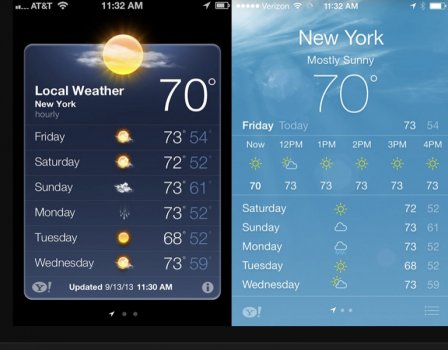
Where exactly is the depth and vitality in the iOS 7 stick diagrams of weather icons such that they all look alike at first glance and require concentration to interpret? The moon is black, clouds are black, the sun is black…
View attachment 1974297
When desiring a quick check on the weather, someone please remind me which app provided an easier-to-understand-quickly weather status?
View attachment 1974298
Things I’ve asked in a few threads over the years and am still waiting to hear reasonable answers to:
1. How did the icon grid system help the experience? What was btoken and how was it fixed? Or was it just something different, and different from what Scott was involved with?
2. How did the refined typography fix what was wrong/broken before? Or was it just something different, and different from what Scott was involved with?
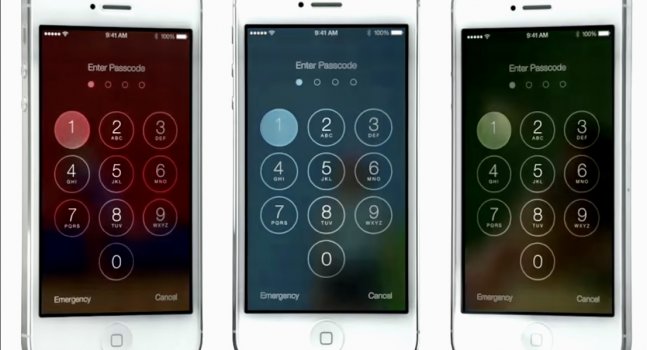
3. If translucency provides a sense of context while obscuring part of your content at times with the see-thru colors, then what was wrong with 3D buttons that helped provide a sense of context while not obscuring any part of your content ever? Or was it just different…
4. Related, how was parallax, which requires an extra step of moving your head or the phone itself in order to see the ”experience of depth,” better than 3D buttons/shadows which provided an “experience of depth” without making the user perform that extra step?
5. Where is the consistency in: JIve blathers about
“a new structure that is coherent and applied across the entire system” (such that much of the interface is a plained-out bland white wash such that it was sometimes difficult to quickly differentiate apps from one another)…only to then contradict himself and tout the benefits of how translucency “
has a very noticeable effect on the way your iPhone looks and feels across the entire system.” So is consistency better, or is unpredictable variation better, or is Jony just a B.S. artist who wanted to do things his way?
View attachment 1974293
6. What exactly is the benefit in the interface being “deferential and unobtrusive” (gag me) such that you have to inefficiently constantly swipe to regain sight of safari controls that disappear at every screen swipe. (The inability to toggle “non-deferential safari controls” so they don’t constantly play whack-a-mole hide-n-seek is one of my most hated iOS “improvements” to date)
Yeah I’m a (iOS7 and all its descendants) hater but I think it’s well deserved.
To the OP: I hope the remnant flat design of iOS eases your transition. THe iOS was once beautifully intuitive. Now it’s coldly plain (but at least has a web browser to let you google for how to do things that used to be obvious).
To
@LFC2020 thanks for upsetting my stomach before bed lol..


