Become a MacRumors Supporter for $50/year with no ads, ability to filter front page stories, and private forums.
To be fair, that’s the only thing I don’t quite like. Not the notch, but that thick menu bar. I think they could make it 1mm narrower
yes - I fully agree. A little bit of screen estate wasted.
This machine actually brings back another positive “legacy item” - higher screens.

Still fondly remember my Thinkpad T30 from 2002 - bright 4:3 IPS-screen: 1400x1050 pixels and no bezel!

Started my own business with that and it was a huge upgrade from the corporate laptops I used before.
 
*** Breaking News ***

MacRumors now brings you an even closer look at New 14-Inch MacBook Pro through an electron scanning microscope:

facceb7c4f57de82660a9ac55f157792--scanning-electron-microscope-the-surface.jpg
 
Let´s make some review. These notebooks are technically great but their design is a stepback. Here is why:

1) So big notch is there just for a marketing purpose, not technically needed. Apple hasn´t tried to find the best technical solution anymore, if yes the notch wouldn´t be there or be very tiny and almost unrecognizable.

2) Borders are not impressive. Probably the same as for 2019 16" version what I own. That means still bigger than on Dell notebooks.

3) The thickness is visually huge. And that´s not because of a few mm more in size. It´s because of changes in form. That means not even worse looking, it also means that it will be harder to take the notebook off the table. The cutouts around the bottom were fine and left still space for all the port, so no, the new design is not there for some additional ports.

But it still doesn´t mean that the notebooks are not great. If they are fast, quiet and power efficient, I can forget all these design flaws. Cross fingers to be so.
The design is technically not a step back:

1) Notch needed for quality camera. Dell XPS camera for example is horrible. A good camera is needed on the modern work-from-home scenarios. Would you have preferred not having the extra screen real estate??

2) The border could be smaller yes but even smaller borders come at a price. The make the screen are more fragile and with mini-led screens they would give a brightness falloff at the edges as there would not be enough space on the edge for the needed leds.

3) So what if it looks fatter. It is not fatter, just roomier for better cooling and more battery. It will not take more space on a desk or in a bag.

In short, Apple decided to make a decent looking machine that will be a great tool for professional use without compromising for the sake of design!
 
If you do not appreciate the functional design optimising the volume of the computer without increasing the outside dimensions then you might not the professional this has been designed for. The extra volume will give better cooling, better battery life and thus will allow a pro to work faster and longer.
It is a better tool than the old tapered design. And professionals care more about the better functional tool than the better looking tool. It is about getting work done!
Sorry but this is a lame excuse, and it seems everyone who is excited about these new laptops is using exactly this line, as if it’s always got to be a trade between form and function. Apple products have become renowned and are expensive exactly because they balance the form with the function. The USP of MacBook’s is you get better function than a windows machine and also a better design. If all ‘Pros’ really actually cared about was how fast the processor was, how much memory it had and the amount of volume available for cooling then they would most likely join the specification rat race that is the PC world. I get that the form and the function needs to be balanced, but all the indications from the reactions in this forum are that Apple have sacrificed too much style and aesthetic at the altar for what appears to be not much more function. The majority feel that this is just a fugly machine, because it is. And it’s hard to imagine most people will truly benefit from the tiny additional screen real estate that this notch is going to provide.

Bringing back some legacy ports (because it is only HDMI 2.0) will be considered ‘Pro’ for some and less ‘Pro’ for others. My business made the switch to USBC five years ago so all our equipment uses this port type. From my point of view I can plug less devices into these new machines.
Regarding the ports I agree. I prefer TB4 ports.

Regarding the design though, that is taste. And taste is different for different people.
Personally I like the boxy retro look. Reminds me of the timeless Dieter Rams designs.
 
  • Like
Reactions: Shalev Lazarof
The design is technically not a step back:

1) Notch needed for quality camera. Dell XPS camera for example is horrible. A good camera is needed on the modern work-from-home scenarios. Would you have preferred not having the extra screen real estate??

2) The border could be smaller yes but even smaller borders come at a price. The make the screen are more fragile and with mini-led screens they would give a brightness falloff at the edges as there would not be enough space on the edge for the needed leds.

3) So what if it looks fatter. It is not fatter, just roomier for better cooling and more battery. It will not take more space on a desk or in a bag.

In short, Apple decided to make a decent looking machine that will be a great tool for professional use without compromising for the sake of design!
Sorry but 1080p camera is a not big deal either. Not even the full FaceID could excuse such a big notch.

And no, a few mm for cutout around the bottom case doesn´t mean worse cooling and less battery. And if yes then just like a 0.05%.
 
  • Like
  • Haha
Reactions: Rashy and duriem
Sorry but 1080p camera is a not big deal either. Not even the full FaceID could excuse such a big notch.

And no, a few mm for cutout around the bottom case doesn´t mean worse cooling and less battery. And if yes then just like a 0.05%.
I just measured my 2013 15". The volume lost by the tapering is more in the 10% region. And that is quite a difference.
 
Sorry but 1080p camera is a not big deal either. Not even the full FaceID could excuse such a big notch.

And no, a few mm for cutout around the bottom case doesn´t mean worse cooling and less battery. And if yes then just like a 0.05%.
It's not just the 1080p camera, it's extra screen real estate freeing up space which previously would have been the menu bar unless you use everything in full screen.
 
It already is “cut in half” by the notch. The added height doesn’t make it look any more whole, it just makes the notch even more out of place.

It’ll be split regardless of that added height of the menu bar. I don’t imagine a menu item extending to the right of the notch any better.
I'm glad Apple designer think different (and think more thoroughly) and actually doesn't use the easy way out. (well, That's the height of the notch. Let's have menu bar be that high as well. Job done. Took 5 seconds to design).
 
Last edited:
  • Disagree
Reactions: douscinco
So given that the menu bar got thicker to cover the notch, does that mean that on 14 we don't really gain anything and on 16 we lose some display space?
It's not a lot, but still, considering that we trade this space for a questionable design decision... I really hope my 2017 MBP lasts me at least until I have gotten used to this design by seeing it out in the wild and on TV a lot... Unlike the type c ports and the touchbar, it's not so much the inconvenience we suffer for getting a slimmer, more stylish (and even more functional, ymmv) computer than the inconvenience we suffer for getting an uglier one. Someone already mentioned that the computer design combines two approaches: the very slim modern bezel and the trusty rounded ‘work-horse’ bottom part. I really think that Apple should have owned it and gone with iPad Pro size bezels which would have taken a little bit from top and bottom and added a bit to the side. It looks gorgeous in the new Mini.

It's weird, I wasn't ever bothered by the notch on the iPhone because I thought they really made sense of the left and right areas and the ‘ears’ became indicators of GUI behavior and also because you scroll a lot more on phones anyway and therefore the notch disappears in practice, whereas on Macbooks, you have a lot more static content (an effect augmented by the windowed GUI) which makes the notch more like an intrusion tacked onto a system. I really hope that they come up with something to really make it disappear over the next few iterations of macOS and the new device designs.
 
  • Like
Reactions: idktbh
it seems everyone who is excited about these new laptops is using exactly this line, as if it’s always got to be a trade between form and function. Apple products have become renowned and are expensive exactly because they balance the form with the function.
I don't know what cave you were in the past 4 years but that's very laughable consider the reality.
 
  • Like
Reactions: Rashy
So given that the menu bar got thicker to cover the notch, does that mean that on 14 we don't really gain anything and on 16 we lose some display space?
Why we still ask this question when it is answered again and again that no, the menu bar is beyond 16:10 screen you usually get from old MBP?
 
  • Like
Reactions: Tagbert and tmoerel
Happy with my 14 inch purchase after all this, the 16 inch is looking too damn big for me coming from my current 16 inch which I already barely used outside of my desk area due to its weight and size
 
It's not just the 1080p camera, it's extra screen real estate freeing up space which previously would have been the menu bar unless you use everything in full screen.
Not exactly. If the menu is around the notch it still means that smaller notch would do a better job. So back to my first post, this is not THE BEST technical solution what could Apple find.

Moreover, the notch also means some problems for software. Eg. Photoshop in my languare and resolution has more and longer menu items that go to the center of the screen. So under the notch.
 
I actually like the body design. It's nostalgic in a way and I don't mind it not looking like something groundbreaking from the future. As for the notch, I won't say anything until I get my order and see the screen in real life.
Although it could be a slight shock switching from a 2011 MBA to this. The MBP will be heavier and take up more space in my bag.
 
It‘s not a dealbreaker, but I‘m just not very excited for this new design. The roundedness of the chassis looks outdated for me (don‘t care about the thickness), the notch looks much more out of place than on a phone and then the menu bar doesn‘t even have the same height. The keyboard area being all black looks like it‘ll show dust and dirt a lot more than in the past. Gonna have to stock up on compressed air.

The power of them is exciting though!
 
  • Like
Reactions: OS X Dude and jjd
It‘s not a dealbreaker, but I‘m just not very excited for this new design. The roundedness of the chassis looks outdated for me (don‘t care about the thickness), the notch looks much more out of place than on a phone and then the menu bar doesn‘t even have the same height. The keyboard area being all black looks like it‘ll show dust and dirt a lot more than in the past. Gonna have to stock up on compressed air.

The power of them is exciting though!
Can´t agree more.
 
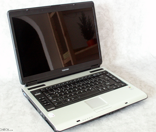
Yeah, the new keyboard design is fresh. It's as fresh as my 2007 Toshiba Satellite. ?

full
Today‘s cars look pretty alike. You can vary things only so much after a century and hundreds of automakers. How varied can one expect computers to get year to year without some repeat themes? Maybe Apple could add horns, or switch keyboard and screen locations for something really unique?
 
  • Like
Reactions: dz5b609
Register on MacRumors! This sidebar will go away, and you'll see fewer ads.