Got a tip for us?
Let us know
Become a MacRumors Supporter for $50/year with no ads, ability to filter front page stories, and private forums.
New iOS 7 Icons for GarageBand and iPhoto Appear, Hinting at Upcoming Redesign
- Thread starter MacRumors
- Start date
- Sort by reaction score
You are using an out of date browser. It may not display this or other websites correctly.
You should upgrade or use an alternative browser.
You should upgrade or use an alternative browser.
Steve Jobs would have fired someone for that.
Steve also told Tim to not think "what would have Steve done." And I like the icons to be honest.
People's taste are different. Luckily Apple has Jony Ive which as Tim Cook put it, probably has the best taste in the world. iOS 7 is amazing.
You say that, yet you give no reasons. Let me ask you: What is it you like? The stick figure drawings or the gradients some of which are hot-cold and others cold-hot? Or do you like how the transparent bar on the top of Safari makes it look like somebody scribbled all over it when text shines through?
Last edited:
Nothing beats "Find my Friends" IMO
The Cards App did. Bring back the Cards app!!

Everyone cried when they went skeuomorphic.
iOS was and still is skeuomorphic and there seem to be many misconceptions about that term. Skeuomorphism is more than just a leather background. Many people here actually seem to like change, but not just any kind of change.
It doesn't matter. That's what's great about the people getting all upset. I've been on this forum long enough to know that any type of change, the people will hate it for the first 6 months. Then it will become near and dear to their hearts until it's changed again 2 years down the line. It's a cycle of cynical people who can't enjoy anything until they've been given enough time to warm up to it.iOS was and still is skeuomorphic and there seem to be many misconceptions about that term. Skeuomorphism is more than just a leather background. Many people here actually seem to like change, but not just any kind of change.
It doesn't matter. That's what's great about the people getting all upset. I've been on this forum long enough to know that any type of change, the people will hate it for the first 6 months. Then it will become near and dear to their hearts until it's changed again 2 years down the line. It's a cycle of cynical people who can't enjoy anything until they've been given enough time to warm up to it.
Or because those are different people. Or because they accept the change due to the a lack of alternatives. At some point every criticism, however valid, may fall on deaf ears. Similarly, not everyone has a change aversion, perhaps more a case of bad-design aversion. I for one thing like change and am naturally curious. But the design and colour palette of iOS 7 still makes me cringe.
I'm more concerned about functionality than what a stupid app icon looks like. I'd love to see Apple make iWork a true Google Docs/Office competitor. Take away any advantage Microsoft thinks it has with Office on a tablet.
----------
How did a sunflower indicate photos? Yet I think everyone got along with it just fine for 6+ years.
Well, it was recognisably a picture of something.
iOS was and still is skeuomorphic and there seem to be many misconceptions about that term. Skeuomorphism is more than just a leather background. Many people here actually seem to like change, but not just any kind of change.
Yup. You nailed it. Different does not automaticly make things better. It just makes things different.
I could deal with the crap icons, but the big fail for ios 7 is how badly it doesnt work from a usability perspective. The first rule of good design is to make things clear concise and easily understandable. In this regard, iOS 7 fails miserably. Try reading the yellow text on a white background in bright sunlight and see how well it works.
I got somewhat lucky. My iPhone 5 developed an issue and was replaced under warranty. Thankfully, the new one still had iOS 6 on it. But, after ownung every iPhone version since the first one, I also bought a Nexus 4, just to learn how Android works. Between myself, for family and for staff, I've bought somewhere around 20 iPhones in the past 5 years. My current 5 will be the last.
Last edited:
I don't know how this is possible. I feel like I should hate all of these icons, but no, I love them. Even compared with the old ones, I love these. Damn.
Steve Jobs would have fired someone for that.
You think Steve Jobs would've fired Jony Ive?
Those two icons are not great, and there is little artistic connection to any of the other new app icons.
I could have done the design and production of those icons--both of them--in about 45 minutes, and been a bit more creative in that timeframe.
I could have done the design and production of those icons--both of them--in about 45 minutes, and been a bit more creative in that timeframe.
What about iWork apps? These do look a lot better than some other iOS 7 icons though.
I suspect apple is waiting to release two revamped sets and mavericks at the same time
But what I would like to see is some internal tweaking. Make the apps plugin friendly so we can add templates, fonts, brushes, filters, loops, themes etc. They could all still have to go through the store but it would let us make the apps more powerful if we needed them cause, like with autobus and GarageBand, we could add things like endnote and MathType and so on
So the icons have been updated. Wonderful.
Now if only they'd update the iPhoto app itself so it's actually USEFUL. As it currently stands it's ridiculously slow and far less capable than many third party apps I've used.
How about syncing of adjustments with the desktop versions of iPhoto and Aperture? How about better organizational ability? Syncing of projects and albums?
As it currently stands iPhoto on iOS is just a weak image tweaker with a bloated interface. We all know Apple can do SO MUCH better.
You think Steve Jobs would've fired Jony Ive?
At least he did not let Jonathan take charge in the UI.
Everything looks so washed out and cold now. I was really looking forward to getting my wife a 5c to replace her 3gs, but that turned into a very hard sell once she saw IOS7 and I had a hard time disagreeing.
I expect all of iLife and iWork to be updated for iOS 7 (look and icons)
iBooks to FINALLY be updated for iOS 7 (look)
And Find My iPhone should get that iOS 7 look.
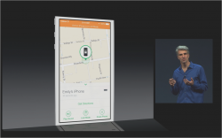
I don't see how no one has noticed this yet, but Apple already gave a preview of it at WWDC.
Attachments
Also, I want an ergonomically acceptable musicplayer for iPad. Mr Ive destroyed my Apple experience.
Ive actually made the iPad music player a bit better, it was destroyed way back in iOS5, long before Ive had anything to do with the software. Still not great now but the best music player app on iPad since iOS4.
I see icons as mini logos. They should artistically be instantly recognizable with minimal effort. These examples do the job for me and I rather like them. Of course I am a huge fan of Miami Vice.
Storage is for people, who do not convert their data into crap.
Hahah this is hilarious, especially the storage aspect. I absolutely adore people when they cry about storage. Like seriously? You need more than 64gb? Really? Storage is for those people who have problems where they want a million apps they never open on their device, a million songs they never play on their device (they just want their entire awful library of music on it), and a million pictures they'll never view. Luckily Apple knows this and doesn't care (well, beyond 128gb anyway).
----------
Oh god you are so dead on with the first part. Seriously everyday on my MacBook Pro I'm so excited to see what they're doing for 10.10. I cannot wait to see that UI overhauled just like they did with iOS 7. Everyday I look at it and it's like a glance back at the horrible iOS 6, because the icons are terrible and you still see that linen background on certain things. Oh and luckily you can change the dashboard background because I would literally never have swiped over to that blissfully terrible Lego looking background for it. I am sooooo pumped for 10.10.
Explains why I like them so much. One of my favorite vacation spots!Welcome to hawaii
Register on MacRumors! This sidebar will go away, and you'll see fewer ads.