Become a MacRumors Supporter for $50/year with no ads, ability to filter front page stories, and private forums.
To fit the trend...again...

If you notice, these colors are similar to the minis. I believe these colors are colors that are going to appeal to the trendy manhattan folk and the hipsters. Im just one of those boston boys who prefers practicality over trendy. Oh well. Prolly just buy one anyway out of frustration...or rage. :apple:
 
OH MAN!!! I can't wait to buy myself a baby puke green iPod Nano!!

The Stig

green.png


HA! I wouldn't say so. How about seafoam, sprindrift, emerald mist, flora or minty expressions? ;)
 
If you notice, these colors are similar to the minis. I believe these colors are colors that are going to appeal to the trendy manhattan folk and the hipsters. Im just one of those boston boys who prefers practicality over trendy. Oh well. Prolly just buy one anyway out of frustration...or rage. :apple:

Frustration....Rage....over the color of an iPod? :rolleyes:
 
What no brown?! :eek:

I was wondering the same thing...where is the **** brown? I am sure many people want it! :rolleyes:

All in all, great color selection...they look kinda bland on the screen, but seem perfect for anodized aluminum or similar materials...go Apple!

That last name is a joke for sure (it's an old fashioned type of glasses), so if the name is fake, the address might be also IMO.

Funny thing is, while a lot of people do it, providing a fake whois record for a website is actually a crime and means that you (technically) don't have rights to the site or domain.

Anyone wanting to be a jerk about it could steal 9 to 5 mac out from under this guy, or at least get him in trouble and force him to use his real name.

Well, it could be the guy running the outdoor cafeteria somewhere in Apple's campus... :rolleyes:
 
That's...interesting. I don't object to the colors (other than the seafoam - I really hate seafoam and the green they have now is pretty great - wish I had picked up my Nano in green last week, but I got the blue because I thought maybe my dad would want it instead), but something about the form factor rings slightly false. I mean, I can see Apple changing the form factor again (not that it is needed, but hey, why not - it's Apple) - but the only conceivable way I can see what the mockups show as working in a functional way would be to make it bigger. That's kind of antithetical to the whole Apple mantra - especially when then Nano is concerned.
 
listen up everyone... blue isn't always necessarily for boys, and pink isn't always necessarily for girls... it's a color, not a penis or a vagina...

besides, i read some stats a while ago that stated that more girls owned iPods than boys, so these new (apparently feminine) colors make sense...

Sorry, I'm just a tad stereotypical when it comes to colors, just when I see a guy wearing pink, I will think differently of him:p If I see a person wearing all black, I'll think that he/she is either a goth or a vampire.

Puma
 
Sorry, I'm just a tad stereotypical when it comes to colors, just when I see a guy wearing pink, I will think differently of him:p If I see a person wearing all black, I'll think that he/she is either a goth or a vampire.

Puma

100 years ago, pink was considered a masculine, aggressive colour and blue was considered calming and feminine. How times have changed.
 
i dont get u guys..as if u like these colours..they are grosssss. i really dislike them.

i clicked on the comments expecting to see hate comments about these colours. as if im alone on this one. :(

Second that.

Many people at this forums seems to agreed to what ever Apple brings, total lack of criteria.
 
I like the current Nano colors better. I just think bright colors look better on an iPod. I also don't like the shape that's on the website in the OP. I see that as being awkward to put in a pocket or something.
 
Naysayers, if want a new nano and the colors don't suite you, then there's always a variety of colorful protective covers/skins you can buy to suite you. Just thought I'd throw that out there... :rolleyes:
 
if these were zune colours...

we would be ripping it out of them.
these look generally poor to my mind, the red is nice tho.

i generally think give people the choice, but then the ipod has done so well in white/black, it would seem to me that the colour is not really that important..

i do worry when companies start to do things like this that they're gonna come out with a flood of little spin offs... just seems to detract from the product and look a bit desperate??

im probably wrong, but its just my thoughts.
 
Guess it's a great time for me to stock up on the current green and blue colors before the "earthy" tones come. I don't hate the rumored colors, but I definitely prefer the current selections of bright and fun colors. Introducing new colors seemed to create a sales surge for the shuffle. Perhaps Apple is expecting people to flock in and buy up the up-coming ones, and others less smitten will flock in to buy the current ones.

This topic is just screaming for a poll.
 
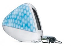
I think these purported new colours reference previous Apple colour choices to some extent…

The pale green is towards the spectrum area of the 'Sage' iMac, and the cranberry/wine one could be reminiscent of the 'Ruby' iMac.

Also to some extent, the pale blue reminds me a little of the predominant shade for the 'Blue Dalmatian' iMac.
 

Attachments

  • imac_bd_phones.jpg
    imac_bd_phones.jpg
    11.2 KB · Views: 793
  • imac_family.jpg
    imac_family.jpg
    18.4 KB · Views: 794
...
Touch-screen. No click wheel. 2.5" screen. Does video. All video is viewable in landscape mode. New features like calculator. Comes with headset in-line remote for pocket usage. Similar UI to existing nano UI. Internal accelerometer for sensing rotation between portrait and landscape modes, for photo displaying, and possibly clover flow. 4GB & 8GB versions.

I don't get why when people have an idea, they break it up. With full stops. Or periods. Like they are being a salesman. It's really weird. I don't get it.
 
I think these purported new colours reference previous Apple colour choices to some extent…

The pale green is towards the spectrum area of the 'Sage' iMac, and the cranberry/wine one could be reminiscent of the 'Ruby' iMac.

Also to some extent, the pale blue reminds me a little of the predominant shade for the 'Blue Dalmatian' iMac.

Very interesting that you pointed that out. I never really thought about that.

This might prove that Apple has experience with using color tastefully in their products. I'm sure they won't disappoint with whatever they have to offer next month.
 
100 years ago, pink was considered a masculine, aggressive colour and blue was considered calming and feminine. How times have changed.

True. Despite being widely considered the color of females, before the 1930s, pink was considered to be a color for boys in America. Because pink is a watered down version of red, it was considered a color of power and strength, as red is still today. Blue was for girls.

Whereas Jews were forced to wear the familiar yellow stars of David, and Roma people were forced to wear a black triangle, men imprisoned on accusations of homosexuality or same-sex sexual activity were forced to wear a pink triangle.
 
great! every 12 year old girl in america will want one! :rolleyes:

If you notice, these colors are similar to the minis. I believe these colors are colors that are going to appeal to the trendy manhattan folk and the hipsters. Im just one of those boston boys who prefers practicality over trendy. Oh well. Prolly just buy one anyway out of frustration...or rage. :apple:

and a color makes a product unpractical... how exactly? :confused:
 
I am falling in love with that wine/cranberry colour. I am hoping that they will go with these colours. They're what takes up the body of consumer fashion right now, so I could definitely see them going with these colours. The men that are squeamish about their sexuality will stick with boring silver, and everyone else can have a fun color.
 
Register on MacRumors! This sidebar will go away, and you'll see fewer ads.