I’ve never not updated to a new OS but losing the dock is a deal breaker and there isnt really anything new worth updating for in OS10
Got a tip for us?
Let us know
Become a MacRumors Supporter for $50/year with no ads, ability to filter front page stories, and private forums.
OS10 is a failure
- Thread starter edhchoe
- Start date
- Sort by reaction score
You are using an out of date browser. It may not display this or other websites correctly.
You should upgrade or use an alternative browser.
You should upgrade or use an alternative browser.
Genuine question— were you using different watch apps so often on the watch that the dock was really that useful?I’ve never not updated to a new OS but losing the dock is a deal breaker and there isnt really anything new worth updating for in OS10
I legitimately can’t think of anything to do on my watch besides reply to text messages, check the weather, and skip the song I’m listening to. And I don’t do that so often in the same session that I even need to access the app switcher.
I didn’t realize how much people used the dock
Personally I’m a fan of the reworked OS overall. One thing I’d like to see is Control Centre developed now it’s easily accessible with the side button. It really should have playback controls in there for example.
Also I think I would have gone with full screen widgets that could show more information, similar to the old glances, which you could flick through with the crown. Even if the widgets were double height you’d be able to fit in so much more information and would better differentiate them from complications.
Widgets like Reminders, Calendar, Weather and News would be much more useful if they had more space to display information.
Last edited:
It sounds like a lot of people would have used it to set it back to how it was and a lot wouldn’t. User settings don’t generally take a lot of time to code, especially when both options are already in the code and it’s just a matter of reading a flag that says which way it should go. The ability to swipe back and forth was already there. The press and hold was already there because that’s how you edit the complications, colors, etc. There’s already a well established Settings section on the watch.A setting almost no one would have used, so it would have been a waste of development resources.
Again, if you want endless settings and options you want Android or Windows.
I don’t usually switch between faces, so I don’t care. But if that’s part of how you use the watch on a daily basis, I can see how it sucks for some people.
You used to be able to use the crown to scroll through a watch face like the sunset but now the crown always triggers the Siri roll
I too don't like those changes. It's now one step more to change faces - something they had already made easier previously (iirc you had to force press the display to do that in early versions of watchOS)
Same with having to press a button to access control center now. Or that on the solar dial you have to tap the display first, before you can change time by turning the crown.
Maybe I just have to get used to it all, but so far WatchOS has made using the watch slower for the way I use it.
(Not to mention a bug when the notification dot stays on but I can't swipe down for notifications until I reboot the watch)
I only use a few apps and really liked the quick access from the dock. I don’t have like 10 apps there but it’s nice to have the 5 or so I use often easily accessibleGenuine question— were you using different watch apps so often on the watch that the dock was really that useful?
I legitimately can’t think of anything to do on my watch besides reply to text messages, check the weather, and skip the song I’m listening to. And I don’t do that so often in the same session that I even need to access the app switcher.
I didn’t realize how much people used the dock
Failure? works great for me. I'm not one to bawl over a changed UI item though. And once you know how to change watch faces, it is pretty easy. So if this is your reason for labeling it as a failure, id say that was a weak argument. Let us see what the adoption rate is. a failure would be like windows 11, that nobody wants
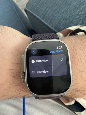
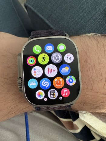
Forgive me but it seems like putting the app view in the revamped grid mode and having your most commonly used apps at the top of the grid would be just as accessible. One press of the Digital Crown will get you there.I only use a few apps and really liked the quick access from the dock. I don’t have like 10 apps there but it’s nice to have the 5 or so I use often easily accessible
It drives me absolutely insane that they moved the control center to the button. I always do ghost swipes and it takes me to this useless new app widget launcher
Is this "grid mode" of which you speak actually the honeycomb layout from the earlier versions of watchOS? There's ABSOLUTELY NOTHING new or useful there.Forgive me but it seems like putting the app view in the revamped grid mode and having your most commonly used apps at the top of the grid would be just as accessible. One press of the Digital Crown will get you there.
Last edited:
I definitely preferred swiping between watch faces as I use many, but it's not a deal breaker.Failure? works great for me. I'm not one to bawl over a changed UI item though. And once you know how to change watch faces, it is pretty easy. So if this is your reason for labeling it as a failure, id say that was a weak argument. Let us see what the adoption rate is. a failure would be like windows 11, that nobody wants
Also, I really like Windows 11. I just massively prefer macOS.
Well for me, grid view is a total mess in finding things. I turned it off on my older Apple watch, and I will with my AWU2. I've tried to live with it, but not any more. It's so full of icons that really don't mean anything at all.I’m just talking about putting the app view in “grid view” since it’s scrollable now — how is the dock better than this?
View attachment 2295589View attachment 2295590
just that it gives you the ability to re-arrange icons. I find it useful now that I moved those apps I do use towards the top.Well for me, grid view is a total mess in finding things. I turned it off on my older Apple watch, and I will with my AWU2. I've tried to live with it, but not any more. It's so full of icons that really don't mean anything at all.
I find zero redeeming value in the honeycomb hodgepodge of apps. I see it much the same as rearranging deck chairs on the Titanic...just that it gives you the ability to re-arrange icons. I find it useful now that I moved those apps I do use towards the top.
It’s very different. It always starts at the top of the grid which means putting your most used apps there gives you very fast access. Also it simply scrolls up and down now. Much easier to navigate.Is this "grid mode" of which you speak actually the honeycomb layout from the earlier versions of watchOS? There's ABSOLUTELY NOTHING new or useful there.
#67 It’s very different. It always starts at the top of the grid which means putting your most used apps there gives you very fast access. Also it simply scrolls up and down now. Much easier to navigate.I find zero redeeming value in the honeycomb hodgepodge of apps. I see it much the same as rearranging deck chairs on the Titanic...
I tried that, but I really do better with words and alphabetical order. fwiw, I use details mode Windows explorer and list mode in finder too.just that it gives you the ability to re-arrange icons. I find it useful now that I moved those apps I do use towards the top.
I can't argue with that, but I would've never thought of it!I find zero redeeming value in the honeycomb hodgepodge of apps. I see it much the same as rearranging deck chairs on the Titanic...
Not that bad😊 it is a “little” inconvenience but not a big deal. We get used to it. Keep calm and be happy 😊I cannot swipe between face?
I cannot fit all my apps on one face so i have to swipe between faces frequently.
Now i have to hold and change faces?
What a hassle!!!
Yeah. Me too. Not sure what all the fuss is about. The "long press" takes about 1 second and then I can swipe to whichever face I'd like.I can still change my face in WatchOS 10. I just long press on the screen.
Yeah. Me too. Not sure what all the fuss is about. The "long press" takes about 1 second and then I can swipe to whichever face I'd like.
Maybe not even a whole second. I'm more concerned about the new cursor bubble. I hate it. It takes a whole second to get the bubble.


Same as the swipe to change the watch face feature.Apple is better than ever at giving options for stuff but they're still Apple, and honestly, I suspect discoverability on that feature toggle would have been less than 1%.
Thank god they fixed that ****. Tired of my faces being changed accidentally.I cannot swipe between face?
I cannot fit all my apps on one face so i have to swipe between faces frequently.
Now i have to hold and change faces?
What a hassle!!!
use the infograph face and you're done.
Register on MacRumors! This sidebar will go away, and you'll see fewer ads.


