Got a tip for us?
Let us know
Become a MacRumors Supporter for $50/year with no ads, ability to filter front page stories, and private forums.
Photo of the Day - April 2010
- Thread starter Designer Dale
- Start date
- Sort by reaction score
You are using an out of date browser. It may not display this or other websites correctly.
You should upgrade or use an alternative browser.
You should upgrade or use an alternative browser.

Palm Sunset
This was taken in Cancun a couple of weeks ago. My girlfriend is laying on one of the lounge chairs there at the bottom right. Sooo romantic I almost got a cramp in my trigger finger, I took so many photos.

Camera: Pentax K200D
Exposure: 0.004 sec (1/250)
Aperture: f/5.6
Focal Length: 18 mm
ISO Speed: 200
I love my weathersealed Pentax gear!
This was taken in Cancun a couple of weeks ago. My girlfriend is laying on one of the lounge chairs there at the bottom right. Sooo romantic
I almost got a cramp in my trigger finger, I took so many photos.
Camera: Pentax K200D
Exposure: 0.004 sec (1/250)
Aperture: f/5.6
Focal Length: 18 mm
ISO Speed: 200
I love my weathersealed Pentax gear!


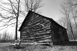
This was taken out in Elbe, Washington.
![]()
iCheese and other Flickr users: If you have your image posted per the instructions I provided on the first post of this month (aka The Guide) and either you or a mod changes your image tags to , your photo will no longer link back to Flickr as Yahoo asks in it's TOS. This is due to the vB code used by MR reading that tag as a thumbnail. Rather than linking to Flickr, clicking an image opens the thumbnail cached on the MR server. Some of this tech stuff may be off, but that's what's going on. The "cure" to the "illness" is to edit your post and remove the "T".
Dale

Walking around the T2i at night seeing how it does.

Camera: Canon EOS REBEL T2i
Exposure: 0.033 sec (1/30)
Aperture: f/10.0
Focal Length: 55 mm
ISO Speed: 1000
Exposure Bias: 0 EV
Flash: Off, Did not fire
Camera: Canon EOS REBEL T2i
Exposure: 0.033 sec (1/30)
Aperture: f/10.0
Focal Length: 55 mm
ISO Speed: 1000
Exposure Bias: 0 EV
Flash: Off, Did not fire
The lighting here is really absurd. It almost makes the heels look cheap and plastic. Was the light source right under a table?
I think it looks pretty cool. It could use some soft foreground lighting, but other than that it's a successful picture. I guess everyone has their comments and, as per usual, Jessica has her criticisms.
Razeus, I like that picture. It tells a story just looking at it....
Virtualrain, I've seen some over the top Christmas decorated houses, never an Easter one, thanks for sharing that!
Dale and others on the old stuff, I love them. I like old stuff. I'm going have to take a picture of my antique kitchen stuff. I collect and refurbish antique kitchen tools, that is my other hobby
Mine for today... Bell tower of the shopping center where my restaurant is... I wish the sunset was more cooperative, will try again...

Chef Jay
Virtualrain, I've seen some over the top Christmas decorated houses, never an Easter one, thanks for sharing that!
Dale and others on the old stuff, I love them. I like old stuff. I'm going have to take a picture of my antique kitchen stuff. I collect and refurbish antique kitchen tools, that is my other hobby
Mine for today... Bell tower of the shopping center where my restaurant is... I wish the sunset was more cooperative, will try again...
Chef Jay
It is the fantastic thread I had viewed, I just like it. All the picture are awesome in its own way and it's telling something at least.Keep It up.

Your last couple of posts seem to contain elements that you are often critical of. The landscape, while beautiful, seems to need a bit of tilt adjustment or is it just an optical illusion? The shot of the rocks is uniform without an element of interesting focus.

Thanks for posting, I often enjoy your captures.
I love dropping in and seeing all the amazing images.It is the fantastic thread I had viewed, I just like it. All the picture are awesome in its own way and it's telling something at least.Keep It up.
Your last couple of posts seem to contain elements that you are often critical of. The landscape, while beautiful, seems to need a bit of tilt adjustment or is it just an optical illusion? The shot of the rocks is uniform without an element of interesting focus.
I think they both work the way they are, the rock shot has a pattern look to it, while the landscape kind of works like that thanks to the "line" created by the mountain which I guess is the straightest
Changing light - (redux, vertical crop)
Thanks TheReef, dpastern, oblomow, heron88, Doylem for your comments on this shot. Oblomow, at first I thought it was too light, myself, but when I viewed it larger I realized better to leave it much as it was when I captured it.
Here it is cropped much like my first Mt. Hood post, as per Doylem's suggestion: What do you think? Is it better without much of the foreground?
![]()
Thanks TheReef, dpastern, oblomow, heron88, Doylem for your comments on this shot. Oblomow, at first I thought it was too light, myself, but when I viewed it larger I realized better to leave it much as it was when I captured it.
Here it is cropped much like my first Mt. Hood post, as per Doylem's suggestion: What do you think? Is it better without much of the foreground?
Holy crud this is beautiful.
Lovely
Here it is cropped much like my first Mt. Hood post, as per Doylem's suggestion: What do you think? Is it better without much of the foreground?
![]()
This really is a lovely shot... and I do like the crop. Very Nice. BJ
Here it is cropped much like my first Mt. Hood post, as per Doylem's suggestion: What do you think? Is it better without much of the foreground?
This really is a lovely shot... and I do like the crop. Very Nice. BJ
On the Beach
Went to the beach in Cornwall this Easter weekend. Nice light down there. Please give me your C&C. Thanks.
![]()
Camera: Canon EOS 1000D
Exposure: 0.003 sec (1/400)
Aperture: f/13.0
Focal Length: 18 mm
ISO Speed: 200
Exposure Bias: 0 EV
Flash: Off, Did not fire
Went to the beach in Cornwall this Easter weekend. Nice light down there. Please give me your C&C. Thanks.

Camera: Canon EOS 1000D
Exposure: 0.003 sec (1/400)
Aperture: f/13.0
Focal Length: 18 mm
ISO Speed: 200
Exposure Bias: 0 EV
Flash: Off, Did not fire
Over the shoulder
Trying a new angle with this daffodil.
![]()
EXIF
Camera:Canon EOS 40D
Exposure:0.006 sec (1/160)
Aperture:f/13.0
Focal Length:60 mm
ISO Speed: 100
Exposure Bias:0 EV
Flash:On, Fired
Trying a new angle with this daffodil.

EXIF
Camera:Canon EOS 40D
Exposure:0.006 sec (1/160)
Aperture:f/13.0
Focal Length:60 mm
ISO Speed: 100
Exposure Bias:0 EV
Flash:On, Fired

Went to the beach in Cornwall this Easter weekend. Nice light down there. Please give me your C&C. Thanks.
Camera: Canon EOS 1000D
Exposure: 0.003 sec (1/400)
Aperture: f/13.0
Focal Length: 18 mm
ISO Speed: 200
Exposure Bias: 0 EV
Flash: Off, Did not fire
Nice light and scenery, but it's a bit too centered for my taste. Crop the bottom ( or better shoot it from another, eg. lower, angle)
Register on MacRumors! This sidebar will go away, and you'll see fewer ads.