First off, I am by no means an expert or skilled at architectural photography, I'm just keen on it. So take my advice with a grain of salt!
")
Think about what you want to illustrate, the building in context of its surrounds, the building itself or an aspect of the place. They are my three starting points. I don't actually try and capture it all in one go, I head to a place with a particular thing in mind, but if you are out of town, it's obviously not going to be possible, unless you are there for a bit and have the luxury of re-visiting.
For a contextual picture, it works. It shows the peculiar design of the place, set against its surrounds. I would take a few steps to the right to bring more of that building in the rear on the right into view. POV's for a building are peculiar to the individual places setting in its surrounds, so explore them with your viewfinder to your eye! I'd love to see this place with views from square on in front and also to the left. There's that sunken area in front that could be of added interest.
[Rant]Were the architects on acid or something, a wedding cake for a library! That has no bloody semblance of relevance from a design point of view. Maybe for a drive-through wedding chapel in Las Vegas, but for a library... really! There's a complete disconnect for the viewer, it just doesn't compute as "library."
Don't get me wrong, I like it as a quirky and unique architectural design, but really feel it missed the mark completely as a library design.[/Rant]
Back to your efforts, AFB. If you want to avoid converging lines, you need to be square to the building and level. Working from a far enough away distance to allow you the ability to crop into the image in PP as you don't have the ability to shift your image up with standard lenses. You could always achieve it in PP if you are only posting smallish web based imagery, then you won't ever notice the squishing or stretching of pixels. Whether you get everything perfectly square is up to you, my preference is NOT to! It looks really un-natural to my eye and quite disturbing visually, when I see images that are perfectly squared off, where the architecture of whole structures is concerned. People talk about the leaning back effect, but no one mentions the leaning forward, that getting things perfectly square achieves. The better architectural imagery, in my eye, is achieved with a modicum of convergence remaining.
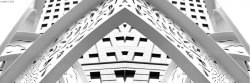
You have nothing really upright or level here, which is a wee bit disturbing for the eye. Play with getting the corner upright or one of the bases level and see what that does to the image.
What I'm trying to get you to look at is, the difference of effect on your image, when you are square and level to the structure as compared to when you look up at the structure and even when you are not level. Which one pleases your eye for that particular place? It's different for me, depending on the individual place and its design.
Look at the use of light to highlight certain aspects of the place, sunlight on a certain face of a building and shadow on another can accentuate the buildings form wonderfully, bringing dimension to an otherwise flat visual representation, as photography is. Sunset, with a nice blend of interior and exterior light is magic!
Hope that helps a tad.
I feel the disconnect of the building stepping in here has messed with the shot. If you had removed that step from the scene it would have been much stronger imagery. With just two planes of dimension and pattern to lure us in.
Again, pinch of salt required. I am no expert, just a quixotic neophyte!