Become a MacRumors Supporter for $50/year with no ads, ability to filter front page stories, and private forums.
Just yet one more example of the poor designers Apple employs lately. It’s such a small thing but it speaks to a larger problem. Their user interface has sucked on many design angles for years. Just take a look at Apple Music. Nothing is as intuitive as it used to be…
Poor designers or poor leadershi*? It's not the designers who have free reign to (randomly) reinvent interfaces that (used to) work pretty damn perfectly and effortless.

That's the sad facet of running a large company where marketing/management/shareholders/someone demands something new and different every so often, even if it means undoing something nearly perfect and/or not in need of much adjustment. iOS7 or Yosemite, anyone?

Safari 15 on Big Sur with "increase contrast" enabled in Accessibility (for those of us who get eye strain trying to work within all the maddeningly-light-grey-shaded fonts and "buttons") looks no better than what Windows could do in 1995. Who's minding the ship at Apple? If only Tim had 1/10 of Steve's ability to discern "good design" and drive for it.

New moto
“It just works…..just not the way you think it does #ThinkDifferent

It's just Apple's unspoken philosophy now to change cosmetics arbitrarily with major updates, even when it was not broken, so that a user feels like it is new. Safari on iOS changed how pages work so often that it is now the most unproductive. Safari tabs on desktop have been similarly changing designs every few years too for no reason.

Sadly, "change for the sake of change" is the new "it just works."
 
It's truly awful. Not to mention how many issues I've run into with websites not fully loading.
I'm having that exact problem specifically with MacRumors. It's like all content below a certain point just isn't displaying (just shows up white). Then if I simply click in the white area, things appear. I've tried disabling all content blockers and it doesn't help. Weirdly, it's only a problem on my M1 iMac, but not on the M1 Air, both same OS version and Safari version ¯\_(ツ)_/¯
 
  • Like
Reactions: nvmls
I have really enjoyed having all my tabs in the one row with no url bar, it just works better and takes up less space. I guess some folks are just completely averse to change.
Averse to bad changes, or changes that are done for the sake of change -- yes. Averse to all changes? No.

The new tab design solves absolutely no problem anyone had, while fouling up a visual UI cue that's been in use for years -- and which is in fact still in use in other parts of the OS.
 
I am not liking what's been happening with Safari on either iOS or Mac OS. I upgraded my backup phones to latest iOS and wasn't too fond of how Safari worked with address bars and tabs. Before it was more fluid. I've kept it to iOS 14 for now, but thinking about when I'll have to upgrade for security reasons.
 
I'm having that exact problem specifically with MacRumors. It's like all content below a certain point just isn't displaying (just shows up white). Then if I simply click in the white area, things appear. I've tried disabling all content blockers and it doesn't help. Weirdly, it's only a problem on my M1 iMac, but not on the M1 Air, both same OS version and Safari version ¯\_(ツ)_/¯
That issue has been present in our machines for years, usually shows up when you leave many tabs open for several days. Often Confluence (from atlassian) is a good page to reproduce that behavior, it's as if memory bottlenecks and is unable to render content real time without user doing some some clicks / scrolling, and even then it may show up incomplete.

Another thing we notice increasing, is the amount of "site has reloaded due to memory usage" kinda top notification bar msg, even on MR happens often, both on M1 and Intel machines.
 
  • Like
Reactions: ignatius345


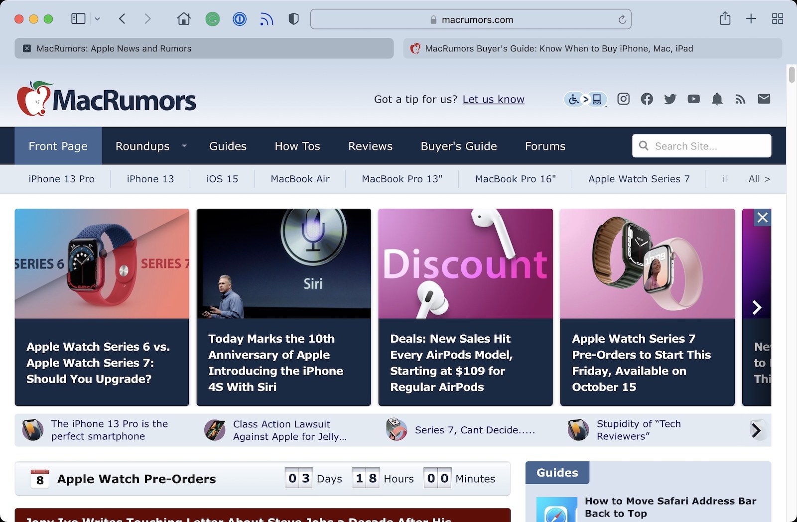
Safari 15's controversial new design on the Mac has led to complaints about the way the browser indicates which tab is active.

safari-15-tabs.jpg

As illustrated by Daring Fireball's John Gruber, there was never any ambiguity about which tab is active in previous versions of Safari, as an active tab is shown with lighter shading that matches the browser's toolbar.

In Safari 15, however, tabs have a new button-like design with a rounder and more defined appearance. Apple has also inverted its shading of tabs, with an active tab now having darker shading and inactive tabs having lighter shading. The change has annoyed Gruber and other users, as evidenced by this Reddit thread with nearly 1,000 upvotes.

"The design is counterintuitive," wrote Gruber. "What sense does it make that no matter your settings, the active tab is rendered with less contrast between the tab title and the background than background tabs? The active tab should be the one that pops."

In a Safari 15 window with two tabs open, especially from the same website, Gruber said determining which tab is active is basically a guessing game. Gruber acknowledged that it is easier to discern the active tab when more than two tabs are open, but he said the confusion with exactly two tabs should have been reason enough to scrap the design change.

"I can't tell you how many times I closed the tab that I needed because of this," one Reddit user expressed in frustration.

Unfortunately for users who do not like the new design, Apple has not made any changes to the shading of tabs in either the Safari 15.1 beta or the latest version of the experimental Safari Technology Preview browser.

Article Link: Safari 15 Users Say New Tab Design is Counterintuitive
I don't get it. Gruber says that Safaris design is not good. How does Macrumors know that "users" do not like it? This is how journalism in the USA works. There is a small circle of people that write about Apple and try to influence public opinion. They try to push their own agenda and MacRumors gives me the impression with article titles like this, that it supports this. A little bit more serious reporting would be good.
Safari's design is controversial. It's not perfect, but it's also not the failure that Gruber says it is. These kind of "journalists" want to think that they are important. I say that each user should judge alone if the new Safari design is good or not and stop reading people like Gruber, Snell and Arment & co...
Just think!
I personally like the new design but I don't like the many bugs on Big Sur. I hope that Apple solves all issues.
 
Averse to bad changes, or changes that are done for the sake of change -- yes. Averse to all changes? No.

The new tab design solves absolutely no problem anyone had, while fouling up a visual UI cue that's been in use for years -- and which is in fact still in use in other parts of the OS.

The new tab design takes up less space and you use the same keyboard combinations. The previous version of Safari on the macOS 11 meant we lost vertical space, now we get it back. Nothing is lost, the browser still works as it always has except now you have a url bar in each tab which is way better than having a URL bar always present and taking up space.
 
The active tab is darker (or lighter if the background color is very dark or black) and the inactive tabs are more like the background color. That is not less contrast as Gruber said but more contrast. It might be negative contrast with lighter pages and positive contrast with dark pages but it's still increased contrast. Again, the key is that the active tab is the one with the different intensity than the other tabs. It is always highlighted or "lowlighted" but this means it always has greater contrast. The real issue is that the direction of the contrast changes. I'm completely fine with it. I liked the old design and like the new one too.

People will get used to it with time if they are not used to it already. People can also turn off the tab bar color and keep it consistent, or even switch to the good compact tab setting and it's even more clear which tab is active.
 
Last edited:
  • Like
Reactions: petvas
The new tab design takes up less space and you use the same keyboard combinations. The previous version of Safari on the macOS 11 meant we lost vertical space, now we get it back. Nothing is lost, the browser still works as it always has except now you have a url bar in each tab which is way better than having a URL bar always present and taking up space.
I agree, but it's still lipstick on a pig. The concept is good, but it's executed poorly, in addition to many other UX/UI & performance issues.
 
The new tab design takes up less space and you use the same keyboard combinations. The previous version of Safari on the macOS 11 meant we lost vertical space, now we get it back. Nothing is lost, the browser still works as it always has except now you have a url bar in each tab which is way better than having a URL bar always present and taking up space.
can you please work for apple in the content section of their website?
this explanation nailed the purpose and innovation of this mess.
thank you!
 
I hate it. An awful “solution” to a problem that didn’t need fixing. Bring back old tabs — I would prefer to not go back to Chrome if I can help it. Hunting for the goddamn tab bar EVERY SINGLE TIME is not fun.
 
When you got John Gruber (who defends Apple 24/7) agreeing with you, you’ve messed up:
Agreed, except... he doesn't defend them 24/7. He likes many of the things they do, sure, but calls out things he sees as wrong or stupid quite regularly.
 
I don't get it. Gruber says that Safaris design is not good. How does Macrumors know that "users" do not like it? This is how journalism in the USA works. There is a small circle of people that write about Apple and try to influence public opinion. They try to push their own agenda and MacRumors gives me the impression with article titles like this, that it supports this. A little bit more serious reporting would be good.
Safari's design is controversial. It's not perfect, but it's also not the failure that Gruber says it is. These kind of "journalists" want to think that they are important. I say that each user should judge alone if the new Safari design is good or not and stop reading people like Gruber, Snell and Arment & co...
Just think!
I personally like the new design but I don't like the many bugs on Big Sur. I hope that Apple solves all issues.

I'm a user and I don't like it. Headline checks out.
 
I agree, but it's still lipstick on a pig. The concept is good, but it's executed poorly, in addition to many other UX/UI & performance issues.
I haven't seen any performance issues in Safari, mostly the issues I have seen are when a website is built specifically for Chrome (even failing in Edge and Opera).
 
  • Haha
Reactions: nvmls
Register on MacRumors! This sidebar will go away, and you'll see fewer ads.