Got a tip for us?
Let us know
Become a MacRumors Supporter for $50/year with no ads, ability to filter front page stories, and private forums.
Show Off Your Watch Face and Home Screen!
- Thread starter Flow39
- Start date
- Sort by reaction score
You are using an out of date browser. It may not display this or other websites correctly.
You should upgrade or use an alternative browser.
You should upgrade or use an alternative browser.
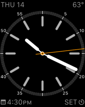
I wish i could set this watchface from my max bill watch. I love the look!
Pretty rare seeing an Edition here.
I have updated it a little and refined the apps that I have on my watch so that it is now even (OCD kicked in).
View attachment 551974
So yeah I like it now and I am going to stick with it.
Knock to Unlock!! How well does it work?
Knock to Unlock!! How well does it work?
knock has actually gotten worse with the last update... However it is actually pretty awesome. I have been using it on the phone for the past year and it works pretty well with the watch. You don't knock but actually tap to unlock. Another app I am trying that does a similar thing is MacID.
MacID has a bigger and better feature set and works extremely well on the watch with the added benefits of having media controls for the mac embedded in the app.
Last edited:
knock has actually gotten worse with the last update... However it is actually pretty awesome. I have been using it on the phone for the past year and it works pretty well with the watch. You don't knock but actually tap to unlock. Another app I am trying that does a similar thing is MacID.
MacID has a bigger and better feature set and works extremely well on the watch with the added benefits of having media controls for the mac embedded in the app.
I use knock on my iMac with my iPhone and find that it works fairly well. It actually works best by tapping on the rear shell. But I agree that the developer could do more, is slow to roll out any features which surprised me that he got it on the watch, and not sure how the whole Touch ID thing that was recently added should work, if it does at all.
Where are you copying the apple logo from??? i can't get it to work
There's a special character that appears as an Apple logo on Apple fonts. To put it in the watch monogram, you can cut and paste this character:
An alternative method to cut and paste would be to use an app that lets you enter Unicode characters there's one called UniChar.
A lot of special characters work (like: ☢☣☠✆☸⚛☯☄) you can use letters in squares or circles (like: Ⓒ## ) there are weird little smilie faces (☻☹⍢⍨⍤〠), but emoji won't work.
For people that don't know, the monogram can be changed in the Apple Watch app under Clock > Monogram
Ah.. I see Apple Insider published an article on how to put the Apple logo on the watch face.
Last edited:
Me too!
I've tried a few of the watch faces but seem to keep coming back to the one you chose (default). It may not be the most attractive of the bunch but definitely the most functional for me
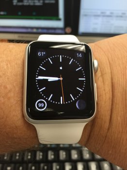
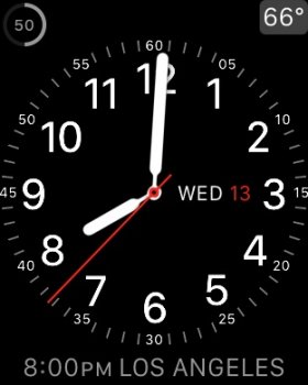
Here's mine
I just keep the home screen in default. No changes or something.
I've tried a few of the watch faces but seem to keep coming back to the one you chose (default). It may not be the most attractive of the bunch but definitely the most functional for me
I've tried a few of the watch faces but seem to keep coming back to the one you chose (default). It may not be the most attractive of the bunch but definitely the most functional for me
I feel the same way. I mean, I love the 'simple' watch face without any information on it. It's so clean, and nice to look at. But it makes it useless somehow, since it does only show the time. Also, I don't like reading from an analog clock, so another turn off.
But again, there are more beautiful watch faces than the 'modular' one. But they don't look well with all those complications. And without them, you would have to ask Siri, or use an app, to find out the information you're searching for.
I stick with the Modular watch face. Definitely the best one.
Show Off Your Watch Face and Home Screen!
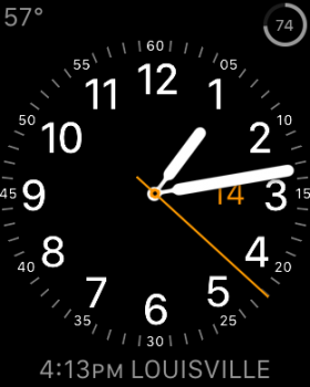
Here's my current watch face setup:

The home screen isn't ready to be shown off yet.
Here's my current watch face setup:

The home screen isn't ready to be shown off yet.
I feel the same way. I mean, I love the 'simple' watch face without any information on it. It's so clean, and nice to look at. But it makes it useless somehow, since it does only show the time. Also, I don't like reading from an analog clock, so another turn off.
But again, there are more beautiful watch faces than the 'modular' one. But they don't look well with all those complications. And without them, you would have to ask Siri, or use an app, to find out the information you're searching for.
I stick with the Modular watch face. Definitely the best one.
I like the look of the simple watch with no marks around the dial, but with a world clock complication set for my time zone --- the latter so I can more easily read the time.
I don't yet have my ⌚️, but will likely mostly use modular with weather in the big complication. I note that mechanical watches cannot use gears to provide a weather complication --- for me a big omission.
Hey, we're twins
As an aside, I've noticed from some of the minimalist faces shown here that they don't work that well on the Apple Watch because of the wasted space outside the rather small dial. Not to mention that it doesn't look symmetrical if you don't have all four complication corners shown.
I'd love it if Apple would come up with a new face with the dial/numbers along the perimeter and the complications inside the dial. There are quite a few nice looking squarish conventional watches with the Roman numbers along the perimeter and the complications located inside the dial.
Show Off Your Watch Face and Home Screen!
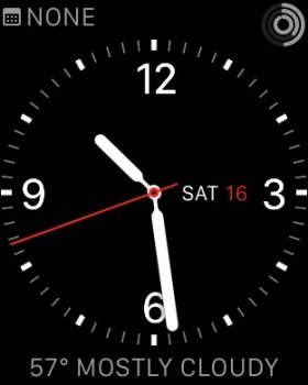
I think this is an under appreciated watch face, and from what I've gathered, a love-it-or-hate-it thing. It's not very functional apart from the time but I think it goes really well with casual/relaxed clothing styles. Very trendy. I use it for that or when there's nothing left in the evening and I'm just chilling. View attachment 552834
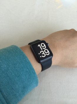
I think this is an under appreciated watch face, and from what I've gathered, a love-it-or-hate-it thing. It's not very functional apart from the time but I think it goes really well with casual/relaxed clothing styles. Very trendy. I use it for that or when there's nothing left in the evening and I'm just chilling. View attachment 552834

Last edited:
I think this is an under appreciated watch face, and from what I've gathered, a love-it-or-hate-it thing. It's not very functional apart from the time but I think it goes really well with casual/relaxed clothing styles. Very trendy. I use it for that or when there's nothing left in the evening and I'm just chilling. View attachment 552834
View attachment 552835
I can't agree more. Congrats.
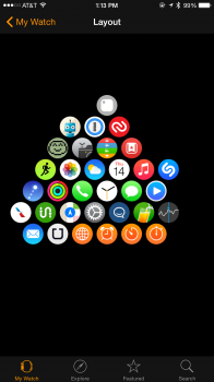
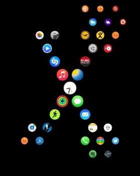
I keep switching between Utility and Chronograph. As for the homescreen, I'm hoping to arrange apps in an arrow shape as I install more. I've also arranged similar apps together so that they're easier to find, but the ones I use most are nearer to the clock.
Attachments
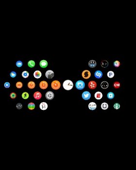
Here is my home screen. By the way: I absolutely hate the way to arrange the apps, it's so ***** "unstable". If you move an app just a little bit too left or right or you delete the wrong app, everything is messed up. But anyway... Tried to sort them by use:
Top left: media and creativity
Top right: miscellaneous or not assignable
Bottom left: sports and workout
Bottom right: productivity and office
The first two apps right / left above or below the watch app in the center are my most used apps of the four categories and will appear first when I see the home screen.
Attachments
I don't think the app layout screen was meant to be *organised* so much as a place to quickly tap. What that means for me is a grid of apps stacked in 4s so I can easily find them without having to move around the grid horizontally. I can move up and down of course but my most used ones are around the centre anyway. 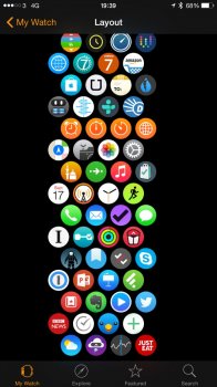

I wish i could set this watchface from my max bill watch. I love the look!

Where did this face come from?
Register on MacRumors! This sidebar will go away, and you'll see fewer ads.


