Become a MacRumors Supporter for $50/year with no ads, ability to filter front page stories, and private forums.
Where did this face come from?

It looks like a mock-up. I reversed image searched the photo and found a website that lets you upload images onto stock apple product photos.
I guess this is why OP said "i wish i could get my apple watch to match my other watch" (paraphrasing :p)
 
It looks like a mock-up. I reversed image searched the photo and found a website that lets you upload images onto stock apple product photos.
I guess this is why OP said "i wish i could get my apple watch to match my other watch" (paraphrasing :p)

Yeah, I'm interested in the website or whatever the poster used that created the mock-up. I wasn't expecting it to be a real watch face.
 
Love!
 

Attachments

  • image.jpg
    image.jpg
    19.5 KB · Views: 1,408
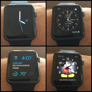
Switched to the modular face because it allows for 5 complications. Loving it.

Image

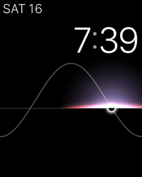
This is what I use during the week because it's the most helpful for work. On the weekend I'll use either Utility, Astronomy, or Solar.

----------

I stand corrected. Here's my updated watch face-

Image

Oh wow! Ok, didn't realize that either - although I think the calendar on the modular will provide a little more information without having to go into the calendar. Let me know how that works though.
 
Oh wow! Ok, didn't realize that either - although I think the calendar on the modular will provide a little more information without having to go into the calendar. Let me know how that works though.

Yeah, Modular, Utility and Mickey Mouse do provide more information with events. However, I compensate on my Simple face by having the Calendar glance smack dab in the middle of glances so I can quickly swipe down to see what event I have next for the time shown in the event complication. I don't necessarily like people being able to see what I have planned for the day.
 
I stand corrected. Here's my updated watch face-

Image

I dig what Modular does for people who need lots of info on their wrist and I'm equally glad it's there for us to use. IMHO, it does nothing for me stylistically.
I'm partial to the busy, modern look of the Simple face using all details with the complications at full spread or Solar for a minimalist, functional, bezel-hugging look.
 
Last edited:
I cant believe how plain all of the watch faces are that people are showing. I hate to say it, but Android Wear watches have far better watch faces, plus true ambient modes where they are on 24/7 without having to twist your wrist or press a button to wake up. Come on Apple, get it together!
 
I cant believe how plain all of the watch faces are that people are showing. I hate to say it, but Android Wear watches have far better watch faces, plus true ambient modes where they are on 24/7 without having to twist your wrist or press a button to wake up. Come on Apple, get it together!

Apple does need to expand on the watch faces. I'd like to see the dial along the perimeter of the watch (as well as Roman numerals) and complications inside the dial. The current dial looks rather small. I'd also like more elegant designs such as the following:

attachment.php
 
Apple does need to expand on the watch faces. I'd like to see the dial along the perimeter of the watch (as well as Roman numerals) and complications inside the dial. The current dial looks rather small. I'd also like more elegant designs such as the following:

Image
I've been playing around with an Android Watch, and the idea that you can create your own or download any watchface you can imagine is great. I've been going back between two:


(Not sure why but there was a glitch in the screenshot where the white box is)
 
I've been playing around with an Android Watch, and the idea that you can create your own or download any watchface you can imagine is great.

screen_zpspuatylcg.png

Not bad, but a bit too busy and Apple would likely make that face more minimalist. IMO the dial should be pushed out to form a rectangle. Otherwise, there's too much wasted space outside the dial as the circle can only be so large. My previous $1,000 link bracelet watch (that I stopped wearing over 10 years ago) was rectangular with the Roman numeral dial along its perimeter.
 

Attachments

  • IMG_1937.JPG
    IMG_1937.JPG
    427.2 KB · Views: 500
  • Like
Reactions: jjm3
Not bad, but a bit too busy and Apple would likely make that face more minimalist. IMO the dial should be pushed out to form a rectangle. Otherwise, there's too much wasted space outside the dial as the circle can only be so large. My previous $1,000 link bracelet watch (that I stopped wearing over 10 years ago) was rectangular with the Roman numeral dial along its perimeter.
This was on my LG G Watch R, which is round so it fits perfectly. I love it, and you have the ability within the Android Wear settings to change the colors and sizes of the dashed lines, hour and minute hand, you can change the info in the 3 circles (or remove any of them), and you can change the text where it says Ranger.
 
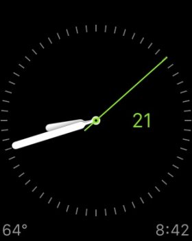
Mine at the moment (used at the end of the day when I have no more events scheduled).

attachment.php
 

Attachments

  • image.jpg
    image.jpg
    14.7 KB · Views: 2,460
  • Like
Reactions: jjm3
Register on MacRumors! This sidebar will go away, and you'll see fewer ads.