Of course they are working on iOS8. And iPad 6 and iPhone 6 as well I am sure.
And also iWatch... I would be impressed if they manage to pack a web browser and a full-fledged OS into a smartwatch.
Of course they are working on iOS8. And iPad 6 and iPhone 6 as well I am sure.
I think while the iOS 7 icons still leave a little to be desired, this is going too far in another direction that'll open up a whole new can of worms.
A balance needs to be struck between flat, monotonous icons that don't emit any sense of emotion, and icons that are all jumbled and bright with inconsistencies everywhere.
iOS 7 leans towards the latter; those Dribbble icons lean towards the former.
Personally, I like these icons done by Jackie Anh (I'd only tweak Notes and FaceTime):
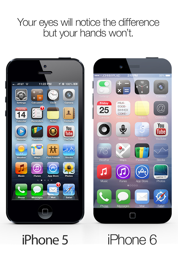
Image
They are harmonious, yet not so same-y that any third-party app won't look at home on the home screen. They are bright, but not "LeapPad My First OS" bright. And above all, they look classy, clean and professional.
The OP has to be bored or not have a single cell to use it positively... everyone can spoof a phone to be anything. It doesnt mean there is an iOS8 in the wild.
This only means the OP doesnt have anything news worthy to write and he wants to drive traffic...
Apple already knows iOS7 will be buggy out the gate, great.This just means to me that it's probably best to wait a month or so to upgrade to iOS7 (if you're not buying a 5C or 5S that is) so Apple has time to work out the kinks.
Could Apple's board jeopardize Ive's position (iOS7, its interface and icons, iPhone 5C and its questionable accessories, especially the "CROCS" case) as it's been done with Forstall and by extension Tim Cook?
You missed the point which is iOS 8 has turned up a lot earlier that it would under normal circumstances.
I think while the iOS 7 icons still leave a little to be desired, this is going too far in another direction that'll open up a whole new can of worms.
A balance needs to be struck between flat, monotonous icons that don't emit any sense of emotion, and icons that are all jumbled and bright with inconsistencies everywhere.
iOS 7 leans towards the latter; those Dribbble icons lean towards the former.
Personally, I like these icons done by Jackie Anh (I'd only tweak Notes and FaceTime):
Image
They are harmonious, yet not so same-y that any third-party app won't look at home on the home screen. They are bright, but not "LeapPad My First OS" bright. And above all, they look classy, clean and professional.
Apple already knows iOS7 will be buggy out the gate, great.
The title references iOS8 but the content has no detail.
iOS 8 will be all black-and-white!
After Sir Jonny Ive realized that shadows, bevels and skeuomorphic elements are not in line with the new ideology of FLAT, he came to the conclusion that color is not needed either to reach his minimalist nirvana
BTW, the best icons I have seen so far are still the ones from this guy:
Image
http://www.behance.net/gallery/iPhone-6-An-edgy-concept/7617209
iOS 8 will be all black-and-white!
After Sir Jonny Ive realized that shadows, bevels and skeuomorphic elements are not in line with the new ideology of FLAT, he came to the conclusion that color is not needed either to reach his minimalist nirvana
BTW, the best icons I have seen so far are still the ones from this guy:
Image
http://www.behance.net/gallery/iPhone-6-An-edgy-concept/7617209
Assuming that iOS 8 isn't just people ****ing with useragents.
Geez can we quit with the stupid alternate icons already. Or can the mods create a separate forum where people can post all the icon mockups they want.
You mean that has ever leaked!You missed the point which is iOS 8 has turned up a lot earlier that it would under normal circumstances.
Too bad they'll probably not move away from the super-candy-colored, gaudy, flat, Katy Perry-ish style they're using for iOS 7.
They can keep the very nice parallax effect, though.
If only they'd tone down the color palette...judging from the 5c, though, it looks unlikely.
Alas, I know I'm in the minority in this regard, but I would have liked a hybrid of iOS 6 (icons, some skeuomorphism), and iOS 7 (transparency, parallax, quick access).
As always with Apple: Sigh. They give some, but take some away.
Yes, but it could still be messed withThey are Apple IP addresses as stated in the original post.
That might seem reasonable unless you have worked in engineering. The problem Apple has, is the these developments go in cycles and each phase needs a different kind of person. People who can write requirements and do top level conceptual design have been done with IOS7 for months or maybe for a year. So what do they do? They started the next cycle on 7.1 and 8.0. They are planning out the work for the next 12 to 24 or 36 months.
Then they need a small army of programmers, developers who write code. These people are good at that but the WORSE people to do tests and quality control. The coders/programers finished their work on ISO7 months ago and have been working on the next release for months.
It is the same with building a housing complex. The guys who do concrete foundations are done and gone LONG before the roofers appear on the site. But yo have to keep them all employed and productive. So the build in phases with many houses all in different stages. Apple does this with software too.
Software is developed by groups of specialists, just like house are built by plumbers and painters and concrete workers. A good manager keeps everyone productive by planning way into the future
