Become a MacRumors Supporter for $50/year with no ads, ability to filter front page stories, and private forums.
Can we FINALLY expect a 'full screen/maximise window' button??

No, because that's unbelievably stupid. OSX makes the window as big as it needs to be, making it bigger is just wasting screen space and hinders multi-tasking. Why do you need to have blank bars on the side of your web page so the window fills the screen?
 
Wirelessly posted (iPhone: Mozilla/5.0 (iPhone; U; CPU iPhone OS 2_2 like Mac OS X; en-us) AppleWebKit/525.18.1 (KHTML, like Gecko) Version/3.1.1 Mobile/5G77 Safari/525.20)


Except fir the fact that Apple has released 4 or 5 major OS updates since XP and Microsoft has only released 1.

Actually, Microsoft released:
Windows XP Home Edition
Windows XP Home Edition N
Windows XP Professional
Windows XP Professional N
Windows XP Media Center Edition
Windows XP Media Center Edition 2003
Windows XP Media Center Edition 2004
Windows XP Media Center Edition 2005
Windows XP Tablet PC Edition
Windows XP Tablet PC Edition 2005
Windows XP Embedded
Windows XP Starter Edition
Windows XP Professional x64 Edition
Windows XP 64-bit Edition
Windows XP 64-bit Edition 2003
Windows Server 2003

Even if you remove the N (EU) and the duplicate Media Center and x64 versions, I'd say Microsoft wasn't just sitting on their hands.
 
I'm not sure what, but I must be missing something here. . . .

People keep saying they want the whole look of Leopard to be unified but looking around my mac I would say that all windows, iphoto, itunes, safari, finder, etc, etc, look pretty damn similar to me. What am I missing?

Also for my 2 cents, I like Leopard and it's look, Just as i liked Panther and Tiger in their time.

Look at the two pictures that are attached. The scrollbar in iTunes is different then the one in Safari.

Don
 

Attachments

  • Picture 1.png
    Picture 1.png
    995.3 KB · Views: 183
  • Picture 2.png
    Picture 2.png
    616.7 KB · Views: 131
I didn't buy a tiny laptop, I bought a portable laptop for on-the-go use, as many many people do (notebook sales are higher than desktop sales).

Nobody said they wanted rid of the scroll bar, but for the iPhone scroll bar to replace it.

[snip]

The screen shows no scroll bar, and when you scroll with the scrollwheel or with two fingers on a touchpad, it appears in a translucent overlay.

Now you see why this is better?
yes, I stand corrected, as long as your not in the "get rid of scroll bar" camp I am with you on this one then. I still stand firm on my themes argument tho.
 
@ darryquinn- I much prefer a normal scrollbar over the kind on an iPhone. IMO, it should be an option you could turn on or off.
Hmm.. I see your point and I agree with you wholeheartedly. While I would find this usable and I would like it, I can appreciate that others would not.


yes, I stand corrected, as long as your not in the "get rid of scroll bar" camp I am with you on this one then. I still stand firm on my themes argument tho.
Yes, I agree that getting rid of the scrollbar would be a stupid move. Wow we're all like one big happy family here :D

Attached is a quickly done mock up of what it would look like.

Although on this example it seems not to stand out enough, bear in mind, it would only show up when you scroll, so you would know that it is the scrollbar.

Step back and imagine that scrollbar-less window on your desktop.

That would make me go "Wow!" not vista. The pure simplicity of it, and the functional usage.

That said, I do still see that other people will prefer other things, that's your right and your opinion.

Picture 13.png
 
Look at the two pictures that are attached. The scrollbar in iTunes is different then the one in Safari.

Don

Ahha, I see. But I still can't find any others. . . It is like playing spot the difference.

Can you tell me of any other examples where the UI differs around my mac?
 
No, because that's unbelievably stupid. OSX makes the window as big as it needs to be, making it bigger is just wasting screen space and hinders multi-tasking. Why do you need to have blank bars on the side of your web page so the window fills the screen?

The knee-jerk blind defense some of you people have to Apple's way of doing things is amazing to me sometimes. It's okay to have thoughts and opinions of your own, You can respect, or use, or enjoy some one/thing without turning a blind eye to every flaw.

This is why choices are a good thing, it takes all kinds to make a world. We all use osx for different reasons. Some are Developers, Some are photographers, Some are just users, Some are UNIX admins. Each may have a different preference..

"resize to fit" is one of the most retarded features I've seen.
A) How many times have you seen it resize wrong and not fit the content? I've seen this happen in safari plenty of times.

B) not all content has a "size". I open iTerm and I have a standard 80x25 window and I hit maximize and it stretches vertically. Why? I wanted it full screen not 80x73. What the ****? What about an email? What exactly is the predetermined width of some random text only email supposed to be?

There's also no consistency here with this "resize to fit". I open slashdot right now and I manually resize the window to have very little width and I hit "resize to fit" and I get a very long window that fits the content pretty well. Then I manually drag the window in to a very wide shape, short height but very long width and I hit the very same "resize to fit" button and now I have a fullscreen Safari. Why? Shouldn't the same button on the same application displaying the same content be consistent?

I can see why some of you would like this, That's why I was saying I'm a big fan of CHOICES. Why can't we just toggle the functionality of this? Why can't we pick the silver theme in settings but then change the color? It would be trivial. What if I don't like silver? This isn't some major overhaul that's going to take time away from giving you people more retarded transition effects when you open up time machine or whatever it is you want..

I like OSX, but it's far from perfect. I use it exclusively as my desktop oriented OS, yet at the same time I still have actual opinions of my own and unwilling to swallow every load they want to bust in my mouth.
 
what about the bottom scroll bar? that should be fun to try and grab a tiny black bar if you are one of the many without a mighty mouse or scroll wheel mouse with no tilt wheel... sorry I just had to bring it up.
 
Since when are there upgrade only discs to change cats?


I call shenanigans on your whole post. 10.0 may not have been terrible, but it's a stretch to call it impressive. Especially given where we are now.


What a weird thing to say, I was just sharing my experience. As to my upgrades, I have upgrade disks for all OS X versions and they will not install without the previous version being installed. Believe me or not, that's up to you.
 
what about the bottom scroll bar? that should be fun to try and grab a tiny black bar if you are one of the many without a mighty mouse or scroll wheel mouse with no tilt wheel... sorry I just had to bring it up.

I think the point i'm trying to make is that nobody "grabs" the bars anymore though. We use two finger scroll on touchpad or scrollball on a mouse :D
 
I think it will look like marble cake.

And as long as it's finally res-independent, I'll deal with that :)

As for full-screen maximize, I think that usually makes little sense on today's big screens--and even 1280x800 is far larger than the days when that feature became popular.

Full-screen often means extra white space on the right, or extra-long text lines that are hard to read. And it ALWAYS means you can't see your desktop or other apps. Now, sometimes you want the simplicity of NOT seeing other apps. Just command-option-click your app icon and you've got that right now. (Or Hide Others from the menu.)

For SOME apps full-screen makes sense, but I'm happy to leave that choice up to the app, which is how the zoom button now works. (It IS full-screen for some apps.) I don't like the choice some apps make, but I consider that a flaw in the app, not worth changing the OS-level zoom feature over.

EDIT: I actually like the current glass scrollbars--the ones in iTunes are just "OK." But I've always thought the little "waves" inside the scrollbars were weird. They obviously put some effort into making the waves NOT move when the scrollbar does. Why? I don't get it!
 
How the heck would you know how long a webpage is then? I say "keep 'em" but, change their appearance... they still look like 10.0. They haven't changed at ALL since 10.0!

So you want to keep scroll bars even if not used as a visual guide to the length of a web age? Ok, then the suggestion to have them optional is the way to go. Perhaps a hot key toggle.
 
It would be cool if the scroll bars only appeared if you were either scrolling or if you hover over towards the edge of the window. They fade in and out as needed.
 

Attachments

  • Scroll Bars.jpg
    Scroll Bars.jpg
    280.7 KB · Views: 232
It would be cool if the scroll bars only appeared if you were either scrolling or if you hover over towards the edge of the window. They fade in and out as needed.

yep that would be nice or as someone suggested kind of like the iPhone. Still no reason not to have them 'the old' way in prefs if required too.
 
This is weird. Just the other day I was looking at the new iLife/iWork pages and noticed Apple changing the appearance of windows etc. There seems to be a lot more black transparent floating windows and a more refined app 'tool bar' to their latest stuff. Maybe a nod to whats in store. :)

Well I think it's likely an hint of what's coming up...
 
I hope Apple does create a new theme for Snow Leopard. Hopefully they can make some UI changes/additions as well. I haven't used Windows for a couple years now but having been messing with Windows 7, I have to say Microsoft is moving in the right direction. The new task bar is much more like the dock in OS X but better in some ways (love the ability to quickly hover over an icon and see the windows associated with that application). I also think the ability to drag a window to the right or left side of the screen to resize it to half the screen is extremely useful. Anyway, hopefully Apple will deliver useful changes. Stuff like quick look I find to be extremely useful.

Windows 7 must factor into this a bit. When SL was announced it was made clear that there would be no added features b/c it was an under the hood fix. Now they're talking about UI changes. They also have to consider that people will not pay $129 or so just for a faster system. Or will they?
 
Hmm.. I see your point and I agree with you wholeheartedly. While I would find this usable and I would like it, I can appreciate that others would not.


Yes, I agree that getting rid of the scrollbar would be a stupid move. Wow we're all like one big happy family here :D

Attached is a quickly done mock up of what it would look like.

Although on this example it seems not to stand out enough, bear in mind, it would only show up when you scroll, so you would know that it is the scrollbar.

Step back and imagine that scrollbar-less window on your desktop.

That would make me go "Wow!" not vista. The pure simplicity of it, and the functional usage.

That said, I do still see that other people will prefer other things, that's your right and your opinion.
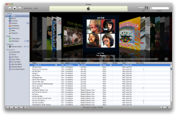
So I just got back from work. I.e., windoze hell and opened up iWork. lol.

I figured out how scrolling might with in Safari. Check out my two attachments. These are from iWork 09. One doesn't have my mouse on the side and the other does.

I think if we are seeing these UI changes in current releases of Apple Apps, we should expect them in OSX. Why else would they move away from the Aqua look? Simply for an App?
 

Attachments

  • Picture 2.png
    Picture 2.png
    31.4 KB · Views: 369
  • Picture 3.png
    Picture 3.png
    43 KB · Views: 363
It would be cool if the scroll bars only appeared if you were either scrolling or if you hover over towards the edge of the window. They fade in and out as needed.

For the iPhone, it is a must, because of the screen size. But on a big display, it isn't. I like seeing scroll bars so I know how much of the webpage has loaded (i.e. Engadget).

Good idea, but I like me scroll bars! Dinny paw ye!
 
Register on MacRumors! This sidebar will go away, and you'll see fewer ads.