Become a MacRumors Supporter for $50/year with no ads, ability to filter front page stories, and private forums.
As long as they change the BBoD (Beach Ball of Death), I'm fine. It's so 10.0...

You know what, IMO, they can get ride of it completely (or can they???) ;)
 
I suppose all things have their season but I loved Aqua from day one and still find it visually pleasing.

Never liked the more 'metallic' and 'flatter' feel of the iTunes interface at all. We had 'flatter' in OS9 and earlier.

If we go back to that feel it's regression, not progress.
 
It would be cool if the scroll bars only appeared if you were either scrolling or if you hover over towards the edge of the window. They fade in and out as needed.

Agreed. See my earlier screenshot, which is, not as good at yours by a long way.

BTW did you know you can push Cmd-Shift-4 and then spacebar to bring up a camera and then snap a screenshot of just a window?
It seems from your screenshot you didn't know :) Try it :D
 
Actually, Microsoft released:
Windows XP Home Edition
Windows XP Home Edition N
Windows XP Professional
Windows XP Professional N
Windows XP Media Center Edition
Windows XP Media Center Edition 2003
Windows XP Media Center Edition 2004
Windows XP Media Center Edition 2005
Windows XP Tablet PC Edition
Windows XP Tablet PC Edition 2005
Windows XP Embedded
Windows XP Starter Edition
Windows XP Professional x64 Edition
Windows XP 64-bit Edition
Windows XP 64-bit Edition 2003
Windows Server 2003

Even if you remove the N (EU) and the duplicate Media Center and x64 versions, I'd say Microsoft wasn't just sitting on their hands.

Not quite updates in the same way as OS X though and some could be regarded as "bug fixes"....
 
As long as they change the BBoD (Beach Ball of Death), I'm fine. It's so 10.0...

You know what, IMO, they can get ride of it completely (or can they???) ;)

Yes I'd like to see an animated apple that's continually split open
 
Ahha, I see. But I still can't find any others. . . It is like playing spot the difference.

Can you tell me of any other examples where the UI differs around my mac?

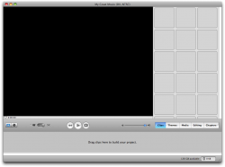
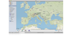
I don't have Aperture installed yet (just did a fresh install yesterday), but it and the other "Pro" apps use the graphite theme. The below image is Safari using the graphite theme. Also, iPhoto '08, and iMovie HD 6 (old version from iLife '06), use different themes. iPhoto's theme is nearly identical to iTunes' theme. iMovie HD 6 (image attached) uses a Tiger like theme. OS X does not have a unified theme at all. But I am partial to the Aqua theme.

Don
 

Attachments

  • Picture 3.png
    Picture 3.png
    491.3 KB · Views: 193
  • Picture 4.png
    Picture 4.png
    96 KB · Views: 190
(im sorry dialup users!:mad::p)

It's not just dial-up users you p*** with posting a large collection of images - it's everyone. Screws up the forum, horizontal scroll bars and half the page is just your images.

How about in future use
 
Nobody said they wanted rid of the scroll bar, but for the iPhone scroll bar to replace it.
...

The screen shows no scroll bar, and when you scroll with the scrollwheel or with two fingers on a touchpad, it appears in a translucent overlay.

Now you see why this is better?

No. I want a scrollbar to tell me how much of the window is currently visible. And the tiny scrollbar is fine for the iPhone/touch but not a system with a real screen.

I think the point i'm trying to make is that nobody "grabs" the bars anymore though. We use two finger scroll on touchpad or scrollball on a mouse :D

I grab the scrollbar all the time.

I suppose all things have their season but I loved Aqua from day one and still find it visually pleasing.

Never liked the more 'metallic' and 'flatter' feel of the iTunes interface at all. We had 'flatter' in OS9 and earlier.

If we go back to that feel it's regression, not progress.

Agree!
 
Agreed. See my earlier screenshot, which is, not as good at yours by a long way.

BTW did you know you can push Cmd-Shift-4 and then spacebar to bring up a camera and then snap a screenshot of just a window?
It seems from your screenshot you didn't know :) Try it :D

Actually... I did use the spacebar trick, but the difference is... I'm at work and all we have is Tiger, so no fancy drop shadows for me :(
 
This thread seemed vapid enough when it was posted, but now it has hundreds of replies it seems even more ridiculous.

Apple should try working on the function of programs before worrying about interface unity. They still have a full screen mode on iTunes that conquers both monitors. Even free VLC doesn't do that! Front Row is half way between garbage and useful. iWeb is the road to enabling a lot of people... if it was designed better.

What Jobs began in the late 90's and early 2000's with Apple's OS has petered out into half finished ideas and a lack of central philosophy. It's way better than anything on the MS side, but it's still so rough and cruddy. compared to what could be.
 
This is good news, but I removed all of the aqua scroll bars from my MacBook quite a while ago. I look forward to seeing what other visual changes Snow Leopard brings
 
I've been thinking somewhat along those lines myself. From the start, Apple said 10.6 would be a "behind the scenes" tweaking of 10.5, which in my mind is not a "full upgrade," just as a Windows SP2 or 3 is not.

That said, I suspect Apple will (have to) charge at least a nominal fee to 10.5 users since they did not announce 10.6 as a service pack or 10.5 update. It's advertised as an "upgrade." $130 would be crazy and if they did charge that then no one can rightfully moan about Windows upgrade pricing. My hope is that Apple will price it under $30 for existing 10.5 users. If not I suspect most people will just wait until they buy a new machine.

Maybe I can put it in a perspective people understand. Leopard is a Ford Mustang. Snow Leopard is a Shelby Mustang.

It looks much like the same car. No new "user features". Most of the car has been dramatically improved. Not by "tweaks" or "optimizations". We're talking completely major changes. But you won't see them driving in the city.

Does that help? I'm really tired of hearing people talk about Snow Leopard as if its just a service pack or minor update.

But doesn't that prove the point? The Shelby is only better to a small handful of people that value power over looks/function. If you aren't going to be at the drag strip, there isn't much difference. If leopard is already rock solid stability-wise and 90% of consumer users ever max out their cpu's, what does snow leopard offer to them? From their perspective, it really is no different than a service pack or 0.0.1 release.
 
I'm not going to read through X pages of posts, but I do want to say this:

Unification of the Mac OS X UI is a good thing, in my book. However, I'm not too particular about what the final theme looks like, as I've liked every single one Apple's used in Mac OS versions 5 through 10.5.

That said, I totally understand the complaints about Mac OS X's user interface being inconsistent at times, and I hope Snow Leopard fixes this. I also understand why Apple might want to change the look to be like the exterior of their newest Macs - it seems to be the trendy thing to do.
 
This makes sense, considering Leopard was supposed to be unified from what I remember hearing. It will be a nice update on top of all the performance improvements that are "under the hood."
 
I don't understand the insistence that the OSX UI needs to be 100% consistent. Perhaps similar elements repeated across different areas of the UI should look and function similarly, but do you really want everything to look the same?

For example, would you like it if every iPhone app UI looked exactly the same (For example if notes, weather, stocks, calculator all looked like the iPod app)? Would you like it if all the iLife apps looked exactly like Finder/iTunes with the blue sidebar and white main window?

Personally, I like windows that are instantly and obviously distinguishable from one another. I think the Finder and iTunes look too similar, and that iTunes needs to look way more distinct and recognizable within a cloud of Finder windows. Each system app should be unique enough to be able to switch to it in Expose without having to read any text or pause for a microsecond to look for it.
 
I think it's great that Apple is focusing on bug fixes and optimization...but if that's basically all we're getting then shouldn't that really be a "Service Pack" release instead of a new OS version? Especially if they're going to ask us to shell out ~$130...I hope they offer something more than "it works better now".

Am I the only one who feels this way?

I would gladly pay 130$ for Snow-Leopard, I didn't shell money for Leopard, useless feature IMO, I got it with a new machine through. Tiger and Leopard were IMO lame update, nothing really more then 3rd party incorporated into the OS (virtual desktop for example). The only real feature was spotlight and meta information search. If you give me a faster OS that can pull out more of those multiple core and GPU with the same hardware, it's a freaking good update. I remember the old day of OS X (I have use it since 10.0 beta), when a major update were equal to more speed on the same hardware. Tiger and Leopard are the only one that slow down on the same hardware and give mostly eye candy.

Make it as rock solide as 10.2 was, solve the wireless network issue many have, the keyboard issue... and make it fast, I will the first in the line to pick this baby up.
 
Is that part of the new marble look?

I love those "flat" light blue buttons. and also like the dark scrollbars on iwork .


Is it the death of the jelly beans?

We'll see
 

Attachments

  • photos_img_20090106.jpg
    photos_img_20090106.jpg
    23.4 KB · Views: 221
  • overlay_organize_06_20090106.png
    overlay_organize_06_20090106.png
    478.5 KB · Views: 284
  • Picture 1.jpg
    Picture 1.jpg
    11 KB · Views: 85
the weird thing is you get those flat stuff on iwork but when u open the media inspector everything is aqua again
 

Attachments

  • Picture 3.jpg
    Picture 3.jpg
    18.9 KB · Views: 99
I don't understand the insistence that the OSX UI needs to be 100% consistent. Perhaps similar elements repeated across different areas of the UI should look and function similarly, but do you really want everything to look the same?

For example, would you like it if every iPhone app UI looked exactly the same (For example if notes, weather, stocks, calculator all looked like the iPod app)? Would you like it if all the iLife apps looked exactly like Finder/iTunes with the blue sidebar and white main window?

Personally, I like windows that are instantly and obviously distinguishable from one another. I think the Finder and iTunes look too similar, and that iTunes needs to look way more distinct and recognizable within a cloud of Finder windows. Each system app should be unique enough to be able to switch to it in Expose without having to read any text or pause for a microsecond to look for it.

I think the point of the unified theme is not to make everything look the same, but to have a level of sameness so the special bits stand out. The development environment of the years seem to move the way of Apple taking care of more and more of the common stuff, letting the Developer concentrate on what value they bring to the table. The UI should be the same.
 
Register on MacRumors! This sidebar will go away, and you'll see fewer ads.