Got a tip for us?
Let us know
Become a MacRumors Supporter for $50/year with no ads, ability to filter front page stories, and private forums.
Spaces in Lion
- Thread starter mrblack927
- Start date
- Sort by reaction score
You are using an out of date browser. It may not display this or other websites correctly.
You should upgrade or use an alternative browser.
You should upgrade or use an alternative browser.
Now that there is a "Automatically Rearrange Spaces" option that you can disable, I think it's much better. We are only losing the grid arrangement like this, and everything else is probably okay. I'll see how annoying it is to flip though 10 spaces all the time though, I'm not sure I'll like that!
Just click on the app dock icon?
Yeah but that won't work for apps that have more than one window on more than one space, it also won't work for apps that have no window open (Photoshop often), and it won't work if you just want to go to a space with nothing on it and open an app on there afterwards.
Now that there is a "Automatically Rearrange Spaces" option that you can disable, I think it's much better. We are only losing the grid arrangement like this, and everything else is probably okay. I'll see how annoying it is to flip though 10 spaces all the time though, I'm not sure I'll like that!
That makes me feel much better.
What happens if you have more than 6 or 7 spaces, how are they arranged in Mission Control? Still horizontally?
That makes me feel much better.
What happens if you have more than 6 or 7 spaces, how are they arranged in Mission Control? Still horizontally?
Yup, unfortunately. 2D desktops are better for single, small display multi-touch devices. Using a Pro-system with more than one display and running Final Cut/Photoshop/Aperture in their own "space", err, desktop, adds unnecessary steps. There should be an option, allowing a 3D or 2D GUI for spaces.
Sigh... Well Spaces-Fans, this looks like the end of the road. Behold, in DP3, the system prefs pane which used to say "Exposé and Spaces" now says "Mission Control":
Image
And the spaces tab is completely gone:
(before)

(after)

The only remaining feature of spaces is the ability to set an application to a particular space (desktop), now moved to the dock icon context menu:

And that's it folks, once they make a "mission control" icon to replace the spaces icon for the system prefs menu, there will be nothing left. While I and many others had hoped that new Lion builds would start to bring spaces back to it's former glory, this most recent build shows that they are going completely in the other direction. By the time Lion comes out, there will likely be nothing left.
Hey, I am 100% sure, its a bug. I have tried to mess up with the defaults and everything, but I couldn't get it to show the SpacesTab. I am more than sure, its coming in the next Preview, which in my opinion will be released in the next couple of weeks.
Just click on the app dock icon?
I wish I could throw the mouse away and just use the keyboard.
Seriously, if you are a developer, you shouldn't know what a mouse is OR that it exists. Keyboard is the way to go.
I wish I could throw the mouse away and just use the keyboard.
Seriously, if you are a developer, you shouldn't know what a mouse is OR that it exists. Keyboard is the way to go.
I use CMD + tab but sometimes i have to use CMD+Arrow when an app window is not opened... I hope Lion adress this issue.
I use CMD + tab but sometimes i have to use CMD+Arrow when an app window is not opened... I hope Lion adress this issue.
I am sorry. What's the issue?
Sigh... Well Spaces-Fans, this looks like the end of the road. Behold, in DP3, the system prefs pane which used to say "Exposé and Spaces" now says "Mission Control":
Image
And the spaces tab is completely gone:
(before)

(after)

The only remaining feature of spaces is the ability to set an application to a particular space (desktop), now moved to the dock icon context menu:

And that's it folks, once they make a "mission control" icon to replace the spaces icon for the system prefs menu, there will be nothing left. While I and many others had hoped that new Lion builds would start to bring spaces back to it's former glory, this most recent build shows that they are going completely in the other direction. By the time Lion comes out, there will likely be nothing left.
Whoa, that's not good. Based on what I'd seen of MC earlier, I expected Spaces to become a more integrated part of OS. Perhaps, in a way, it has been? More abstracted from the user perhaps? I need to get a copy of Lion to play with...
Jeez, every time I come to this forum to catch up on the latest Lion news I come away disappointed. Is it really downhill from here?
Doesn't Apple realize that computers and iPads are fundamentally different and used in very different ways?
Doesn't Apple realize that computers and iPads are fundamentally different and used in very different ways?
What!? Spaces is gone? One of the many draws of OSX is Spaces.
No, it's not gone in Lion. It's just drastically devolved.
Jeez, every time I come to this forum to catch up on the latest Lion news I come away disappointed. Is it really downhill from here?
Doesn't Apple realize that computers and iPads are fundamentally different and used in very different ways?
I think, Lion is worth it except for Spaces.
Don't give Apple a hard time. They are doing some great things with Lion but yes, they are messing up with Spaces and Expose.
So one must wait for at least a beta version to count on anything materialistic. Maybe they will come up with an option or something different.
The "beta" is already out and we have been testing it (Dev Preview 3). I personally HATE the new devolved version of Spaces in Lion. I cannot say I love much else in Lion, but it certainly is not at all terrible. Fact is, for the most part Lion is not a drastic change from Snow Leopard. There are quite a few visual changes mostly with the intention of making Lion merge with iOS. I personally think making the more versatile OS X resemble the functionality of the less versatile iOS (made for phones and tablets) is ass-backward. But that being said, much of what I've seen in the Dev Preview of Lion is not terrible ONLY BECAUSE the versatility is still absolutely there. The things I abhor though have everything to do with the melding OSX/iOS process... like Space and the FULL SCREEN APPS which totally kills your second monitor if you have one. Having full screen apps is totally NECESSARY on an iPad and iPhone since the screens are so limited and small. But if I want my app to be full screen on my desktop computer, why the heck would I want to render my second monitor useless when I put the app in full screen mode??? All I have to say about Lion's adoption of that is, I'm glad full screen apps (the iOS way) is not FORCED in Lion. You have to envoke it - which I will likely never do.
Rant completed till someone other button is pushed and my rage is triggered! }: |
Are you guys reporting these to Apple? They don't just want to hear about bugs but anything that hinders your workflow, even something like Mission Control. I think that if enough people to complain, they might do something. I know Apple has their own way of doing things, saying that you don't know what's good for you, but if after months of using Lion you still don't like Mission Control (or anything else), that probably means you'll never like it, so they got that wrong.
They did listen to people who wanted an Apple TV that doesn't sync to the computer, also when people wanted the buttons back on the iPod Shuffle, for example. Maybe they might listen this time too.
It's clear that Mission Control exists because of Full Screen. Full Screen Apps need to have their own Space, which would result in an uneven number of spaces from time to time, also a dynamically changing number and arrangement of spaces. This makes the old grid layout not work. The only solution to Full Screen apps having their own space is having a linear arrangement of spaces. But what if you prefer grid spaces over Full Screen apps? Maybe Apple could allow us to choose...
Maybe just a checkmark "Enable Mission Control" would solve everyone's problems, and unchecking that would cause Full Screen Apps to behave just like any window that takes up most of the screen.
I can see why full screen apps would fill up one Space. But why would full screen apps necessarily entail a linear, non-grid overview layout ?
I can see why full screen apps would fill up one Space. But why would full screen apps necessarily entail a linear, non-grid overview layout ?
I expect they went linear for several reasons: 1) gesture controls. It's easy to swipe back and forth. Grid gesture controls would be awkward or impossible to implement 2) Compatibility with the new mission control view. There's simply no space to include a grid. (And, as baryon has already mentioned, compatibility with fullscreen mode.)
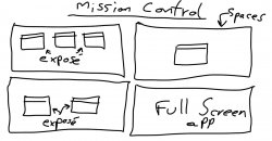
I think Mission Control should be like this:

It combines full screen apps, Spaces and Exposé at the same time. It's exactly what you get today when you go into spaces overview mode, and hit Exposé. You get a view of all your spaces and all the windows in each space. It's perfect.
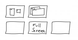
The problem is that using full screen apps in their own space doesn't necessarily result in an even number of spaces, which leads to this:

Which leads to you not being able to go "up" when you're at the last space, as there is nothing above it. This would lead to inconsistencies, confusion and frustration, and it's not elegant.
Also, it's easy to understand that when you open a full screen app, it opens in the space to the right of the current one. However, in a grid, what if you're on the rightmost space already in the above drawing, and THEN you open yet another full screen app? You get another space to the right of that one, like this:

So I think that linear spaces are the only solution.
However, why not just ditch full screen apps altogether, and use grid spaces?? That would have so much more advantages than just full screen apps, together with the need of linear spaces...

It combines full screen apps, Spaces and Exposé at the same time. It's exactly what you get today when you go into spaces overview mode, and hit Exposé. You get a view of all your spaces and all the windows in each space. It's perfect.
The problem is that using full screen apps in their own space doesn't necessarily result in an even number of spaces, which leads to this:

Which leads to you not being able to go "up" when you're at the last space, as there is nothing above it. This would lead to inconsistencies, confusion and frustration, and it's not elegant.
Also, it's easy to understand that when you open a full screen app, it opens in the space to the right of the current one. However, in a grid, what if you're on the rightmost space already in the above drawing, and THEN you open yet another full screen app? You get another space to the right of that one, like this:

So I think that linear spaces are the only solution.
However, why not just ditch full screen apps altogether, and use grid spaces?? That would have so much more advantages than just full screen apps, together with the need of linear spaces...
I much prefer it, but maybe that's because I have a Magic Trackpad. You can now switch between Spaces with a 3 or 4 finger swipe. It works brilliantly - so much better than before.
I do like being able to switch spaces with the trackpad - and hope they keep that feature.
nonetheless, going from spaces #1 to #4 is just a blurry experience... slightly nauseating... i'm not a fan of the new linear layout.
they should do 4-finger swipe up, left or right is spaces
3-finger is expose / dashboard
nonetheless, going from spaces #1 to #4 is just a blurry experience... slightly nauseating... i'm not a fan of the new linear layout.
You can press ctrl-number to go directly to a particular space...at least you could in the initial Lion preview, not sure if they changed it.
You can press ctrl-number to go directly to a particular space...at least you could in the initial Lion preview, not sure if they changed it.
As long as this is still possible I don't care what it looks like. This is the only way I use spaces currently on 10.6. (except I use cmd)
Are you guys reporting these to Apple? They don't just want to hear about bugs but anything that hinders your workflow, even something like Mission Control. I think that if enough people to complain, they might do something. I know Apple has their own way of doing things, saying that you don't know what's good for you, but if after months of using Lion you still don't like Mission Control (or anything else), that probably means you'll never like it, so they got that wrong.
They did listen to people who wanted an Apple TV that doesn't sync to the computer, also when people wanted the buttons back on the iPod Shuffle, for example. Maybe they might listen this time too.
It's clear that Mission Control exists because of Full Screen. Full Screen Apps need to have their own Space, which would result in an uneven number of spaces from time to time, also a dynamically changing number and arrangement of spaces. This makes the old grid layout not work. The only solution to Full Screen apps having their own space is having a linear arrangement of spaces. But what if you prefer grid spaces over Full Screen apps? Maybe Apple could allow us to choose...
Maybe just a checkmark "Enable Mission Control" would solve everyone's problems, and unchecking that would cause Full Screen Apps to behave just like any window that takes up most of the screen.
It seems to me that the solution should be to just make Mission Control an optional and additional feature. Leave the old spaces and expose intact. As for grid view in spaces, this should be no problem. Spaces are still numbered in grid view and so the linear translation in Mission Control would just follow that.
It's the fact that Apple is forcing this on us that is mind boggling. I know a lot of people rant about Spaces, but I'm more astonished with how bad Mission Control messed up all-window expose. The entire point of pressing the expose button as it stands is to "un-layer" and tile your windows. Now, however, if you have two windows of the same application open (in addition to others) pressing the Mission Control button will actually force layer the windows of the same app together! Mission Control actually does the exact opposite of the solution expose provided and yet it's a "replacement" for expose! Madness...
Register on MacRumors! This sidebar will go away, and you'll see fewer ads.

