Become a MacRumors Supporter for $50/year with no ads, ability to filter front page stories, and private forums.
Here's to hoping they'll fix the Spotlight "show all" window by changing it to look like it did in Tiger.

It went from this:
tigerspotlight2.jpg

to this:
spotlightleopard.png

Yea, I miss that too. Spotlight has become almost useless to me. Sometimes I enter the full filename in Spotlight. Last time, the file was there. Now it's not, so open a "spotlight window". It show 2000 results, most of them unrelated. I really want Tiger's spotlight windows back, with the categories and previews and I want it so search all my drives at once.

Let's report that "bug" to apple, maybe we'll get it back like the dock folders.
 
No icon? You need this:

Stack.jpg

I love the fact that you get the functionality of both having a folder, and the previews, but don't like the look.

I personally prefer stacks to how things were it Tiger. I never was a folder-in-the-dock user until stacks came about, and since I only use 3, I have them memorized by position and don't need the folder icon to differentiate. However I completely understand and sympathize with those who use more and are annoyed by this behavior, and these updates all look to be positive.

What I really want is to be able to do the fan view with the dock on the left. I have trouble finding documents in grid view as quickly as fan view, so I've moved my dock to the bottom from the left where it's been sitting for years.
 
yeh i hate the new spotlight show all window now too although i like thats its actually in a finder window now so you can use finder keyboard shortcuts. but you cant leave the window a custom size and file types other than images dont even have icon previews!?? WTF?

Yeah the new spotlight 'Show All' view is terrible!

It really reduces the usefulness of spotlight a lot.
 
Here's to hoping they'll fix the Spotlight "show all" window by changing it to look like it did in Tiger.

It went from this:
tigerspotlight2.jpg

to this:
spotlightleopard.png

I wrote an entire thread about how much I hate the new Spotlight and I'm glad to see I'm not alone.
 
I wrote an entire thread about how much I hate the new Spotlight and I'm glad to see I'm not alone.

I also can't believe that they f***ed spotlight up so bad in Leopard. It's much faster but pretty useless this way. The old "show all" button needs to be implemented again ASAP.
 
I wrote an entire thread about how much I hate the new Spotlight and I'm glad to see I'm not alone.

totally agreed. but the one thing i like (though perhaps this is not new and i just never really noticed it in tiger?) is that there's a readily-apparent button on the "show all" window to search only file names, not contents. about 85% of the time when i'm looking for a file, i know what it's called. it's frustrating when the file whose name is exactly what i typed in the search field is buried beneath dozens and dozens of files that contain those terms in their contents. this made me miss OS9 searching.
 
But not for me

This is great news! As I don't really have any remaining "issues" with Leopard myself, it will now be the "perfect" OS for me. Awesome how Apple listens to it's users. Considering in the grand scheme of things how few people most likely really complained about this anyway. Let's hope it's 100% true!

My current biggest background operating problem with OS 10.5 is that with my ATI x1900 video card, there are artifacts of lines left on many of the windows. Or they could appear on the screen back drop picture. Many times redraws can delete one of them, other times that does not work.

My biggest problem doing work using OS 10.5 is that there is a much limited movement using the keyboard arrow keys to move in the finder windows in the list view. I have to use my trackball all of the times rather only when I velt like it. This usually takes more time & has kept me from using OS 10.5 all of the time.

I'm not a big dock user, so I haven't found a time to check the discussed change. I believe that Apple should build on the past, not delete the past when a new OS version comes out.

Bill the TaxMan
 
I want Tiger's spotlight back too with Leopard's fastness... it makes me want to cry sometimes how backwards it is now.
I HATED Tiger's Show All Spotlight window. It showed way to many results and I found the Sorting options to be garbage.

I actually really like the new Spotlight results window.
You aren't alone. I think integrating it into Finder WHILE ADDING* functionality was the right thing to do. To me, it's a hundred times more useful.

*Advanced Boolean searches are now available unlike in Tiger.
 
The audio/video preview in Finder was replaced with the new -- and far improved in my opinion -- QuickLook functionality. Just hit the space bar when your audio or video file is selected in the Finder. All your controls are there and even easier to see and use.

:)

That's so cool! I couldn't figure out the point of QuickLook.
 
I HATED Tiger's Show All Spotlight window. It showed way to many results and I found the Sorting options to be garbage.


You aren't alone. I think integrating it into Finder WHILE ADDING* functionality was the right thing to do. To me, it's a hundred times more useful.

*Advanced Boolean searches are now available unlike in Tiger.

Definitely. In my opinion, allowing advanced results in both the Finder itself and some alien window in Tiger was a mistake. Leopard is a huge improvement.
 
I wrote an entire thread about how much I hate the new Spotlight and I'm glad to see I'm not alone.

Add me to the list of 'bring back the old spotlight' - it isn't the fact that I like the old way, but the fact that the old way made alot of sense; if it was a document, i'll go down to documents, expand that, click on 'show all' and voila, there it is.

What pisses me off more - I can no longer search using spotlight my Library/Settings directory; so when I used to remove applications, to remove the temporary settings I just searched for the application name, then drag and drop - I have to manually search through directories for the files.

Who ever made these changes need to be chained to a pole and given a public flogging.
 
Regardless its an issue that you would submit via the bug reporter, which wasn't done until the end of November. Otherwise Apple could fairly assume it wasn't a major issue for people ;).

I reported it immediately (on the Monday after Leopard was released) to Apple Support. I told them this was a dealbreaker. I also pointed out that I expected that this was reported further up the system.

So it was reported already during the lasts days in October.

But the main question remains. Why in hell did Apple remove this feature in the first place? That is the 1 million dollar question of the year.

It is like if Apple is trying to make the transition more smoothly for Windows switcher to invent the Start button in a new fashion. I don't get it???
 
Fishy?

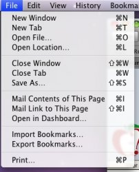
Something odd about that screenshot besides the custom dock....look at the "i" in the word list in the screen shot on Macstein. Looks a lot thinner than the "i" in GRID and KIND. Something fishy here.....:eek:

I agree, it's half the width of any other 'i' on the menu.. hmm..

Picture3.png
 
Not a lot of people seem to be commenting on this one, but to me this is HUGE. Take my Home folder for instance, I like having that in the dock. Guess what? The first folder alphabetically in my Home directory is my personal "Applications" folder. So guess what icon shows up in the dock? I keep mistaking that for my REAL Applications folder; it bugs the heck out of me!

This is the second biggest thing for me after the hierarchy folders is back. I definitely don't like the how the dock display the content in the folders as it is now. It is butt ugly and even worse. It makes it difficult to overview the dock, and that can't be the purpose.
 
I agree, it's half the width of any other 'i' on the menu.. hmm..

Picture3.png

Not every single character anti-aliases the same. I'm looking at the File menu in Safari right now and I'm looking at "Open File" and "Mail Link" and the "i" in File is fatter than the "i" in Mail and Link.
 

Attachments

  • Picture 2.jpg
    Picture 2.jpg
    36.1 KB · Views: 339
I have not been desperate for this feature, but I will be happy if this is legit and gets added.

What I really would like is a "Finder View" option that would just open your Stack in the Finder when you clicked on it.

I would also like a Search Box in Grid View that would highlight items with searched keywords like in System Preferences. We probably won't see that in a Leopard Update though.
 
I would also like a Search Box in Grid View that would highlight items with searched keywords like in System Preferences. We probably won't see that in a Leopard Update though.

That sounds like a really cool idea! My Downloads folder gets pretty messy and it would be nice to be able to do searches in it right from the Dock.
 
I agree, it's half the width of any other 'i' on the menu.. hmm..

looks to me like they are both occupying two pixels of width, but due to antialiasing their color is distributed differently over those two pixels (because their centers aren't lining up with the pixels in exactly the same way).

i'm curious to know if any developers to whom 10.5.2 was seeded might speak up about this? i'm not sure if they will include it in my student developer mailing, but it's definitely not showing up in my downloads on the ADC site.
 
Register on MacRumors! This sidebar will go away, and you'll see fewer ads.