Nice, how did you change the tools sidebar?
That'll cost ya!
")
Actually, this is a snapshot of a Pixelmator palate.
At the very least, this will help you get your colors back.
A hack for the artwork is forth coming.
Nice, how did you change the tools sidebar?
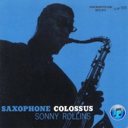
I think it looks vintage, something you would expect on an old jazz record.
What's more annoying is the changes in iTunes itself, the loss of colour in both the icons in the sidebar area and the Preferences is a pain.
Now that the menu bars are understated, this dramatically allows the content, i.e. album art, movies, apps, etc. to appear to be much more vibrant.
Comparing both versions, side by side, on two iMacs, iTunes 10 seems much more elegant, refined, and vivid - not to mention much more responsive and speedier, overall.
The pale aqua background on the side menu creates an interplay of subtle color variations within and around the grey-scaled side-bar icons - a side by side comparison makes the iTunes 9 layout seem a bit Fisher Pricey.
Yep, and it forces you to declare gender? No ping for me, for those and other reasons.I'm annoyed that you can't use your iTunes Store Nickname for your screen name. Having to put your real name is annoying as *&X?2@!*
That'll cost ya!
Actually, this is a snapshot of a Pixelmator palate.
At the very least, this will help you get your colors back.
A hack for the artwork is forth coming.
right click itunes show contents, then resources and scroll down. You can probably copy the old itunes 9 icons over, just like you can do to get the old icon back in the dock.
I think it's ugly because it doesn't match with the Safari, Mail, Calendar, and all the other Mac icons I have on my dock.
.Ok, first off, its an icon!
Second, its a step forward. We aren't in the 90's anymore, CDs are becoming a thing of the past and iTunes has been the leader moving consumers from physical media to digital downloads. The old icon was dated, a thing of the past, like vinyl records.
Really want my color back in itunes....
uhm... if you show most people in the WORLD a CD and DVD, they wouldn't be able to tell you which is which.
After 20 pages, it's pretty evident that it's not just an icon.
Despite the fact that I agree with this, it's like the quarrel about the Islamic center near the World Trade Center site. It's not that big of an issue, but it's still getting blown up.

FTW!
Only on MR: 483 posts about the iTunes icon.
FTW!