Got a tip for us?
Let us know
Become a MacRumors Supporter for $50/year with no ads, ability to filter front page stories, and private forums.
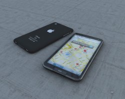
The Best Mock Up of an iPhone. Ever.
- Thread starter nickspohn
- Start date
- Sort by reaction score
You are using an out of date browser. It may not display this or other websites correctly.
You should upgrade or use an alternative browser.
You should upgrade or use an alternative browser.
i know this is a mock up, but anyone notice that the '3G' logo next to AT&T is the old logo?
please tell me youve done something more usefull today
please tell me youve done something more usefull today
It's a legitimate claim. About 90% of all mockups for "Leaks" have the 2.0 software on them.
please tell me youve done something more usefull today
well i don't need to learn how to spell tonight.
"Soon we'll be reaching speeds of threeeeeeee!!!!"1,000 what? $1,000? Really?
This looks 'shopped.
I can tell from some of the pixels, and from seeing quite a few 'shops in my time.
This actually makes my iPhone3G look outdated, something every new iteration of Apple hardware has managed to do when compared with the older version..

That's beautiful. Best mockup I've ever seen.
I'd buy that in an instant.
Agreed. We can only hope the new iPhone will be an improvement in design as much as it is with its internals.
It's really too bad that it's just like a concept vehicle, of which the mass production version won't even come close.
nope. this would be the second time i was disapointed that apple cant live up to a rumor... remember this?
http://www.crunchgear.com/2008/06/0...-colors-check-video-chatting-check-and-check/
i was in love, ready to buy it, only to have apple uglify the gorgeous iphone 1G with plastic. PLEASE APPLE! don't do it again!
I also loved that mockup, I was actually disappointed when the 3g was announced, it looked bad by comparison.
This is the problem with spending your time reading Macrumors I guess, people can make mockups that look realistic but are unrealistically small/thin and have features that Apple won't or can't add yet, then when the real thing is released it looks bad by comparison.
Seeing this mockup i'll never upgrade my current 3g to the newer version if it does not look like the mockup.
If the mockup is a higher end 32gb version, then I'll pay upto a grand for it.
I don't like the wasted space at the top and the bottom with the current iteration of the iphone. The mockup hits exactly at those points + the matt back.
Wish apple has taken notice of this.
If the mockup is a higher end 32gb version, then I'll pay upto a grand for it.
I don't like the wasted space at the top and the bottom with the current iteration of the iphone. The mockup hits exactly at those points + the matt back.
Wish apple has taken notice of this.
I'm planning on skipping this iteration of the iPhone because even the upgrade rumors don't seem that great, but if it looks anything like that mockup I might have to reconsider. I really like the redesigned home button, but it seems like it might be easy to press accidentally while it is in your pocket.
Beautiful.
But the battery life on something that thin is about 4 minutes.
Yeah that always annoyed me about my iPod touch. I listened to one song and then done....
Wow very nice looking. The only thing I dislike is the Home button. I don't like how they merged it with the bezel and made it a square. Personally though, I think it would be interesting if Apple made the Home button touch sensitive, like they eventually did to the iPod click wheels.
It looks like the Zune HD
I like it, I can't see why all these mock-ups of a "on" light for the front facing camera, just cause your mac does it doesn't mean your phone should/will...
Still, by far the best looking mock up I've seen.
Still, by far the best looking mock up I've seen.
Register on MacRumors! This sidebar will go away, and you'll see fewer ads.